There has been plenty of discussion about the images presented here. What people like and what they would change. I would like to attempt to take it one step further (I hope). I am going to critique two images that stood out to me because they seem to be speaking the words "What if? Here is where I would like us to discuss what if it was this or what if that so that you can have an enhanced awareness to ask the same or similar questions the next time you put the camera up to your eye.
Ask yourself, what do you do when you compose an image? What are you thinking about? Shape, texture, light and light quality? Design, balance and relationships? How about previsulization? Of course and that is what I want to focus on with the following two image critiques.
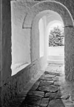
The first image belongs to John Neal. Before I start, I should also let it be known that I'm a photo retoucher and I have no bones about moving or removing things that just don't work in a design. Yes, I removed the wiring that was over the doorway. If that is too big of a crime then just tell yourself that I painstakingly went back to this very location, patched the wiring because the owner got sick of looking at it and then went to the trouble to wait for the right light and framed it exactly the same. I understand the need to photograph some things as true as possible and that is all right and fine with me but if I'm looking for something that I want to present as art, I'm not going to wait for the Gods to put every single little element in the right spot and I'm certainly not going to wait for them to tell the wind to blow to remove a piece of trash from the composition. I hope I'm not alienating anyone but I know there are those who would wait for the wind to blow the trash out of the way instead of removing it themselves.
Ok, enough of my rant, lets look at some photos. I've read through everyone's post and the consensus on this image seems to be that some can't tell what the subject is but the textures and lighting are great. I don't know what John's level of experience is so I'm to present some ideas as I would do them. Now in hind-sight what would you have done? What were you thinking when you took the photo? If you printed it in a darkroom, what were you thinking when you printed it, what were you trying to emphasize?
Looking at this image, I would say that you were engulfed by the soft light and the white on white effect it has on the painted wall and likely so! But how to draw the viewers eye to it? Well, you've placed the tree in the background off to the side a bit which certainly helps draw the eye in as mentioned in a previous post but now what, do I look at; the tree or the soft lit area inside? Was this your dilemma? What I'm trying to do here is to get you to think about what you've printed vs what you could have done so that when (not if) these arguments resurface the next time a similar scenario comes up so you can work out several ideas before clicking the shutter. That's not to say you didn't do that when you took this one but since everyone seems to have a few similar thoughts, perhaps we can present those suggestions implemented so you can see how it might look and thus explore the possibilities.
Lets look at this first version I present. Going with the idea that perhaps the tree is competing for attention against the white walls I've brightened up the outside so that the tree is no longer a subject stealer. The eye will always be attracted to the brightest thing in the image first but in this case, note how the archway becomes the subject. How does this help you for when you were looking through the camera? Was this what you were after in the first place? Or were you after the white walls in next space. If this is what you might have wanted, you could have chosen to opened up the lens even further thereby increasing the sense of white on white but having a single subject becasue most of the tree would be blown out.

Ok, lets look at another version. This one goes the opposite direction. In this scenario the viewer goes through the corridor and outside to the tree but now the tree is a bit more attractive. We have the nice white on white inside and some nice shading that emphasized the textures and it all leads you right to the tree which now has detail restored to it and the ground.
To take this shot, you would have had to expose more for the outdoor illumination.
The idea here is to get you to previsualize these two scenarios while you are at the scene. You could take is a step further like one of the previous posters suggested and have a person in the doorway...how long would you be willing to wait for that opportunity? Many times it is impossible to wait that long but it should be something you think about. Add to it, the possibility of that person being in one of the two scenarios I've presented here.
I think perhaps what you actually got was a cross between two ideas in one photo. Or I could be completely wrong about this in which case, these two images would serve as other ideas you may not have thought of when you were there.
One down, one to go! But it may have to wait until tomorrow night. Right now I have to go study more bloody CSS for work ;-)
P.S. John, if you would like to have the layered Photoshop CS2 file I used to make these, just let me know.