New Plus X

Ronald M

Veteran
Local time
8:31 PM
Joined
Aug 17, 2005
Messages
4,813
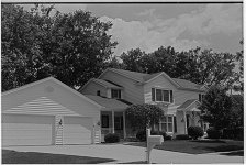
I ordered and received a 100 feet of the new version of Plus X, well it is a few years old. It was my standard film since 1965 but I drifted away when Kodak said they wanted out of the film business. They have since changed their business model.

Now that I nailed the developing time for the new emulsion on the third try, the prints are simply stunning, fine grain,sharp, beautiful tonal range. One test roll was with a 111C and like new condition Summitar, the other was an my M6 and new version 50 2.8.

Home made D76 1:1 ( reg formula) 68 for 7.5 min at 68-no rinse or stop-TF4 fix 3 minutes- Ilford wash sequence. Nothing special. Agitation 5 inversions every 30 sec. Nikor tank and drop the loaded reel in at 7.5 and start pour out at 15 sec to end. The Kodak times were way long, 8.5 min. Printing was on my Leica V35 with 2.5 grade filtration. A Focomat 1c should be at #2 or no filter.

Here is the problem. It does not scan well. Blown highlights, big grain. I can get it to look better if I adjust the curve so the last 20% goes up at an 75/80 deg angle and the rest is straight. Then I get nice separation in the sky and puffy white clouds. I can`t seem to find a point where it scans with detail everywhere like the Tri x or Delta 100 do.

I am using a Minolta 5400 scanner in black and white neg mode, Minolta software. Any suggestions?

The grain in even tone grey on prints is virtually invisable on 8x10 prints, but looks terrible in the scan at 1350 ppi or 5400 ppi.

If you print in a darkroom, I suggest you try a roll or two. This is the nicest film I ever used.
 
Try scanning it as a color transparency at full resolution, converting it in PS afterward. Using some hardware/software combinations this can give much better results. Then of course, there's the standard "Use Vuescan or Silverfast", but I think you can get good results without them.
 
I'm not an expert, but try scanning B/W as a color neg or transparency. Pay attention to the histogram in the pre-scan, if available. After the pre-scan, adjust either the gamma point or white point, as well as the brightness graph/curve at the top right of the graph - to see if you can prevent the highlights from blocking up. After the scan, convert to B/W using the color channels in Adobe Photoshop. You'll be amazed at how much better this works than just using the B/W mode in the original scan software. Understanding the histogram is the key.
 
I tried the color positive trick. It produced a file with shadow detail and the highlights are now well inside the right side of the histogram. I overworked the sky a little so it is not my best but you can see this starts to get acceptable.

Scanning as a transparancy seems to hold the highlights
 
Try moving the white point a tad lower. The white point is at the top right of brightness chart/curve. Gamma is the center point. Black is the point on the bottom left.
 
For the time being I have given up on scanning negatives. There are just too many tricks and each negative (and sometimes the same negative run the second time is different) need special attention. You could try scanning a satisfying print to see if you like those scans better; and to see if those scans are better than your negative scans.
 
I did the positive scan a second time and did not move the white point in. Therefore there was void space at the right end of the histo.

I used some curves and levels in CS3 and got it perfect.

Never had to do this before, but we live and learn.

I may cut the developing time 7.5 to 7.0 and see what happens.
 
It sounds like you have plan. Scanning does require some user intervention. If you do enough of it, you get a feel for the tweeks, to include how thick or thin to develop you negs.
 
I did not think so either until I tried it. As a neg scan, the graph fills the histogram. As a positive there is some space at the right.

you are right, if you move the white point in to compensate there is little difference. If you do not, there is a big difference.
 
Ronald, not denying you may have found it works for you. I simply have tried a few times with my Nikon LS-4000 and 8000, and Epson 2450 and 4990, and have just not found any difference at all. It might be a stop-gap solution to a poor neg, I don't know. But trying it both ways on numerous negs and numerous types of scanners and in the end I see no difference.
 
Most film scanners are designed around scanning slides, and I've always found I get more detail at both ends of the spectrum scanning my negatives as positives. Like Ronald, I get more room in the histogram, and once inverted in PS, I get more highlight and shadow detail. Maybe we're doing something different- there are certainly about as many scanning regimens as there are people scanning out there- but it is a technique worth trying. Lots of other folks have documented this.

Anyway, Plus-X used to be one of my favorite films. Much of my best work from the 80's to mid 90's was shot on it. I switched to other stocks after Kodak changed it, but maybe I need to revisit it.
 
Last edited:
Revisit it. Part of my reason for post is to praise the film. It is more important to me to get prints in the darkroom than to have it scan a certain way. If I could get unmanipulated prints on #2 paper that scanned perfectly, I would be happy.
Delta 100 seemed to do it. But I like the Plus X print better so far.

A neighbor who did top quality wedding work in the 60s/70s saw the prints last night. He was very impressed.
 
Here is the problem. It does not scan well. Blown highlights, big grain
Sounds to me like you've got ICE turned on. Try and check that it's not set to "on" as a default. Also scan in Greyscale mode, not Color.

I've never used a Minolta 5400, but I remember seeing that with my Coolscan in the beginning when NikoScan thought it was doing things for my own good.
 
Back
Top Bottom