The Leica "square" font

It's a custom font but similar to Isonorm. Teutonic and technical in form I think it's perfectly suited to its application.
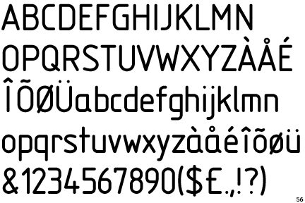
Isonorm.gif

Teutonic in form, perhaps, but Italian in origin by the earlier post.
Just saying.

Giorgio
Mantua me genuit.
 
I don't like the font either, exept on the black paint MP. There it goes well with the art déco design of the camera with its blacks, whites, reds and silver. On the lenses and the other cameras Leica should return to the more neutral font of the M3, M2 and M4 cameras.

Erik.
3755343368_eb5e0db4e4_z.jpg
 
Last edited:
At small sizes you really have very little option but to use a font which is very simple for optimum clarity. For that reason alone the font is a good one. No one is offering any alternative. There is good reason for that.
 
In it's context (on lenses/cameras) I feel the typeface works exceptionally well. Personally I much prefer it than the font on the Hexanon for example. The Leica typeface seems very purposeful, and whether you 'like' it or not, it's legible and distinct.
 
Back
Top Bottom