RayPA
Ignore It (It'll go away)
Welcome to this critique thread. Please read the purpose statement and the guidelines/ground rules regarding participation.
Purpose
The primary purpose of this thread is to provide a forum where photographers can give and receive constructive criticism on one another's photographs. By setting up some basic guidelines we hope that this thread will provide a forum where the give and take of honest constructive criticism can help us become better photographers.
Guidelines/Ground Rules
The thread has very specific rules regarding participation. The one basic rule is that you cannot provide criticism on an image or comment in a critique thread unless you also have an image posted. To post an image to this thread you must be a participant. Participation in this thread is limited. Here are the guidelines and ground rules for participation:
• Participation in this thread is limited to 5 photographers
• Participants join the thread by posting their intention. You can simply reply with your intent to join by posting something like: "I'm joining," "I'm in," or just state your name
• Joining is on a "first come, first served" basis. The first 5 to reply become the participants.
• Please, only join this thread if you are able post an image within 24 hours of joining.
• Once the thread has 5 participants, no other photographers can join or participate in the thread
• Once the thread is full of participants all photographers will upload their image(s)
• Please abide by any thematic requirement (e.g., landscape, portrait, etc.)
•The number of photos for each participant is limited to one
• Photographers attach photos as thumbnails (no inline images or links)
• Photos should be standard screen resolution (72~90) and the longest side of the image approximately 10 inches in length.
• Photographers post their images supplying titles (if any) and other pertinent information (the amount of information should be minimal)
• Photographers can only comment on their own images and reply to comments only when everyone else in the thread has posted their comments on the image
• Every participant must comment on every photo (except their own—initially)
• Every participant must make at least two comments, one positive comment, and one constructive criticism (which is actually two positive comments)
• Once every photographer has commented then a free flowing discussion begins. It is at this point that every photographer can comment on their own work and reply to comments, ask questions, etc.
• The participants decide when the thread closes.
If you'd like to participate in a critique thread and need some ideas about how to proceed with viewing images critically, you may find this thread helpful:
How do you look at photos
You can also provide feedback on critique threads here:
Critique Feedback Thread
Remember: Please do not provide criticism on an image or comment in a critique thread unless you also have an image posted.
This thread is now active, please follow the guidelines if you'd like to participate! Have Fun!
.
AusDLK
Famous Photographer
Been awhile so I'd like to participate.
ClaremontPhoto
Jon Claremont
I'm in for this.
formal
***
I'll join this one too...
RayPA
Ignore It (It'll go away)
I'll jump in too. It's been a while.
.
.
ampguy
Veteran
I'm in, I hope I'm not jumping in too often, if so, someone let me know and I'll take a break.
ClaremontPhoto
Jon Claremont
ampguy
Veteran
picture books
picture books
self portrait, iso 1600, reflections, pp in picasa.
picture books
self portrait, iso 1600, reflections, pp in picasa.
ampguy said:I'm in, I hope I'm not jumping in too often, if so, someone let me know and I'll take a break.
Attachments

AusDLK
Famous Photographer
RayPA
Ignore It (It'll go away)
Sorry Guys. The power went out in my neighborhood (it's very windy). I'll find an image and post up.
")
RayPA
Ignore It (It'll go away)
RayPA
Ignore It (It'll go away)
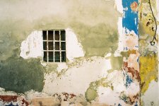
Jon Claremont said:Old House, Much Repaired
I love images like these. Images where one can slip back and forth from abstraction. This one is well balanced between two sides: the left side with the window, and the right side with the two vertical bands. Alone the left side would be much less of an abstraction, simply a window with some interesting markings. By including the right side Jon has really put the stamp of abstraction upon the image. The image really moves to another level. The splashes of color are great (particularly the blue) and the two vertical bands are very strong.
I do feel my eye being pulled between the two sides, and it seems to land right smack dab in the middle. So it's balanced nicely, but I'm initially left looking at a rather uninteresting blank spot, which isn't bad because this is an image that should be investigated, but it feels static. With these types of images the smallest crop can make an incredible difference. There's lots to like and want to keep here. The space above and to the left of the window seems extraneous and excessive. The brightness along the top edge also pulls the eye. I'm wondering whether a more dramatic crop, some burning and dodging, and some more tweaking of the levels might provide some dynamics to the image. By dramatic crop, I'm thinking an x-pan ratio-type crop.
It takes a good eye and a keen sensibility to find and compose a shot like this. Very impressive shot, Jon.
ClaremontPhoto
Jon Claremont
Hey! formal?
Are you posting a photo?
Are you posting a photo?
RayPA
Ignore It (It'll go away)
Jon Claremont said:Hey! formal?
Are you posting a photo?
Yeah, I noticed that, so I stopped. Sorry for jumping the gun.
formal
***
ClaremontPhoto
Jon Claremont
ampguy:
This is a photo that I like, but I don't know why. I've returned several times over the past day or so to look again. 'Picture Books' clearly takes the eye at first and it was a while before I saw the reflection. The central blue spot is bold but I'm not sure whether it works if the intention is to draw attention to the camera.
ausDLK:
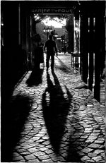
It's a photo with questions and I like it. Is it day or night? Is the person walking towards or walking away? Above all I like the light fringe around the person's arms - it looks very X-Files. Even the bar sign adds to it. There's nothing I'd change as it's such a one off photo.
RayPA:
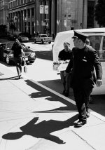
Street photography at its best. She walks away, the cop watches, the delivery guy isn't seeing either of them. It's a very pleasing slice of life and you made the photo at the decisive moment. The shadows are just right too. In a perfect world the black car wouldn't be there, but there's nothing you can do about that.
formal:
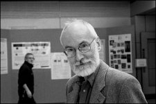
He looks very relaxed and that's a tribute to your people-skills. You've got his eyes wide open and making contact which makes for a very memorable photo. The person in the background adds a nice dynamic quality and also balances the photo. A slightly different viewpoint would have isolated the man from the background by placing him against something less busy, although keeping the background out of focus achieves this isolation in great part.
This is a photo that I like, but I don't know why. I've returned several times over the past day or so to look again. 'Picture Books' clearly takes the eye at first and it was a while before I saw the reflection. The central blue spot is bold but I'm not sure whether it works if the intention is to draw attention to the camera.
ausDLK:
It's a photo with questions and I like it. Is it day or night? Is the person walking towards or walking away? Above all I like the light fringe around the person's arms - it looks very X-Files. Even the bar sign adds to it. There's nothing I'd change as it's such a one off photo.
RayPA:
Street photography at its best. She walks away, the cop watches, the delivery guy isn't seeing either of them. It's a very pleasing slice of life and you made the photo at the decisive moment. The shadows are just right too. In a perfect world the black car wouldn't be there, but there's nothing you can do about that.
formal:
He looks very relaxed and that's a tribute to your people-skills. You've got his eyes wide open and making contact which makes for a very memorable photo. The person in the background adds a nice dynamic quality and also balances the photo. A slightly different viewpoint would have isolated the man from the background by placing him against something less busy, although keeping the background out of focus achieves this isolation in great part.
formal
***
Jon
------
This is a good abstract image. I like the colours and there appears to be something red in the window; I just can't make it out, but that adds to the image.
I find the RHS a bit distracting - especially the wire.
ampguy
---------
It takes a while to see what is happening here. It was only after I had inspected the blue circle did I start to see your reflection. There is an interesting symmetry in the picture, but I feel that it is a bit too dark and I just don't get the blue circle.
ausDLK
---------
Great street photography. I like the framing of the man, his pose, his shadow and the row of lamps in the background.
The objects on the upper left are a tiny bit distracting.
RayPA
--------
Another great street shot. His stance looks awkward, but it has produced an excellent shadow.
I think it would be better without the the van and the man with the flowers, but that's street photography. I'm not sure about the shadow along the pavement towards the girl - interesting shapes but a bit distracting.
------
This is a good abstract image. I like the colours and there appears to be something red in the window; I just can't make it out, but that adds to the image.
I find the RHS a bit distracting - especially the wire.
ampguy
---------
It takes a while to see what is happening here. It was only after I had inspected the blue circle did I start to see your reflection. There is an interesting symmetry in the picture, but I feel that it is a bit too dark and I just don't get the blue circle
. ausDLK
---------
Great street photography. I like the framing of the man, his pose, his shadow and the row of lamps in the background.
The objects on the upper left are a tiny bit distracting.
RayPA
--------
Another great street shot. His stance looks awkward, but it has produced an excellent shadow.
I think it would be better without the the van and the man with the flowers, but that's street photography. I'm not sure about the shadow along the pavement towards the girl - interesting shapes but a bit distracting.
ampguy
Veteran
critiques
critiques
Jon - Intriguing window shot with decaying wall. I like it, it draws the eyes and mind to wonder what's inside there, or what was it. I am slightly confused by the re-painting and hook on the far right, and I might have cropped the far right sides off, the blue/pink and yellow layers on the R side. I think that far right just adds too many disjointed colors.
Dave - looks very dramatic, the guy looks dangerous, and the lettering for the bar or store looks very "Terminator" font like. The b&w brick floor adds to the drama, very nice. I'd be curious to know how much it was touched up, if at all.
Ray - Nice street shot. I like the straight angles of the guy's coat in the shadow, and how his whole figure has a shadow, nothing cut off. I wonder if it might be an even simpler shot if the guy with the case of water or whatever and van weren't there, just the bellman guy checking out the scenery.
Formal - nice sharp portrait of a well groomed professor or scientist looking guy. I think I would have cropped the left third off of the dude gawking at the camera in the background.
RayPA
Ignore It (It'll go away)
ampguy said:self portrait, iso 1600, reflections, pp in picasa.
Ted, this is a cool image. I love the symmetry and the depth conveyed by the signs and the lights. It's very formal. However, I'm trying to find some meaning here. I feel I have to find something because of the manipulation involved, and because it is a self-portrait. This feels like a "through-the-looking glass" type image. The stacks of books are interesting and the foreground sign an obvious choice for reflecting (pun) upon the photographer and his art.
I can't make out what's inside the blue circle, or its purpose. It's placement and emphasis are very deliberate. It's weird; I keep seeing different images inside the circle , which makes the photograph interesting—but perplexing. Because it is a self-portrait I'd love to hear what you were trying to convey. Overall, the image feels a little heavy and probably could benefit from a bump up in brightness and contrast.
Nice work.
RayPA
Ignore It (It'll go away)
AusDLK said:Awaiting your comments.
Dave this is a strong piece. Technically sound. Graphically taut. Ominous and threatening. The interruption of the figure's shadow produces an arrow-like pointer that jabs right at the viewer. The calm safety beyond, behind the figure seems so non-threatening, an escape that seems impossible to get to with this figure blocking the way, advancing upon us.
In these days of Photoshoping I would be very tempted to "black-out" the lettering in the sign, but its presence adds some authenticity to the image as a valid street "catch." It feels unplanned (not saying it was planned). I'd also be tempted to "edit" out the strip of light on the left.
Great work. Well done!
Share:
-
This site uses cookies to help personalise content, tailor your experience and to keep you logged in if you register.
By continuing to use this site, you are consenting to our use of cookies.