user237428934
User deletion pending
A few photos of an abandoned train station in munich. Although taken with an evil dslr (24mm and 50mm) I would like to have some critics regarding composition. Do you find them interesting or just boring? Thank you.
#1

#2

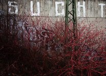
#3 (sucht = addiction)

#4

#5

#1
#2
#3 (sucht = addiction)
#4
#5
lxmike
M2 fan.
very nice, like the colours
uhligfd
Well-known
With this subject matter, I seem to not be a fan of those wide open, no DOF shots 1,2, but in # 4 it is ok.
Can you turn your camera to portrait mode? How would # 2 have looked then?
Can you turn your camera to portrait mode? How would # 2 have looked then?
jesse1dog
Light Catcher
Like #4 the best - the colour and out of focus elements of the picture appeal. #1 has the appearance of vignetting which doesn't detract, for me.
It looks a good location - guess there are more photos there.
jesse
It looks a good location - guess there are more photos there.
jesse
semrich
Well-known
I'm usually drawn to these kind of photos usually in B&W, though I do like your rendition in color and like your composition. It all seems to tie together.
Turtle
Veteran
I think #1 is the strongest and #2 the weakest. I think the series would benefit from a wider context shot, that gives a sense of the overall space - the urban landscape so to speak. Without this I find myself wondering what is really there and what it looks like in overall terms.
I find the shallow DOF of #1 works fine.
Its hard to comment without seeing the place, but if you can return it might be worth trying some more abstract work. High contrast lighting could work.
I find the shallow DOF of #1 works fine.
Its hard to comment without seeing the place, but if you can return it might be worth trying some more abstract work. High contrast lighting could work.
Mablo
Well-known
#1 and #2 are my faves compositionally. B&W versions could be even better but that's just my biased opinion.
user237428934
User deletion pending
Thanks for your feedback. Unfortunately I don't have more details of the location. Have to visit it again.
I really like #1 and #4. I'm not sure about #2. No one mentioned #3 although I like it because of the structure and colour of the bushes in front of the writing on the wall.
I will print #1 and #4 in large for my office and I'm curious how the blurry background of #1 will look in large.
Found this one on flickr that gives a little overview:
http://www.flickr.com/photos/adamus-adelus/515205504/
boklm
Established
Hmm, I like them. Especially the first one. I think it's nice in color, I'm not sure if I would like them more in B&W.
lawrence
Veteran
Like the others, I like the colour rendition. Is this Portra 160NC?
robert blu
quiet photographer
I like the first picture, but I would see the fourth as the best of the group if you crop away tha background on the right side to get a stronger visual effect. Try simply to put one hand on your monitor. But this is just my opinion which could be wrong, of course.
robert
PS as already said, good colours.
robert
PS as already said, good colours.
koniczech
Established
I really liked 1,3,5.
1 has that great, super subtle depth of field at the beginning, with the twig on the left side that makes a great 'introduction' when looking left>right. The whole picture guides the eye really well.
2 seems more like documentation
3 reads like a story, again left>right / top>bottom
4 I initially liked this one, but it almost looks like a stock photo, being that I see relatively the same thing every time I ride a train. not that it's a bad photo, its just not contextual like the rest of your photos which scream railroad,abandoned,etc.
5 the geometries in this shot are amazing. The competing curves of the concrete stairways and steel train-stops are great! And you can also see a second train-stop between the first and second stair... this makes the photo for me. This and the first are my favorites.
Any more from that shoot?
koniczech
Wayno
Well-known
No one mentioned #3 although I like it because of the structure and colour of the bushes in front of the writing on the wall.
That's probably my favourite shot of the ones you've shown, although I would crop it just above and to the right of the graffiti text to remove the distractions of the railing and staircase (see my attachment if it works). I like the first shot as well.
Attachments
pvdhaar
Peter
I hope you don't mind me saying this, but shots 1, 3 and 5 come across as taken in a hurry. They appear cluttered or taken from a sub-optimal position.
If you have a chance to go back there, then take a tripod along. If not for mounting the camera on, then at the least for slowing you down (a back pack with a couple of bricks also helps ;-)
Spend some time finding the right angle, and I'm sure you could make them a lot better.
Shot 2 by the way, seems better thought out. The same holds for shot 4.. Wiggling the contrast settings in your DSLR (or in post processing) is all they need..
user237428934
User deletion pending
Like the others, I like the colour rendition. Is this Portra 160NC?
Oh. I have to disappoint you. No film. Digital, and I invested a few minutes that they look this way.
user237428934
User deletion pending
Any more from that shoot?
koniczech
I regret that I don't have more that I like. It's like always after visiting a location for the first time. I am at home, think about the photos and now have a list of things I would change or take photos of. Next time....
user237428934
User deletion pending
I hope you don't mind me saying this, but shots 1, 3 and 5 come across as taken in a hurry. They appear cluttered or taken from a sub-optimal position.
No, it's perfectly Ok. I asked for critics. Interesting that you say they were taken in a hurry. You are right with 3 and 5. For 1 it's not true. I spent some time in thinking about 1 and 4 before I took the photo.
Mudman
Well-known
I like 4 the best, but think it could have benefited from someone in the background. Maybe tripod + self timer and run out there?
user237428934
User deletion pending
Thanks again to all. Your feedback was very educational. I have a lot to think about.
user237428934
User deletion pending
I like 4 the best, but think it could have benefited from someone in the background. Maybe tripod + self timer and run out there?
I did something like that indoor already. Problem is that outside at daylight you need a really strong nd filter.

Share:
-
This site uses cookies to help personalise content, tailor your experience and to keep you logged in if you register.
By continuing to use this site, you are consenting to our use of cookies.