Sparrow
Veteran
Well let’s look at the rule of thirds.
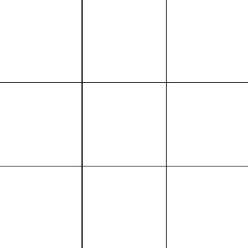
First. In the diagram below, is “A” really any more interesting, more pleasing (pleasing is a word you hear with composition often although I’m not sure what pleasing has to do with art), or inherently better in any way than “B” or “C”?
Not to me. The rule of thirds tells us it is. Maybe there is some study that supports it, I don’t know and don’t care.
Second. I don’t care because it is far too simplistic. Not many photographs contain just one element like this, and as soon as you introduce other elements, then the position in the frame of that first element is going to be dependent on the position of the others, isn’t it? It is all pretty complex when you are looking at a hundred things in your viewfinder (some consciously, some subconsciously). You have to somehow corral all of that into some kind of order, but to fall back on a simple rule of thumb is to ignore what’s going on and work by rote.
That’s why I think these kind of rules are just bunk. I think that it’s really just a way to tell a beginner, “You don’t have to put something in the center of the frame”.
OK lets ... first off what have those three dots got to do with it? It isn't the rule of three dots is it?
It's very useful as a starting point for creative artists and designers, and handy to know there are lots of articles all over the place. It’s useful simply because it allows one to have some idea which images will engage the viewer and which will not. In the field it can help inform framing and in a studio give a starting point for setting up a shot.
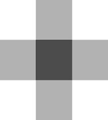
It simply says that if a image is split into thirds vertically and horizontally the centre “third” and it’s four nodes will be of more interest to the viewer; stating the obvious really.
I’ll try and keep this abstract to keep things simple
So in theory any arrangement of elements that approximates to those points, people will tend to be interested in and keep their attention.
and anything contained within that area will get similar attention.
However anything outside will distract the attention and lead the eye off to the edge of the frame and out of the picture, so it could almost be called the Rule of “Don’t Put Stuff Close to the Edges” from a practical POV
So (again in theory) this should look clunky and take the eye out of the frame;
and this one should tend to keep it in
You may need to switch to a darker theme to see the edge of the frames clearly
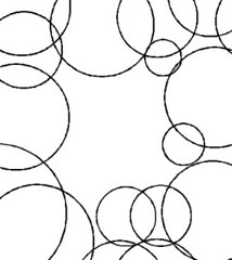
The effect is also maintained with tones of light and dark and amorphous figures.

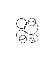
and when the ground is replaced by the figure, that's another of the gestalt laws; Figure/Ground Relationships
... if not why not
Gabriel M.A.
My Red Dot Glows For You
I think that the so-called "Rule of Thirds" is more of a guide, and is taken to heart by the unimaginative; specially those so-called viewers that are very easily distracted by the real world reflected upon a photo.
In an attempt to simplify "discussion" among hot-headed circles, I think this guide was directed onto a Rule.
There is also the so-called Golden Ratio, and that allows a certain harmony within a frame that can seem to break the "guide/rule of thirds" to the untrained eyes --and therefore become incredibly "distracting" of their senses.
All of this yadda yadda is of course "bunk" to the "who cares!"-ists. And in the end...who really is "right"? Well, I don't think that it's for nothing that ole Leo of Vinci made some very lasting images.
Sparrow
Veteran
... yes, I think of guidelines or tendencies myself, I was just trying to distract 'em from cluttering up the other thread
MickH
Well-known
... yes, I think of guidelines or tendencies myself, I was just trying to distract 'em from cluttering up the other thread
Fat chance.
I think the problem is with the words rule or rules. Start laying those down and you're messing with the right to freedom of expression. You've ended up with people expressing all over your entertaining/diverting/informative thread.
:bang::bang:
Good luck.
")
JoeV
Thin Air, Bright Sun
Guideline yes, rule no. But I prefer the ratio of 2/5 instead of 1/3, which I arrived at empirically, but which, to my eye, typically works better.
~Joe
~Joe
Sparrow
Veteran
Guideline yes, rule no. But I prefer the ratio of 2/5 instead of 1/3, which I arrived at empirically, but which, to my eye, typically works better.
~Joe
... yes, me too, weirdly that square-root of two A size paper thing really is quite nice ...
ferider
Veteran
Guideline yes, rule no. But I prefer the ratio of 2/5 instead of 1/3, which I arrived at empirically, but which, to my eye, typically works better.
~Joe
No surprise ... 3/5th is much closer to the golden ratio (1.618).
WRT rules, is as much a rule as "no bokeh in landscapes", Stewart.
Roland.
Sparrow
Veteran
Fat chance.
I think the problem is with the words rule or rules. Start laying those down and you're messing with the right to freedom of expression. You've ended up with people expressing all over your entertaining/diverting/informative thread.
:bang::bang:
Good luck.
.... sadly the gestalt thing is a German translation ... so they have to be rules or laws, and then the people who are reading it who don't need no stinking rules it's bound to happen ...
Sparrow
Veteran
No surprise ... 3/5th is much closer to the golden ratio (1.618).
WRT rules, is as much a rule as "no bokeh in landscapes", Stewart.
Roland.
... just me but it is ... really awful
David Hughes
David Hughes
Hi,
An yet "rule of thumb" means roughly. I guess few people call them rules these days.
Regards, David
An yet "rule of thumb" means roughly. I guess few people call them rules these days.
Regards, David
ferider
Veteran
Did you know that the 135mm framelines (corners really) inside the 35mm framelines come rather close to the golden ratio ? In particular for newer Leicas (M6).
Roland.
Roland.
Sparrow
Veteran
Did you know that the 135mm framelines (corners really) inside the 35mm framelines come rather close to the golden ratio ? In particular for newer Leicas (M6).
Roland.
... and they rely on the 'closure principle' to trick folk into thinking they'er joined up with straight lines
Sparrow
Veteran
... isn't it a little early to be drinking?
lukitas
second hand noob
... yes, me too, weirdly that square-root of two A size paper thing really is quite nice ...
ah, fibonacci...
fireblade
Vincenzo.
If you are paying your way who cares


Sparrow
Veteran
... no sign of gsn or airfrogman I notice, come on chaps lets hear your arguments, no? ... not interested in telling me what you think, sharing your insight, disrupting another thread? ...
MickH
Well-known
If you are paying your way who cares
If I do that 'relax your eyes and look at it' thing I see converging lines in the ripples on the water - similar to Lukitas' escalator shot.
gns
Well-known
It simply says that if a image is split into thirds vertically and horizontally the centre “third” and it’s four nodes will be of more interest to the viewer; stating the obvious really.
Do you mean the center "Ninth", in other words, the center?
If you place something in the center, the viewer's attention will be there. If you place something on one of the nodes, then yes, the viewer's attention will be there. If you place something elsewhere, that's where the attention will be. Yes, pretty obvious. I just don't buy that one place is inherently better than another. That's just too simplistic and ignores everything else that my be going on. And I don't see what's so magic about 1/3 (consider above discussion of 3/5, Pi, square root of 2, and whatever)?
I really said what I wanted to say in the other thread. But since you called me out here, I figured I should show up. Don't really care to continue, though.
Cheers,
Gary
Dektol Dan
Well-known
I Suggest
I Suggest
That you watch Disney's Donald Duck in Mathamagic Land (early 1950's?). You can start your research there. I have quite a library of Pythagorean/Golden Mean books, but that's a good introduction.
Ever think of studying art? There really is not much that is new.
I don't think that traditional composition is taught anymore, but it may be....
airfrogusmc
Veteran
I just don't buy that one place is inherently better than another. That's just too simplistic and ignores everything else that my be going on.
Gary
I totally agree with this. The best place is what is best for each image depending on the other elements in the frame and what the creator is trying to say.
Share:
-
This site uses cookies to help personalise content, tailor your experience and to keep you logged in if you register.
By continuing to use this site, you are consenting to our use of cookies.