hlockwood
Well-known
I know i'm sticking my neck out with that title, but I believe it is a great composition.
HFL

HFL
peterm1
Veteran
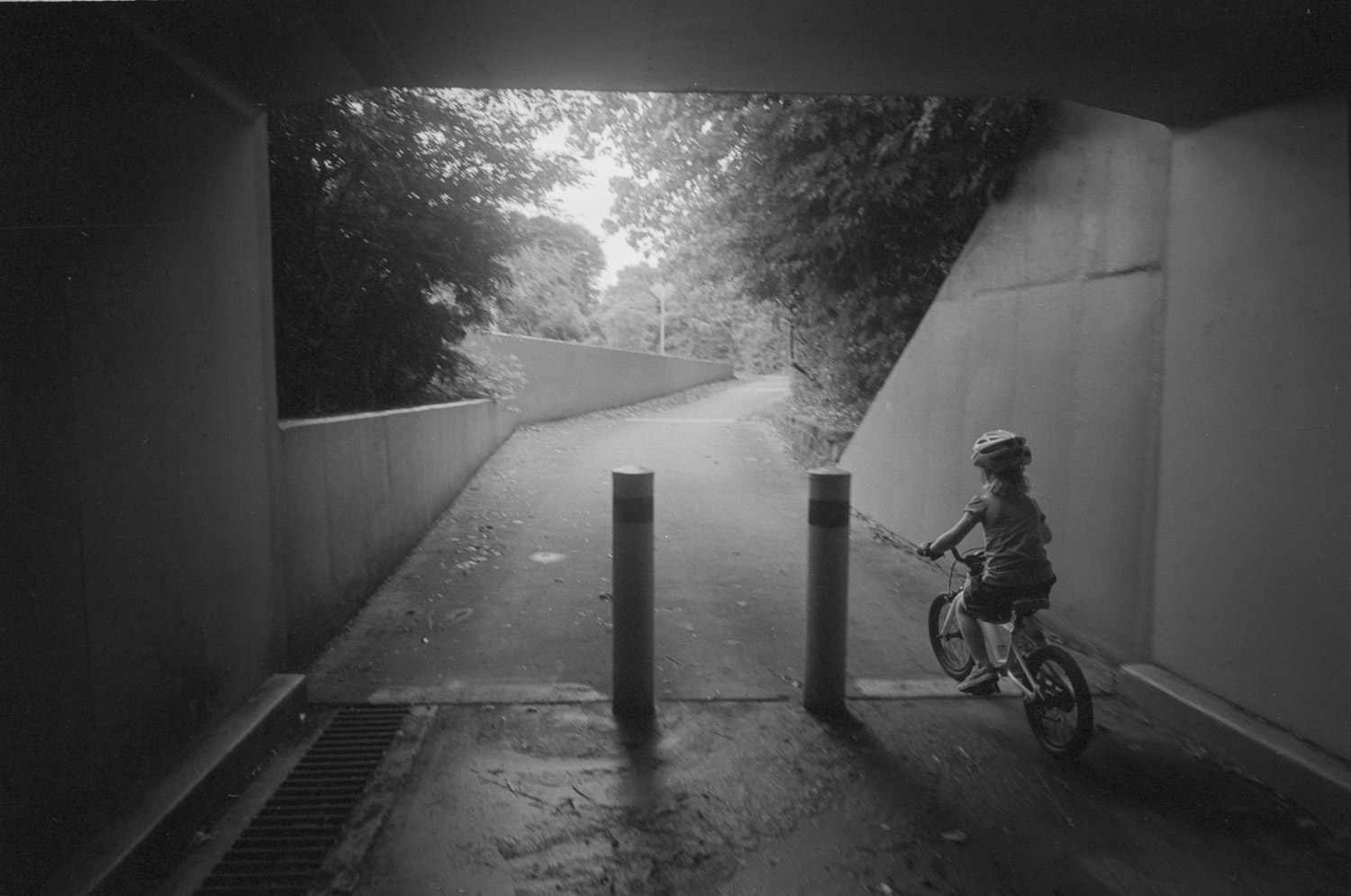
Its a good composition. It uses the rule of thirds, diagonals and leading lines well.
But I think I would have placed the person further up and to the left a tad. With care, this could have also gotten rid of the glimpse of the handle bars on the mid left of the image which is distracting. (Details like this are important when it comes to refining composition and I have no scruples about photoshoping such distractions out if there is no other option and it can be done neatly). Also it would have meant the fence beside which she is standing along the river front is less in the middle of the image which might have been a better application of the rule of thirds. By the photographer moving more to the right and shooting more acutely towards the left this could have also accentuated the diagonals in the image and drawn the eye in even more - but its hard to say as it all depends on whether that would have brought other undesirable elements into the image, such as more of the fore mentioned bicycle handles.
(BTW its OK to break the rule of thirds - or any "rule" about composition but only when it works by improving the result). I hate to be picky. As I said its a good image but I would not quite say "great". And as I said its all about the details..................
Now THIS is a great composition (but then it should be given it was taken by Henri Cartier Bresson)
http://www.ventspleen.com/wp-content/uploads/2010/06/HenriCartierBresson.HyeresFrance.1932.jpg
DNG
Film Friendly
I think the image is too static, and possibly photographing the biker/bike from a different angle may add some dynamics. Many times the geometry of all the elements can make or break an image. The foreground fence adds depth and dynamics, but, occupies too much of the frame.
I know when I shoot at times, trying to remember compositional guides can be set aside when we see an opportunity. And many times we have one chance to get a the best moment. Other times, we have time to take a few photos at different angles so we have a chance to try different compositions.
If the subject is not dynamic, then the other elements need to take up the slack.. like the photo that Peterm1 shared from HCB... the geometry adds the needed dynamics that is lacking from the biker on the street.
I am slowly beginning to "see" more dynamics in subjects, and I am not taking as many photos as before because they are not very dynamic, in expression, or motion, or circumstance.
One of mine from last year... not very dynamic.....Expressions are boring

2014 Classic Street Photography by Peter Arbib: My Classic Street Photography, on Flickr
One with better dynamics...Expresions tell a story with each child

2012 Classic Street Photography by Peter Arbib: My Classic Street Photography, on Flickr
Good balance with foreground and subject...Subject is what the eye is drawn to, not the bikes parked outside.

2014 Classic Street Photography by Peter Arbib: My Classic Street Photography, on Flickr
I know when I shoot at times, trying to remember compositional guides can be set aside when we see an opportunity. And many times we have one chance to get a the best moment. Other times, we have time to take a few photos at different angles so we have a chance to try different compositions.
If the subject is not dynamic, then the other elements need to take up the slack.. like the photo that Peterm1 shared from HCB... the geometry adds the needed dynamics that is lacking from the biker on the street.
I am slowly beginning to "see" more dynamics in subjects, and I am not taking as many photos as before because they are not very dynamic, in expression, or motion, or circumstance.
One of mine from last year... not very dynamic.....Expressions are boring
2014 Classic Street Photography by Peter Arbib: My Classic Street Photography, on Flickr
One with better dynamics...Expresions tell a story with each child
2012 Classic Street Photography by Peter Arbib: My Classic Street Photography, on Flickr
Good balance with foreground and subject...Subject is what the eye is drawn to, not the bikes parked outside.
2014 Classic Street Photography by Peter Arbib: My Classic Street Photography, on Flickr
dmr
Registered Abuser
I know i'm sticking my neck out with that title, but I believe it is a great composition.
Some of the things I look for when shooting, such as angles, curves, shadows, are all in there.
hlockwood
Well-known
I know i'm sticking my neck out with that title, but I believe it is a great composition.
HFL
Thanks, Peterm1, that's a very teachable critique. In my defense, this was a "street" shot. the young woman picked up her stuff and moved on within seconds of my shot.
Although I hate to crop, you're right about that object on the left of the image.
And who is this guy, Cartier - Bresson? He can't seem to capture things that aren't blurry.
HFL
Last edited:
hlockwood
Well-known
I think the image is too static, and possibly photographing the biker/bike from a different angle may add some dynamics. Many times the geometry of all the elements can make or break an image. The foreground fence adds depth and dynamics, but, occupies too much of the frame.
I know when I shoot at times, trying to remember compositional guides can be set aside when we see an opportunity. And many times we have one chance to get a the best moment. Other times, we have time to take a few photos at different angles so we have a chance to try different compositions.
If the subject is not dynamic, then the other elements need to take up the slack.. like the photo that Peterm1 shared from HCB... the geometry adds the needed dynamics that is lacking from the biker on the street.
I am slowly beginning to "see" more dynamics in subjects, and I am not taking as many photos as before because they are not very dynamic, in expression, or motion, or circumstance.
Thanks, Peter. this was one of those "one chance to get the best moment" as the young woman moved off seconds after the shot.
I very much liked your shot with the bike, an essential element – in my opinion.
HFL
hlockwood
Well-known
Some of the things I look for when shooting, such as angles, curves, shadows, are all in there.
Thanks very much, dmr.
HFL
FrankS
Registered User
OP: I'd say it's very good. I like the layers created by the visual elements.
I'd crop a bit off the left side and crop a bit more off the top.
I'd crop a bit off the left side and crop a bit more off the top.
BillBingham2
Registered User
OP: I'd say it's very good. I like the layers created by the visual elements.
I'd crop a bit off the left side and crop a bit more off the top.
+1
I might be a bit more ruthless and goa bit tighter at the top, less white in this case is more.
Good eye!
B2 (;->
Contarama
Well-known
Flip it upside down and squint your eyes at it. It is way heavy on one side. My opinion.
http://www.adammarelliphoto.com/2011/06/robert-capa/
http://www.adammarelliphoto.com/2011/06/robert-capa/
jim_jm
Well-known
I'd agree with Bill and Frank's comments above - crop a bit off the left side and more off the top (just above the tallest tree). The blank white sky doesn't add anything and draws my eye up out of the frame. Think about where your eye (and brain) goes as you look at the photo.
The things you've got going here are good contrast, a distinct foreground, mid-ground and distance, and the diagonals from the railings add movement to the image. Without the silhouetted railing in the foreground, it would be much less interesting. Also, the shadow of the bike makes a nice tie-in to the dark railings.
Great? That's only for you to decide, but it has good potential and is interesting to look at.
hlockwood
Well-known
Great comments
Great comments
I'm vey happy that all you folks took the time to offer serious and valuable criticisms.
OK, I'll have to admit, the shot is less than great, and could use some changes to the existing image. I'll carry the suggested changes back to the computer to see how they work.
Thanks again,
HFL
Last edited:
michaelwj
----------------
Since you stuck your neck out...
Is it good? Definitely
Is it great? Nope.
My 2c:
The handle as mentioned by others is a minor issue. There are bigger issues for me though, and cropping it out will cramp the left side. I'd clone it out instead.
The biggest issue for me is that I don't know what the cyclist is doing. Do they have their arm up? It is hidden in the fence which confuses their actions. The fence also makes a mess of the bike which is a messy thing to photograph cleanly (bikes have lots of tubes at odd angles which end up messy). Is that a backpack behind the front wheel? Again, the fence works against you. I also find the foreground fence a very strong element, which competes for my attention. Others have suggested moving to increase the angles, and I agree that would improve the image, but then I come back to the cyclist, and if that's where I'm being led to, then it needs to be a clearer centrepiece. The 3rd Image by DNG is an example where the bikes aren't messy (each tube can be seen and there is repetition to reinforce the bikes) and the subject is clear. I can see the subject and what he is doing. I understand that it was a uncontrolled street shot, and in that sense you have done very well. It is a good image, and I would be happy with it. Sometimes good composition is only revealed on the light table, you do your best on the street with the cards you're dealt, sometimes you win, sometimes you don't. The more you practice the luckier you get rings true in street photography.
I find the hardest part is identifying the winners after the fact. Especially true when I take a lot of shots. But the biggest help is being critical about both your own work and others, and putting your own head on the chopping block. The feedback you have gotten on this image is worth an awful lot.
Edit: I forgot to say that not all images have to be great. Sometimes images like this can work really well in a book or exhibition as a transitional or linking image between two similar themes. Almost as a break between more thought provoking images.
Edit 2: I feel I should show one of mine which I think is a good, but not great composition.
daveleo
what?
I'll write this before I read other comments.
The lines are good.
The format bothers me. I think 10X8 would work better (not knowing what is just outside your frame here).
For all the busy-ness of the lines in the lower half, that blank sky is a boring area.
Now I will see what the other folks wrote.
PS: I commented only on the composition (lines, areas, balance of shapes and light patches, etc etc), not on how the image effected (affected?) me.
airfrogusmc
Veteran
When you think about composition, in my opinion, it is great if it is part of the way you compose. Not the way others compose or what might fit into a preconceived idea of what a good composition is. Heres a few quotes by some that have had a bit of visual success.
"When subject matter is forced to fit into preconceived patterns, there can be no freshness of vision. Following rules of composition can only lead to a tedious repetition of pictorial cliches." - Edward Weston
"There are no rules and regulations for perfect composition. If there were we would be able to put all the information into a computer and would come out with a masterpiece. We know that's impossible. You have to compose by the seat of your pants." - Arnold Newman
"There are no rules for good photographs, there are only good photographs." - Ansel Adams
"And in not learning the rules, I was free. I always say, you're either defined by the medium or you redefine the medium in terms of your needs." - Duane Michals
"There are no shortcuts, no rules." - Paul Strand
"Photography is not a sport. It has no rules. Everything must be dared and tried!" - Bill Brandt
"I came from the outside, the rules of photography didn't interest me... "-William Klein
" ...... a photograph can look any way. Or, there's no way a photograph has to look (beyond being an illusion of a literal description). Or, there are no external or abstract or preconceived rules of design that can apply to still photographs. " Garry Winogrand
and maybe my favorite which gets directly to this thread
" ......so called “composition” becomes a personal thing, to be developed along with technique, as a personal way of seeing." - Edward Weston
So I guess the real question should be does this composition look like one of your compositions and does this image fit in with other images that you have created.
rfaspen
[insert pithy phrase here]
Good comp. Yes.
Could be "improved". Yes.
I'm not as experienced and authoritative as others here, but I have long learned about checking my edges, and distracting elements. In this comp. there is a distracting element on the left edge.
Layers in diagonal is good for me so I like the kind of composition presented. The sky might leave some room for adjustment in proportion of "top" layer(s).
I am not the guy to critique beyond that. I begin to enter my zone of "I know it works, but I can't tell you why".
Is it Film? My gut says digital, but again, I'm not an expert...
hlockwood
Well-known
Of course, by suggesting that the composition might be great, I knew that folks would jump in with opinions, and that I'd learn something in the process. I was successful. Thanks for that.
Here is some of what I learned: I should have noticed that distracting obstacle on the left edge of the frame. Had I done so, I would have cloned it out rather than crop. Furthermore, the comments on the sky are dead on; I should have lowered the ceiling to half way to the tree top – not all the way as suggested.
rfaspen: film, Ilford XP2 Super 400
Contarama: About a century ago, in a high school drawing class, I had drawn a portrait that I thought was quite good – until I turned it upside down, as we were instructed to do. Into the trash it went. I don't quite agree with you for this image. But thanks for the reminder.
airfrogusmc: Some good quotes there. As to your last question, I believe the answer is, yes, it does fit, especially when I'm taking a shot purely for its compositional content. Like this one,
Richard G
Veteran
Good? I'm not even sure of that. Hard to talk about composition alone when it's not an abstract. The lovely ironwork comes for free: like a competition dive with a low degree of difficulty it is actually harder to make a great composition, or photograph beyond composition, when there are such attractive elements. The cast iron lawn chair and its shadow has become tired. The white plate and a single fork (Kertesz) was utterly original and genius. There isn't a compelling harmony of the elements here, and that is why all the different suggestions for where to crop.
hlockwood
Well-known
Good? I'm not even sure of that. Hard to talk about composition alone when it's not an abstract. The lovely ironwork comes for free: like a competition dive with a low degree of difficulty it is actually harder to make a great composition, or photograph beyond composition, when there are such attractive elements. The cast iron lawn chair and its shadow has become tired. The white plate and a single fork (Kertesz) was utterly original and genius. There isn't a compelling harmony of the elements here, and that is why all the different suggestions for where to crop.
Thanks Richard. I'll have to remember that one cannot "talk about composition alone when it's not an abstract."
As for "all the different suggestions for where to crop." There were actually 2 and they were the same.
But I welcome your vey constructive remarks, I was getting a swollen head from all the compliments.
HFL
hlockwood
Well-known
Firstly, I wanna recognise that you are sticking your neck out there for public critique. That's way more than most people do - so serious kudos for that....
So what was this photograph about? I really still have no idea. Why did you take it? What was interesting about it? Don't waste time trying to polish a turd and work on perfect cropping or your tones or something for this image - figure out exactly what you found interesting and mentally work on how to express that for your next shot. Lastly, it may be helpful to tell us why you think this is great composition - not just that you think it is. More info = more possible help.
Wow! "Don't waste time trying to polish a turd..." Gotta remember that.
But I think I'll pass on your offer of more help.
HFL
Share:
-
This site uses cookies to help personalise content, tailor your experience and to keep you logged in if you register.
By continuing to use this site, you are consenting to our use of cookies.