Sparrow
Veteran
... ...
I thought it would be easier to read if I pulled what copy I had in this more succinct version ... the original thread is here if anyone needs to see it...
-----------------
Looking at Pictures the Psychology of Images ... or putting the Horse before Descartes
-------------------------------------------------------------------------------------------------------------------------
... yes I know, but I'm not twisting your arm up your back ... you don't have take any notice, and even if you do, you don't have agree with me
Composition ... would you say has component parts? ... simple enough concept I'd have thought, and it would follow that if the artist understood those parts, and understood how to put them together he could communicate his vision more accurately to his audience? ... well if he chose to use them in that way ... and, of course, if he can see what those parts are in the first place ... in any event why would any artist not be interested in learning them?
If you don't see that then you'll probably not need to read the rest of this ... as I intend giving a guide to some practical ways of analysing art and design ... and some tricks of the trade that makes it easier to see.
I realise photography doesn't lend itself to Composition like many other arts do, and that encourages the 'no rules' and 'rules are to be broken' folk to involvement ...
First off ... Line, viewpoint or mind's eye ... I've always know it as just line and my daughter who is modern, and looks likely to get a better degree than I did, now uses eye-line so I'll go with that ... so
Eye-Line ... is the way ones eyes naturally explore a picture when the viewer is relaxed and isn't concentrating on other aspects of the image. This oddly is the basis of nearly all composition, eyes, brain and mind almost unconsciously do this all the time without their owner knowing the reason they like some things and not others
... it can follow lines the outline of shapes and may be delineated by colour, tone or contrast. Keith commented his eye found the knotted string in this photo courtesy of Bingley and I can see how and why.

next ... How to make stuff easier to see ...
------------------------------------
... the trick is learning how to relax the facial muscles around the eyes, clear the conscious mind and just allow ones eyes to find their own way around the picture without even thinking about it. Once you get the hang of it its dead easy ... almost closing your eyelids as if looking into the sun can help to blur and abstract the image too.
You can get this sort of effect, blurred and with more contrast ...

https://farm9.staticflickr.com/8664/16559350409_719beae927_c.jpg
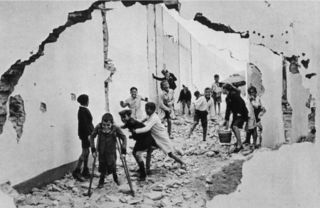
... often this is enough of an abstraction of original image to remove all the distracting bits'n bobs and any story (narrative) that get in the way seeing the Elements of the image ... you will have seen artists tipping their head on one side, turning images upside-down or viewing them negative, closeup or from a distance? ... all we are trying to do in doing that, is to remove some of the reality so we can actually see at the elementary parts of the image ... of course back in my art college days it was much easier, we just got drunk or took a creativity-pill ... but that was 1968
... either way by the time one is looking at this any semblance of reality is pretty much gone ...

https://farm9.staticflickr.com/8656/16123147884_90954b9d7b_c.jpg
... now we can see at least something of the fundamentals, and it's easy to work out that those repeating rectangular windows dominate the photo, the composition is almost wholly created by contrast and shape, and while the girl is visible she clearly is not going to be the centre of attention, the subject, the whole emphasis is elsewhere.
You can also see that the curve of the chair-back and the lines formed by the straps and that knotted string are still working to retain the eyes' attention around that area ... something Keith noticed in the 'brutally' thread.
next ... The Elements of Composition ...
------------------
... I was convinced there were six when I was at college, but luckily I avoided looking any more of a fool than I normally do by checking the interweb ... and it seems new elements have been added like so many umami flavoured higss-bosons since I last looked ... nine in one list I found
Anyway ... I intend persisting with just the six I know about, and where I can I'll use the photographic terms not the arty ones, those six being;
Line ... straight curved matriculated, any linear element however formed that the eye can follow
Shape ... a line that joins up with itself
Depth ... a shape with a perceived three dimensional form
Contrast ... any of the above which is visible due to being a different value or tone
Texture ... the surface finish of any of the above
Colour ... the colour of any of the above
This is sort of the vocabulary of images, the building blocks to which we have to play with.
Obviously, each Element can be formed in an almost unlimited number of ways, but the human-mind tends to find some ways more attractive than others. The convention is to call these attractive ways Design Principles or Rules ... but it much easier to think of them as just 'things arranged nicely' ... Things (the Elements) and Nicely (the Principles)
next ... Design Principles or Rules of Composition
----------------
... although I should probably address the ... 'we don't need no stinking rules ... there are no rules and ... and, rules are there to be broken anyway' brigade so here we go ...
1) 'We don't need no stinking rules' ... yes, you are correct, but you failed to grasp the meaning of the third paragraph of my first post.
2) 'There are no rules' well, sorry but there are and denial does not constitute evidential proof come back with a cogent argument ... or bugger off
3) 'Rules are there to be broken' yes, very true even today ... but! after one knows the rules involved and why one is breaking them. Not because you can't be bothered to educate yourself and just trot out something smart someone else said and you chanced upon somewhere on the internet.
If you stick with the design principles you will end up with a nice picture, harmonious and coherent ... the reason we break the rules is to introduce something offensive, dissonant or disordered into the image intentionally ... if we choose to make an image dissonant it isn't forced on us by ignorance, we control the medium it's no longer simply chance.
anyway, next ... Design Principles or Rules of Composition
--------------------
... there are lots of these, first off the so called Gestalt principles (Berlin School of Experimental Psychology) it was part of those 'new' arts that erupted at the end of the 19th century and continued until the Second War ... I work with these Modernist principles most of the time, these and the phycology that goes with them has experimental proofs to back them so this bit is more than just my opinion ... it's the phycology of our perception of form, or how we see nice stuff, we all do it and this just explains why. The word Gestalt simply means shape or form,
Gestalt Principles or Gestalt Psychology:
Proximity ... we see objects close to each other as nice ... we like repeating patterns and we enjoy finding them even in random images and when we find them we treat them as a group.
Similarity ... we tend to think that similar things are a group ... we like uniformity, just think of tiled floors, venetian blinds or even brick walls, how often do stuff like that feature in photos you like?
Closure ... when looking at the stars we tend to enjoy joining the dots and we tend to perceive the whole when we only see a part ... simple as that, we find order in chaos given half a chance you only need to see a fraction of a curve for ones' mind to perceive the whole circle
Symmetry ... we like symmetry and are attracted to the focus point of that symmetry, next time you make a sandwich try cutting it slightly it off centre and at a slight angle ... and see how wrong it looks
Ground-Figure ... those tricks drawings that look like a woman's face or a man playing a saxophone, clever but not that useful to photographers. (you'll find the term Pragnanz used by some, pretentious enough to be the next Bokeh eh?)
... they've possibly added a few over the years so you can might find others on the net ... and personally I'd dismiss that last one as stating the obvious
... the truth is ... when your first impression of a photo is positive, or when you instinctively see it as 'good' more than likely it is because one or other Gestalt principles is to be found working within it. When you look at photos you admire, you'll find it is likely to adhere to one or more Gestalt principles, and being able to analyse a photograph can help in planning and taking other photos somewhat, but more importantly it gives us the ability to communicate with each other about them ...
next ... Classical Principles:
------------------------
... Classical design principals, not to be confused with the Classical Order, which is a well defined order of architectural types. Sometimes classical design seems to be a whatever people decide to pull out of the bran-tub ... so I'm not suggesting this list is comprehensive.
Shape and Proportion; including Pi, the golden ratio and the so called rule of thirds and the like
Geometry; regular forms and I suppose Pi, the golden ratio again
Balance; positioning orientation and harmony in the elements
Field of View; the area within the image that holds your attention
Negative Space; the area that isn't Field of View
Eye-Line; how the viewer's eye finds it's way round the image
Contrast; or value, the difference between the light and dark bits
Repetition and Rhythm; repeats, patterns and rhythms
Illumination; lighting
Form; modelling, shading and like
Colour; the colours and their combination
Perspective; I've never been sure if perspective belongs here, but it has to go somewhere
... you could probably think of many more, almost anythings that anyone finds attractive is fair game I think, and why I use the other lot ... it is too easy to pick something to support the case for anything one fancies.
Anyone who has gone to a critique night at camera club or watched many of the videos modern 'masters' post on the interweb pick anything to criticise an image as long as it doesn't apply to their work (more of this later).
next ... finding Proximity
-------------------------
Groups of individual items in close proximity our mind treats both as what it is, individual items ... and as a single whole object. Not only that but the mind seems to enjoy finding them, as though the mind was rewarding itself for being clever, it will go on to trace their outlines and invariably see them as having a common purpose ...
... this sort of thing

il-29a par Sparrow ... Stewart Mcbride, on ipernity
While they are clearly just a few black rectangles on a white ground we all see them as a single sloping plane that have length, width and because of the distortion depth too. (Personally my mind is trying to straighten the vertical axis to make it a building's windows or rows of shelving) In any event we like groups and make all sorts of assumption about them, imagine designing a rug like this ...

il-30a par Sparrow ... Stewart Mcbride, on ipernity
... I'd be checking my third-party cover was in place before marketing that baby
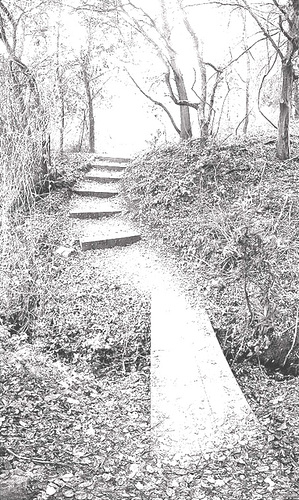
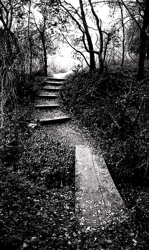
Now to photos, among the other things going on in this just notice how your eye is arrested by those steps as it follows the natural line through the photo, the composition follows the line the path but it is that group of rectangles that's the interesting bit ...
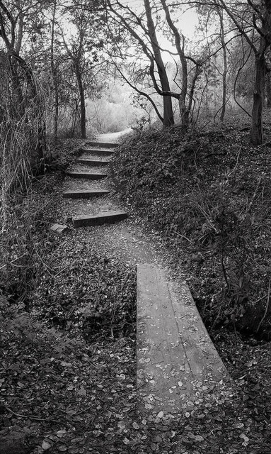
16471422829 4d23ec4c56 c par Photo ... Dirk, on ipernity
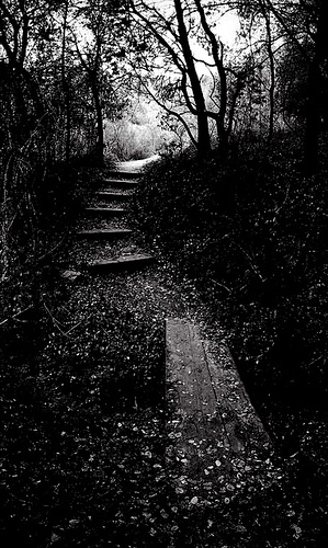
... again you may see it better like this ...
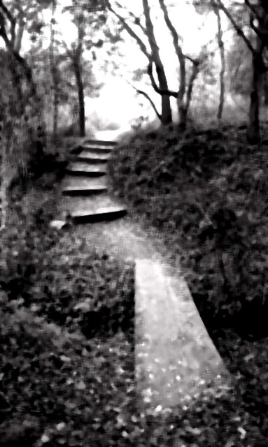
16471422829 4d23ec4c56 cA par Photo ... Dirk, on ipernity
... it's all about the repeating steps with that similar rectangle in the bottom right echoing them and stoping the eye dropping off the bottom of the photo. Again in this photo of mine, the photo is of no merit except for those rows and columns formed by the windows and the repeating rectangles in the road markings yet it gets more attention than the subject deserves

In effect when I'm out and about patterns and like objects are a couple of the things I'm alert to, however they do attract the viewers attention and as always things are lurking in negative space to catch us out ...
16634247766 02cc4165c4 o par Photo ... Lynnb, on ipernity
... the high contrast isn't helping to distract from the patterns those step-laders have ... they're hardly noticeable at first but if you relax and just gaze at it, it distracts from the good bits of the photo
If you look through Henri, Chim or Capa's work you'll see it all the time, I've always tried not to look at study other photographers but they crop up all the time ... this one keeps getting credited to Henri, I'm not sure, it really doesn't fit in with his work at the time ... but whoever took it broke the rule either by accident or design ... the scatter of this pattern is the reverse it's a lack of pattern but it's dissonant not wrong

... if that was the artists intention
next ... Similarity
----------------
Sparrow
Veteran
----------------
... out of interest one quick'n easy way to abstract any image file is to play with the Contrast and Brightness controls ... wind the contrast up until the photo looks like a photocopy/xerox or a silver lith print and then play with the brightness, or use Photoshops Threshold control and slide Threshold Level too and fro ... and you'll get this sort of effect ...
 ---
---
 ---
---
... much easier to sort out the light and dark areas ... chiaroscuro effects (strong contrasts between light and dark) almost always help to understand form and depth
... back in the olden-days we would put stuff through the copier or a fax-machine a few times and play with the light/dark controls ... which got us into trouble a few times, on cost grounds, with the thermal paper and toner
-----------------------
... Similarity, is finding and seeing similar items as groups, there's a long running thread on the board which is full of things in threes contains lots ... we pick out similar shapes, colours or types and treat them as a group.
So similar shapes ...

Boutique Regina - Bank Street par Sparrow ... Stewart Mcbride, on ipernity
... tend to draw the eye between them, so the rule thinks all the rectangles on this should be attractive to a viewer and have their eyes flicking all over the place when they look at it. Personally I find Similarity of shape never seems as reliable as Proximity ...
... in colour terms, similar colours form the group, in this shot, the yellow works well enough to catch my attention. It clashes with all that blue and sort of holds my attention in that part of the photo, at the time I was just thinking of the colour contrast, I had plenty of time to wait for the moment as that cart trundled down the beach ...

The Beach at Acharavi, Kerikira (Corfu) par Sparrow ... Stewart Mcbride, on ipernity
... I pick out those magenta items as a group too but to no good effect, they act as a distraction to me.
... and type in this instance boats

Sam’s Boats, Roda, Kerkyra (Corfu) par Sparrow ... Stewart Mcbride, on ipernity
... so Similarity and Proximity are handy in one respect when we're out trying to take photographs, you just need to keep in mind that patterns and like objects are worth exploring or avoiding depending on ones' need at the time. People will have already noticed this I expect, the cover of Abby Road shows the application of it ... the Beetles on that traffic crossing, and it crops up in lots of photos taken by the 'great' photographers ...
Sometimes it works against the photo though, in this shot, it's the repeating lines and road markings that end up dominating, I look briefly at the subject then get distracted by the strong patterns and end up looking all around the frame, even that flare is similar to the road markings ...
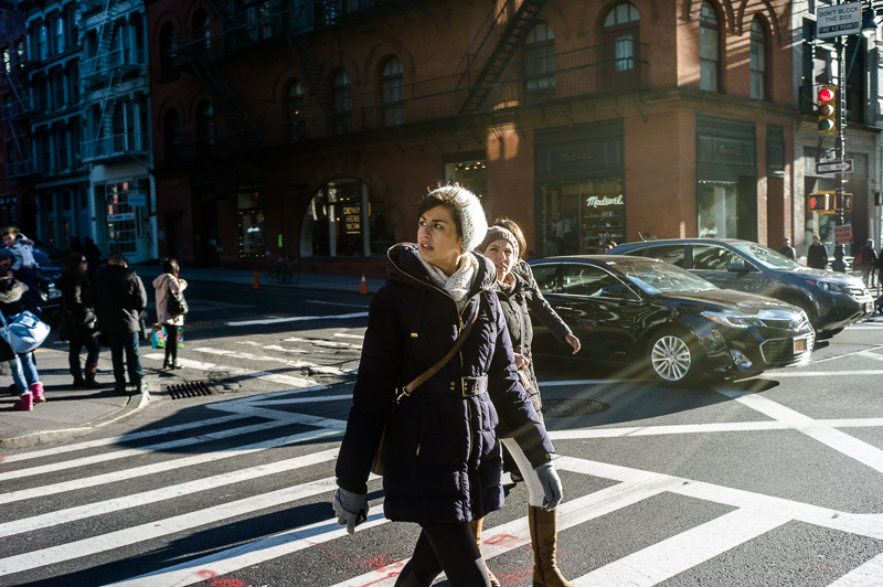
tumblrni6w19KxYl1qamvqvo1 1280 par
... nightfly, on ipernity
... so it's an attractive photo but it distracts from the photographers intended subject, the girl.
next ... Closure
----------------
Conventions ... many years ago 1972 or 73 maybe, I'd just started my first proper job at a commercial design company as a junior. They did textile design and some print design, doing a huge range of design work ... and still using traditional methods back then. I was put under an old guy called Alfred Graham. You got all the simple or boring jobs at first.
Now and then you would get the chance to do some 'sketching' which in this context simply involved doing pretty pictures with charcoal and chalk on craft-paper. You would spend half a day drawing followed by half an hour of Alf showing you where you'd gone wrong ... I think I learned more in a couple of months of that than I had from anything before ...
... one day I was working on a diagonal pattern ... the brief was for a diagonal pattern in an Arts and Crafts style ... I did them 50:50 bottom left to top right and bottom right to top left, Alf dismissed the bottom right to top left sketches as unsaleable due to the 'negative angle' ... he said lines raising to the right were 'positive' and the other way 'negative'. I mentioned the effect to one of my lecturers he dismissed it as 'just convention' saying 'its just the way graphs are shown on TV not properly aesthetic'. In effect some responses are hard-wired and others learned, and the learned ones were less reliable.
... so if Alf was right, all those diagonals on this shot should make it feel positive, exiting or pleasant ... (I'm assuming people can see those diagonals now)

tumblr ni6w19KxYl1qamvqvo1 1280 par , on ipernity
... but flipped over? ... negative, dull or depressing, simply because we see graphs on powerpoint that way round. I know how I see it and the argument is sound enough ...
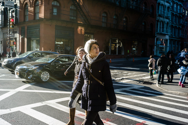
tumblr ni6w19KxYl1qamvqvo1 1281 par , on ipernity
... but just how many effects are learned and how many natural is difficult to say, I've had some of the basic gestalt effects challenged as having been learned
Take a look at this shot of Michael Markey's, I've always liked it because underlying all the frantic action it has a real melancholy feel, and I think that comes in some part from the diagonal composition, what do you think? ... it also has many of the other things I've been discussing erlier
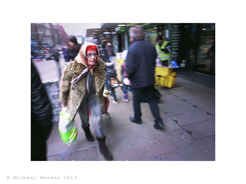
Woman with Bag par Sparrow ... Stewart Mcbride, on ipernity
Oh, yes the thin women ... back in the seventeenth century female beauty favoured the more rotund lady, take a look at Peter Paul Rubens work ... but that all changed with the gothic revival, when the Pre-Raphaelites brought the medieval look back as the benchmark ... aesthetics is a movable feast, and old pictures may not be using the same vocabulary we use today
next ... Closure (or why you shouldn't cut peoples feet off)
------------------------
... I've used this image a few times, to demonstrate closure ...

il-2a par Sparrow ... Stewart Mcbride, on ipernity
... and at this point I usually ask the dissenters how many circles they can see.
I expect they think it a trick, but is there anyone who doesn't see circles in that image? it is just so obvious despite there not actually being a single circle in it. Humans, once past the age of three we, humans, can't help completing known shapes that are partly obscured or outside the frame of view.
I read somewhere it was all about working out what type of animal was partially obscured by some bit of primordial jungle just after we came down from the trees ... whatever causes it we tend to follow the path of lines or shapes even when obscured or outside the frame.
I'll not pick on that girl on the crossing again although you'll see the same effect on that ... here's one of mine I cocked-up a while back in Corfu Town, in my defence I was going for my first coffee of the day at the time ...
2810126869 46703e66f8 o par Sparrow ... Stewart Mcbride, on ipernity
and the rule says you'll try to complete the outline of the girl (just for you Alan) and in cutting her feet off I've spoiled the shot ... now who thinks this is a pointless rule? ... lets hear why it's OK to cut someones feet off or having partially obscured subjects in your photos ... anybody?
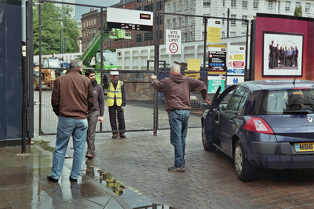
In addition the same effect given half a chance will distract the viewers eye both inside and outside the frame, any feature that leads the eye to the edge of the frame runs the risk of the viewer's eye along with their attention going out of it ... as in this shot from Paul (paulfish) the legs, and those poles doing most of the damage ...
As always those same features can work the other way and concentrate the viewer's attention to a point or region, as in this rather striking shot by Lukitas from the 'brutal' thread. Here coming from the corners and converging as they do they almost insist one looks at the centre of the frame ...
... so if the much discussed Rule of Thirds does at least make you think twice about putting stuff close to the edges.
I may go on to do Symmetry ... next
.................
... out of interest one quick'n easy way to abstract any image file is to play with the Contrast and Brightness controls ... wind the contrast up until the photo looks like a photocopy/xerox or a silver lith print and then play with the brightness, or use Photoshops Threshold control and slide Threshold Level too and fro ... and you'll get this sort of effect ...
... much easier to sort out the light and dark areas ... chiaroscuro effects (strong contrasts between light and dark) almost always help to understand form and depth
... back in the olden-days we would put stuff through the copier or a fax-machine a few times and play with the light/dark controls ... which got us into trouble a few times, on cost grounds, with the thermal paper and toner
-----------------------
... Similarity, is finding and seeing similar items as groups, there's a long running thread on the board which is full of things in threes contains lots ... we pick out similar shapes, colours or types and treat them as a group.
So similar shapes ...
Boutique Regina - Bank Street par Sparrow ... Stewart Mcbride, on ipernity
... tend to draw the eye between them, so the rule thinks all the rectangles on this should be attractive to a viewer and have their eyes flicking all over the place when they look at it. Personally I find Similarity of shape never seems as reliable as Proximity ...
... in colour terms, similar colours form the group, in this shot, the yellow works well enough to catch my attention. It clashes with all that blue and sort of holds my attention in that part of the photo, at the time I was just thinking of the colour contrast, I had plenty of time to wait for the moment as that cart trundled down the beach ...
The Beach at Acharavi, Kerikira (Corfu) par Sparrow ... Stewart Mcbride, on ipernity
... I pick out those magenta items as a group too but to no good effect, they act as a distraction to me.
... and type in this instance boats
Sam’s Boats, Roda, Kerkyra (Corfu) par Sparrow ... Stewart Mcbride, on ipernity
... so Similarity and Proximity are handy in one respect when we're out trying to take photographs, you just need to keep in mind that patterns and like objects are worth exploring or avoiding depending on ones' need at the time. People will have already noticed this I expect, the cover of Abby Road shows the application of it ... the Beetles on that traffic crossing, and it crops up in lots of photos taken by the 'great' photographers ...
Sometimes it works against the photo though, in this shot, it's the repeating lines and road markings that end up dominating, I look briefly at the subject then get distracted by the strong patterns and end up looking all around the frame, even that flare is similar to the road markings ...
tumblrni6w19KxYl1qamvqvo1 1280 par
... nightfly, on ipernity
... so it's an attractive photo but it distracts from the photographers intended subject, the girl.
next ... Closure
----------------
Conventions ... many years ago 1972 or 73 maybe, I'd just started my first proper job at a commercial design company as a junior. They did textile design and some print design, doing a huge range of design work ... and still using traditional methods back then. I was put under an old guy called Alfred Graham. You got all the simple or boring jobs at first.
Now and then you would get the chance to do some 'sketching' which in this context simply involved doing pretty pictures with charcoal and chalk on craft-paper. You would spend half a day drawing followed by half an hour of Alf showing you where you'd gone wrong ... I think I learned more in a couple of months of that than I had from anything before ...
... one day I was working on a diagonal pattern ... the brief was for a diagonal pattern in an Arts and Crafts style ... I did them 50:50 bottom left to top right and bottom right to top left, Alf dismissed the bottom right to top left sketches as unsaleable due to the 'negative angle' ... he said lines raising to the right were 'positive' and the other way 'negative'. I mentioned the effect to one of my lecturers he dismissed it as 'just convention' saying 'its just the way graphs are shown on TV not properly aesthetic'. In effect some responses are hard-wired and others learned, and the learned ones were less reliable.
... so if Alf was right, all those diagonals on this shot should make it feel positive, exiting or pleasant ... (I'm assuming people can see those diagonals now)
tumblr ni6w19KxYl1qamvqvo1 1280 par , on ipernity
... but flipped over? ... negative, dull or depressing, simply because we see graphs on powerpoint that way round. I know how I see it and the argument is sound enough ...
tumblr ni6w19KxYl1qamvqvo1 1281 par , on ipernity
... but just how many effects are learned and how many natural is difficult to say, I've had some of the basic gestalt effects challenged as having been learned
Take a look at this shot of Michael Markey's, I've always liked it because underlying all the frantic action it has a real melancholy feel, and I think that comes in some part from the diagonal composition, what do you think? ... it also has many of the other things I've been discussing erlier
Woman with Bag par Sparrow ... Stewart Mcbride, on ipernity
Oh, yes the thin women ... back in the seventeenth century female beauty favoured the more rotund lady, take a look at Peter Paul Rubens work ... but that all changed with the gothic revival, when the Pre-Raphaelites brought the medieval look back as the benchmark ... aesthetics is a movable feast, and old pictures may not be using the same vocabulary we use today
next ... Closure (or why you shouldn't cut peoples feet off)
------------------------
... I've used this image a few times, to demonstrate closure ...
il-2a par Sparrow ... Stewart Mcbride, on ipernity
... and at this point I usually ask the dissenters how many circles they can see.
I expect they think it a trick, but is there anyone who doesn't see circles in that image? it is just so obvious despite there not actually being a single circle in it. Humans, once past the age of three we, humans, can't help completing known shapes that are partly obscured or outside the frame of view.
I read somewhere it was all about working out what type of animal was partially obscured by some bit of primordial jungle just after we came down from the trees ... whatever causes it we tend to follow the path of lines or shapes even when obscured or outside the frame.
I'll not pick on that girl on the crossing again although you'll see the same effect on that ... here's one of mine I cocked-up a while back in Corfu Town, in my defence I was going for my first coffee of the day at the time ...
2810126869 46703e66f8 o par Sparrow ... Stewart Mcbride, on ipernity
and the rule says you'll try to complete the outline of the girl (just for you Alan) and in cutting her feet off I've spoiled the shot ... now who thinks this is a pointless rule? ... lets hear why it's OK to cut someones feet off or having partially obscured subjects in your photos ... anybody?
In addition the same effect given half a chance will distract the viewers eye both inside and outside the frame, any feature that leads the eye to the edge of the frame runs the risk of the viewer's eye along with their attention going out of it ... as in this shot from Paul (paulfish) the legs, and those poles doing most of the damage ...
As always those same features can work the other way and concentrate the viewer's attention to a point or region, as in this rather striking shot by Lukitas from the 'brutal' thread. Here coming from the corners and converging as they do they almost insist one looks at the centre of the frame ...
... so if the much discussed Rule of Thirds does at least make you think twice about putting stuff close to the edges.
I may go on to do Symmetry ... next
.................
Sparrow
Veteran
-----------------
... this logo, the yin-yang logo or the Tai-Chi symbol according to the interweb, demonstrates symmetry ...
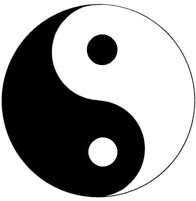
Yin-Yang par Sparrow ... Stewart Mcbride, on ipernity
... the swastika, Maltese-cross are rotationally symmetrical, Volkswagen, American-Airlines or McDonald's logos are symmetrical on their centreline, Mercedes and Chanel's are both rotationally and centreline symmetrical ... some people will no doubt think designers do this for no good reason ...
... while others think the viewer will naturally seek out symmetry and finds it perceptually pleasing ... the mind will seek out and divide objects into any number of symmetrical parts, it will find it pleasing to detect symmetry ... and pay particular attention to the point of symmetry.
As Lukitas observed of his photograph "Maybe that is what is wrong about this one: all the lines point to the middle, but there is nothing there"
photo by Lukitas
It's not just in the abstract, there is one study that demonstrates the human face to be more attractive the more symmetrical it is, a quick look on the interweb reveals lots of information.
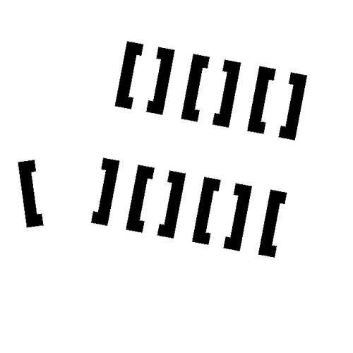
Here, although these are just two rows of six square parenthesis and one by itself ...
z par Sparrow ... Stewart Mcbride, on ipernity
... the theory predicts the viewer will try to form symmetrical groups and so you'll see three units (with two parenthesis forming each group) on the top row and two whole units with a half unit at each end ... and that you'll go on to connect the lone element to its closest partner, and interestingly the area between the two items becomes an area of particular interest
I'm sure every photographer will be able to look back at shots that drag ones attention to some boring part of the frame ...

No 40 par Sparrow ... Stewart Mcbride, on ipernity
... like the central column on this photo from a project of mine
--------------------
I'm always surprised just how much of the world is symmetrical, nature to a great extent plants in part, all animals that I can think of ... and almost everything manmade of note is symmetrical, yes I know there's Antoni Gaudí but even then you'd not wan't to live in one of them ... all those odd curves and angles would drive you mad ... and imagine decorating!
The other year when I'd just finished my Corfu book I found myself on the island for three weeks with nothing too much do. One gets bored with sunbathing in minutes, so I got in the car and went wandering around. It was a bit like letting my brain defocus like I do with my eyes when I started noticing the geometry of the place. No matter what age or style, geometry and symmetry were everywhere, not just buildings but in surface design and pictures too. No matter what the scale, material or media one looked at.

No 32 par Sparrow ... Stewart Mcbride, on ipernity

No 10 par Sparrow ... Stewart Mcbride, on ipernity
The more complex the symmetry the more we seem be attracted by it, all those Late Gothic cathedrals still being maintained astound people as much now as they did in the fifteenth century ... and are dripping with symmetry, they attract photographer like flies, even though the world already has more than enough photos of churches.
next ... Ground-Figure and Areas of Particular Interest
------------------------
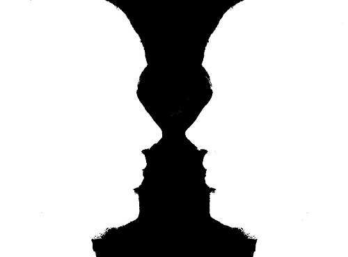
I expect almost everyone has come across the Rubin's vase effect ... this sort of thing
Ground-Figure mono par Sparrow ... Stewart Mcbride, on ipernity
... once you've seen the vase it becomes hard to not see it, even in a realistic image its outline persists, for me it pops in and out on this version
Ground-Figure par Sparrow ... Stewart Mcbride, on ipernity
It dosen't need to be symmetrical, you can still see a face in the dark bit of this road sign, well I can anyway ...

map par Sparrow ... Stewart Mcbride, on ipernity
... just a bit of a visual trick really, I'm not sure if they are of that much use to photographers other than to point out how a viewers interest can be concentrated to some areas by a photo's layout, colour or value, Henri did it all the time, a figure framed by a door or window or as in this shot a hole blown in a wall ...
henri cartier bresson children par Sparrow ... Stewart Mcbride, on ipernity
... the ability of an image to sometimes make one area draw the eye often crops up in figurative art, some areas will somehow assume a particular interest to the viewer. Sometimes it's an actual frame like the Cartier-Bresson shot above sometimes just the natural line of the photo, or as in Lukitas's photo just the symmetry of the shot making the centre area pull in ones interest ...
photo by Lukitas
... once you look for it you see it all over the place, but it's one of those things you seldom see it at the time. Later on the contact sheet it stands out like a sore thumb, something like that chap who claimed to take photos of stuff to see how it looked when photographed
------------------------
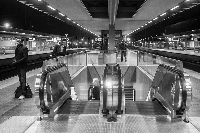
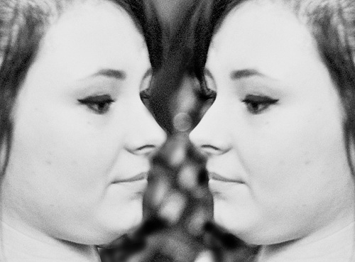
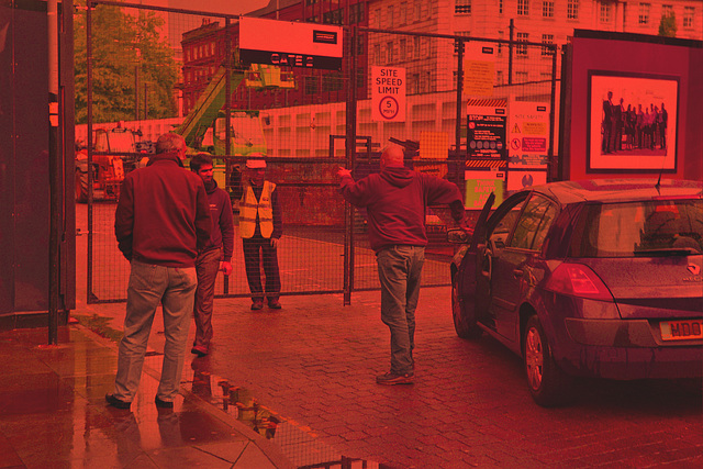
So while the Rubin's vase effect is of little use, mirroring images is easy enough with photoshop, but they always look a bit odd ... things that are absolutely symmetrical have an unsettling effect on the viewer, like those symmetrical human faces made from half a celebrity. Things which are almost concentrate the viewers attention in a particular area of the image ... so if you were to really study this photo, and have picked up on the ideas I've been banging on about ...
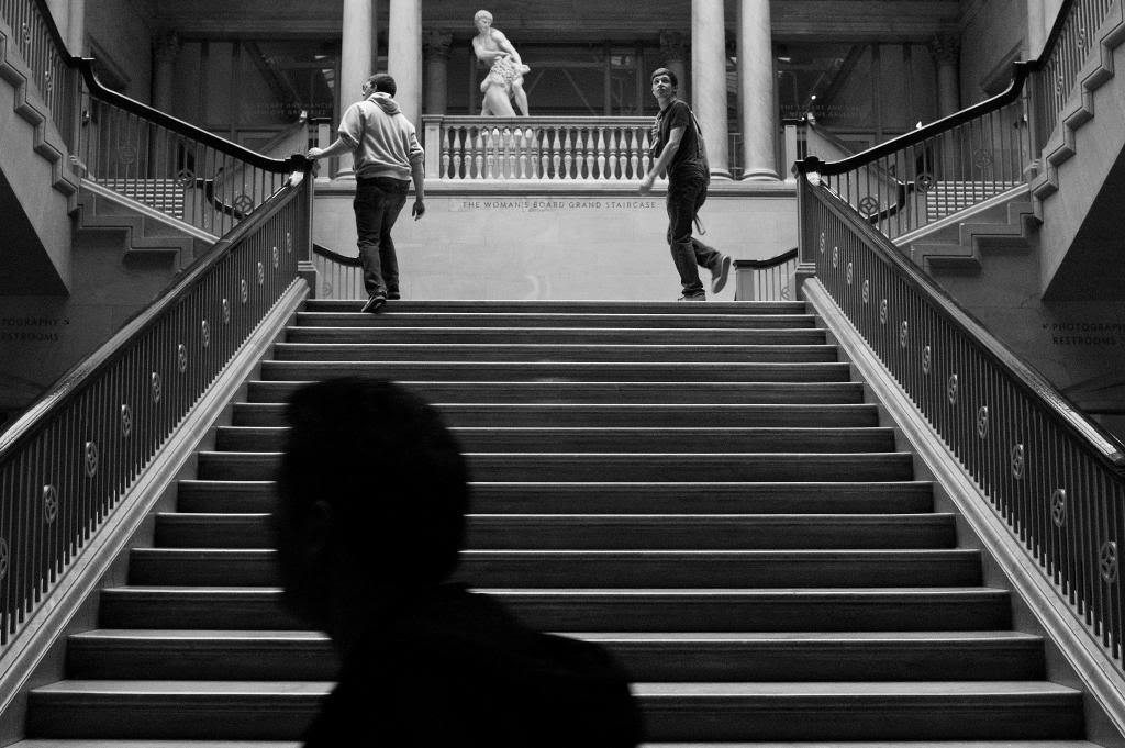
photo courtesy of airfrogusmc ©
... you will see the Rubin's vase and its negative space, the symmetry, proximity and repetition, the depth all encouraging you to like the photo, but you'll be aware of the line and light/shade drawing your eye back to that lighter rectangle and the four columns, and the small triangular group of three figures on the landings. So you'll probably like the photo, its got so many of the Principles we normally like.
Though you'll possibly feel the ground/figure area we're particularly interested in (the light rectangle, columns and figures) is divorced from the best part of the photo graphically (the stair and handrails), and there is the Closure effect drawing your eye up those four columns and out of the frame ... those give the shot a disconnected, unsettling feel to me ... and leaves me wanting to know about the shadow in the bottom of the frame
There are many things going on in that photo, one of the few bits of theory that helps in real world photography is to notice something in the three dimensional world that will be an area of interest to the viewer in the print ... this is one of mine a spot in a local town, this relies on a couple of the same effects ...

Woolshops, Halifax par Sparrow ... Stewart Mcbride, on ipernity
... not as many and not with the same intensity, like a lighter version
---------------------------
... The Classical Principles:
I'm a mod myself (modernist) ... I have drawn pictures for as long as I can remember, my granddad would bring me 500 sheet pads from Woolworth's (Big Scribblers they were called) each week and I would fill them with drawings, finding drawing as easy as I found writing difficult. I was at grammar school before I found that there was a way to understand pictures other than just liking or disliking them ... one of the set books was John Wyndham's The Day of the Triffids and it was illustrate by a set of modernist drawings.
I was sold on modernism and it's tenets ... so from my point of view all of the Classical Principles are explained by the Gestalt and the colour theories of Munsell Rood and the like ... so this lot from earlier ...
Shape and Proportion; including Pi, the golden ratio and the so called rule of thirds and the like
Geometry; regular forms and I suppose Pi, the golden ratio again
Balance; positioning orientation and harmony in the elements
Field of View; the area within the image that holds your attention
Negative Space; the area that isn't Field of View
Eye-Line; how the viewer's eye finds it's way round the image
Contrast; or value, the difference between the light and dark bits
Repetition and Rhythm; repeats, patterns and rhythms
Illumination; lighting
Form; modelling, shading and like
Colour; the colours and their combination
Perspective;Perspective
... are easy for me to dismiss ... except there are some in there that I now realise are a handy shorthand for some effects.
------------------------
... this logo, the yin-yang logo or the Tai-Chi symbol according to the interweb, demonstrates symmetry ...
Yin-Yang par Sparrow ... Stewart Mcbride, on ipernity
... the swastika, Maltese-cross are rotationally symmetrical, Volkswagen, American-Airlines or McDonald's logos are symmetrical on their centreline, Mercedes and Chanel's are both rotationally and centreline symmetrical ... some people will no doubt think designers do this for no good reason ...
... while others think the viewer will naturally seek out symmetry and finds it perceptually pleasing ... the mind will seek out and divide objects into any number of symmetrical parts, it will find it pleasing to detect symmetry ... and pay particular attention to the point of symmetry.
As Lukitas observed of his photograph "Maybe that is what is wrong about this one: all the lines point to the middle, but there is nothing there"
photo by Lukitas
It's not just in the abstract, there is one study that demonstrates the human face to be more attractive the more symmetrical it is, a quick look on the interweb reveals lots of information.
Here, although these are just two rows of six square parenthesis and one by itself ...
z par Sparrow ... Stewart Mcbride, on ipernity
... the theory predicts the viewer will try to form symmetrical groups and so you'll see three units (with two parenthesis forming each group) on the top row and two whole units with a half unit at each end ... and that you'll go on to connect the lone element to its closest partner, and interestingly the area between the two items becomes an area of particular interest
I'm sure every photographer will be able to look back at shots that drag ones attention to some boring part of the frame ...
No 40 par Sparrow ... Stewart Mcbride, on ipernity
... like the central column on this photo from a project of mine
--------------------
I'm always surprised just how much of the world is symmetrical, nature to a great extent plants in part, all animals that I can think of ... and almost everything manmade of note is symmetrical, yes I know there's Antoni Gaudí but even then you'd not wan't to live in one of them ... all those odd curves and angles would drive you mad ... and imagine decorating!
The other year when I'd just finished my Corfu book I found myself on the island for three weeks with nothing too much do. One gets bored with sunbathing in minutes, so I got in the car and went wandering around. It was a bit like letting my brain defocus like I do with my eyes when I started noticing the geometry of the place. No matter what age or style, geometry and symmetry were everywhere, not just buildings but in surface design and pictures too. No matter what the scale, material or media one looked at.
No 32 par Sparrow ... Stewart Mcbride, on ipernity
No 10 par Sparrow ... Stewart Mcbride, on ipernity
The more complex the symmetry the more we seem be attracted by it, all those Late Gothic cathedrals still being maintained astound people as much now as they did in the fifteenth century ... and are dripping with symmetry, they attract photographer like flies, even though the world already has more than enough photos of churches.
next ... Ground-Figure and Areas of Particular Interest
------------------------
I expect almost everyone has come across the Rubin's vase effect ... this sort of thing
Ground-Figure mono par Sparrow ... Stewart Mcbride, on ipernity
... once you've seen the vase it becomes hard to not see it, even in a realistic image its outline persists, for me it pops in and out on this version
Ground-Figure par Sparrow ... Stewart Mcbride, on ipernity
It dosen't need to be symmetrical, you can still see a face in the dark bit of this road sign, well I can anyway ...
map par Sparrow ... Stewart Mcbride, on ipernity
... just a bit of a visual trick really, I'm not sure if they are of that much use to photographers other than to point out how a viewers interest can be concentrated to some areas by a photo's layout, colour or value, Henri did it all the time, a figure framed by a door or window or as in this shot a hole blown in a wall ...
henri cartier bresson children par Sparrow ... Stewart Mcbride, on ipernity
... the ability of an image to sometimes make one area draw the eye often crops up in figurative art, some areas will somehow assume a particular interest to the viewer. Sometimes it's an actual frame like the Cartier-Bresson shot above sometimes just the natural line of the photo, or as in Lukitas's photo just the symmetry of the shot making the centre area pull in ones interest ...
photo by Lukitas
... once you look for it you see it all over the place, but it's one of those things you seldom see it at the time. Later on the contact sheet it stands out like a sore thumb, something like that chap who claimed to take photos of stuff to see how it looked when photographed
------------------------
So while the Rubin's vase effect is of little use, mirroring images is easy enough with photoshop, but they always look a bit odd ... things that are absolutely symmetrical have an unsettling effect on the viewer, like those symmetrical human faces made from half a celebrity. Things which are almost concentrate the viewers attention in a particular area of the image ... so if you were to really study this photo, and have picked up on the ideas I've been banging on about ...
photo courtesy of airfrogusmc ©
... you will see the Rubin's vase and its negative space, the symmetry, proximity and repetition, the depth all encouraging you to like the photo, but you'll be aware of the line and light/shade drawing your eye back to that lighter rectangle and the four columns, and the small triangular group of three figures on the landings. So you'll probably like the photo, its got so many of the Principles we normally like.
Though you'll possibly feel the ground/figure area we're particularly interested in (the light rectangle, columns and figures) is divorced from the best part of the photo graphically (the stair and handrails), and there is the Closure effect drawing your eye up those four columns and out of the frame ... those give the shot a disconnected, unsettling feel to me ... and leaves me wanting to know about the shadow in the bottom of the frame
There are many things going on in that photo, one of the few bits of theory that helps in real world photography is to notice something in the three dimensional world that will be an area of interest to the viewer in the print ... this is one of mine a spot in a local town, this relies on a couple of the same effects ...
Woolshops, Halifax par Sparrow ... Stewart Mcbride, on ipernity
... not as many and not with the same intensity, like a lighter version
---------------------------
... The Classical Principles:
I'm a mod myself (modernist) ... I have drawn pictures for as long as I can remember, my granddad would bring me 500 sheet pads from Woolworth's (Big Scribblers they were called) each week and I would fill them with drawings, finding drawing as easy as I found writing difficult. I was at grammar school before I found that there was a way to understand pictures other than just liking or disliking them ... one of the set books was John Wyndham's The Day of the Triffids and it was illustrate by a set of modernist drawings.
I was sold on modernism and it's tenets ... so from my point of view all of the Classical Principles are explained by the Gestalt and the colour theories of Munsell Rood and the like ... so this lot from earlier ...
Shape and Proportion; including Pi, the golden ratio and the so called rule of thirds and the like
Geometry; regular forms and I suppose Pi, the golden ratio again
Balance; positioning orientation and harmony in the elements
Field of View; the area within the image that holds your attention
Negative Space; the area that isn't Field of View
Eye-Line; how the viewer's eye finds it's way round the image
Contrast; or value, the difference between the light and dark bits
Repetition and Rhythm; repeats, patterns and rhythms
Illumination; lighting
Form; modelling, shading and like
Colour; the colours and their combination
Perspective;Perspective
... are easy for me to dismiss ... except there are some in there that I now realise are a handy shorthand for some effects.
------------------------
Sparrow
Veteran
--------------------------
... The Classical Principles:
I'm a mod myself (modernist) ... I have drawn pictures for as long as I can remember, my granddad would bring me 500 sheet pads from Woolworth's (Big Scribblers they were called) each week and I would fill them with drawings, finding drawing as easy as I found writing difficult. I was at grammar school before I found that there was a way to understand pictures other than just liking or disliking them ... one of the set books was John Wyndham's The Day of the Triffids and it was illustrate by a set of modernist drawings.
I was sold on modernism and it's tenets ... so from my point of view all of the Classical Principles are explained by the Gestalt and the colour theories of Munsell Rood and the like ... so this lot from earlier ...
Shape and Proportion; including Pi, the golden ratio and the so called rule of thirds and the like
Geometry; regular forms and I suppose Pi, the golden ratio again
Balance; positioning orientation and harmony in the elements
Field of View; the area within the image that holds your attention
Negative Space; the area that isn't Field of View
Eye-Line; how the viewer's eye finds it's way round the image
Contrast; or value, the difference between the light and dark bits
Repetition and Rhythm; repeats, patterns and rhythms
Illumination; lighting
Form; modelling, shading and like
Colour; the colours and their combination
Perspective;Perspective
... are easy for me to dismiss ... except there are some in there that I now realise are a handy shorthand for some effects.
------------------------
Form in Photography
You'll hear and read words like Form, Modelling and even Chiaroscuro used to describe that three-dimensional effect caused by high contrast ... Depth and Contrast in modernist terminology, Chiaroscuro if you're talking about a Caravaggio ... it was used extensively in the renaissance (the bokeh of the day) along with perspective to create depth in pictures, perspective had come back into fashion in the Late Gothic period ... all of them involve tricking the viewer into seeing the three-dimensional represented on the flat surface of a print or painting ... this sort of thing ...
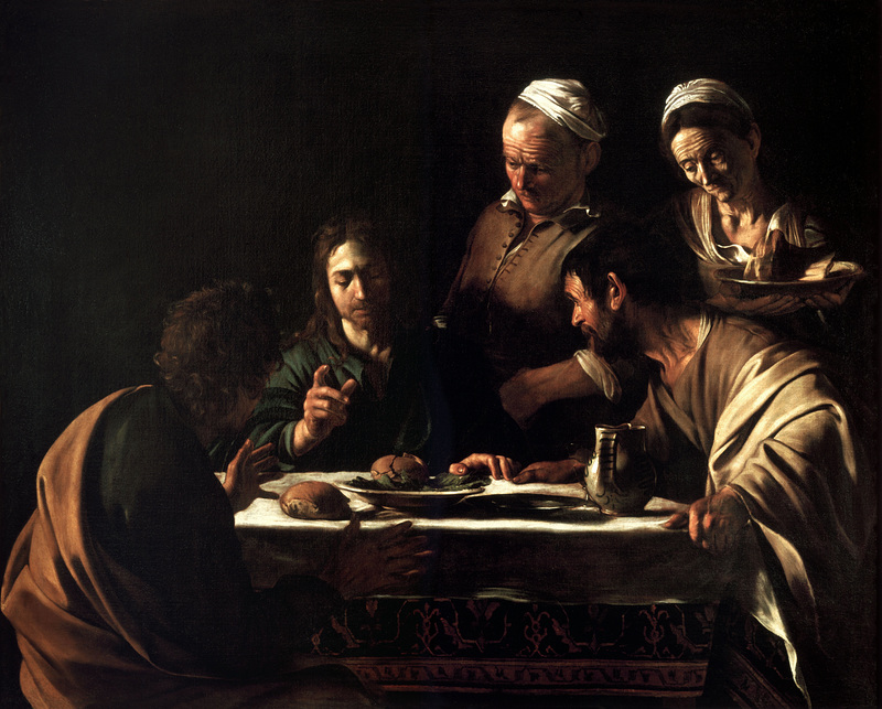
Supper at Emmaus-Caravaggio (1606) par Caravaggio
The problem being that we generally don't see the world in such great contrast. After taking a photo one can play with the contrast or abstract the image in other ways but it's not easy to see beforehand. There is one trick though, our eyes see colour less well in poor light so viewing a scene through sunglasses, ND filters or even just a dark red filter will help to visualise how a coloured scene will look in a monochrome print. I recall seeing a device from the thirties that was like a small telescope and had a dense ND filter and a standard FOV lens, called a Monoscope or similar, for photographers and filmmakers to visualise monochrome better.
You can turn this ...
Manchester Streat Closed par Sparrow ... Stewart Mcbride, on ipernity
... into this ...
Manchester with filter par Sparrow ... Stewart Mcbride, on ipernity
... it gives you an idea how the monochrome version will look, and as the light entering is of a lower value fewer of the colour receptors (cone-cells) are stimulated allowing you to see more of the low light monochrome receptors (rods-cells).
Using a dark red gell filter to look through in a figure-drawing class is a great help to understanding the shading, and if one has to produce a drawing or painting from a photograph it is a lot easier if you have both a colour and a black and white version to look at.
----------------------
... The Classical Principles:
I'm a mod myself (modernist) ... I have drawn pictures for as long as I can remember, my granddad would bring me 500 sheet pads from Woolworth's (Big Scribblers they were called) each week and I would fill them with drawings, finding drawing as easy as I found writing difficult. I was at grammar school before I found that there was a way to understand pictures other than just liking or disliking them ... one of the set books was John Wyndham's The Day of the Triffids and it was illustrate by a set of modernist drawings.
I was sold on modernism and it's tenets ... so from my point of view all of the Classical Principles are explained by the Gestalt and the colour theories of Munsell Rood and the like ... so this lot from earlier ...
Shape and Proportion; including Pi, the golden ratio and the so called rule of thirds and the like
Geometry; regular forms and I suppose Pi, the golden ratio again
Balance; positioning orientation and harmony in the elements
Field of View; the area within the image that holds your attention
Negative Space; the area that isn't Field of View
Eye-Line; how the viewer's eye finds it's way round the image
Contrast; or value, the difference between the light and dark bits
Repetition and Rhythm; repeats, patterns and rhythms
Illumination; lighting
Form; modelling, shading and like
Colour; the colours and their combination
Perspective;Perspective
... are easy for me to dismiss ... except there are some in there that I now realise are a handy shorthand for some effects.
------------------------
Form in Photography
You'll hear and read words like Form, Modelling and even Chiaroscuro used to describe that three-dimensional effect caused by high contrast ... Depth and Contrast in modernist terminology, Chiaroscuro if you're talking about a Caravaggio ... it was used extensively in the renaissance (the bokeh of the day) along with perspective to create depth in pictures, perspective had come back into fashion in the Late Gothic period ... all of them involve tricking the viewer into seeing the three-dimensional represented on the flat surface of a print or painting ... this sort of thing ...
Supper at Emmaus-Caravaggio (1606) par Caravaggio
The problem being that we generally don't see the world in such great contrast. After taking a photo one can play with the contrast or abstract the image in other ways but it's not easy to see beforehand. There is one trick though, our eyes see colour less well in poor light so viewing a scene through sunglasses, ND filters or even just a dark red filter will help to visualise how a coloured scene will look in a monochrome print. I recall seeing a device from the thirties that was like a small telescope and had a dense ND filter and a standard FOV lens, called a Monoscope or similar, for photographers and filmmakers to visualise monochrome better.
You can turn this ...
Manchester Streat Closed par Sparrow ... Stewart Mcbride, on ipernity
... into this ...
Manchester with filter par Sparrow ... Stewart Mcbride, on ipernity
... it gives you an idea how the monochrome version will look, and as the light entering is of a lower value fewer of the colour receptors (cone-cells) are stimulated allowing you to see more of the low light monochrome receptors (rods-cells).
Using a dark red gell filter to look through in a figure-drawing class is a great help to understanding the shading, and if one has to produce a drawing or painting from a photograph it is a lot easier if you have both a colour and a black and white version to look at.
----------------------
Sparrow
Veteran
next .............. I'll reserve a space incase I decide to finish the thing
willie_901
Veteran
Stewart,
I appreciate all your time, thought and effort spent on this project.
It is possible a you could profit from a self-publishd E-Book on Amazon and, or iBooks.
Anyway... thanks.
I appreciate all your time, thought and effort spent on this project.
It is possible a you could profit from a self-publishd E-Book on Amazon and, or iBooks.
Anyway... thanks.
Sparrow
Veteran
... I just wanted to see what I already had and, and make it available to anyone who's interested to read through it ... I wanted to make it light and jokey, but it didn't work out that way
Ranchu
Veteran
I'm a big fan of Atget, I was looking at this in a book last night.
")
http://www.sfmoma.org/explore/collection/artwork/10191
http://www.sfmoma.org/explore/collection/artwork/10191
Attachments

Sparrow
Veteran
I'm a big fan of Atget, I was looking at this in a book last night.
http://www.sfmoma.org/explore/collection/artwork/10191
... Eugene?
Share:
-
This site uses cookies to help personalise content, tailor your experience and to keep you logged in if you register.
By continuing to use this site, you are consenting to our use of cookies.