Sailor Ted
Well-known
Sailor Ted
Well-known
Horrific however much cleaner then Mainland China 
pfogle
Well-known
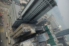
That second one's really scary! Like you're hanging over the side
- these are the 12mm? Nice lens
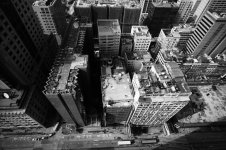
--pps I hope you don't mind, but I took the liberty of doing a greyscale to see what it would look like. I quite like it with lots of contrast...
- these are the 12mm? Nice lens
--pps I hope you don't mind, but I took the liberty of doing a greyscale to see what it would look like. I quite like it with lots of contrast...
Attachments
Last edited:
Sailor Ted
Well-known
Thanks Phil,
I don't know why I'm such a color junky however I suspect many shots would take on new feelings in BnW. Perhaps I'll grow up- some day
Ted
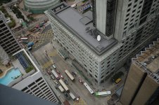
PS. I did have to hang a bit and it was scary
Yes that was the 12mm lens- my favorite on the R-D1 (1.5 crop factor) now if only Zeiss would come out with a sharper 12mm that is smaller then that 15? monster they are selling for a kings randsom (and less expensive to be sure)
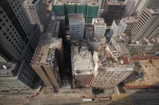
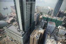
Actually shot one is my 35mm non-asph Chron, shot two is my 21mm Zeiss and shots three and four are from my 12mm CV. It's hard to keep track and sometime I need to look at the shots and then think about it.
I don't know why I'm such a color junky however I suspect many shots would take on new feelings in BnW. Perhaps I'll grow up- some day
Ted
PS. I did have to hang a bit and it was scary
Yes that was the 12mm lens- my favorite on the R-D1 (1.5 crop factor) now if only Zeiss would come out with a sharper 12mm that is smaller then that 15? monster they are selling for a kings randsom (and less expensive to be sure)
Actually shot one is my 35mm non-asph Chron, shot two is my 21mm Zeiss and shots three and four are from my 12mm CV. It's hard to keep track and sometime I need to look at the shots and then think about it.
Last edited:
Bill58
Native Texan
I get vertigo just looking at them. I could never be a high- rise window washer.
Pherdinand
the snow must go on
Wait...I think i can see Jackie on that roof!
pfogle
Well-known
Ted,
I think a lot of your work has potential for b/w. My main crit would be that you're being too conservative in preserving tones... sometimes drama is more effective than accuracy IMO.
BTW, the second shot was done with the 12mm, not the 21 - the buildings are the same size as in the last two
I agree with your comment that it would be nice to find a sharper 12mm - it's not bad, but it's not great. To my eye (I don't have one to compare) the 15mm looks a bit sharper, especially the samples I've seen on the M8, but the vignetting makes it less attractive on the R-D1. It does at least have the advantage of being fairly consistent across the frame, so you can use some post-prod sharpening without the center looking overdone.
Sailor Ted
Well-known
pfogle said:you're being too conservative in preserving tones... sometimes drama is more effective than accuracy IMO.
Thanks I'm just getting used to this whole "digital" thing. I'm trying not to over do saturation and color while experimenting with different levels of both. Here's a re-work of a shot from the series with a tad more saturation and set to "vivid" in Epson's RAW converter. I think it works much better and I believe is a better option when it's cloudy and grey (just like picking a high saturation film on a cloudy day back when we had more film choices).
As to the 12mm I may have been one detent before infinity on these shots due to being set for"zone focus" (perhaps the only real focus the R-D1 has- sadly). I'll do another series ether in San Fran or when I'm back in Hong Kong and see but I'm sure your correct. Your also correct that the 15mm has too much light fall off on the R-D1 and that it's a little soft around the edges- still I'll experiment with it when I get my M8 (can't wait to see what kind of pictures the M8 will take by comparison).
Any ideas on how a comparatively sharper camera like the M8 will perform in hand held low light situations? I wonder if the M8's sharpness will at some level work against my shooting style- long(ish) hand held exposures? One thing's certain, an accurate range finder will come in handy : )
Oh and BTW is it just me or does adding sharpness in PS somehow take away from a pictures sence of depth or 3-D? Yes it makes an image "sharper" but can it also make an image appear flatter? Again I am a digital noob so thanks for the help.
Attachments
Last edited:
Share: