R-D1 black-and-white files look flat/muddy

L

leegf

Guest
Hi there,

The R-D1 is my main cam now, but it's still new to me. I like to shoot primarily black-and-white, and although preliminary results vary (a lot of it does have to do with the light, and I've also gotten some nice files, too), more often than not, I'm finding that black-and-white files (whether done directly in the camera, or shot in color first, then converted to b/w later on) are flat and muddy. If I push the contrast or adjust levels in Photoshop in an attempt to get a longer tonal scale from pure black to pure white, I find that the whites look blown out, garish, and just plain awful.

Any tips? Workflow descriptions as well as sample images would be extremely helpful.

Thanks.

Drew
 
Well, I'm not sure how much I can add after the preceding extremely comprehensive post >:-> but...

-- When you say your "results" are flat, what type of end product are you talking about? Prints? If so, do you mean home-made ones (e.g. on a photo-inkjet printer) or ones you get from a store or an online printing service? Or are you referring to images viewed on your computer monitor? Or images viewed on some other type of device, such as a TV set? We need to know what you're evaluating so we can suggest areas on which to concentrate your efforts.

-- Also, when you say the results are flat, to what are you comparing them? The results from a different digital camera to which you're more accustomed? Or results from film-camera images digitized with a scanner? Or film-camera images printed conventionally? Or what?

As Lament probably meant to say before being overtaken by reticence, it's a fact that a digital image has a shorter absolute tonal range than a negative-film image -- if you've been a conventional-film shooter up until now, it's a lot more like working with a slide film, and a fairly contrasty one at that.

But as is the case with slide film, you can make rich-looking, fully-toned images from R-D 1 files as long as you're prepared to work within the characteristics of your recording medium.

If you can give us more specifics, we'll try to suggest the parts of the "image chain" that will be the most productive targets for you to adjust in search of the results you want.
 
Lament, touche :)

jlw said:
Well, I'm not sure how much I can add after the preceding extremely comprehensive post >:-> but...

-- When you say your "results" are flat, what type of end product are you talking about? Prints? If so, do you mean home-made ones (e.g. on a photo-inkjet printer) or ones you get from a store or an online printing service? Or are you referring to images viewed on your computer monitor?

Yes, computer monitor, specifically LCD. I can confirm that it's calibrated properly, so it's not a monitor calibration issue.

jlw said:
-- Also, when you say the results are flat, to what are you comparing them? The results from a different digital camera to which you're more accustomed? Or results from film-camera images digitized with a scanner? Or film-camera images printed conventionally? Or what?

I'm comparing them to film-camera images scanned by a humble Minolta Scan Dual film scanner of previous generations, and viewed on a computer monitor. But I also used a Nikon D80 for a very short while, and while I wasn't exactly happy with the D80's black-and-white images also, I don't remember them being quite as flat as the R-D1's.

jlw said:
As Lament probably meant to say before being overtaken by reticence, it's a fact that a digital image has a shorter absolute tonal range than a negative-film image -- if you've been a conventional-film shooter up until now, it's a lot more like working with a slide film, and a fairly contrasty one at that.

But as is the case with slide film, you can make rich-looking, fully-toned images from R-D 1 files as long as you're prepared to work within the characteristics of your recording medium.

Sounds like you and he are probably right, not that that was ever much of a secret. The digital medium is indeed new to me (excluding the film-digital hybrid workflow from before, which to me doesn't count), so any tips on maximizing its potential would indeed be helpful. I recognize that a lot of it is subjective also, so I usually find sample images to be extremely helpful. Thanks!
 
If you shoot raw, the quality of the b&w conversion is under your control. What are you using to convert to b&w?

My R-D1s is now sold, but I thought it did very well with b&w, it's what I mostly used it for before I started shooting film again. I mainly used the Convert to B&W Pro plugin in Photoshop Elements.

_EPS2195.jpg


There's lots more b&w R-D1s stuff in my gallery if it helps.

Ian
 
If your making jpegs, your wasting your time. Raw is the only way to go. I do 99% b&w and make prints all the time for sale and exhibition. I'm using a program by the imaging factory that is great. It kinda feels like analog processing and the quality is unsurpassed.

Check out Martin's B&W site....there's many good tips around his site....

http://com1.runboard.com/bthedigitalmonochromeforum


good luck....don
 
Just two samples FWIW, both with the Epson raw converter.

EPSN1573-afterNBweb.jpg

(200 iso, Summicron 28/2, f/5.6)

EPSN2932-afterweb.jpg

(400 iso, Summilux 50/1.4asph, f/1.4)
 
leegf said:
Lament, touche :)
Yes, computer monitor, specifically LCD. I can confirm that it's calibrated properly, so it's not a monitor calibration issue.

I'm comparing them to film-camera images scanned by a humble Minolta Scan Dual film scanner of previous generations, and viewed on a computer monitor. But I also used a Nikon D80 for a very short while, and while I wasn't exactly happy with the D80's black-and-white images also, I don't remember them being quite as flat as the R-D1's.

Okay, I hope the sample images people have been providing have helped convince you that an R-D 1 can produce b&w files with dramatic tones. (The sample files look great on my LCD monitor.) Now, let's see what we can do to get YOUR files to look that way...

1) As someone else said, you'll get better conversions if you shoot raw files. That's simply because the raw format retains the full original bit depth (tonal range) recorded by the sensor, while JPEG format throws away some bits and knocks down your image to 256 gray levels. (You can still get good results with JPEGs, but exposure is much more critical, and there's less you can do to "save" sub-optimal images in post-processing.)

2) Just as a starting point (even though you may have done this already) I'm going to suggest looking at histograms of your images to get a clue as to why they don't look as rich as you'd like. You probably already know this, but an image histogram is a graph that shows how many pixels there are of each value, from darkest to lightest. Looking at the histogram (check your image-editing software manual if you don't know how to display it) can tell you a lot about how the tones are distributed in your photos, and how you might want to change that distribution to get the effect you want.

As an example, here's a picture of mine which I feel should have a pretty good tonal range, from the near-white of the girl's dress to the near-black of her hair, with lots of gray tones in between:

before.jpg


As I said, it should have a good range of tones -- but the image I see on my monitor looks a little flat. I've put the histogram (this is a Photoshop one) in the same frame so you can see it. Looking at the histogram, you can see that most of the pixels are concentrated in the darker areas (toward the left side of the horizontal axis) and that there are relatively few pixels in the highlight areas (toward the right side of the axis.)

In other words, even though there's a wide range of tones (which you can see by the broad distribution of "peaks" across the histogram) they're shifted toward the dark end, which makes the picture look a bit muddy.


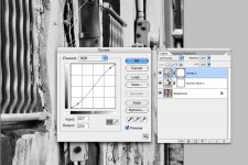
So, I'm going to do two things, both with Photoshop's Levels control: I'm going to move the white point toward the left, so that the lightest pixels are shifted more toward white; and I'm going to move the midpoint (gamma) control toward the left, so that the middle tones also are shifted toward white. Once I've done that, if I've made the blackest tones too gray, I'll move the black level control toward the right a bit, until I've got a good base of blacks.

(By doing this, I'll actually be cutting off, or clipping, some of the lightest and darkest tones; instead of being rendered as very light or very dark gray, they'll be rendered as pure white or pure black. You might think that would be just what you don't want to do to get a full-range picture... but again, remember this is a bit like working with slide film: sometimes you have to choose to let some highlights go white or some shadows go black, in order to get a picture that has "sparkle" and depth.)

So, here's the result after I've made this one adjustment:

after.jpg


I think it looks quite a bit snappier and perkier, and it also looks more like the way I remember the scene.

Dirty trick: Actually I did one more thing to the image as well -- I applied just a bit of the Smart Sharpen filter to give a bit of crispness to fine details. Psychologically, we tend to interpret more-finely-detailed scenes as snappier and more contrasty, and less-detailed ones as muddier and flatter... so sharpening details a bit can enhance the sense of tonality, especially for low-res images viewed on a computer monitor.

So, did any of that help? Maybe you should post an image or two that you think should have come out better than they did, so we can try to help identify what's going wrong...
 
1. Always shoot RAW - it's that much better!

2. look up different ways to convert files to B&W - especially via the channel mixer in photoshop - my personal favorite.

3. It looks as if that epson software is doing fantastic conversions.

4. Use "curves" instead of levels - it's much less damaging to the image information.
 
Since you write that you do have Photoshop...

Add an adjustment layer (curves), but set its blending mode to "luminosity". Then with that layer active, click in the lower left part of the curve line and draw it downward a little. Then click on the curve line in the upper right portion and draw it upward. This creates as much contrast as you wish, and hopefully replicates the "S" curve that b/w film has. Best of all, since it is an adjustment layer you can come back later and make further changes.

Take care,
Michael
 

Attachments

  • contrast_curve.jpg
    contrast_curve.jpg
    98.6 KB · Views: 0
wontonny said:
lament said:
Welcome to digital photography
'nuff said.

What do these remarks (and re-remarks) mean, exactly? I think the examples that have been posted here demonstrate that digital RFs can produce photos with a wide, dramatic range of tones.
 
Never use histograms, PS level controls or Smart Sharpen filters personally. Just:
- the Epson raw plug-in with its B&W settings and controls like black and white points and colour filters;
- iCorrect to adjust highlights and shadows mainly;
- Photoshop Elements to resize and rotate if need be;
- Fred Miranda's Nikon CS Pro for sharpening (medium setting).
Takes me 5 minutes generally.
 
BTW look at the kind of grain one can get at 400 iso with R-D1 and Epson raw plug-in.
(100% crop of the pic above)

EPSN2932-aftercropweb.jpg
 
As usual jlw has given you some clear and helpful advice.

Can I just add another Dirty Trick. A Photoshop method of just giving a slight overall contrast boost.

You can use the Unsharp Mask filter for 'Local Contrast Enhancement'

If you set a high Radius (50) and a fairly small Amount (I use between 10 & 25, depending on the image) and set Threshold (between 0 & 3). Then the filter boosts the midrange contrast rather than sharpening.

My workflow is after any other adjustments to first set the image size. Use USM for Local Contrast Enhancement and the use then Smart Sharpen filter to sharpen. If you have an earlier version of Photoshop without Smart Sharpen repeat USM with more normal sharpening settings.

There is some more on this tick here: http://www.luminous-landscape.com/tutorials/contrast-enhancement.shtml
 
Last edited:
jlw,

This is indeed helpful. Thanks for taking the time to write out a detailed response. Your example illustrations look great, BTW.

There's quite a bit of useful information here. Thanks everyone.

Drew
 
I shoot RAW, then convert to a TIFF file. I have a Tri-X formula for channel mixer that I next use. Go to levels and adjust white and black points, slide the middle slider to get the contrast you like. You can use curves or not depending on how you fill about the image at this point. I find curves hard to use. If you still feel it lacks that snap, which most of the them do, use USM 20-50-0, this adds a little pop or snap. If you like it keep it. In some images I use diffuse glow to over exaggerate small highlight areas. You are now done except for sharpening and resizing. Here is one that I used the diffuse glow to bring a little life to a very low contrast image: http://www.flickr.com/photos/8178676@N04/490713479/

You can see the blown areas on the light switch.
 
Just an ignoramus here compared to others, but...

Just an ignoramus here compared to others, but...

I'm just a Brobdidnagian Yahoo. I shoot jpegs and convert them to B&W using Picasa. Then hit the default "auto" buttons for contrast and color, or just use "I'm feeling lucky", which gives different effects. Then use the color filter selector if you so desire, hit sharpen (sometimes) and you are done. Takes about 15 seconds after some practice. I know this sounds improbable based on all of the expert advice you've had here but it works swell, and you'll be hard pressed to duplicate the results in the more advanced photo editing sw unless you are a real expert and fanatical about getting the last scintilla of quality possible. This will work for 99.9% of your photos.

/T
 
jlw said:
What do these remarks (and re-remarks) mean, exactly? I think the examples that have been posted here demonstrate that digital RFs can produce photos with a wide, dramatic range of tones.

And it certainly wasn't impossible with B&W slide film (probably less latitude than an R-D1 I would think?)

e.g.

390570453_fcaa279adb.jpg


I really miss Scala :(
 
Back
Top Bottom