ChrisN
Striving
colinh
Well-known
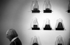
In the right shot her shoulder cuts one of the, errrr, objects. So (to my untrained eye) that makes for unclear lines. I think a shot from diagonally behind would have been better.
I like the left one, which implies one could walk past this piece of art (?) without it dramatically changing one's life.
The two as a diptych, swapped around, would imply much the same thing")
colin
I like the left one, which implies one could walk past this piece of art (?) without it dramatically changing one's life.
The two as a diptych, swapped around, would imply much the same thing
colin
WoolenMammoth
Well-known
hi chris-
enjoy both photos but think I would have preferred to see each without the woman, I dont think she adds a whole lot. My opinion isnt really worth two cents, but there you have it
enjoy both photos but think I would have preferred to see each without the woman, I dont think she adds a whole lot. My opinion isnt really worth two cents, but there you have it
J J Kapsberger
Well-known
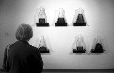
I find the second photo more interesting than the first. The 'story' is clearer to me. The presence of the woman is essential to this shot. I'm not at all bothered her shoulder blocking part of the object.
I feel that you should crop the bottom of the photo to lose the dark line running along that edge. Crop just above that dark area.
I like the way you've positioned her head evenly between the leftmost objects and the description on the wall. You've created a bit of symmetry which juxtaposes nicely with the asymmetrical wall display.
Last edited:
BillBingham2
Registered User
To me (my 2 cents worth), the second is the better of the two. I would have liked the woman to move a bit to the left and block the label and move away from the part she is blocking. I think this might balance it better.
Interesting lighting and subject, but I think you need to work it a bit more. Do some sketches and see if you can bring a model with you. No one says you can not have a bit more control over these things.
B2 (;->
Interesting lighting and subject, but I think you need to work it a bit more. Do some sketches and see if you can bring a model with you. No one says you can not have a bit more control over these things.
B2 (;->
Share: