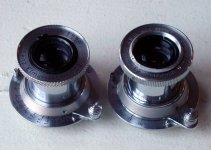
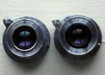
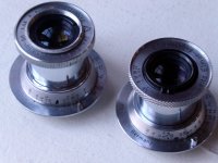
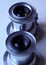
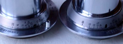
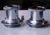
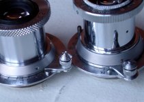
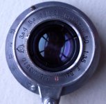
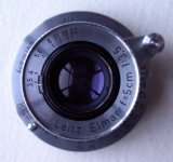
Here's the promised test results (Summicron vs. Summitar)
Firstly, the differences are such that I don't think they would show up on a computer monitor.
Secondly, the Summicron 'won' this little informal test, but I would be completely happy using the Summitar exclusively if I had to (for my type of photography: street, portaiture and travel). All of the photographs were 'good enough' for wall-display (if you like pictures of book-cases on your wall!) even the ones at full aperture.
I photographed a book-case of about 3ft x 5ft, containing about 250 books. The camera was loaded with HP5+ rated ISO 200 and placed about about 6ft away, on a sturdy tripod, using a cable release and barn-door lens-hood. I printed the photographs full-frame on 10 x 8 glossy RC multigrade at grade 2.5, using a Nikon lens stopped down two stops, the focus being checked with a Paterson focus-finder.
At f/2, both lenses produced slightly soft, lowish-contrast results. This was an attractive softness though (great for portraits) and the titles of books could still be read. White lettering had a sort of subtle 'glow' around it - if you'll excuse the term - and the Summitar exhibited this effect more than the Summicron. A non-photographer volunteer immediately picked out the Summicron photograph as sharper.
At f/4, the Summitar caught up with the Summicron - in fact the volunteer thought that the Summitar was sharper. However under a loupe, small lettering (such as the publisher's name in upper-case font 12 or 13) was readable from the Summicron, but less so from the Summitar. A strange phenomenon is that some books beyond the plane of focus were sharper on the Summitar, so perhaps the flatness of field is less on the Summitar? I declare the test at this aperture to be a draw.
At f/8, the Summicron was clearly ahead again. The image was sharp with lovely contrast. The Summitar had less contrast and some of the white lettering on book-titles was slightly smeared. The non-photographer volunteer picked the Summicron out as the winner without hesitation.
As a further test, I photographed the gothic splendour of Queen's University Belfast on a sunny day at half-way between f/8 and f/11. Both would look fine on the wall. The Summitar gave a more 'retro' look, but fine detail (such as the latticed windows) was clearer on the Summicron. The volunteer picked out the Summicron image as sharper (she felt that it was more 'embossed-looking') and a check with a loupe backed this judgement up.
So there we are.
Not a scientific test, but enough to convince me that my 1946 Summitar-M is nearly as good as my 1960's rigid Summicron. The Summicron is somehow more 'polite' though. It perhaps lacks the retro character of the Summitar, but is more consistent across the aperture-range. For general use, either lens is fine. For portraiture, the Summitar at f/2 is kinder. The Summicron has the advantage of easily-obtainable lens-hoods and filters and a marginally better performance in terms of perceived sharpness at all apertures (with the possible exception of f/4)
Cheers,
Seán.
PS If you really want to see some of the comparison photographs, I can scan the prints at work. Let me know if this would be helpful.