I don't often do colour...

FrankS

Registered User
Local time
6:24 PM
Joined
Aug 23, 2004
Messages
19,348
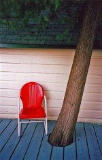
but sometimes that's the subject of the image, Blue Tile.

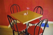
Here's a scan from a 4x6 supermarket print, taken with a Leica Minilux and supermarket 100asa film. (f2.4, 1/15sec) I may have added too much saturation, though the colours were warm and rich. What do you think? I'm open for criticism.
 

Attachments

  • zooma zooma (Small).jpg
    zooma zooma (Small).jpg
    44.3 KB · Views: 0
Last edited:
Frank,

The colors work very well with each other, it is a little warm but such is the character of indoor light with cheap film. That blue square makes the picture. Possibly a little less saturation. That minilux has a nice little lens doesn't it?

Thanks,
Gavin
 
How did you get the one tile to turn blue and the tiles to the left of the table to turn brown? You are holding information? Thank you.. good creative composition.
 
I like the various shapes and how they play together. I don't know the first thing about manipulating colors etc, but if you could get a little of the red out of the table top it would stand out a little more nicely and might even help the blue tile stand out more.
 
If you maintain this colour phase Frank I may have to get a poloroid tint in my contact lenses. :p

The new trendy Frank ... I like it! :)
 
Thanks for the suggestions. Here's a version with less saturation and less red. The random blue tile makes it for me too.
 

Attachments

  • zooma zooma (Small) (2).jpg
    zooma zooma (Small) (2).jpg
    41.8 KB · Views: 0
Looks good on my monitor-I tend to like warm colors, and the bit of edge oddity I see on part of the table and the flower fit the mood I get.

How does it look scanned from the film?
 
A very rich, bold use of color of the first version. Nothing shy about it. The blue tile makes the photo by providing a color relief. Like eating salty bacon with pancakes and syrup. I prefer the first one. Nothing exceeds like excess. :)
 
mwooten said:
A very rich, bold use of color of the first version. Nothing shy about it. The blue tile makes the photo by providing a color relief. Like eating salty bacon with pancakes and syrup. I prefer the first one. Nothing exceeds like excess. :)

Same here. The first has a look reminiscent of earlier color photography, say 40s or 50s. I'll vote for the first one. A very nice composition. The little bit of blue is a nice touch.
 
Here's another colour shot. Contax Tvs camera, scan from print again.
From northern Ontario cottage.
 

Attachments

  • red chair (Medium).jpg
    red chair (Medium).jpg
    47.1 KB · Views: 0
Last edited:
That first one is gorgeous Frank. Simple, playful as you could want- those loopy lines from the chairs balance the rigidity of the table just so, just as the blue tile does the jig in the wall. I don't mind the full on red- but then I'm an Agfa Ultra fella.

Can't get that second one to open.
 
Frank I like the first for the same reasons menchioned by the others. Plus I might add it looks like an William Eggleston print.;)
 
Of the two "Blue Tile", I prefer the more saturated version, Frank; I figure a scene likethat is about the colors more than anything else so the first works better for me. And the lone blue tile sets off the warm colors nicely.
I do, however, like the second photo rather better; the red chair contrasts well with the other muted colors. I can imagine a nice big print of that one would look very good, indeed!
Rob
 
I really like the second pix. I cropped it on my pc getting rid of that dark area above the chair. That looks best to my tired old eyes. Good pix.

Tom
 
I'd go for #1 as well.

There's some wierd yellowish noise-like stuff on the right side as well as the shadows, which is even more pronounced in #2. Is that suppose to be there?
 
Frank actually posting pictures? Didn't see that coming ... :p

If I may say something: The picture could be better if the blue tile is not obstructed by the back of the chair. A different angle maybe.
 
Back
Top Bottom