Critique #83 *Cafe / Pub / Club* 5 Participants

@vince - you are correct. we have 5 photos...i should have counted instead of just taking photobizzz's comment at face value. some very good submissions and now onto the critique.
 
Okay, I guess I'll try it first -- this is my first partcipation in a critique, so please forgive me if I'm a little rusty at this!

i) Lawrence's Shot: Nice sense of place here. I've been in bars like this, I have some idea of the people who hang out there too (though I could be wildly off here!), with the video gambling in the background, the Bud signs, Dale, etc. The light is great -- kinda seedy and just revealing enough to show you that this ain't no fern bar. Love the ductwork, the stacks of beer boxes, concrete (I'm assuming) floor -- they just have the bare minimum, don't they!

BTW, did you check the jukebox to see if they had 'Freebird'?

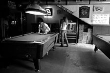
I like the way the fellow is racking up the balls -- he seems like he's doing it very carefully, making sure it's just 'so'. The woman is a nice touch, in a trashy sorta way.

If I could wish for anything in this shot, I would have loved to see a face, and probably hers looking at the guy or something. It almost seemed like you were afraid of getting caught taking the shot, hence shooting them when there wasn't the possibility of them seeing what you were doing. Getting closer is also a risk too, but hey, if they see you and you're just honest about what you're doing, they probably wouldn't care.

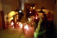
ii) Raid's Photo: Nice and interesting colour in this photo. Really gives that sense of a cosy friendly neighbourhood place at night. This place must be a bit more upscale than Lawrence's, 'cause they have that fancy pepper grinder and those carafes for all that wine they drink (no Bud here!). Plus, everything is in nice rows and in their proper place. Then you have some indication of people in the background -- as I say, a nice friendly place that I could see myself wanting to be in.

One of the issues I have with this shot (and it could be due to the shot being converted to a digital file and me viewing it on a screen) is that nothing appears in sharp focus, and as a result my eyes keep jumping around in the photo -- in other words, I want to grab onto something and I can't (mind you, that could say more about me than you). But, the fact that my eyes jump around allows me to create a story about this place (as described above), so that could be a good thing.

iii) Gabriel's Shot: Don't know what to say about this one. The lighting on the woman on the left is nice, but the whole shot appears to be blurry (here again, could be due to an analog shot converted to digital, then me looking at it on a computer screen, so forgive me if I'm wrong). Now blurry can be okay -- Lord knows I shoot enough of those -- but this blurry doesn't add anything to the shot, to me anyway. As well, the expressions on the faces of the two people are kind of non-moments, to me. If the woman on the left, for example, was expressing some kind of excitement or looked like she was screaming or some kind of emotion in reaction to what the woman on the right was saying, it would hold my attention more. But, she's just kinda listening and well, not a whole lot more. Here again, this could just be due to my personal biases, so I could be way off!

iv) Michael's Shot: Now this is a hip spot, judging by all the cool eyeglasses, ponytails, black shirts, etc. Sorta reminds me of those photos you see of the 'places to be' in Paris during the 1930's done by Kertesz or Brassai. Nice moment of the woman bending an ear to listen to the musician serenade her (holding her Gitannes just so!), and nobody but her. Here again however, I'm going to let my personal biases and tastes get in the way -- I want to see the two of them in sharp focus, and I don't want his head blown out on the side, 'cause that's where the action is. The guy behind the guitarist has more detail and sharpness and tonal detail, but the guitarist and the woman is where the main interaction in this photo is happening, and you're losing me with the side of his head blown out and them being blurry. Real nice sense of place though, and as you can see I'm able to construct a story out of this shot, and that's what it's all about, isn't it?

So, I hope that my ramblings have been somewhat helpful and constructive, as opposed to being unhelpful and destructive.
 
Last edited:
Vince: Your shot tells a story and I like its directness, its rawness There is an air of finality to the stubbing of the cigarette -- the break is over, now back to work. I do have a problem with the tone of the image -- for me there's too much blue/purple. I think it would benefit from gray-scaling.

Raid: I like the colours, the feeling of intimacy and the interesting lighting on the decanters. However I feel that the background is a bit too busy and distracts from these qualities. Maybe if the camera had been tilted down a bit it would have been improved.

Gabriel: An unusual and interesting photograph that implies more than it says. It has a dreamy quality that comes from the beautiful tones yet there is also something predatory about it -- the photographer on the prowl after dark. Sontag would have had a field day with this one! I will refrain from using the "b" word but the out of focus quality is nice and I wonder if it was taken with a Sonnar, J3 or similar? Hard to say how it could be improved without changing its essence.

Michael: As with Vince's shot, this "slice of life" gets me wondering about the circumstances. The guy with the ponytail appears to be playing an electric guitar while talking to a member of the audience. What's going on? I do have some technical issues with this shot. I suspect you were shooting at about 1/15th as there seems to be some camera shake and I think the contrast is a bit too great -- I'd like to see some detail in the faces of the protagonists and a bit more shadow detail.
 
Last edited:
It took me some time to view the images postet and write down my thoughts. Please don't feel offended if something sounds/reads funny or harsh. It sure was not intended to be that way. All pictures provided are very good, but I had a strange feeling looking at them. A cafe/club/pub is a place to meet people and have fun. So the pictures are not what I thought I would see. Great, that's what I like about rff! This forum provides some interesting new views. Thank you for that.
Vince
Very good composition and a very nice use of dof. Not much of a normal pub scene. To me it shows that it is possible to be lonely in a crowd of people, judging from how he uses his elbows to protect his space. The hands of a person working hard to earn his money and not using an ashtray but something available shows a kind of hands on approach. It makes me think about the scene and the (not shown) surrounding. Nice grain. What hardware did you use? I like it a lot... ...do you sell prints of this? ;)
Lawrence
Something was strange when I saw this picture. I didn't know what, but after some time I realised that the light in this picture is not what I am used to in a room with pool tables. Usually they are dark rooms with not much more than the tables visible providing some intimacy for the players. A good picture which captures the atmosphere of the scene and I like it. A little more interaction between the two and less light in the upper right corner would have made the shot even better, but I was not there and maybe there was not much of that interaction and , of course, you couldn't change the light. Again, nice grain and please comment on the hardware used.
Raid
Sorry, but I have a hard time with this one. Please, don't get me wrong. It is not that I do not like it, but I don't get the message. Maybe it's me wanting to see more than there is in the picture. Good focus on the foreground and a nice bokeh with people sitting and chatting in the background. Help me with this one, please.
Gabriel
Nice tonality. Good interaction between the two and a beautiful background. What I would like to see is more of the surrounding in which this happens. I want more of the cafe/club/pub to feel the atmosphere. Other than that a nice picture which makes me wonder what they are talking about and I would like to see their faces.
 
1.Vince

The image is very expressive to me. I like the geometry in the photo. I see an incomplete triangle being formed by the two arms. The cigarette pack and the ashtray with the many holding the stub make it more alive to me. I can nearly smell the cigarette smoke. I can read part of the cigarette label on the stub (Marlboro?). Was this your focus point? This image was well executed.


2. Lawrence

I feel similarly to what Vince wrote about this image. The part of the man leaning over to arrange the billiard balls is good. The details in the background [board, cases ... etc.) are very good too. If the woman had turned a little to the man, I may have worried less about the open space between the two billiard tables. Still, this image is a good one. The dirt spots in the middle of the page [on the floor] appear to my eyes like a "path", drawing them to the tight pair of pants. Was this done deliberately?


3. Gabriel

As you often do, you provide us with the unusual. I see the eye contact between the two women, and I see the "glow" in the middle. I start to wonder what type of place these people are at. Is there a stage of some sort infront of these two women? The multiple spotlights suggest this. Sharpness is not a major factor here since other factors play the stronger role in the image.

4. Michael

The man with the guitar and the woman beside him are for me the main characters in this image. The unsharp image on my monitor suggests the use of a very slow speed. I am unsure about the message in this image since it is full of people. The man with the tattoes on his upper arm and the cigarette in his mouth is also interesting. Maybe this is supposed to be a snapshot in time inside a music place.
 
Last edited:
He will be here soon.

Then we can explain to each other what in the world was on our mind when we took these photos!
 
raid said:
Bump

Bump

Bump


Maybe Gabriel sees this posting.
Ooops -- my bad :(

I have been having access issues at home and little spare time. I thought I had some time left given how we got started. :eek:

I promise I'll get back to this no later than this afternoon (U.S. Central time)
 
ferider said:
Gabriel, are you OK with my guest role ? Thanks.
But of course!

Ok, I am really sorry... I'm doing this right now, otherwise :rolleyes: my access is better at work, and that's not a compliment to my service this week.

OK...give me a few...
 
Vince Lupo said:
Here's mine...
I like the feel of this one: gritty subject, and "grain" to match. I would have preferred the pack of cigarrettes be closer to the diagonal running from top left to bottom right; and have moved a bit so that the jacket found at the bottom left corner were not in the frame.

But I know how difficult it is to get shots in a bar if you want to be discreet about it, and most of the time what you see is often gone by the time you're done framing, focusing, setting the aperture/speed, etc.

It does give you a feeling of being at a bar; working buddies? Or just working folk.

I'm attaching a "reframing" of the shot (I hope you don't mind) so you can see what I mean; it of course messes up the edges :(
 

Attachments

  • Vince Lupo_B.jpg
    Vince Lupo_B.jpg
    151.2 KB · Views: 0
lawrence said:
Here's mine...

Evidently taken with a...25mm? Something wide. I like the idea, yet I feel we need some eye-guidance. I slightly rotated and cropped your image (something I don't like to do myself, but sometimes you just have to) so that we get a better sense of balance between the left half and the right half of the frame.

Here's one of those scenes where a low-contrast lens would have helped so that you could get that sense of light flood, flooding the shadows from top right to bottom left. Unless, of course, you meant just this kind of contrast.

My eye has a lot, but not "too much" (that's a good thing) to look at. Busy and simple.
 

Attachments

  • lawrence_B.jpg
    lawrence_B.jpg
    166.4 KB · Views: 0
raid said:
Here is my image.
There are wine glasses and bottles, and people in the foreground: so the mood is set, yes, but what is this really? Is this a Café, a Pub, or a Club? Not quite sure. But the "gathering" revolving around "social drinking" (or "sharing") is there, without question.

I cropped (again, I don't like to crop post-shooting unless I really have to) to get a better sense of perspective, removing the ceiling and the . I would have liked to get rid of the pepper grinder, but at least I isolated it from the other bottles. I have also adjusted the red cast to get a better "smoother" feel to the ambiance, also to not let it pervade the whole image.

Evidently we're focusing on the glasses and bottles. So it's a party. But in a house, or a Pub or a Club? Hard to say. A social gathering, no question.
 

Attachments

  • raid_B.jpg
    raid_B.jpg
    64.7 KB · Views: 0
Back
Top Bottom