Full frame versus square: which is best?

paulfish4570

Veteran
Local time
2:39 PM
Joined
Jan 22, 2010
Messages
9,816
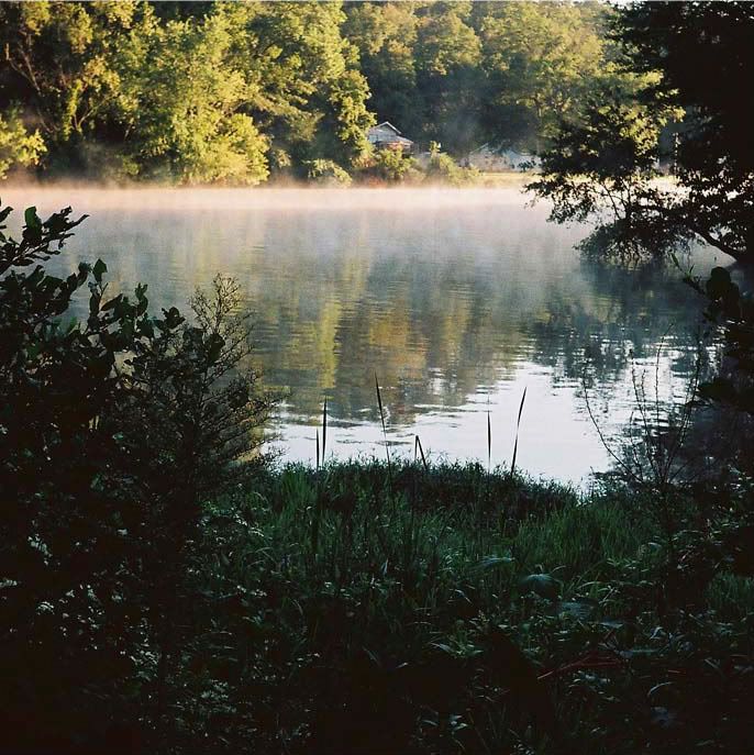
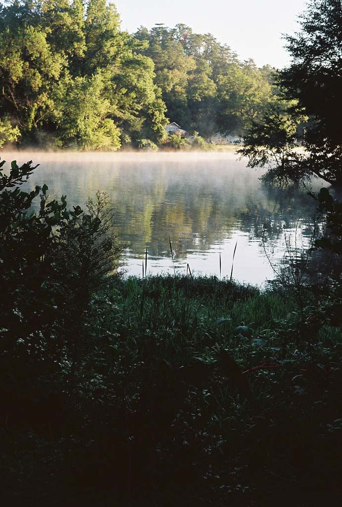
full frame version:
R1-14A.jpg


"2 1/4x2 1/4" version:
R1-14A-1-1.jpg


Hexanon 47/1.9, Konica S III, Kodak Gold 200, drugstore processing/scanning to CD, a little PP by me.
 
I bet a lot of folks are going to disagree with me, but I like the top one better. Even though there's not a lot of details in the shadows, I feel that the dark areas of the photos add atmosphere that the square shot is lacking. Just my humble opinion.
 
Well, I will, in fact, disagree with you hipsterdufus :)

I think that the bottom framing, almost a vignetting, by the darker vegitation gives sufficent atmosphere while in the portrait mode version, all it does is leave a cluttered space that activly detracts from the compostion above it.

That said, the square composition looses much more of its effect by the loss of the open sky at the top. The best part of the composition in the original portrait mode version is the balancing of the light and dark areas - the open bright sky giving way to the fog over the water giving way to the dark shaddowed recesses of the vegitation at the bottom of the image.

If I were composing this to print, I would probably loose about half of the bottom dark space while keeping the open space at the top. That would be a better take on the image to my eyes.

Hope this helps,

William
 
Good points from William. How about a 6x7 cropped image? It's seems to be the best from both worlds and it's a relatively standard-sized image.

4970498533_2cfd710c6b_b.jpg
 
To my eyes, this is not a good picture to try to improve by cropping or otherwise. The light on the background is not complimenting at all, the background is washed out and off-color. Also it is not focused and the sticking up dark reeds in front are not distinctive enough to be the only things in focus.

Sorry to burst the balloon. It is a nice first try and good that you asked. This means you are trying to be conscious of your pics - which is always a good start .... Try again, recompose, wait for a low humidity day (even with early dew fog) and ... good luck.
 
Well, uhligfd, the top part looks exactly as it did that morning, which I was trying to capture, and the color is dead on. As for less humidity? You ain't gonna get that in a river bottom.
Focusing at infinity would be worth a try. In this photo, I wanted to draw the eye to the sharper, more subtle vegetation in the foreground.

I like the 6x7 version.

And I appreciate ALL of y'all's comments ...
 
Nice 6x7 crop. It reminds me of my time in Georga - :eek: (of course, that was Ft. Benning in July so that memory is bit sweat drenched :D

uhligfd does have a good point on the point of focus. Perhaps trying a similar image with either infinity or hyperfocal distance for f16 might make it clearer what you're trying to do?

William
 
Different strokes and all that. The square is a lovely format, but composing for a square takes some thought. If you want a square picture, it's best to think in terms of a square from the beginning.
 
Absolutely, Dave.
Rectangle is one avenue of thought; the square another.
I posted the photos here to get some actual thought other than my own noodling. ;)

By the way, IIRC, I shot the pic at 1/125 @ f5.6. This was VERY early in the morning, and I need shutter speed to counter hand tremors. A re-shoot may call for a Yashica A and a tripod; gotta get some Ektar ...
 
Last edited:
Try 5x7 aspect ratio. One of the neat things I like in Lightroom is the ability to set an aspect ratio regardless of the original. I crop many of my imgaes to 5x7. Originals can be 35mm, 6x6, 6x7 or 4x5. 5x7 is nice. Different too.
 
Hello Paulfish, I like full format from your pictures, but I love square format but in these examples the square is not taken with composition for square format as Dave said. Nice shot Paul.
 
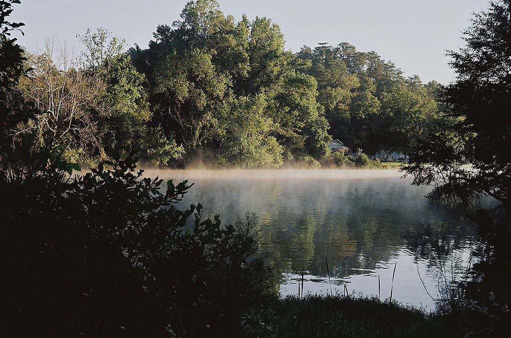
Here is a horizontal shot, with focus on infinity, shot immediatey after the vertical version on the same roll, with some PP by me. What say ye on this one?

R1-15A-1.jpg
 
I like that shiny-barked, naked tree on the left. All in all, I think I like the full-frame horizontal best.
Thanks again for everyone's opinion.
 
Back
Top Bottom