Kiyatkin
Established
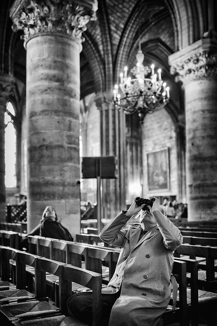
Which one is better, the full frame version A:

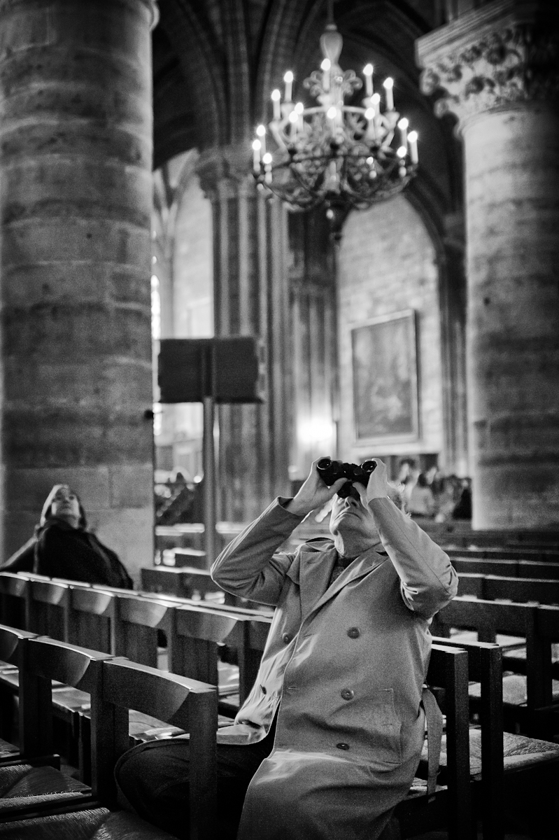
Or the cropped version B:
Or neither...
TIA,
Dmitry
PS: Sorry of this is a wring place to post this...
Or the cropped version B:
Or neither...
TIA,
Dmitry
PS: Sorry of this is a wring place to post this...