emraphoto -- At first glance this is a very powerful almost awe inspiring photograph. Dark and very moody. The composition adheres almost perfectly to the rule of thirds and is therefore pleasing. I must add that the white space on the sea horizon line bugs me -- it looks unnatural in this small image. The image quality of the sample that you uploaded appears to be low insofar as sharpness is concerned particularly in the water surface. This makes me wonder if it was a time exposure. Anyway there is an overall softness to the image that I'm not sure serves the image well. Perhaps this would be less of an issue with a much larger print. Remember this all first glance stuff. I'm not sure that the image holds well for long term viewing. It borders on cliche -- I mean all by itself it is all of the good things that I wrote above -- but this scene is something that we have seen before. Many times. So the question becomes: what makes this image stand out? Makes it unique? Makes it different from a nice picture vs. a work of art? Rhetorical questions, yes. But something to think about. To me it is a nice picture in many ways -- but not a masterpiece.
lZr -- Wow. This is a masterpiece. It renders poorly on my laptop screen for some reason but that's my problem not your photograph's. My only constructively (negative) comment is that the image is slightly out of balance to my eye. I think some of the area to the right of the larger tree could be lopped off making the aspect ratio that more of a traditional 11x14" or 16x20" rather than one of the digital sizes (ie. 13x19"). This one printed large I can see hung behind many a sofa in living rooms around the world. It is too sedate and pastoral for my personal taste but who cares what I think? It is a beautiful image and one you should be very proud of. Make some large prints and hit the art fair circuit and I think you could make a killing.
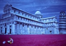
kmack -- I have to agree with lZr about the landscape-ability of your submission even when I know that he also questioned that about my own. I maintain that mine is more landscapy since it a wide shot while yours I think could more easily be categorized as an architectural photograph. That said, on with more constructive (I hope) commentary. Well, it is sharp... Beyond that I find it difficult to be very positive. The image is just very, very busy (over sharpened?). There is all of the detail in the stone walls of the building and this completely sucks my eyes in almost to the point that I do not notice anything else. The fence in the foreground is lost into this busy-ness which I think contributes to the unsatisfying one-dimensional aspect of the image -- that is to say there is little to no depth. For anything other than straight documentary purposes (ie., this is what this particular building looked like on this particular date), frankly, I find the image pretty boring. Sorry. I look at it and ask why submit this particular photograph for critique -- in a landscape category or otherwise? As a picture of a building it is okay but submitting a photograph for critique (at least in my book) implies that the photographer is going for something more lofty -- art maybe. This is not a work of art.
shiro_kuro -- Okay, this one is a real landscape... I can see that you understand and utilize the rule of thirds -- in this particular image it applies almost perfectly in the horizontal and vertical planes. I do think that you went a little heavy on the density and contrast sliders. It would be nice to see some detail in the shadows on the left center (between the water and the tree branches) and again in the upper right portion of the frame. The glow of the rock above the water in the center is nice. I suspect it looks much nicer in a high resolution image or in a decent sized print - so don't lose this. Subject-wise, while it is a nice image, it lacks any wow-factor for me. While lZr's, and to a (much) lesser extent emraphoto's, photographs grabbed my attention, yours just kind of sits there. Again, it's a okay, but it doesn't hold up to long term or repeated viewing -- that is to say that it lacks any visual element that makes it a truly memorable image.