Critique #62 *Landscape Theme* 5 Participants

@kmack.....Nice detail in the building ....The tree branches and the fence do well at keeping my attention on the building ... I think you should of got closer and or a different position to eliminate the sky and background building and just focused on this structure as your main subject by itself it is very interesting .....or perhaps distance to include more of the surrounding area .... I also find the the small branches of the bushes growing out of the fence distracting ...not sure if its because the stone detail and the fine detail of the branches sort of clash .....
 
@IZr... This image is Beautiful ..the softness with the greens and gold .... The slight blur in the outline of the tree suggest movement in an image that seems to be complete in the stillness of this landscape ...... was this taken with your Horizion S3 pro ?
 
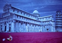
@AusDlk.....Such a surreal image ..the boy in the fore ground really adds to the dreamlike atmosphere ....There is so much space between the different elements in this photo ...... really lets you explore ..... The balance seems off to me which the boy seems to help balance out creating a tension..The right side of the image distracts me ... Does a different crop help ? Maybe it is the leaning tower in the background .....:) Look forward to hearing more about this image from you .
 

Attachments

  • Tower&Boy.jpg
    Tower&Boy.jpg
    446.8 KB · Views: 0
Last edited:
I removed the explanation to be inbetween the rules (minimum wording).
Camera: KM Maxxum 7. Sensia 100 slide film. Cheap KM lens 75-300 @300 f/11, 1/100.
I got to the place I knew in advance and put my camera on the car window frame. Shot from ~500 meters. I took 35 bracketed shots in 7 series. Every serie was compansated 5 frames +/- 1/3 (1 at 0, 2 for + and 2 for - comp). Same frame, but with dif. light condition as the clouds moved relatively fast. I also changed the f stop for more or less speed up to 1/500.
The session took 15 minutes.
 
emraphoto -- At first glance this is a very powerful almost awe inspiring photograph. Dark and very moody. The composition adheres almost perfectly to the rule of thirds and is therefore pleasing. I must add that the white space on the sea horizon line bugs me -- it looks unnatural in this small image. The image quality of the sample that you uploaded appears to be low insofar as sharpness is concerned particularly in the water surface. This makes me wonder if it was a time exposure. Anyway there is an overall softness to the image that I'm not sure serves the image well. Perhaps this would be less of an issue with a much larger print. Remember this all first glance stuff. I'm not sure that the image holds well for long term viewing. It borders on cliche -- I mean all by itself it is all of the good things that I wrote above -- but this scene is something that we have seen before. Many times. So the question becomes: what makes this image stand out? Makes it unique? Makes it different from a nice picture vs. a work of art? Rhetorical questions, yes. But something to think about. To me it is a nice picture in many ways -- but not a masterpiece.

lZr -- Wow. This is a masterpiece. It renders poorly on my laptop screen for some reason but that's my problem not your photograph's. My only constructively (negative) comment is that the image is slightly out of balance to my eye. I think some of the area to the right of the larger tree could be lopped off making the aspect ratio that more of a traditional 11x14" or 16x20" rather than one of the digital sizes (ie. 13x19"). This one printed large I can see hung behind many a sofa in living rooms around the world. It is too sedate and pastoral for my personal taste but who cares what I think? It is a beautiful image and one you should be very proud of. Make some large prints and hit the art fair circuit and I think you could make a killing.

kmack -- I have to agree with lZr about the landscape-ability of your submission even when I know that he also questioned that about my own. I maintain that mine is more landscapy since it a wide shot while yours I think could more easily be categorized as an architectural photograph. That said, on with more constructive (I hope) commentary. Well, it is sharp... Beyond that I find it difficult to be very positive. The image is just very, very busy (over sharpened?). There is all of the detail in the stone walls of the building and this completely sucks my eyes in almost to the point that I do not notice anything else. The fence in the foreground is lost into this busy-ness which I think contributes to the unsatisfying one-dimensional aspect of the image -- that is to say there is little to no depth. For anything other than straight documentary purposes (ie., this is what this particular building looked like on this particular date), frankly, I find the image pretty boring. Sorry. I look at it and ask why submit this particular photograph for critique -- in a landscape category or otherwise? As a picture of a building it is okay but submitting a photograph for critique (at least in my book) implies that the photographer is going for something more lofty -- art maybe. This is not a work of art.

shiro_kuro -- Okay, this one is a real landscape... I can see that you understand and utilize the rule of thirds -- in this particular image it applies almost perfectly in the horizontal and vertical planes. I do think that you went a little heavy on the density and contrast sliders. It would be nice to see some detail in the shadows on the left center (between the water and the tree branches) and again in the upper right portion of the frame. The glow of the rock above the water in the center is nice. I suspect it looks much nicer in a high resolution image or in a decent sized print - so don't lose this. Subject-wise, while it is a nice image, it lacks any wow-factor for me. While lZr's, and to a (much) lesser extent emraphoto's, photographs grabbed my attention, yours just kind of sits there. Again, it's a okay, but it doesn't hold up to long term or repeated viewing -- that is to say that it lacks any visual element that makes it a truly memorable image.
 
Last edited:
>Look forward to hearing more about this image from you .

Once everyone has taken a crack at offering comments on all of the images, I will reveal my secrets! ;)
 
Sorry guys, I have been unable to be on line for a few days there.

I will be able to spend some time here tomorrow.

Again, I apologize for holding things up.
 
IZR:
The composition is well balanced. The colors are marvelous and rather unexpectedly muted. It is very pictorial and rather ethereal.

To nit pick a little:
The one false note in the composition is the more distant tree to the left. That blob of a tree distracts from the main focus provided by the larger tree.

Over all it has the feel of a water color and not a photograph.

lZr said:
I got to the place I knew in advance and put my camera on the car window frame. Shot from ~500 meters. I took 35 bracketed shots in 7 series. Every serie was compansated 5 frames +/- 1/3 (1 at 0, 2 for + and 2 for - comp). Same frame, but with dif. light condition as the clouds moved relatively fast. I also changed the f stop for more or less speed up to 1/500.
The session took 15 minutes.

Well captured and presented, thanks for sharing it.

Emraphoto:
Good job with a difficult exposure problem. The bright patch on the horizon does give a bit of focus to the photo. I would have liked to see greater definition in the clouds to really make this work. Overall the photo is a little soft for the subject for my taste.

Ausdlk:
Bold choice and interesting vision.

I'm not sure where you are going with here (not that that is a problem). The composition is a bit surrealist but the color choice and softness of the image imply a rather old fashioned pop sensibility (feels to me a bit of Warhol or Lichtenstein's 'Cathedral 4' minus the ben-day dots). This could work well as an enlargement greater than 14x11 but I suspect it is a little too soft to be enlarged that big. (maybe not).

I've been to Pisa in the 1970's and my memories of the Piazza dei Miracoli are a little different. :)


shiro_kuro
Simple elegant composition with a good focus element. I think it would have more impact if there where a little less contrast and a greater tonal range.
 
AusDLK said:
kmack -- I have to agree with lZr about the landscape-ability of your submission even when I know that he also questioned that about my own. I maintain that mine is more landscapy since it a wide shot while yours I think could more easily be categorized as an architectural photograph..

I deliberately chose an an architectural subject as landscape. I do not think you can really separate the two. In urban areas architecture is the landscape.

No matter how lame, that is my explanation.:)

The negative is a 4x5 almost full frame from a Crown Graphic, hand held 1/50 sec f22. Schneider 135mm lens.

No sharpening.

And your right, it really does not work, I was looking for other eyes to help me identify why.

Thanks.
 
Thanks to all for their comments.

My photograph may not be what you expected.

It was taken with a Leica M7 with a pinhole body cap (hence the softness) and exposed through an orange filter onto Kodak Infrared Ektachome (hence the surreal colors).

So perhaps a new photo category: color infrared pinhole.

Colors are as recorded in camera. No Photoshop alteration.

I have a show coming up where I will be printing this one and others large (probably 19x13) and putting them on display.
 
AusDLK said:
Thanks to all for their comments.

My photograph may not be what you expected.

It was taken with a Leica M7 with a pinhole body cap (hence the softness) and exposed through an orange filter onto Kodak Infrared Ektachome (hence the surreal colors).

So perhaps a new photo category: color infrared pinhole.

Colors are as recorded in camera. No Photoshop alteration.

I have a show coming up where I will be printing this one and others large (probably 19x13) and putting them on display.

Very cool, hopefully the 19x13 will not be too soft to be viewed from a reasonable distance.
 
Thank you All for the comments.
Dave - Interesting setup for this shot. Big size can be marvelous to look at.
Forgot to say - I have the original landscape posted in my gallery. This one was PS filtered to gold
 
Back
Top Bottom