1st roll through my G-III...

squeaky_clean

Back to basics...
Local time
1:41 PM
Joined
Dec 16, 2005
Messages
144
Location
Big Sky Country
Again, thanks to G'man... this thing is a joy to use.

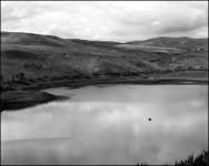
Here is a few snaps from a roll of Kodak 400 CN I put through it. Between the film and the scans, they look a little grainy... But? A couple that I thought were interesting. Not impressed with the film at all, but then, I didn't really expect to be.

Now I've got a roll of Fuji NPS in it... I'm curious how those will turn out.
 
Your 2nd pic of the art sculpture is interesting. My photo professor at school cautioned us against using the CN Kodak film, which she says is low in contrast. I tried a roll a few years ago and thought it looked a little bland. Post some pics of the NPS later.

Roy
 
I agree with the low contrast comment, from what I've seen... It came with some Neopan I bought from a user here, so I though I'd give it a try... The scans seem to reduce the contrast a little, too. Still trying to figure this scanning stuff out.

I will post some pics from the NPS when I finish the roll.
 
Chris, some nice snaps! You might try giving the chromogenic films a bit more exposure than indicated by the box speed. That is, treat them as 200 or 250 speed films, or bias your metering to give more emphasis on the shadow values. You'll find the grain will smooth out, and the darker areas/shadows will have better contrast and richness. Low contrast is characteristic, so machine prints from the lab will look dull unless the lighting and/or subject are contrasty. But consider this an advantage, as it captures a wider range of tones that way. You can always pump up the contrast as you see fit when editing your scans. 🙂
 
Yeah, actually, most of them do look a lot better with a little more contrast. I'm always reluctant to edit the stuff too much. Don't know why. I guess I just like to know that what's there is what I put there, not the computer... But here's what they look like with a little more contrast...
 
you can eliminate the purplish effect by scanning in b+w vs just scanning in color. Still doesn't change the true color and tone of the film though.
 
I like the POTS one. I don't much care for 400CN -- too flat. The only reason that I can think of for using it is ease/cost of developing and printing if you're not doing it yourself. Looking forward to the NPS shots!
 
So, I just got through with the roll of NPS, and I have to say I am dissapointed. This is the actually the second roll I've shot, (the other in my EOS) and I just don't care for it. The color is kinda flat, in my opinion. It does well with skin tones, but other than that I don't think it is all that great. I can't posy any shots just yet, as I'm away from home and so I don't have my scanner.
 
Howdy Chris !

I also have a GIII that the Greyhoundman worked on. It is like "BUTTAH" A very fine camera indeed ! As far as C41 process film goes, I really like the results from Ilford XP2 Black & White.
Very nice with the GIII. I have a few posted in my Gallery on this forum with it. For color, Fugi Reala is hard to beat! I hope you enjoy your Canonet, they are nice lil' shooters !

Cheers !
Charles
 
squeaky_clean said:
So, I just got through with the roll of NPS, and I have to say I am dissapointed. This is the actually the second roll I've shot, (the other in my EOS) and I just don't care for it. The color is kinda flat, in my opinion. It does well with skin tones, but other than that I don't think it is all that great.
Chris, I've had good results from NPS; I really like it. Below is a shot in non-contrasty light with NPS, yet it looks fine to me... I'll venture a guess that it's your lab's printing that is disappointing, rather than the film or camera.

Edit: Oh, and here's one from the Kodak 400CN film too, on a dull day...
 

Attachments

  • 041121-20big.jpg
    041121-20big.jpg
    154.5 KB · Views: 0
  • 040915-B11big.jpg
    040915-B11big.jpg
    152.9 KB · Views: 0
Last edited:
I have only shot 5 or so rolls of NPS, when I first got my Yashica TRL, and noticed it has lower saturation. Since I usually shoot landscapes with color, I stuck with the higher saturation films. I would guess for portraits it would work well.

Roy
 
Dang, those reds pop! I thought NPS was for pleasing skin tones too, but maybe i need to rethink it and keep my eye out for some on sale. Nice shot, doug. Hope it wasn't your ride.

Roy
 
Back
Top Bottom