I think what we're demonstrating by this (and it's a useful demonstration) is that the idea of "simulating 3D" means different things to different people.
-- For some it (at least partially) means a strong sense of texture, which can be produced by contrasty lighting and correct exposure. The original image in the thread had strong textures in the tile background, and this helped enhance its sense of dimensionality.
-- For some it means a strong separation between a foreground subject and its background, and there are several ways to achieve this:
lighting, such as in the original picture, in which the backlighting creates a rim-light effect;
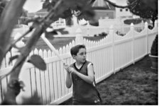
color, such as the young lady's red clothing, which helps her "pop" off the relatively drab background;
differential focus, again demonstrated by the young lady in red; and
pattern contrast, such as the first picture's two organic shapes against the regular tiled background, and the organic shape of the young lady against the fairly regular patterns of the background buildings.
-- It also can mean a sense of depth created by perspective. My Kingslake treatise showed how correct management of the center of perspective can create an illusion of depth by simulating the perspective that you would see if viewing the original scene. Another way perspective can suggest depth is again demonstrated by the first picture: the regular way that the tile pattern recedes into the background provides the brain with a "depth cue" that tells us we are viewing a scene that has three dimensions.
There may be other ways to analyze this as well. But I think we could safely say that if your goal is to create an image with a strong sense of three-dimensionality, you'd do well to create as many of these elements as possible:
-- Dramatic rendering of textures
-- Strong separation of main subject from background, via lighting, color, and/or differential focus
-- Either a natural or exaggeratedly-deep center of perspective, if you can control size and viewing distance; also, by including perspective elements that provide "depth cues" to the brain by clarifying the differing distances of foreground and background objects.
Incidentally, a terrific way to study many of these techniques in action (literally!) is to watch great old black-and-white movies. Their directors and cinematographers were masters at creating a sense of depth through texture, lighting, and perspective.
Another thing you can do is sort through your own photos, identify ones that seem to have a strong sense of depth, then analyze them to see what you did so you can re-create the effect when desired. All this discussion reminds me that very few of my own photos have much depth effect (I'm usually photographing a flat subject plane against a flat background plane) but it's really something I ought to work on. I did find an older studio photo I did (not with an RF, unfortunately, so I can't put it in my gallery) which I think does illustrate some of these 3D "cues"; let's analyze what some of them are...

Juliette had (and still has) a fabulous combination of feminine delicacy and muscularity, which I tried to bring out by lighting her for strong textures: a soft main light about 45 degrees away from the camera, and a hard backlight almost 180 degrees opposite the main light. (You can see the lighting directions from the shadows cast by her foot.) This setup produces a rim-light along her upper arm, torso, and raised thigh that helps separate them from the background. It also creates dramatic contours across her arms and torso that give them a sculptured quality.
Juliette (who is a visual artist as well as a dancer) helped with this by striking a pose in which her upper body is twisted at an angle to her hips; this gives different lighting across the upper and lower parts of her, creating more dynamic shading. I didn't know it at the time, but later learned that this type of pose is called
contrapposto and was heavily used by classical and Renaissance sculptors.
Normally you can't get a lot of foreground-vs-background effect when shooting against the bland surface of seamless paper, but in this case I tried a gimmick which I think worked pretty well (and which I probably should have continued developing): I shot a "fan" of light onto the background so it had some tonal variation, creating an illusion of 3D surface. The gimmick consisted simply of a cardboard tube with a plastic Fresnel lens (cheap "page magnifier" you can buy in any drugstore) cut in a circle and taped over one end of the tube; I slipped the tube over the snout of a Minolta 360PX flash unit and played with the spacing and angle until I got a shape that was distinct but not too sharp-edged. Incidentally, the main and fill lights were low-end Novatrons, with the main firing through an umbrella, so no really high-dollar studio gear was involved!
I didn't get any other shots nearly this good that day, but in this one case everything came together to provide (I think) a shot in which a sense of three-dimensional depth and volume works together with the emotional content provided by the contrast between Juliette's serene face and the sense of coiled-spring tension in her upper body.
I guess I really ought to try to do more of that kind of thing...