a bit Blue about Blues.

Andy,
To my eye, your X-Pro1 sky is far closer to 'true' than the Canon's. The Canon sky seems WAY too purple, at least here on my monitor.

Do you calibrate your monitor? I use the Spyder calibration tool on mine, so I may be seeing something different that yours.
 
Jamie

I understand those comments but for one fact....
I was looking at the real sky when I make my comparison.
We did not have a cyan blue sky yesterday afternoon. We did have a slight reddish haze at time before thunderstorms arrived.
The xpro shot is miles from accurate and the canon one although not perfect... much more representative if what was photographed.

This may be a hopeless discussion without all things being equal.
 
This is very interesting. I have a Canon 6D and took some shots of a very dark, nearly black, purple agapanthus and it came out very blue looking (RAW, no filters). Shot it with the X Pro 1 and the color was much closer to reality. Still had to burn it a bit to get it to agree with what my eye saw but just a little.
 
I know the CFAs have different spectral responses, and camera makers play games with WB, but if none of the channels are actually blown out, I'm pretty sure you can map 11, 12, or 14 bits per channel of RAW data almost any way you want to 8 bits/channel of JPEG. That's just math. That's why people shoot RAW.

It's not an x-trans thing either. The Bayer sensor in the X-A1 renders almost identically. That's obviously the way Fuji wants its JPEGs to look. It looks like their films look (mostly).

Me, I don't like anyone's rendering but my own. Sony? Nuclear reds. Turn it down. Canon? Smarmy warmth. Nikon - blah, too neutral or too greenish, needs sharpening. Olympus? Those "Cheap Travel Brochure" blue skies? Gimmie a break.

Be the photographer. Take control. It's not that big of a deal.
 
This is your file with the aforementioned adjustments (+20 blue hue, +15ish blue luminance)

The Hue is the key to getting more magenta in the sky, and the boosting luminance brings back a little of the 'heaviness' of the blue in the original file.

_DSF6508-2_zpse0ece400.jpg
 
Thank you Gavin.
The edit I did was a plus 23 on Hue in Aperture. I did not up the luminance as much only a few taps.
So I guess it's as Max says. Simply the philosophy of Fuji in choosing how to visually render the light the sensor collects.
+20 is a big swing and has potential to ruin other areas of an image (not this image though).

:(
 
Well no, it's not the philosophy of Fuji, it's the properties of the filters as you're using Aperture. If it were the just philosophy there would be no problems with other colors when you jack the sky around 20. Digital is ****ed on the most basic level. "Be the photographer" sure sounds nice, but I don't buy build it yourself camera kits. If it can't cough up a blue sky, why use it? You'll probably get better results with Fuji's raw converter, though if it's still the same as I remember it's pretty much unusable, unfortunately. DPP however, is great.


:)
 
Color Harmony for Beginners

Color Harmony for Beginners

As a musician I am familiar with harmonics. Simply put, if a guitar string is plucked, at the strings full length that note of the instrument complete with overtones.

To find those tones one can pluck the string, and touch the string lightly at half the string length, a third, a quarter and so on. The strength of each overtone in combination results in the unique sound of the instrument.

BUT, an important thing to remember, is that even order harmonics add, and odd subtract. Quarters and halves add, thirds subtract.

This is how a pipe organ works, and how synths work as well.

Now, instead of talking subtractive color, which you all should know by now, we are talking harmonics. In color, reds, oranges and yellows are even ordered, greens an blues are odd.

White is the perfect balance of even and odd.

Now to find the truest, best balanced representation of the blue sky color of your photo, in spite of the limitations of your film or sensor, simply adjust the curves of red, green, and magenta until the sky shows a blue that literally vibrates with white. The rest of the photo's colors will also be at the best you can obtain in balance as far as hue.

HOWEVER, please remember that just as there are tone deaf people, there are many people who are tone blind. Also, getting skilled at this takes some practice.

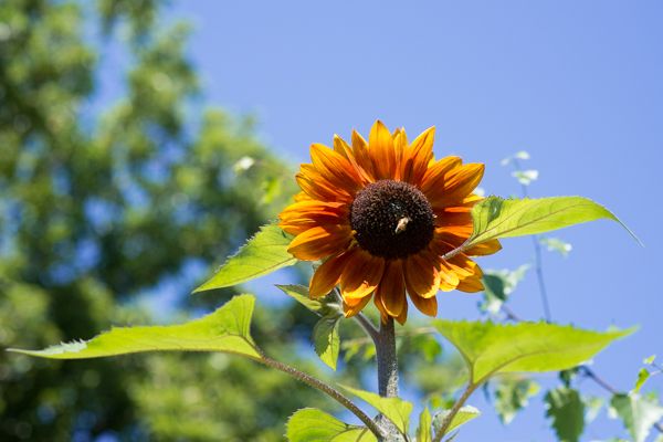
Look at the sky in this shot. It is perfectly in balance. The sky literally glows.

13332159064_ac6fe4dbe1_o.jpg
 
Back
Top Bottom