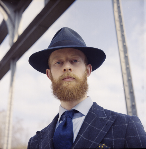
Am I the only one who thinks Portra film looks awful?

alot of steps where people can mess up.

buying fresh
storing cold
correct exposure
correct scanning
calibrated (high end) screen
correct colour editing post-scan

and of course then when posting online, you can never know what monitor people use when viewing images.

what monitor are you using, and when was the last time you calibrated it? and with what calibrator?

-
kind of conclusion is that there are alot of variables where things can go wrong.

i still shoot film exclusively 35mm and 4x5, and my preference is def. for portra 160, as well as 400, as wel for scanning and printing digitally, as well as wet printing
 
Ditto, I'm in love with portra and never had an issue with green casts...

I don't think it is a green cast, more of slight overemphasis of green where it exists. I see in in Noritsu Portra 400 scans from both you and NCPS.

Here is an example you scanned.
6048139895_c13de05164_b.jpg


Here is an example scanned by NCPS
5618647650_efaefdb07c_z.jpg


To my eye the intensity of the green channel is just a bit to high.

I like the Noritsu's colors a bit better with Fujicolor 160S and 400H.

The colors on Kodak films come out a bit better with Agfa scanners, but those scanners lack the resolution of the Noritsu.

©2012 Chris Grossman
 
I don't think it is a green cast, more of slight overemphasis of green where it exists. I see in in Noritsu Portra 400 scans from both you and NCPS.

To my eye the intensity of the green channel is just a bit to high.

I like the Noritsu's colors a bit better with Fujicolor 160S and 400H.

The colors on Kodak films come out a bit better with Agfa scanners, but those scanners lack the resolution of the Noritsu.

Glad to see you got your rolls back from us! (Assuming these were the shots that went to the wrong person, that is...)

In these images I can see the overemphasis you are talking about just barely, but in the linked images above there are definite green casts.

Like most of the others touting the goodness of Portra (particularly the 160!), I believe the OP's reaction correct in disgust of the color treatment on those images, but it has more to do with the photographer's treatment of the image and not the film itself. Even expired I don't think would cause what was displayed in those images, as I shoot all kinds of expired film and don't see shifts that noticeable in any of them. Given, there are some oddities in the expired film, but not consistent color casts like that. Bad monitor calibration and poor eyes for color temp. That's what I am chalking it up to.
 
Depends on who the photographer/scanner is. I love portra. It looks beautiful to me, but when my friend shoots with porta. It looks like... BLEH.
 
I have tried Portra recently and I must say, that a lot really depends on the scanning procedure, profiles, the monitor calibration , printer and what not. Without the proper equipment I find color work extremely difficult. Here is one of my last tries with Portra 400 and an old Flexaret III. I developed the film myself, so temperature control was also not quite accurate. So I think the main factors are really not so much the film, but mereley the skills, taste and equipment of the processor.

U27794I1334448850.SEQ.0.jpg


And I forgot, the monitor calibration and equipment on the recieving end of the internet are also playing a role. Color is difficult. Be it film or digital.
 
I use Reala for nature and Portra for architecture. I think they are both fine films and like BW appreciate their characteristics depending on the subject matter. I also like that Portra is available in 220 which helps feed my Bessa III. Just wish Reala was still available in 35mm.
 
I use Reala for nature and Portra for architecture. I think they are both fine films and like BW appreciate their characteristics depending on the subject matter. I also like that Portra is available in 220.

We just got some propacks of the 220 in 160 and 400 on a fluke order, I was really thinking about picking up a pack for myself...
 
I have tried Portra recently and I must say, that a lot really depends on the scanning procedure, profiles, the monitor calibration , printer and what not. Without the proper equipment I find color work extremely difficult. Here is one of my last tries with Portra 400 and an old Flexaret III. I developed the film myself, so temperature control was also not quite accurate. So I think the main factors are really not so much the film, but mereley the skills, taste and equipment of the processor.

U27794I1334448850.SEQ.0.jpg


And I forgot, the monitor calibration and equipment on the recieving end of the internet are also playing a role. Color is difficult. Be it film or digital.


Gho, that's a lovely picture

Mike
 
I shoot a lot of Portra. Don't forget it is color negative film. Back in the B.S. days (before scanning) you could take the same developed negatives to two different photo finishers and get completely different results...

The same goes with scanning.

Portra is one of the most forgiving and versatile films, period. You almost don't need to even meter, the latitude is HUGE.

Shoot some and get it scanned by a lab you are already familiar with, or scan it yourself and you will not see any green cast.
 
And I forgot, the monitor calibration and equipment on the recieving end of the internet are also playing a role.
Calibration could be off on the posting end too. Also the way you save the file has an effect. I would simply save a jpeg, upload it then post the photo on websites where I wanted to share. Often my photos looked different on the website than on my computer. I switched to "Save for web" and my photos looked the same on a website as they do on my PC.
 
You can't trust what you see on the web... too many variables between you and the actual image.

I've used Portra for many years and find it to be an excellent film. But then my tastes are very likely different that everyone elses. :)
 
My experience with Portra is that it is horrible straight out of the scanner and it needs work. If you get the work done properly it is one of the best films ever. Example of mine

6x6 Straight out of my (admittedly pretty basic) scanner:

scan-414samlpe.jpg


after colour/curves corrections in lightroom (and hair removals in ps :p )

scan-414small.jpg


unfortunately I dont have a step-by-step guide on how to correct it, you need to trust your eyes and keep playing with the tint/temperature sliders until it looks like... portra. Maybe I got it wrong I dont know, but at least I liked it.
 
BTW I'm currently looking at the results above on two different screens: my work laptop and my colour corrected Dell. Massive difference between the two.
 
Back
Top Bottom