asking for your critique

Jon Claremont said:
The text is not at the right angle, and it is very very dificult to get it right.

I suggest printing the text and taking it downtown with you, and a bit of blutak too...

Who needs Photoshop while we have blutack, eh? :)

Stewart's right, the text doesn't recede as it would if it were printed on the mailbox. It's OK at avatar size but not bigger.
 
back alley said:
i have photoshop 7 and do not know how to burn in with it, not as a stand alone tool.
i usually just adjust levels and sharpen a touch.

is burning possible with ps7?

joe

Select the area you want to burn or dodge and adjust curves in the selection to tweak the local contrast. I think you need to make your selection "soft" at the edge (the word feather rings a bell) to avoid hard transitions. I'd usually do it by waving my hands about over the paper.
 
back alley said:
if i recall correctly i focussed on the silver lock in the middle of the mailbox.

would you normally focus on the part closest to you?
i maybe should have tried different parts to focus on so i could compare.
thanks bj.
I think in the case of this photo, I would have focussed on the closest part of the object. You were obviously quite close, so d.o.f. is an issue; if I were to take the same picture, I would want to have the closest edges of the mailbox sharp, and either let the rest fall out of focus, or use a smaller aperture.

My 2c,
BJ
 
mark, how do i select that area?
i agree, some things were easier with a wet darkroom.

bj, it was likely shot at f2 or maybe f4 as i was trying for a bit of a test at wide open apertures.
 
Try the marquee tool or the magic wand, Joe. As there's a well defined edge there the marquee should do it. I think there may be a bit of RTFM in your future as we're stretching my PS skills a bit now :)
 
back alley said:
can you explain a bit more please?

thanks
joe


test.jpg
 
Sparrow said:


stewart, is that just from the angle the text is placed on the box or did the change in font have anything to do with it also?

i just want to take a moment a thank you guys for the extra effort and let you know that i truly appreciate it all.

also, i've been playing with it some too and changed the font colour to a grey, i think that helps also.
joe
 
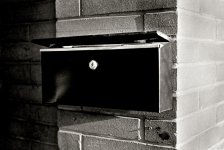
For what you had intended, Joe, as a study of lines, shadow and texture, I kind of like it. What I found distracting were the top of the mailbox in the bottom of the frame, the slanted vertical of the front edge of the brick wall, and the dof. It may be better to shoot it with a smaller aperture so you get the entire mailbox in focus.

I can't comment on the size, since on my screen it is just right. I have a wide screen, though, so YMMV.

I would differ with the others in that I am not so concerned with the bright right third - it doesn't help much to burn it since it just turns grey and flat. You may want to reshoot it with less exposure. What I would do with this shot is burn in the shadows, to accentuate the middle third of the frame, and create more depth. I hope you don't mind - I played around with it a bit.

Why is the mailbox open?
 

Attachments

  • mailbox2.jpg
    mailbox2.jpg
    257.6 KB · Views: 0
Last edited by a moderator:
interesting comments ray.
i had not thought about the left side at all, liking it the way it was. i have to study your version a bit more to properly evaluate. i actually like the right side brightness as it is kind of strong in a negative sort of way. and the sun was shining on it. i rated xp2 at 200.
why is it open? no idea, that's how i found it and i never thought to open it more or close it.

this has been a facinating excercise for me, enlightening as to how others see and interpret the same thing.

we should do this more often...thanks!!
joe
 
Back
Top Bottom