FA Limited
missing in action
this thread's not as much fun w/o photos!
which one do you like better?
quick and dirty
which one do you like better?

quick and dirty

Rayt
Nonplayer Character
My eyes are immediately drawn to that "red cross" on the left side and unless that was the subject matter of your shot then it distracts from the real subject matter whatever it is.
peterm1
Veteran
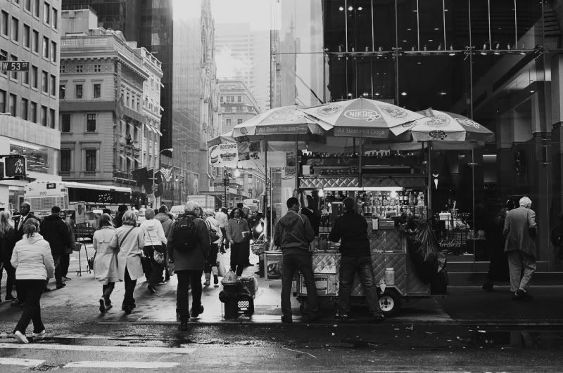
it's funny... I think most "friends" who see my photography much prefer my color photos. They tend to be bright, and a little more light hearted. Somehow... when I shoot black and while I conjure up a more reserved, somber... darker side. I often prefer the latter.
I was looking at some color pictures (HDR ones, in fact) on Flickr earlier this week and my initial reaction on seeing them was "wow they look great" but on looking at them for a while longer and then thinking about them, I came to the veiw that they were like candy floss ....no substance. Bright picture post-card photos that are superficially stimulating but like fast food - little depth or complexity to them. I much prefer the somber darker side of black and white as you put it. Some how to me black and white strips a photo to its bare essentials and les you experience it not as a representaion of reality so much as a beautiful object in its own right. A true piece of art, in short.
craygc
Well-known
this thread's not as much fun w/o photos!
which one do you like better?
The problem with doing a "which one" comparison is that the B&W is obviously not a B&W emulsion and regardless of the colour/B&W argument, a converted colour (slide/neg/digi) is very different from a traditional B&W emulsion.
...and I agree, the eye draw is towards the red cross
lawrence
Veteran
With the colour version my eye is drawn to the umbrellas above the fast food stand. With the mono version my eye is drawn to the pedestrians on the left and the man walking up the steps to the right. So, in a sense, they have become two different photographs and I prefer the mono version, however I think it would benefit from increased shadow detail (which is there in the colour version).
stefan_dinu
Established
I don't think the two pictures are relevant for the discution. There are some pictures that work in color, but it is not the case with the above example. To be true, I don't like the BW version either.
When using color, you have to pay more attention to the scene. the color has to add something, not to be a mess.
If you want a real test, take any well known color photography and strip the colors away to see what's left.
I give you a head start: here
When using color, you have to pay more attention to the scene. the color has to add something, not to be a mess.
If you want a real test, take any well known color photography and strip the colors away to see what's left.
I give you a head start: here
sirius
Well-known
... In B&W, I'm forced to work harder to look at form, and what's interesting in the photo aside from some nice colors...
Bnack, I think you explained a big reason in this statement you made. Black and white allows you to have less to worry about. It simplifies a picture and makes it immediately more abstract and formal. It becomes less about how we actually see and more like a drawing.
I'll go out on a limb here and generalize to make a point...Good art is where form and content are both exceptional and complimentary. One spot of misplaced colour can draw attention and ruin an otherwise great photo. A great colour photo has to have good form, content, and colour! In fact, I feel that a great "colour" photo has to be primarily about the colour, like Eggelston's were. In other words, a successful colour photograph is one that would be ruined by making it black and white.
A final point for consideration, where do you want your photos to end up? I contend that it is very difficult to successfully blend colour photographs with black and white in a book or exhibition. They do not sit well together. A book that is entirely black and white (or visa versa) has a beautiful purity and consistency of vision.
Last edited:
FA Limited
missing in action
My eyes are immediately drawn to that "red cross" on the left side and unless that was the subject matter of your shot then it distracts from the real subject matter whatever it is.
i shouldn't have picked a photo with such a big distraction in it or maybe desaturated it. i forgot which store that was on Fifth that was.
The problem with doing a "which one" comparison is that the B&W is obviously not a B&W emulsion and regardless of the colour/B&W argument, a converted colour (slide/neg/digi) is very different from a traditional B&W emulsion.
hahaha pretend it's your favourite b&w film, it's supposed to be philosophical right
With the colour version my eye is drawn to the umbrellas above the fast food stand. With the mono version my eye is drawn to the pedestrians on the left and the man walking up the steps to the right. So, in a sense, they have become two different photographs and I prefer the mono version, however I think it would benefit from increased shadow detail (which is there in the colour version).
that's the same way i saw it. for me, the subject was the hot dog stand and so the color really brings it out. in b&w, i focus on the white jackets which to me wasn't as interesting.
I don't think the two pictures are relevant for the discution. There are some pictures that work in color, but it is not the case with the above example. To be true, I don't like the BW version either.
When using color, you have to pay more attention to the scene. the color has to add something, not to be a mess.
If you want a real test, take any well known color photography and strip the colors away to see what's left.
I give you a head start: here
i don't like the BW version either. i thought the colour one was interesting, i wanted to get the hot dog stand.thanks for the link, the photo is a bit abstract for me, but interesting looking up eggleston's work
Nh3
Well-known
Its all about the subject. What is the main defining characteristic of the subject, is it color or form? If its form b&w and if its color then color.
But the question (impossible to answer) is how do you conclude what "is" the defining characteristic of the subject?
ClaremontPhoto
Jon Claremont
how do you conclude what "is" the defining characteristic of the subject?
Bill Cilnton said more or less the same.
lawrence
Veteran
Monochrome colour
Monochrome colour
True. I sometimes prefer colour when the range of colour is very limited, as with this:
The same applies to Eggleston's famous red ceiling linked to above. What doesn't normally appeal to me are the bright, eye-candy colours that Martin Parr uses, for example.
Monochrome colour
But the question (impossible to answer) is how do you conclude what "is" the defining characteristic of the subject?
True. I sometimes prefer colour when the range of colour is very limited, as with this:

The same applies to Eggleston's famous red ceiling linked to above. What doesn't normally appeal to me are the bright, eye-candy colours that Martin Parr uses, for example.
katgut@earthlink.net
Established
In looking back at a couple of decades of both color and B&W published work, I would argue that color does not have the legs of B&W. Many of the color photos I see from years past, whether in wedding photos or books,
age poorly. Perhaps photos and book pages fade and the color balance changes. Perhaps our perception of what good color balance is has changed over the years. I find it likely that the photographers of the future may look back at the highly saturated colors of today and cringe.
An example: While I admired Galen Rowell's photography in the past, it is difficult to muster the same enthusiasm when looking at his work now--much of it simply looks dated.
However, my own perceptions of the work of my favorite B&W photographers--Elliot Erwitt, Henry Horenstein, David Plowden, Salgado, etc.--does not seem to change over time.
Share:
-
This site uses cookies to help personalise content, tailor your experience and to keep you logged in if you register.
By continuing to use this site, you are consenting to our use of cookies.