business card critique

ijohnnyz

shoot pictures not people
Local time
11:40 PM
Joined
Feb 1, 2006
Messages
124
Hello RFFer, I'm trying to design my own business card. What do you think of this one?

U4415I1400307881.SEQ.0.jpg


Although I'm not actually promoting a business, I think having some sort of ID may ease any confrontation I might encounter when street shooting.

As for the design, some friends felt the text on top look awkward, but I wanted my name and info where it might stick out when put in a wallet. I think the photo express my "candid/street photography" style but I also think it's not dynamic enough to be on a business card.

Anyone care to share their own business cards?
 
I think a business card is too small to put an image on. Get a quality font and keep it minimal.

I'd tend to agree with this sentiment. Unless somehow the photo is simple and the details very large. In that photo above, the details are very small (man against wall, people in background etc), and will be even tinier when put on a 2" x 3.5" business card.

Guess the other alternative would be to have business 'postcards' made instead (4" x 6"). Actually, I kinda like that idea -- then it becomes more of a keepsake, and you can put additional info on the back of it. Easy to keep half a dozen of them in a pocket of your camera bag.
 
I don't think anyone will go for your details with the card still in their wallet. I'd personally put the details either below the picture or on the back.

I disagree re detail in the photo. A business card is about the size of an iPhone 5 screen. That's enough to get some idea of the photo you are using. I'd keep it because nothing says photographer like a photo. And a card to give to resolve disputes should shriek photographer and professional. A larger than standard card doesn't say professional IMHO.
 
I got cards from Moo.com I picked out 50 of my favorite live music shots and one side is a photo of a band or performer the other is my info. I give people a choice of what card they want. It works great because it's like a little photo that people want to keep. Most people just chuck out business cards no matter how cool your graphic design is.

The key is to give people a gift that showcases your abilities and also gives them a reason to hang on the card.

I happened to run into a rapper that I had on one of my cards and it led to licensing quite a few photos for a documentary.

I know this is different for you because you're not a music photographer, but pick some shots that you think are exceptional and give people a choice of images to pick from. It will stick in their minds more than a boring card with just your name on it because it promotes interaction.

Here's an example of one of my more popular cards.

front:
front by _JDT0505, on Flickr

Back:
back by _JDT0505, on Flickr
 
I disagree re detail in the photo. A business card is about the size of an iPhone 5 screen. .

I just looked at his card above on my iPhone (filling the whole screen), and the details and his contact info look pretty tiny to me. But, if as you say he has the photo fill the whole front of the card and the contact details are on the back, that would be better and probably work fine.

Don't know about a 'non-standard' card being perceived as 'unprofessional' or not being perceived as professional. People have to stand out (particularly in a creative field), and having something that's not 'standard' is fine by me. I've gotten cards from people that are smaller than standard (1.5" x 3.5"), and they don't seem any less professional to me. And here again, Johnny has said he's not promoting a business.
 
The back of a card needs to be white nd blank, since it is often used to write specific information relevant to only the person it is written for. So a full sized image is out of the question for the back. That's a nice picture though.
 
The back of a card needs to be white nd blank, since it is often used to write specific information relevant to only the person it is written for. So a full sized image is out of the question for the back. That's a nice picture though.

True enough, but you could also look at that blank space as an opportunity to provide more information to the recipient of the card. That's of course assuming they bother to turn over the card!

Think this discussion is proving that there aren't any 'rules' nowadays :)
 
I just looked at his card above on my iPhone (filling the whole screen), and the details and his contact info look pretty tiny to me. But, if as you say he has the photo fill the whole front of the card and the contact details are on the back, that would be better and probably work fine.

Don't know about a 'non-standard' card being perceived as 'unprofessional' or not being perceived as professional. People have to stand out (particularly in a creative field), and having something that's not 'standard' is fine by me. I've gotten cards from people that are smaller than standard (1.5" x 3.5"), and they don't seem any less professional to me. And here again, Johnny has said he's not promoting a business.
Vince, I agree with everything you say. The suggestion had been made, though, to use 6x4 cards instead of business cards. I wouldn't do this unless I knew that I was doing it as a deliberate marketing strategy, perhaps to promote MF photography? For a card to give to someone asking "what are you doing taking that photo?" I really think as strong a message as possible that what they are seeing is a professional at work should be sent, not 'a creative at work.'

The medium is the message.
 
Totally agree, so maybe a 'standard' card might be the way to go. Guess I was just looking at it as a more interesting/more memorable marketing piece/calling card than strictly a standard business card (and more likely to be pinned on a bulletin board, taped on a fridge etc). And it's something he could mail out if he wanted. Personally I don't think it's necessarily any less 'professional', however.

As an aside, do you think that people look at the back of business cards? I've often wondered that, as I have info on the back of my card, and hope they bother to turn it over!
 
I think the secret to a "flip-able" business card is to put no info on the front. An abstract image or monogram on the front, and the particulars on the back.

I'm surprised someone hasn't linked to the business card discussion from American Psycho. :cool: In terms of business cards in films, I always remember the one George Clooney gives to Matt Damon in Oceans 11.
 
I went to a trade show once for the company I worked for before my disability. They were too cheap to get us business cards, so I made some myself. They were on colored stock, and 4x6". When we started handing them out, we got many different reactions. But most looked like they thought we were idiots.

Stick with the standard size.

PF
 
I think your proposed card looks great, better than most I encounter. Interesting image, nice layout and font. About the only comment I would make is that that the image is a little large and overwhelming, and includes a lot of static scenery around an interesting focus. Maybe crop it and increase the white space on the card.

But far be it for me to correct the design experts wisely advising you above.

Finally, why are you not trying to make a business out of it?

Randy
 
Good looking card. I like it. You may consider a foldable standard card. Your details on the front, your photo in the center, and a blank space on that back titled "Notes."
 
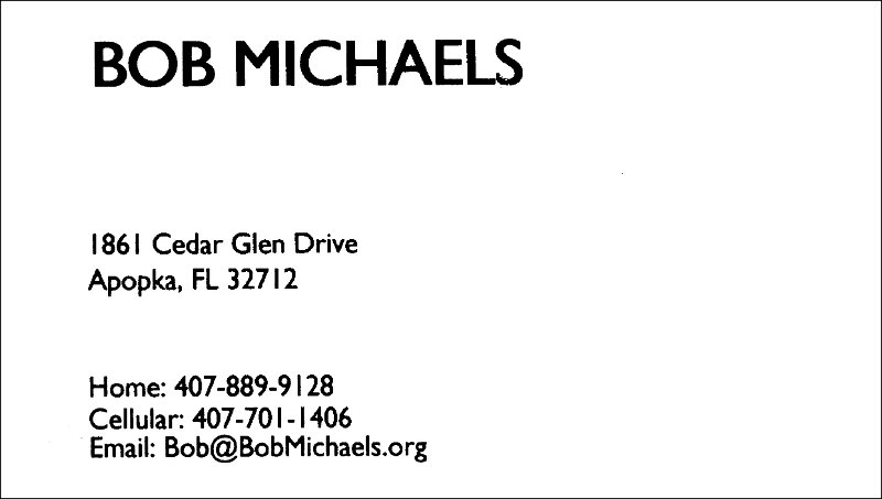
I suggest you compare your ideas with the actual business cards of some notable people. It is quite easy to find what the actual business cards for the likes of Steve Jobs, Warren Buffett, Donald Trump, Larry Page, Mark Zuckerberg. They all share one common trait: very simple, only contact info, clean and uncluttered with no photos nor anything fancy.
 
as simple, clean, and uncluttered as I can get. It does not say anything about photography by design. If I have not made enough of an impression for someone to remember me, the card is not going to help.

Bob%20Michaels%20business%20card001.jpg
 
Some fantastically bad and very opinionated advice here. You're a photographer, so of course you should use a photograph - unless you're so famous that people know you by name already or so wealthy you don't really need any work. I like the monochrome design and disagree entirely that you should use only one side (Who on earth made that rule?!!?). Not so sure about your choice of photograph, though. Try to find something more immediately striking. That one's pretty boring. And, seriously, if you don't even include a link to a portfolio website on your own card, please don't offer advice to anyone. You're unlikely to help them
 
ijohnnyz: OK, let me suggest your get some opinions on your business card from some graphic artists or advertising people instead of photographers (including me). This certainly is not our area of expertise and, as a group, we frequently fail to see the forest for the trees.
 
ijohnnyz: OK, let me suggest your get some opinions on your business card from some graphic artists or advertising people instead of photographers (including me). This certainly is not our area of expertise and, as a group, we frequently fail to see the forest for the trees.

Good advice. Allow me to step in. :D

None of these cards are great guys. Sorry but it has to be said.

OP:

Go to this site: http://us.moo.com

Take a look at their Luxe cards. Very nice and very affordable.

On the front of your card, in small type:

Name (biggest type but still small – 12pt?)
Photographer (smaller than name – 10pt)
[space
.
.
.
here]
Contact info (in-line, smallest type – 8pt)

On the back of the card put a full bleed of the photo. That's it.

If you're feel like it print small amounts with different photos.
 
Back
Top Bottom