You are using an out of date browser. It may not display this or other websites correctly.
You should upgrade or use an alternative browser.
You should upgrade or use an alternative browser.
Camera-Scan Challenge for Color-Neg, as Automatic as Possible
- Thread starter ColSebastianMoran
- Start date
- Latest activity Latest activity:
- Replies 349
- Views 55K
DrTebi
Slide Lover
DrTebi
Slide Lover
For anyone that would like to try their favorite conversion method, here a link to the negative of the Portra 160, shot with the 80A filter:
Portra-160-80a-filter_-0.tif (67.5 MB)
I have played around with negfix and negative2positive, getting more or less promising results. I will post more later... unless someone asks me to stop 🙂
Portra-160-80a-filter_-0.tif (67.5 MB)
I have played around with negfix and negative2positive, getting more or less promising results. I will post more later... unless someone asks me to stop 🙂
Ronald M
Veteran
I would use Nikon 850 with my ES2 modified if jpeg was acceptable. It is not almost never.
I use my D800E, 60 2.8 current and modified ES2. Luma Cube on low around 6” away. Killer results.
White bal on mask, bring into your editing program,, invert with curves, burn/dodge as required, and levels. You do not need anything fancy.
I use my D800E, 60 2.8 current and modified ES2. Luma Cube on low around 6” away. Killer results.
White bal on mask, bring into your editing program,, invert with curves, burn/dodge as required, and levels. You do not need anything fancy.
ColSebastianMoran
( IRL Richard Karash )
First, Ronald, thanks for commenting. Yes, a lesson from this long thread is there are lots of ways to deal with color negatives. For production I prefer ease and efficiency; but I also indulge myself to try fancy things.
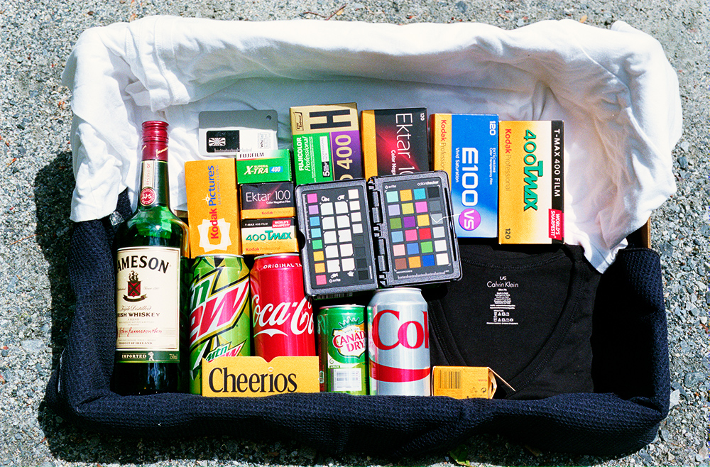
DrTebi, thanks for trying my negatives and reporting. I agree that your 80a shots and conversions provide a better starting point. For color reference, the t-shirts are quite clean white and black respectively. The pebbled towel a the bottom is very dark blue.
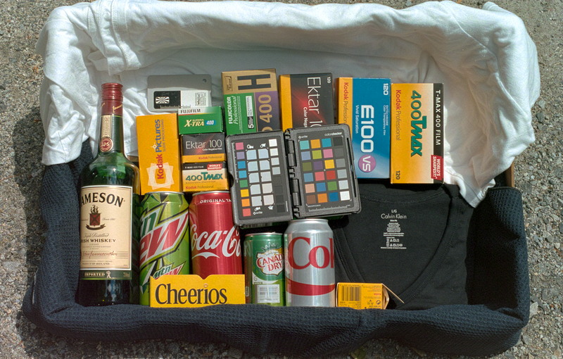
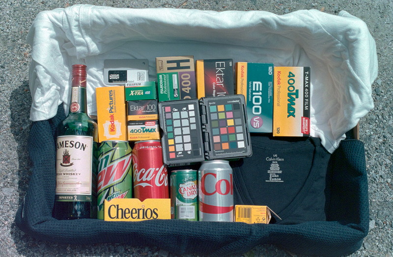
Typical problem areas with this shot are the E100 box, Kodak yellow going mushy or even greenish, and the Coke can going purple. Lots of opportunities for color casts in the white t-shirt.
What do you think? Your 80A shots could make good images?
See next posts for a different radical approach.
ColSebastianMoran
( IRL Richard Karash )
Tri-Chromic Narrow-Band Lighting for Cam-Scan
Tri-Chromic Narrow-Band Lighting for Cam-Scan
On another forum, people are experimenting with tri-chromic narrow-band illumination for camera-scanning of color negatives. Explanation: It's not continuous spectrum lighting (like sunlight, incandescent, or electronic flash, what we see as white is a combination of ALL visible wavelengths). Instead we are talking about pure red, pure green, and pure blue, nothing in between (with the right mix, we see it as white, our RGB monitors work this way).
How to get such light? A current iPad or iPhone is pretty good. Stage/theater lighting with R, G, and B LEDs (leave the white ones off). For $30 at Amazon, Sansi offers a pretty good RGB yard light. OK, let's try.
There are two approaches:
- One-shot, with all three light colors on.
- Three shots, one w/Red, one w/Green, one w/Blue light only.
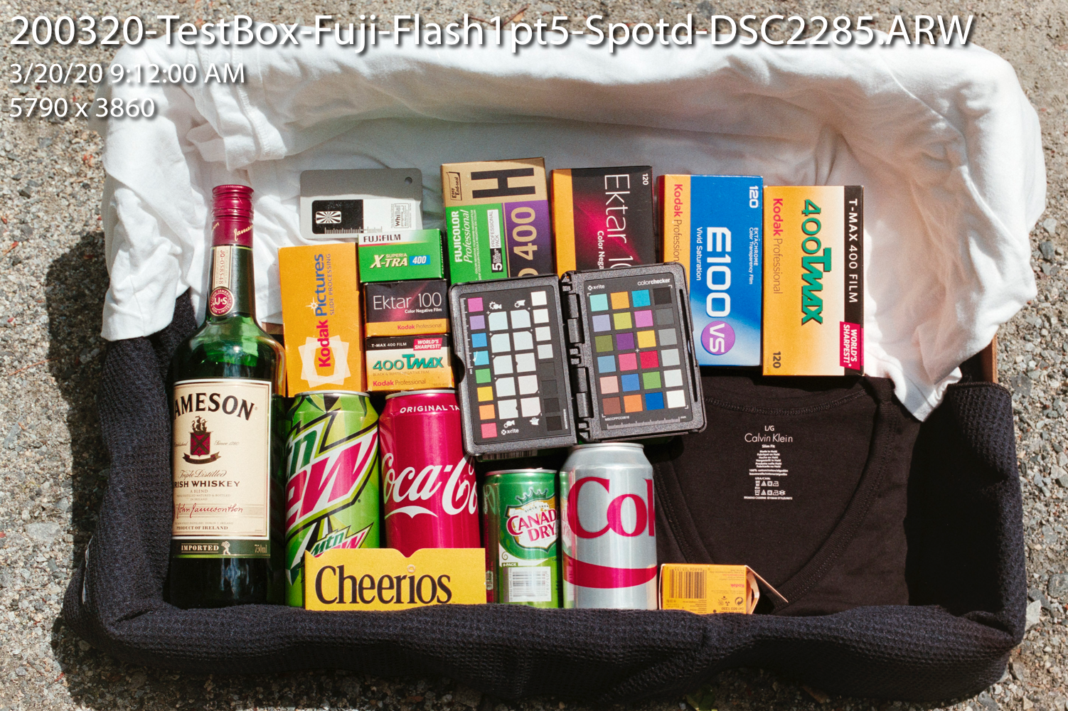
First, here's my current reference shot, Fuji 200 film, a new shot, full fall NE sun. Sony RAW cam-scan for ETTR at +1.5EV with electronic flash. Converted in LR with Negative Lab Pro. Settings: Frontier 3 Std Auto-Color Neutral.
This is pretty good. I would adjust the hues for Kodak yellow and Coke red, but I think this is a very workable scan. What will tri-chromic narrow-band lighting do with this negative?
One-Shot Narrow-Band
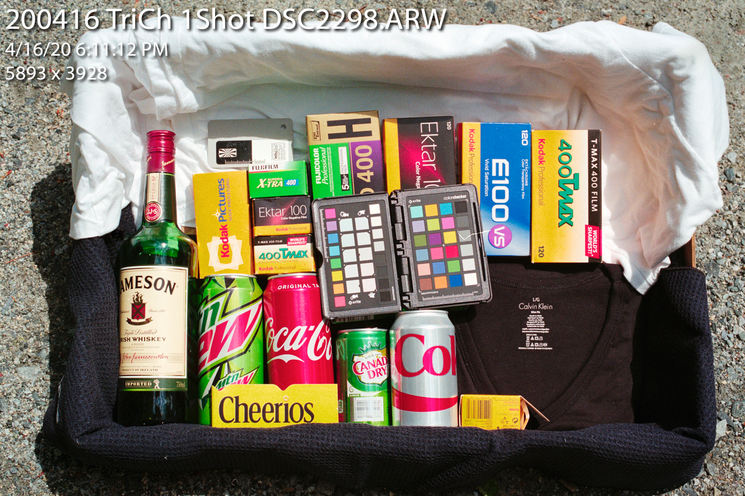
Same method. Sony RAW file, negative illuminated by an iPadPro with screen at max brightness, white light. I don't know whether camera engineers ever considered such lighting. Same processing as above.
Result is pretty good with these setting and no adjustments. Not as good as above. Kodak and Coke have drifted a bit further from desired, but all fixable. My conclusion: lights like these are fine for camera-scanning. Many people are using iPad, phone, or computer screen for backlight. Drawback is the ~2-3sec exposure. Here's the result:
Three-Shots, R G & B, Combined
This starts to get crazy. What to do with the three shots?
Some have built a "Frankenstein's Monster" image file by extracting one channel from each of the three images, then somehow processing that. I found mixed results from these, and was ready to abandon the whole thing.
Then an interesting suggestion:
- Run the raw files through MakeTiff, which I own, to de-mosaic and turn into linear tiff files
- Load these into layers in PS, aligning the layers
- Set the layer blend mode for all layers to "Lighten"; this produces a viable negative image.
- Levels layer to adjust histograms for all three channels, normalize each channel, full width, no clip. Leave middle slider at 1.00.
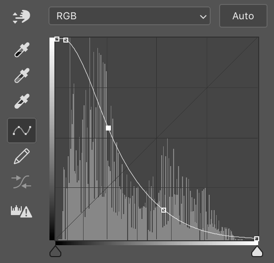
- Curves layer to invert with a big curve (I used a big bend in the curve, see below)
- Curves option-Auto, snap neutral midtones, for a basic auto correct.
Sounded crazy to me, but here's the result: Lots of good rich color here? Coke is good, E100 is good, Kodak yellow quite good. Gray stones and black t-shirt are better than either of the above conversions.
You can download the inversion curve, or make one that looks like this:
Some of my pals are using this method as their standard, creating automated tools to take the three shots, load and convert. The question is whether it's worth it. Does the three-shot capture give more color separate and better color? It was used in CoolScan scanners. Was that for quality? stablility of light source? or to make scanners less expensive? Anybody know?
Later I'll add links to the files in case anyone wants to try this.
Comments welcome
Tri-Chromic Narrow-Band Lighting for Cam-Scan
On another forum, people are experimenting with tri-chromic narrow-band illumination for camera-scanning of color negatives. Explanation: It's not continuous spectrum lighting (like sunlight, incandescent, or electronic flash, what we see as white is a combination of ALL visible wavelengths). Instead we are talking about pure red, pure green, and pure blue, nothing in between (with the right mix, we see it as white, our RGB monitors work this way).
How to get such light? A current iPad or iPhone is pretty good. Stage/theater lighting with R, G, and B LEDs (leave the white ones off). For $30 at Amazon, Sansi offers a pretty good RGB yard light. OK, let's try.
There are two approaches:
- One-shot, with all three light colors on.
- Three shots, one w/Red, one w/Green, one w/Blue light only.
First, here's my current reference shot, Fuji 200 film, a new shot, full fall NE sun. Sony RAW cam-scan for ETTR at +1.5EV with electronic flash. Converted in LR with Negative Lab Pro. Settings: Frontier 3 Std Auto-Color Neutral.
This is pretty good. I would adjust the hues for Kodak yellow and Coke red, but I think this is a very workable scan. What will tri-chromic narrow-band lighting do with this negative?

One-Shot Narrow-Band
Same method. Sony RAW file, negative illuminated by an iPadPro with screen at max brightness, white light. I don't know whether camera engineers ever considered such lighting. Same processing as above.
Result is pretty good with these setting and no adjustments. Not as good as above. Kodak and Coke have drifted a bit further from desired, but all fixable. My conclusion: lights like these are fine for camera-scanning. Many people are using iPad, phone, or computer screen for backlight. Drawback is the ~2-3sec exposure. Here's the result:

Three-Shots, R G & B, Combined
This starts to get crazy. What to do with the three shots?
Some have built a "Frankenstein's Monster" image file by extracting one channel from each of the three images, then somehow processing that. I found mixed results from these, and was ready to abandon the whole thing.
Then an interesting suggestion:
- Run the raw files through MakeTiff, which I own, to de-mosaic and turn into linear tiff files
- Load these into layers in PS, aligning the layers
- Set the layer blend mode for all layers to "Lighten"; this produces a viable negative image.
- Levels layer to adjust histograms for all three channels, normalize each channel, full width, no clip. Leave middle slider at 1.00.
- Curves layer to invert with a big curve (I used a big bend in the curve, see below)
- Curves option-Auto, snap neutral midtones, for a basic auto correct.
Sounded crazy to me, but here's the result: Lots of good rich color here? Coke is good, E100 is good, Kodak yellow quite good. Gray stones and black t-shirt are better than either of the above conversions.

You can download the inversion curve, or make one that looks like this:

Some of my pals are using this method as their standard, creating automated tools to take the three shots, load and convert. The question is whether it's worth it. Does the three-shot capture give more color separate and better color? It was used in CoolScan scanners. Was that for quality? stablility of light source? or to make scanners less expensive? Anybody know?
Later I'll add links to the files in case anyone wants to try this.
Comments welcome
Last edited:
ColSebastianMoran
( IRL Richard Karash )
As promised, here are links to the RAW files for the tri-chromic experiment above.
First, four Sony raw files. One-shot tri-chromic and then R, G, and B files. It will be obvious which is which.
http://2under.net/private/200416-TestBox-TriCh-RAW.zip
Second, in case you want to try to "blend lighten" approach and don't have MakeTIFF or any other way to de-mosaic and linearize, here is a complete set of files for the above, 550 MB:
http://2under.net/private/200416-TestBox-TriCh-RAW-wTIFF.zip
Enjoy!
ColSebastianMoran
( IRL Richard Karash )
I will continue to post new methods, tools, and examples as the come to my attention.
For those working in Photoshop, here is a nice tutorial by Alex Burke. He's using many bits of the PS methods described in previous posts, with two wrinkles:
1. He samples the film rebate and then subtracts that from the image data
2. He has a manual way that appears roughly equivalent to "Curves... Option-Auto... Dark/Light... Snap Neutral Midtones"
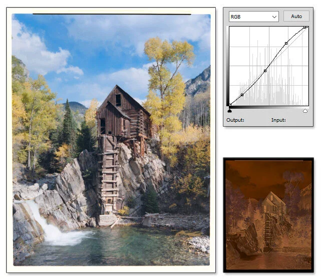
Alex Burke "Manual Inversion of Color Negative Film"
His example image:

teddy
Jose Morales
I know I'm very late in this post, but to get "tonality" like the Frontier colour - what I do is get an image to look as neutral as possible with the Temp & Tint sliders. Then - erhem, then I use "Split Toning" of a value of highlights hue: 350-10%, and shadows hue: 200-10% to get my TONALITY.
It will never be close to the Frontier, but it is the closest I've encountered. I may get praise for this or just get bagged - but I think this is interesting.
Kodak Portra 160. Image scanned with an Epson 4990, adjusted in Lightroom 5

It will never be close to the Frontier, but it is the closest I've encountered. I may get praise for this or just get bagged - but I think this is interesting.
Kodak Portra 160. Image scanned with an Epson 4990, adjusted in Lightroom 5

ColSebastianMoran
( IRL Richard Karash )
@teddy, that looks pretty good.
Color negative... What software inverted the image to a positive?
Thanks for the split toning suggestion.
Color negative... What software inverted the image to a positive?
Thanks for the split toning suggestion.
I know I'm very late in this post, but to get "tonality" like the Frontier colour - what I do is get an image to look as neutral as possible with the Temp & Tint sliders. Then - erhem, then I use "Split Toning" of a value of highlights hue: 350-10%, and shadows hue: 200-10% to get my TONALITY.
It will never be close to the Frontier, but it is the closest I've encountered. I may get praise for this or just get bagged - but I think this is interesting.
Kodak Portra 160. Image scanned with an Epson 4990, adjusted in Lightroom 5
teddy
Jose Morales
@teddy, that looks pretty good.
Color negative... What software inverted the image to a positive?
Thanks for the split toning suggestion.
Hi ColSebastianMoran,
... Can I just call you Richard? Nice to meet you.
So, what I use to scan is Vuescan. Either in Manual colour ouput (to get as tonaly neutral as possible), but you can also leave it on Auto to be honest.
Then, I import into Lightroom - get the Tint and Temp sliders adjusedt as neutral as possible. Finaly - Split Tone.
All other settings are up to what you like. This technique took me a long time to realise, under my nose all the time. I love the Fuji Frontier colour (Fuji SP3000) but you will NEVER achieve it at home. This is the closest I believe - and probably Negative Lab Pro, but I have never tried that yet.
Try it, it will leave you with pleasing tones - even in Black and White!
Black and White split toning hues are up to your preferences.
Mark C
Well-known
Hi ColSebastianMoran,
... Can I just call you Richard? Nice to meet you.
So, what I use to scan is Vuescan. Either in Manual colour ouput (to get as tonaly neutral as possible), but you can also leave it on Auto to be honest.
Then, I import into Lightroom - get the Tint and Temp sliders adjusedt as neutral as possible. Finaly - Split Tone.
All other settings are up to what you like. This technique took me a long time to realise, under my nose all the time. I love the Fuji Frontier colour (Fuji SP3000) but you will NEVER achieve it at home. This is the closest I believe - and probably Negative Lab Pro, but I have never tried that yet.
Try it, it will leave you with pleasing tones - even in Black and White!
Black and White split toning hues are up to your preferences.
Maybe you could post your raw file of this, or another shot you've processed, and see what someone can come up with in Negative Lab Pro. It would make for an interesting comparison.
teddy
Jose Morales
Maybe you could post your raw file of this, or another shot you've processed, and see what someone can come up with in Negative Lab Pro. It would make for an interesting comparison.
Sure - I will try and do this tomorrow.
teddy
Jose Morales
Ok, I just wanted to say firstly that there was an ommision and I apologise for that.
The ommision is that I Scan > Import > Apply VSCO Filters > Apply Tint & Temp Adjustments > Apply Split Toning (to get that Frontier look). I completely forgot about this step, but thinking about it, this step is not crusial to my aim in the colour response (although it may help to make it more sophisticated).
I apply VSCO filters to help me get as close as a film stock response as possible on top of a home scan, however I think the key to the Frontier look in my opinion is the Split Toning. The Frontier must have a secret sauce on the glass carrier, filtration, colour temp, light source, colour science on hardware/software etc - so this is what I do to emulate it.
My scan process essentialy is like this: Scan in Vuescan in AUTO, Import to Lightroom, Apply VSCO filter to the type of film, Apply Tint and Temp adjustments including Split Toning (Highlights Hue:350, 10%, Shadows Hue:200, 10%) ALL SAVED to a PRESET!
So essentialy my scan process is a 3 STEP PROCESS to achieve a rich tonal response from Colour Negatives.
Here are two scans with people and a landscape. You can steal them from here:

Group Portrait:https://www.flickr.com/photos/joseantoniomorales/49856504358/sizes/l/
Rolleiflex Xenotar 75/3.5, Kodak Portra 160, Vuescan on Auto color output, Epson 4990, no enhancements

Robe Beach Scene: https://www.flickr.com/photos/joseantoniomorales/49857343377/sizes/l/
Hasselblad 503cx, Zeiss Planar 80/2.8, Kodak Portra 160nc, Vuescan on Auto Color Output, Epson 4990 no enhancements
For this excercise, we use our prefered method whatever it is to get a close to film response, or Frontier or Noritsu if you like that colour.
If someone has Negative Lab Pro, do that please - that will be most interesting.
What I will do is side by side, provide a base scan - no corrections. A scan with WITHOUT Split Toning and a Scan WITH Split Toning. 3 Scans side by side.
Have fun!
The ommision is that I Scan > Import > Apply VSCO Filters > Apply Tint & Temp Adjustments > Apply Split Toning (to get that Frontier look). I completely forgot about this step, but thinking about it, this step is not crusial to my aim in the colour response (although it may help to make it more sophisticated).
I apply VSCO filters to help me get as close as a film stock response as possible on top of a home scan, however I think the key to the Frontier look in my opinion is the Split Toning. The Frontier must have a secret sauce on the glass carrier, filtration, colour temp, light source, colour science on hardware/software etc - so this is what I do to emulate it.
My scan process essentialy is like this: Scan in Vuescan in AUTO, Import to Lightroom, Apply VSCO filter to the type of film, Apply Tint and Temp adjustments including Split Toning (Highlights Hue:350, 10%, Shadows Hue:200, 10%) ALL SAVED to a PRESET!
So essentialy my scan process is a 3 STEP PROCESS to achieve a rich tonal response from Colour Negatives.
Here are two scans with people and a landscape. You can steal them from here:

Group Portrait:https://www.flickr.com/photos/joseantoniomorales/49856504358/sizes/l/
Rolleiflex Xenotar 75/3.5, Kodak Portra 160, Vuescan on Auto color output, Epson 4990, no enhancements

Robe Beach Scene: https://www.flickr.com/photos/joseantoniomorales/49857343377/sizes/l/
Hasselblad 503cx, Zeiss Planar 80/2.8, Kodak Portra 160nc, Vuescan on Auto Color Output, Epson 4990 no enhancements
For this excercise, we use our prefered method whatever it is to get a close to film response, or Frontier or Noritsu if you like that colour.
If someone has Negative Lab Pro, do that please - that will be most interesting.
What I will do is side by side, provide a base scan - no corrections. A scan with WITHOUT Split Toning and a Scan WITH Split Toning. 3 Scans side by side.
Have fun!
Mark C
Well-known
I guess I misunderstood. I thought these were camera scans.
teddy
Jose Morales
I guess I misunderstood. I thought these were camera scans.
Sorry Marc, actually it was me who misundestood the purpose of the this thread however I have also tried scanning with my Sony a7 lately and have applied the same process to my scans to emulate the film response.
I can tell you though that scans from my Sony are by far more neutral from the start compared to my scanner.
One thing I can emphasize though is that the most interesting aspect of my method is the Split Toning. You can still try that to get more tone from c41 scans. In the future, I will be doing more scans from my Sony a7 onto colour negatives and experiment with.
Mark C
Well-known
I just misread. I'm camera scanning with my Sony a57, then converting with VueScan. I thought your were doing something similar. I do also use my Epson scanner, but even the a57 is noticeably sharper.
silkyfeet
Established
Ok, I just wanted to say firstly that there was an ommision and I apologise for that.
The ommision is that I Scan > Import > Apply VSCO Filters > Apply Tint & Temp Adjustments > Apply Split Toning (to get that Frontier look). I completely forgot about this step, but thinking about it, this step is not crusial to my aim in the colour response (although it may help to make it more sophisticated).
I apply VSCO filters to help me get as close as a film stock response as possible on top of a home scan, however I think the key to the Frontier look in my opinion is the Split Toning. The Frontier must have a secret sauce on the glass carrier, filtration, colour temp, light source, colour science on hardware/software etc - so this is what I do to emulate it.
My scan process essentialy is like this: Scan in Vuescan in AUTO, Import to Lightroom, Apply VSCO filter to the type of film, Apply Tint and Temp adjustments including Split Toning (Highlights Hue:350, 10%, Shadows Hue:200, 10%) ALL SAVED to a PRESET!
So essentialy my scan process is a 3 STEP PROCESS to achieve a rich tonal response from Colour Negatives.
Here are two scans with people and a landscape. You can steal them from here:

Group Portrait:https://www.flickr.com/photos/joseantoniomorales/49856504358/sizes/l/
Rolleiflex Xenotar 75/3.5, Kodak Portra 160, Vuescan on Auto color output, Epson 4990, no enhancements

Robe Beach Scene: https://www.flickr.com/photos/joseantoniomorales/49857343377/sizes/l/
Hasselblad 503cx, Zeiss Planar 80/2.8, Kodak Portra 160nc, Vuescan on Auto Color Output, Epson 4990 no enhancements
For this excercise, we use our prefered method whatever it is to get a close to film response, or Frontier or Noritsu if you like that colour.
If someone has Negative Lab Pro, do that please - that will be most interesting.
What I will do is side by side, provide a base scan - no corrections. A scan with WITHOUT Split Toning and a Scan WITH Split Toning. 3 Scans side by side.
Have fun!
i scan with a v700 and have tried epson scan, silverfast and the trial version of vuescan. what annoys me is on the same roll in the same lighting i cant get consisant results. Your scans looks good i will give this a try with my free trial of vuescan. im in to mind whether to purchase it as i bought silverfast and was dissapointed. i would rather print lol
teddy
Jose Morales
i scan with a v700 and have tried epson scan, silverfast and the trial version of vuescan. what annoys me is on the same roll in the same lighting i cant get consisant results. Your scans looks good i will give this a try with my free trial of vuescan. im in to mind whether to purchase it as i bought silverfast and was dissapointed. i would rather print lol
Oh, yes - scanning is almost an art - or a past time made to feel better by calling it "an art". In my case, it has taken a long long time to figure out what best method is to scan and get the best results, but there are more important things in life as you know.
The key to eventually getting a good scan is: training your eye to subtle colour hues and tone, KNOWING what you want to achieve in comparison, experimentation and - I cannot stress this more: perserverance, pervere, and continue to try.
Next time you scan, try to achieve the most colour NEUTRAL setup. High resolution is not necessary. And on import, do the same whether its Photoshop, Lightroom, Gimp or what ever.
teddy
Jose Morales
I just misread. I'm camera scanning with my Sony a57, then converting with VueScan. I thought your were doing something similar. I do also use my Epson scanner, but even the a57 is noticeably sharper.
That's great Mark, I will to the same and post to this thread soon when the time allows.
Yes, with a camera - there's more resolution. However I think in this instance getting the colour right first is more important. Grain does also impact on the final output, but first things first.
I don't want to hijack this thread, but I will contribute to it when I can.
Similar threads
- Replies
- 1
- Views
- 119
- Replies
- 68
- Views
- 3K
- Replies
- 2
- Views
- 304
- Replies
- 7
- Views
- 2K

