raid
Dad Photographer
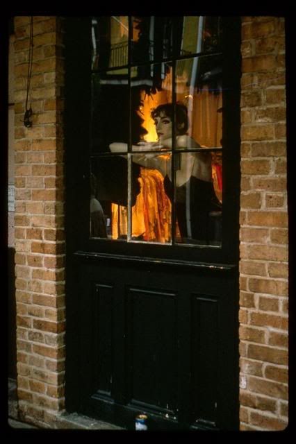
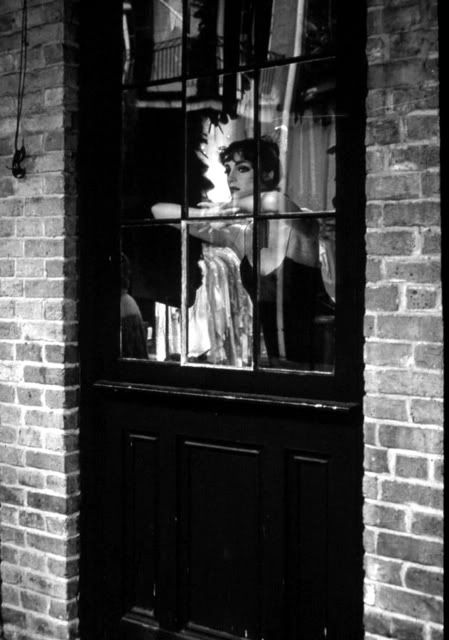
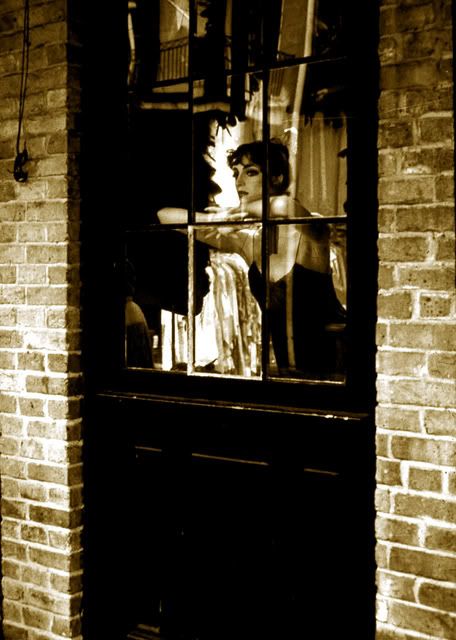
I have an image of a mannequin in the area around Bourbon Street (New Orleans). The original transparency shows some nice orange color through the window. The B&W version on the other hand, lets you better focus on the mannequin. Lastly, the PS colored B&W conversion is more vintage looking.
What do you think about such conversions in general? Is it "fake" and unacceptable, or is it just another way to get a different looking image?
I was walking around the block when I was starltled by "her look".
What do you think about such conversions in general? Is it "fake" and unacceptable, or is it just another way to get a different looking image?
I was walking around the block when I was starltled by "her look".
Last edited:
payasam
a.k.a. Mukul Dube
Perfectly acceptable, Raid; though I'd call the third picture toned, not coloured.
robert blu
quiet photographer
in my opinion the third image is very good and pleasant. For me it is important the final look of the image, if it is made by toning in tea a traditional wet darkroom picture or madie by PS elaboration it is not so important. What is important is to reach the desired effect, and the effect must have his own logic, nor just be a "special effect" to surprise people. In your case it works, the first image with the orange colours is a little confusing, the second is acceptable but the third transmit more emotion compared to the previous two. Well done. Just my idea.
robert
robert
raid
Dad Photographer
payasam said:Perfectly acceptable, Raid; though I'd call the third picture toned, not coloured.
Payasam,
Yes, you are right. It was toned.
raid
Dad Photographer
robert blu said:in my opinion the third image is very good and pleasant. For me it is important the final look of the image, if it is made by toning in tea a traditional wet darkroom picture or madie by PS elaboration it is not so important. What is important is to reach the desired effect, and the effect must have his own logic, nor just be a "special effect" to surprise people. In your case it works, the first image with the orange colours is a little confusing, the second is acceptable but the third transmit more emotion compared to the previous two. Well done. Just my idea.
robert
Robert,
I see your point. This is the first time that I have played with this image. I took it years ago during a photo project that I set for myself to do. The first photo is the way it really looked like.
julio1fer
Well-known
This is a great capture.
I believe it is perfectly right to choose if you want to render the image in B&W, toned, or in color. In this example I like best the third version and the original color slide. The third version, with its warm tones, is probably better suited to the vintage, intimate look of the subject.
Raid, I do B&W versions of my color shots all the time, and I try to learn what makes them work. Hopefully this exercise helps me to better "seeing" (photographically speaking) a subject.
trittium
Well-known
you could paint the color on a new layer then change the layer to color mode. This is the most complex one I have done. It kind of a technicolor feel.

Pablito
coco frío
I prefer the original color version. IMO, the monochrome version would improve a lot if you brought down the tonality of the brick wall surrounding the door That way, the viewer would be draw to the figure, not distracted by the bright and highly textured walls.
Attachments
raid
Dad Photographer
Pablito said:I prefer the original color version. IMO, the monochrome version would improve a lot if you brought down the tonality of the brick wall surrounding the door That way, the viewer would be draw to the figure, not distracted by the bright and highly textured walls.
Hi Pablito,
How would I go about bringing down the tonality of the brick walls? I am only doing very basic PS changes with me "PS Elements".
raid
Dad Photographer
trittium said:you could paint the color on a new layer then change the layer to color mode. This is the most complex one I have done. It kind of a technicolor feel.
Matt,
Your image looks like IR film. I like it, but it looks surreal. As for using layers, I would not know where to start.
raid
Dad Photographer
julio1fer said:This is a great capture.
I believe it is perfectly right to choose if you want to render the image in B&W, toned, or in color. In this example I like best the third version and the original color slide. The third version, with its warm tones, is probably better suited to the vintage, intimate look of the subject.
Raid, I do B&W versions of my color shots all the time, and I try to learn what makes them work. Hopefully this exercise helps me to better "seeing" (photographically speaking) a subject.
Julio,
Thanks. I have only recently started to convert a few ofmy color images to B&W. Sometimes it works well and sometimes it does not.
Pablito
coco frío
I may have gone a little too far, but there are many ways. Select the wall, then use curves or levels. Or, just use the burn tool, but you won't have as much control. BTW, I really like the muted tones of the color version and the orange color behind the manequin. It has a perverse sort of erotic quality, knowing it's a manequin. Much more evocative, IMO.
raid
Dad Photographer
Pablito,
I tried out your suggestion. Is this image "better"?
It's not completely done yet, but you get the picture.
The Image as initially posted here:
The image adjusted partially:

I tried out your suggestion. Is this image "better"?
It's not completely done yet, but you get the picture.
The Image as initially posted here:
The image adjusted partially:
Last edited:
Pablito
coco frío
Raid, check the thumbnail attached to my post #8. I tried it out for you! In your new version (post #13), I can see the ghost of the selection tool- gotta watch out for that. Also the figure is looking a bit washed out. Was better in your original monochrome version. Don't despair, it's a very strong image and worth the effort!
Pablito
coco frío
Not sure what you're doing Raid, but you're losing contrast in the figure....
payasam
a.k.a. Mukul Dube
I'd say it's probably an improvement. But the highlights of the lower part of the door are gone.
vrgard
Well-known
Just wanted to say thanks, Raid, for starting this thread and to everyone else for sharing their thoughts and suggestions. I like to convert from color to B&W and, based on reading the postings here, realize that I still have much to learn about how best to do it.
-Randy
-Randy
ferider
Veteran
I do it all the time. I use the FM PS plugin which is very easy
to use, plug filters in, add levels, etc. It's perfectly acceptable
IMO and makes life much easier, wrt dust removal, etc.
Roland.
to use, plug filters in, add levels, etc. It's perfectly acceptable
IMO and makes life much easier, wrt dust removal, etc.
Roland.
Last edited:
vrgard
Well-known
Roland, which FM plugin are you referring to? Is it BW Workflo Pro?
-Randy
-Randy
raid
Dad Photographer
I am in a learning mode right now, and I will not give up. I realized my error after I chose the central part of image and did some adjusting there. The mannequin looked not so contrasty afterwards. As I said before, it is an experimental trial. Thanks.
Share:
-
This site uses cookies to help personalise content, tailor your experience and to keep you logged in if you register.
By continuing to use this site, you are consenting to our use of cookies.