Carl Zeiss LTM Compared: new Lomo J3+, original J3, Zeiss Sonnar, Nokton 50

Carl Zeiss M39 lenses

bobby_novatron

Photon Collector
Local time
12:58 PM
Joined
Apr 13, 2010
Messages
1,239
Out of curiosity I did some comparison shots this morning using the new Lomo Jupiter-3+ and some vintage glass I own. Perhaps some people might find this useful.

Note: my testing parameters were quite relaxed. I really just wanted to compare the qualities of these lenses. The ambient light changed slightly during my test, so I apologize in advance for the small differences in lighting between photos.

CAMERA: Leica M 240
Settings: ISO (auto), WB (auto), in-camera JPEG @ 24MP, default colorspace / sharpening etc.

The camera was set on a tripod about 100cm from the grey card. Focus was on the star pattern on the card. LiveView was used to verify focus.

The test images below have been resized for convenience. No editing was done except for slight cropping and image resizing.

Jupiter-3 and Zeiss Opton Sonnar were mounted to the camera using an Amadeo Contax/Leica adapter.

LENSES:
(1) New LOMO Jupiter-3+ (2016)
(2) original Jupiter-3 (early 1960's)
(3) Zeiss Sonnar (post-WW II)
(4) Nokton ASPH (current model)


Why did I use these particular lenses?

Primarily because they were the ones that I had on-hand. Plus, they're all the same focal length and feature the same maximum aperture.

On to the photos!

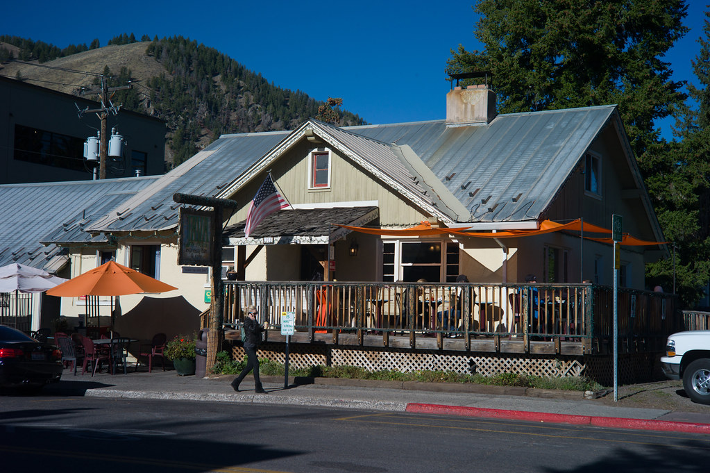
IMAGE #1: Lomography Jupiter-3+ @ F1.5

24973822202_44403c7385_o.jpg


IMAGE #2: original (early 1960's) Jupiter-3 @ F1.5

25065680976_732fcef859_o.jpg


IMAGE #3: Carl Zeiss Opton Sonnar (post-WW II) at F1.5

24973841972_13064c6e3c_o.jpg


IMAGE #4: Nokton 50/1.5 ASPH @ F1.5

24461316014_3dc89511f9_o.jpg


VERDICT:

1. As I suspected, the new J-3+ shows slightly higher contrast and sharpness than the original J-3.

2. The original J-3 has a cooler overall color profile than the other lenses. It seems to render the image very slightly towards the blue/green. At least that's what my copy seems to do.

3. The Nokton provides excellent contrast and sharpness even wide-open...superb performance from a modern lens design.

4. Setting up lens tests like this is a good way to waste a couple of hours.

5. None of these lenses is "poor". They all have their positive points. The original J-3 and Zeiss Opton have the "dreamiest" quality when shot wide-open, the modern J-3+ a bit less so.
 
Bobby, everybody loves to put something in the center of the frame and shoot it, with various backgrounds to show some bokeh.

But one key question is always: how are the edges? Is there much field curvature? That's easy to check by just adding something to one side at a similar distance, and also using a fabric or something with texture on "the floor" can really help.

Another very interesting comparison would be a storefront at f/4, from 8 meters or so, where I would love to see the J3 edges vs the double gauss nokton.

here is my own 1937 CZJ 501.5 around f/4 on the kolari modded sony:

DSC03369 by unoh7, on Flickr

and at f/8 on the M9, where it was stronger than I expected:


jena blue by unoh7, on Flickr

Less tedious for me is to just take both lenses on a photo walk and swap on the more interesting subjects. :)
Hence in the last one I swapped the 50 cron v4:


L1023008-2 by unoh7, on Flickr

There is also so much fixation on wide open shots, which are interesting of course, but f/4 and f/8 are bread and butter.
 
Thanks for the comparisons Bobby. I agree with your conclusions.

I have a few original J3s (some good some less so), the latest Nokton (which I think is superb) and the lovely Zeiss too. Since I bought the Smilax ASPH (used) I haven't used any of them as I love that one so much, but I think I would rather use the J3 classic for the softer look than the new J3 because if I wanted sharper I would go for one of the others
 
Surprise, surprise! The original J3 shot is my favorite. It has less contrast than the rest but seems to render so "naturally". The J3+ is somewhere in between...
 
All four lenses are good optically the Nokton is the best but it also has the least interesting look very modern, very clean, rather sterile. The J3+ and the opton are very close in out of focus Rendering, the J3+ has a cleaner look. The J3 is also less dreamy than the opton.
For me the J3+ is the best a compromise between the classic sonnar look a bit dreamy but cleaner look than the old opton. The J3 is a close second. My least fav is the Nokton. But that is a very personal opinion.
 
uhoh7 -- thanks for the suggestions. Yes, after I took these shots I realized there were many other factors that I could have tested for. Vignetting and distortion came to mind. I'll have to save those tests for another day -- hopefully soon! Unfortunately life seems to get in the way from letting me play with my cameras + lenses.

Additional notes:
1. The in-camera lens profile was manually chosen as the pre-asph Leica 50/1.4 ... how this affected the images I don't know. I wasn't sure which profile to choose, so I guessed.
2. The J-3 that I have is from 1962 or 1963, it wasn't made at KMZ. I think it's one of those lenses that they had already farmed out to another factory. I'll have to cross-reference the mystical Soviet manufacturing symbol on the lens face.
 
Additional notes:
1. The in-camera lens profile was manually chosen as the pre-asph Leica 50/1.4 ... how this affected the images I don't know. I wasn't sure which profile to choose, so I guessed.

Shoot them all w/o profiles. The profiles provides a lens correction.
 
My first impression was the J3+ seems to have the most distortion (background swirl). The more I look at them, the harder it is to be sure though.
 
My first impression was the J3+ seems to have the most distortion (background swirl). The more I look at them, the harder it is to be sure though.

I was actually surprised to see how similar the 3 Sonnar designs performed. The only odd one out is the Nokton due to its modern design. But that's not a bad thing -- I quite like how the Nokton renders. Horses for courses, as they say.
 
A couple more comparison photos.

Leica M 240, 24MP JPEG resized, no crop no editing.
No in-camera lens profile chosen.

Both images were shot at F2.

IMAGE #1: new Jupiter-3+

25065734171_fd0d63e347_o.jpg


IMAGE #2: original Jupiter-3 (1963 ZOMZ version)

24791292299_88c7cc24e3_o.jpg
 
Thanks for providing these images!

The J3+ looks much cooler than the original. But that could be from the camera's auto white balance setting. You need to set the same white balance for both.

Looking at all the results I've seen so far, I prefer my ZM Sonnar 1.5. Which is good, as it saves me money seeing I already own it! But if I was in the market, I definitely would consider the J3+

Thanks for your input -- the more informal "lens tests" that I perform, the more I realize there are many variables that need to be standardized. I had the camera WB set on AUTO, so yes, that could have been a factor. However I am noticing a difference between the colour rendering of the original J3 and the new J3+.

In some situations the original J3 seems to render the scene more naturally, but under artificial lighting the J3 is more blue / green -- the new J3+ seems to be more consistent under different types of lighting. But I'll need to do more photos to be sure.

IMHO I'm not noticing a huge difference in overall performance between the original J3 and the new J3+ ... in fact I would guess that to most people they wouldn't notice any difference at all, apart from slightly higher contrast in the new J3+ and a slightly different colour cast.

Do I regret getting the new J3+? No, not at all. It's a very nice product, and extremely well-made. In a tactile way it's much better than the original J3 -- the original J3 seems quite proletarian and basic compared to the new version. The new J3+ with its chrome-plated brass and smooth dampening is qualitatively better than the old version.
 
FWIW I also owned the Zeiss C-Sonnar 50/1.5, it was a very good lens as well. Extremely well made, I liked it a lot. But I ended up selling it to raise funds for other purchases.
 
Physical comparison: a couple photos of 3 like-minded lenses.

IMAGE #1: Although the two "classic" lenses (center + far right) are Contax mount, I thought a size comparison might be interesting. If I had a LTM Jupiter-3 I would use that for comparison, but I sold mine last year.

Anyway, the new J3+ is still relatively compact even when compared to the two Contax mount lenses.

LEFT: new J3+
CENTER: Carl Zeiss Opton Sonnar (post-WW II, not sure which year)
RIGHT: original J3 (1963)

25057069642_354c7c5b2d_o.jpg


IMAGE #2: I tried to angle the lenses to get a sample of each lens' coatings. The Zeiss is more blue / purple, and the original J3 is more blue / neutral, but the new J3+ appears to have a different coating formulation.

24879696510_5b118c7e03_o.jpg
 
FWIW I also owned the Zeiss C-Sonnar 50/1.5, it was a very good lens as well. Extremely well made, I liked it a lot. But I ended up selling it to raise funds for other purchases.

Mine isn't extremely well made! Got the wobbles, and a very dry focus ring.
Apparently Cosina also used the wrong grease for the helicoils when they made a batch of these.
For $1200..
Which is why this Jupiter is a great value at $650.
 
I would love to see example shots (especially wide open and around f5.6) of the current Zeiss C-Sonnar 50/1.5 lens vs. the new J3+ as well as some of the other lenses. Great stuff so far! Thanks everyone.

Dave (D&A)
 
Impressive tests!

I'm OK with original J-3 оnly and I would never paint on my FED-2 :)
 
Back
Top Bottom