
You are using an out of date browser. It may not display this or other websites correctly.
You should upgrade or use an alternative browser.
You should upgrade or use an alternative browser.
Critique #11 (5p,1i/p)
- Thread starter RayPA
- Start date
- Latest activity Latest activity:
- Replies 39
- Views 4K
remrf
AZRF
Once again I will make my comments on the photos in the order in which they appear in the thread.
Ducky: I apparently lack the sophistication to appreciate this photo. I don't "get it". If I look at the underlying form I can see strong compositional line and a very interesting balance of "objects" within the photo. But no clear subject. Even with the clue of the title I still don't get it. Nothing in the photo that appears on my screen is in sharp focus. You have your stated subject on the extreme left, a balancing figure (the young oriental man) on the extreme right. Which uneasily balances the hefty photographer in the center. Strong vertical lines introduced by the flag poles and a slashing horizontal line made by the guard rail and higher deck area in the rear of the photo. But the subject is almost buried in the photo and had you not stated the title I would not have known she was the subject. She is looking to the right but not at the balancing figure on the right who looks to be talking to someone hidden by the two guys in the center. Maybe this is a show stopper of a photo and one of the others in this thread (or you) can explain it to me. As it is it goes right over my head.
Dracotype: Very strong image. To my eye it has perfect balance which seems at first glance to be weighted too heavily to the right. But the longer one looks at the photo the more the viewer can appreciate why the subtle offset is a required facet of the image. The upward left curving arch of the tree tips the balance back to center yet leaves a subtle tension which I find appealing. Even the washed out color works for me in this effort though I would not mind seeing what a more highly saturated attempt would look like. All in all a strong photograph with great composition and you have a good eye imo for subject matter and placement.
Nomade: Another photo which I admit I don't get. As it appears on my screen it has a sepia type tint to it and the wishy-washy sharpness and limited contrast range of a polaroid (which I don't find appealing). Everything tilts to the right. Even the liquid in the brandy snifter indicates a level offset though not as great as the background. The development or exposure is such that there is no real contrast range and no real detail in the image.It's all blown out. I think this effort would have been much stronger had you achieved sharp focus on the window sill and left the background completely out of focus by the use of max aperture and high shutter speed. Again maybe you or one of the others in this thread can "splain" this photo to me as I don't see its merits.
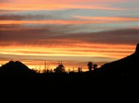
gabrielma: Beautiful late afternoon color with that wonderful prismatic "red shift" of light traveling through maximum atmosphere at near full horizontal.
I love this kind of light and congratulate you on catching it and your subject at just the right moment. Very rich color and great placement of the subject within the composition. It stands very well just as it is but to my eye the height to width is just a smidgeon off in the favor of height. I think it would be an even stronger composition with either a bit of the foreground below the subject cropped off or by adding a bit more width to the frame if the full image would allow it. But even if you said," The heck with you. I like it just the way it is", I would say this is the best photo in this group.
Ducky: I apparently lack the sophistication to appreciate this photo. I don't "get it". If I look at the underlying form I can see strong compositional line and a very interesting balance of "objects" within the photo. But no clear subject. Even with the clue of the title I still don't get it. Nothing in the photo that appears on my screen is in sharp focus. You have your stated subject on the extreme left, a balancing figure (the young oriental man) on the extreme right. Which uneasily balances the hefty photographer in the center. Strong vertical lines introduced by the flag poles and a slashing horizontal line made by the guard rail and higher deck area in the rear of the photo. But the subject is almost buried in the photo and had you not stated the title I would not have known she was the subject. She is looking to the right but not at the balancing figure on the right who looks to be talking to someone hidden by the two guys in the center. Maybe this is a show stopper of a photo and one of the others in this thread (or you) can explain it to me. As it is it goes right over my head.
Dracotype: Very strong image. To my eye it has perfect balance which seems at first glance to be weighted too heavily to the right. But the longer one looks at the photo the more the viewer can appreciate why the subtle offset is a required facet of the image. The upward left curving arch of the tree tips the balance back to center yet leaves a subtle tension which I find appealing. Even the washed out color works for me in this effort though I would not mind seeing what a more highly saturated attempt would look like. All in all a strong photograph with great composition and you have a good eye imo for subject matter and placement.
Nomade: Another photo which I admit I don't get. As it appears on my screen it has a sepia type tint to it and the wishy-washy sharpness and limited contrast range of a polaroid (which I don't find appealing). Everything tilts to the right. Even the liquid in the brandy snifter indicates a level offset though not as great as the background. The development or exposure is such that there is no real contrast range and no real detail in the image.It's all blown out. I think this effort would have been much stronger had you achieved sharp focus on the window sill and left the background completely out of focus by the use of max aperture and high shutter speed. Again maybe you or one of the others in this thread can "splain" this photo to me as I don't see its merits.
gabrielma: Beautiful late afternoon color with that wonderful prismatic "red shift" of light traveling through maximum atmosphere at near full horizontal.
I love this kind of light and congratulate you on catching it and your subject at just the right moment. Very rich color and great placement of the subject within the composition. It stands very well just as it is but to my eye the height to width is just a smidgeon off in the favor of height. I think it would be an even stronger composition with either a bit of the foreground below the subject cropped off or by adding a bit more width to the frame if the full image would allow it. But even if you said," The heck with you. I like it just the way it is", I would say this is the best photo in this group.
Last edited:
Dracotype
Hold still, you're moving
Photos reviewed in order of apperance. You know the drill...
Ducky: I am not sure how to start with this one. I think that unless I had read your title, I might not have understood the focal point of the photograph. Unfortunately all I see is confusion. The photographer in the center immediately draws my attention, and the woman in the white dress seems to be a secondary figure. The photo is nicely exposed, no technical errors that I can see. Is this a crop? I would like to see the uncropped if possible.
remrf: I am a sucker for gnarly cloud shots, so if I fail to be immensely critical, you know why 😀 . First, awesome colors. The fact that only black and red seem to be the main colors makes this an image which has a stron graphic quality about it. I would, however, say that the telephone poles and lines make for some distraction. I might framed the shot slightly lower, to include more of the foreground, but this is a two edged sword. The foreground is all black, not too interesting. The clouds are fantastic colours, but kind of taper off at the top. You probably optimized it as best you could. The other problem is that if you had framed it lower, you would have broken the Rule of Thirds. Not that it couldn't have been better that way. Awesome coulds!
nomade: Yes, definate contrast issues. Some parts almost look solarized. I can't think how. On to the photo. There is definately a sense of mystery on my part as to which is the subject here, the wine glass, or the street scene. I can't tell if the glass is in focus, but the street looks more in focus than the glass. I would prefer a much more limited DoF in this case. There is a fairly good symetry, with the immense black space and the wine glass balancing the street scene. But I would like a much more concentrated focus on the wine glass, if it is the subject.
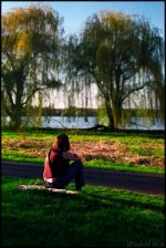
gabrielma: To start, well exposed. No blown highlights, etc. The focus on this shot is also well done. The DoF is very nicely done as well. I really like the isolation of the figure. With the figure turned away it also lends a "universal" air to the picture, almost postcard in feeling, in a good way 😀 . I would say, that as far as framing, I am not entirely sure about vertical. I realize that including all of the trees lends a balance to off set the foreground figure. I might have liked a closer horizontal shot. My constant mantra is always "Get closer!!!", but this doesn't always work. Perhaps a lower shot, or more a profile. I don't know. I think it is great as it is. A definate keeper.
Hope these comments were helpful.
Drew
Edit: I completely spaced and didn't see nomade's picture. Sorry about that. 🙄
Ducky: I am not sure how to start with this one. I think that unless I had read your title, I might not have understood the focal point of the photograph. Unfortunately all I see is confusion. The photographer in the center immediately draws my attention, and the woman in the white dress seems to be a secondary figure. The photo is nicely exposed, no technical errors that I can see. Is this a crop? I would like to see the uncropped if possible.
remrf: I am a sucker for gnarly cloud shots, so if I fail to be immensely critical, you know why 😀 . First, awesome colors. The fact that only black and red seem to be the main colors makes this an image which has a stron graphic quality about it. I would, however, say that the telephone poles and lines make for some distraction. I might framed the shot slightly lower, to include more of the foreground, but this is a two edged sword. The foreground is all black, not too interesting. The clouds are fantastic colours, but kind of taper off at the top. You probably optimized it as best you could. The other problem is that if you had framed it lower, you would have broken the Rule of Thirds. Not that it couldn't have been better that way. Awesome coulds!
nomade: Yes, definate contrast issues. Some parts almost look solarized. I can't think how. On to the photo. There is definately a sense of mystery on my part as to which is the subject here, the wine glass, or the street scene. I can't tell if the glass is in focus, but the street looks more in focus than the glass. I would prefer a much more limited DoF in this case. There is a fairly good symetry, with the immense black space and the wine glass balancing the street scene. But I would like a much more concentrated focus on the wine glass, if it is the subject.
gabrielma: To start, well exposed. No blown highlights, etc. The focus on this shot is also well done. The DoF is very nicely done as well. I really like the isolation of the figure. With the figure turned away it also lends a "universal" air to the picture, almost postcard in feeling, in a good way 😀 . I would say, that as far as framing, I am not entirely sure about vertical. I realize that including all of the trees lends a balance to off set the foreground figure. I might have liked a closer horizontal shot. My constant mantra is always "Get closer!!!", but this doesn't always work. Perhaps a lower shot, or more a profile. I don't know. I think it is great as it is. A definate keeper.
Hope these comments were helpful.
Drew
Edit: I completely spaced and didn't see nomade's picture. Sorry about that. 🙄
Last edited:
Ducky
Well-known
- Local time
- 3:14 AM
- Joined
- Jul 26, 2006
- Messages
- 1,287
As posted:
Remrf: A powerful image with a nice monotone effect I found appealing. After a few moments, however, I found my eye being pulled to the lower left section. The high soft clouds in the top half of the frame, along with the slopeing hill on the right could not hold my eye and I drifted to the tree and power lines in the lower left corner. Power lines are a fact of life and, along with the tree, dark against the bright area of sky, gave a nice effect. Overall, I'd say the upper half dominated and distracted too much for my eye.
Dracotype: A lovely, stark image with a very low horizon makes this a wonderful shot. I found it very satisfying as posted. We're supposed to say something constructive. Well, keep doing it.
Nomade: Nicely cockeyed and saturated. A surrealistic and impressionistic image that I found worth studying. The wine glass, along with the saturated contrasty buildings in the background, give this image a nice look. The dark bordering areas on the right and bottom allowed the viewer enough reality to know the rest was just a dream. To improve the "photographic" faults would ruin it for me.
Gabrielma: A nice image. The slightly out-of-focus willows provide a nice background for the sharp image of the girl. The vertical format was necessary but distracted from the image. A bit oversaturated coloring for my eye, what I call "fujifilm" green. Nice but maybe a better crop/frame would have helped.
Quite a variety of entries. . .and opinions.
nomade
Hobbyist
Ducky-
Ducky-
I'm sorry if i'm going to make a post for each photograph, just feels all in one posts are overcrowded...
Ok, first, it seems to me that the major subject of this photo is off the frame anyway, something that attracted the photographer there and the lady in white...
The picture name is "where", well maybe i can get that.
The only problem is, when you are looking at it, you just see the photgrapher, and since everything is in focus, you look and see other people and a secondary subject that is wearing white and attracts you, so i think i got you, it's just that there are easier obvious things...
Let's just say it's technically correct but lack some technical manipulation...
nomade
Hobbyist
remrf- Sunset
remrf- Sunset
I'm in love of the cloudy photos, There are different sources of attraction in this, well first, the reddy clouds, looking through and trying to figure the shapes and stuff, and down there, the dark sight of trees, following vertical and horizontal lines(tel/power cables??)
What i like about this photograph, isn't just the color, it's extraordinary, but it's because it looks so real not merely a scene in a photograph, normally sunset isn't only about the sun or skies, a specific scene, it's about everything, and it's here in that photograph, you can contemplate in a real sunset...Limited scene though, but you can't ask for more.
Not to mention the contrast too,
nomade
Hobbyist
Dracotype.
Dracotype.
Simple, the photo subject is long, filling the frame, and is kept the centre of attraction(you say it's centre weighed), its lines are a bit chaotic, it makes you look in various directions, it's like a dynamic stillness...The image is quite balanced imo, though by definition it's not, but that's how it gives its strong impact...
Well done.
nomade
Hobbyist
Gabriel ma
Gabriel ma
I sense a dreamy mood in that photo, a light sun, a lady sitting there and she's completely absorbed in her own thoughts, the dof suits me, because i know if i were in that lady's place that's how i'll see it...or maybe a bit more blurry
It works well for me, this lady captures my attention, i don't have problems with the vertical format.
remrf
AZRF
hey nomade, I just read your thread about the botched ( I mean totally screwed) processing of your film. I went back and looked at your photo again and tried to imagine what it would look like had the lab processed the B&W film correctly.
I like what your photo should have been a lot better than what the lab did to your image.
You really should look into developing your own B&W. It's not expensive to get into and takes no more than a kitchen or bathroom sink (or bathtub if you prefer).Nor is it hard to do. Search the net and you can pick up the chemicals easily. A Nikor stainless steel tank and reel can be had pretty cheap on ebay. Most chemicals come with explicit instructions on the bag or box and if you want I'll send you kodak pdf files on their B&W films which gives time and temp info.
My local Walgreens will scan my home developed B&W 35mm and make me a cd with the files for about $3.00. I can do as good a job (or better) at home than the pro lab I use when I'm lazy. So can you. Check out Critique # 4 and look at the portrait I posted there. I developed that at the kichen sink and had the pro lab do a scan because my scanner sucks on 120 B&W. It will do 120 color slides well but not B&W.
No one should have to put up with the kind of screw up your lab put you through. That's just wrong!
nomade
Hobbyist
I know, i've been looking for stuff online, comparing the prices, when i was in canada, life was easier with labs and processing, but here, kodak are controlling the chemicals prices in such a way that all the other labs gave it up...
Maybe i'll ask for some relative to buy me some stuff on their way to visit...
I'm dying for it, i lost more than 10 good photographs becaus eof their stupidity, and all they did was giving me an extra album, asseholes!!
I'm also looking for more control, i want to do everything by myself...for the experience of it, to sya the least, but now..!!!
Gabriel M.A.
My Red Dot Glows For You
Well, I have been spectacularly bad the past few days...don't know why I don't get notified. It's all my fault until I find the gnome(s) responsible 😱 🙁
Gabriel M.A.
My Red Dot Glows For You
I'm sorry Ducky, but somebody's taking a picture, and there are a lot of people around. I *really* want to find a positive aspect about the photo, but I just am unable. The only element fully shown is in the background, and that is the lady in the white dress. 🙁Ducky said:Canon A35F on Fujifilm 200-scanned
Gabriel M.A.
My Red Dot Glows For You
OK, who doesn't like the colors of a nice golden sunset? The clouds create a good separation in "thirds", and the palm trees and hill form an interesting sillouette. But, argh, those blasted cables; I wonder if next time, in a situation like this, overexposing about a stop or so would make the light "erase" the thin cables on the horizon?remrf said:My photo for this round. Sunset from my backyard.
Gabriel M.A.
My Red Dot Glows For You
I think the composition is very nice, the dominant sky in the background, taken over by the trunk, which you've placed off-center (very nice) about a third of the way from the right edge, and two thirds from the left, defers some attention to the rest of the landscape. It is gloomy, its elements unpretentious. Well done.Dracotype said:Taken in Colorado National Monument. Canon TLb and (outdated) Fuji Sensia 100.
Although the low contrast is, in my view, admirable (you can see that touch of pink and gold in the background, in the midst of this greyness) I think this would be an even stronger photograph if it were in B&W, where I know it would be difficult to keep that subtle difference in tones between the sky and the rock if you were to keep the low contrast. High contrast wouldn't be a crime, but I'm curious to see both high- and low contrast versions in B&W.
Very very good.
Gabriel M.A.
My Red Dot Glows For You
Ah, that roll...yes, the contrast is, em, interesting. I know it is certainly not your fault.nomade said:"A glass of wine", i beleive that there were something wrong with the developpment(only a guess)
I'm not sure what the cars down below have to do with the glass of wine; you have a visit? A party? Why is the glass on the sill (or is that just a wall)? I feel that, as I look at this, I need to balance myself. I think this is one where a very narrow depth-of-field would have come to the rescue, where the glass of wine is in focus, and we are drawn to it uniquely.
What did you have in mind here, when you shot this?
remrf
AZRF
gabrielma said:OK, who doesn't like the colors of a nice golden sunset? The clouds create a good separation in "thirds", and the palm trees and hill form an interesting sillouette. But, argh, those blasted cables; I wonder if next time, in a situation like this, overexposing about a stop or so would make the light "erase" the thin cables on the horizon?
As I was wandering through my images I found a couple shot from about the same point and with a similar look to the sky which did not have the urban intrusions in them. I haven't checked but I'll bet they were not from the same night. We tend to have lots of spectacular sunsets here in Az. So many that I only shoot about 1 in 20 when the clouds and light are doing something REALLY cool.
This shot is a good example of a change in photographic direction I made about a year ago concerning sunsets. I have seen it opined here on RFF that the world does not need any more sunset shots. An opinion I obviously do not share. When I first started hunting sunsets I looked for and tried to capture only sunsets which had no modern components. A frustrating task I found as I only had two days a week (the weekends) when I had sufficient time to drive far enough away from the city to escape any visual refference to civilization. Perversely nature would rarely accomodate me when I had the time and opportunity and would put on its most spectacular shows when I was driving home from work or at some location where man's construction was plainly evident in every direction.
Then one night I was just coming over a freeway heading west and the sky was putting on a REALLY spectacular exhibition and I was cursing the fates which put me where I was at the time when I realized that I probably had been going at it all wrong. The view I beheld was of the stupendous sunset supposedly marred by the huge overhead signs and structures of the overpass in the foreground.
But was it really marred? Or was I merely unable to see a composition in what lay before my eyes? As I studied at the scene I saw that there was a great composition there which INCLUDED the modern with the ageless.
So that is my new direction concerning sunsets. I play them as they lay so to speak. The photo I offered for this thread was shot the way it is on purpose. I actually like the inclusion of the telephone cables and trees in the shot. It is real. It is how it really is instead of an artificial scene narrowly composed to exclude any evidence of mankind's presence on the planet. Perhaps there really are enough of those already. I have more than a few in my collection of images thus far.
I don't expect anyone to follow me in this direction nor do I think there is anything wrong with the critques about this photo. I thank you for the observations. But as I read them I realized that I had made my creative decision about such photo's internally and had never articulated them here or anywhere else. I just started shooting them when and where I saw them. And tried to make them as artistically composed as circumstance would allow. It did not occur to me that the telephone cables would be a distraction because I had come to see them as an integral part of the image. Just goes to show that when you march to a different drummer those around you will wonder why you are acting so weird. 🙄
nomade
Hobbyist
gabrielma said:What did you have in mind here, when you shot this?
Exposed for the glass of wine, that i placed on top of the window's edge, with such an exposure, the highlights should have been a bit too bright to be attracting attention from the glass anyway...
The result was quite interesting as much as i was disapointed...
I also lost a couple of wine and Toblerone shots😡
Dracotype
Hold still, you're moving
To bad nomade about the wine and Toblerone shots. I remember I messed up one roll (processing myself). Mine was worse than just bad contrast. My developer had kicked the bucket. Ilfosol S apparently has a very short shelf life. I lost the entire roll. So much for processing myself... 😀
Thank you everyone for the response on my sunset tree shot. Unfortunately remrf the lab that does the scans did not do a good job. The scan does not do the slide justice. It is slightly more saturated.
gabrielma, I always hesitate to do sunset shots in black and white. Not out of any disrepect. I like the subtlety of the colors of a sunset, and I like to capture that. Black and white you just get a grayscale. And I like black and white very much. I will try black and white versions of this one though. A high contrast sounds like it might work. A good suggestion.
Drew
Gabriel M.A.
My Red Dot Glows For You
Alright, about my picture: This shot is cropped; I very rarely crop, and I very rarely forget which lens I used exactly for a given shot, but I don't precisely remember which one I used at the end of that roll, for I was testing a variety of lenses and I was juggling so much that evening, that I don't know what was what, and I didn't write the notes I should have when I test more than a few lenses. What I do remember precisely is that this was shot with a Leica M6 with Agfa Vista 100. It is either a 35mm Ultron with an ND filter (unlikely), a Canon 85mm (I seriously doubt it), a Leica Elmarit 90mm f/2.8 also with an ND filter, or a Steinheil 135mm f/4.5 😱
This was during a warm spell in April of this year, and the snow and ice on the lakes had just melted earlier that week. The sun was about to set, and I think it was already 5pm or so.
This was during a warm spell in April of this year, and the snow and ice on the lakes had just melted earlier that week. The sun was about to set, and I think it was already 5pm or so.
remrf
AZRF
Similar threads
- Replies
- 0
- Views
- 876
- Replies
- 50
- Views
- 2K
- Replies
- 14
- Views
- 833