Critique #12 Theme: *Street Photography* (5/1)

fitzihardwurshd said:
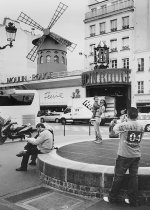
...is the title, and it's about cliches and symbols.
Witha CV 4/25 and Ilford FP4, scanned print


to me it kinda looks bleached, whole dynamic range of picture is in midtones (but i'm not sure now, cause it seames that my monitor is to bright, as shutterflower said that my image looks to dark.. don't know...)

..and i think that tighter composition shooted from bellow would suit it better...

:D
 
kaiyen said:
Canonet QLIII 17, Tri-X EI 800 Rodinal 1+50 24:00 60s initial + 10s every 3 minutes (a little too long)


why did you posted so small image?

anyway i like it, my second fav... :) would be nice if you had whole sign "help wanted"....
 
nikola said:
Split, Croatia
In my opinion, there's a perplexing lack of shadow detail on the people and the arch, but is showing on the cobblestone; I would have waited a little bit more so that the person behind the street lamp wouldn't be covered by it.

It's well-aligned and properly framed, and there's enough detail that invites you to explore what goes on in this street.
 
fitzihardwurshd said:
...is the title, and it's about cliches and symbols.
Witha CV 4/25 and Ilford FP4, scanned print
I would have increased the contrast, at least slightly so that the midtones weren't so diffused with the shadows and the highlights, too bad it's too crowded in the background, but that's reality and you cannot control that.

It's a nice capture of tourists taking a cliche shot, at a cliche spot; the round vent, the Moulin Rouge, the man reading the paper, they're all well placed on the photo. It is a good capture of everyday life at a not-so-everyday spot yet so-cliche landmark. It's real life and it is recorded well, composed properly.
 
kaiyen said:
Canonet QLIII 17, Tri-X EI 800 Rodinal 1+50 24:00 60s initial + 10s every 3 minutes (a little too long)
Argh! Too small! I shouldn't complain much, my attachment was a bit small too.

I like the light and the tones. I don't know if you meant to chop off the "p" and the "ed" off the sign when you took the photo, but I would have not chopped it off, unless it meant something overall with the elements of the scene -- and it is not immediately evident nor upon inspection. :(

The main subjects seem to be the larger individual at the counter, and the sign at the window. It makes you look at the image. There is a lot to explore; the photo itself is exposed and "printed" so well that it's as if you're right there, looking from the outside, from your point of view. And I think that's one thing that street photography should be about, presenting something from your point of view, not just a "snap" on the street.

So it makes me think, and I'm still thinking...
 
shutterflower said:
RF645, 100mm, Neopan Acros

I love the focus on the performer, and how everybody else is "oblivious" or ignoring him. He's in his own world. *That* was captured and I see that. Well done.

Composition-wise, it's hard to judge; all the elements here are important, but you can argue that the column may have best been closer to the edge of the frame. Yet, this gives a sense of unbalance that is inherent in the whole Performer/World relationship of this picture.

Nice high contrast without "overdoing it", subtle blown highlights, some thick shadows, but nothing that hides elements from the scene.

Me like.
 
Last edited:
shutterflower said:
Oui.
shotterflower said:
Looks almost like a slide film.
I really forgot to add this (like I did at first in my first critique); this is from *gasp* digital, but I gave it a slide film look treatment (Elitechrome). Good eye.

I've always wondered about this photo, and not always quite sure, but I like it.

Per the rules that's all I'll say about my own photo until we're all done critiqueing (critiquing? --sp??) each other's photos.
 
Nikola: could you expand a little further than "I like it" and "no sky, no fountain, sky is not interesting as can be"?

Per the rules:
"• Every participant must make at least two comments, one positive comment, and one constructive criticism (which is actually two positive comments)"

Just a thought.
 
shutterflower said:
this is the best I can do - the MOST I will do. I agree that the two on the right are too much in the foreground, too prominent in the composition, but I kind of liked the shot because of this crowdedness - the fact that it was taken in a very crowded place and through a crowd when it parted only for a second, made the clutter and composition meaningful.

But, the crop ain't bad.


George,
I see what you're saying. I am not telling you how to crop it, just suggestions :)

One other comment is now, if you're going to keep the guy on the right, then leave him in entirely. The half face is kinda weird :).

allan
 
fitzihardwurshd said:
...is the title, and it's about cliches and symbols.
Witha CV 4/25 and Ilford FP4, scanned print

I'm with George on this one, it's a bit hard to pin down the subject in this photo. I see what you mean about cliche's and symbols, though I'm not sure whether you mean symbol in terms of the MR, which is iconic, or something else.

I do think what would've worked is to get in closer. Wide angle lenses make things look farther away than they really are, so your subjects are all a little small in comparison to the whole frame. So move in there. Good advice, though one that I have trouble following myself with street stuff.

And yes, a bit more black would help. Seems flat on all of my 4 monitors here at work.

allan
 
Sorry for beeing that late, but I have been on the road, as I said.

To Nikola:
A very nice mediteranean view, I’ve been there a long time ago, gives a very good impression of the place. Interesting perspective too. Too dark on my monitor too, its brightness is adjusted to the greyscales of some web galleries like usefilm. Unfortunatley the monitor calibration is something we seldom think of, tho comparing photos in principle does not make any sense without the same calibration.

To Kaiyen:
A carefully exposed nightshot, just a glance while passing by. But where is the idea , the point where my eyes shall anchor ? Maybe I missed something ?

To shutterflower:
The guitarplayer is isolated perfectly by a DOF spot , just the right third of the photo is too dominant for me. I’d cut it right next to the guys head, and a bit on top and at the bottom too to get it halfways balanced again. The eyes should be brightened up a bit, hats a really a PIA at people shooting. Leaving the critical points off it is a very nice street shot.

Gabriel:
Voila, Les Tuilleries, great how the girl and boat are connected in a colour concept ! Not easy to get such a vertical in balance, but you succeeded.
Good impression of the generous space in the park, the crop at the lhs is a bit too tight for my taste, it looks as if a part of the photo got lost.

Regards
Fitzi
 
kaiyen said:
I'm with George on this one, it's a bit hard to pin down the subject in this photo.

Allan,

The idea was to get three clichés in a row:

1 = The Moulin Rouge, which is one of the worst clichés of Paris, a Disney like tourist milking machine , referring to a 120yo myth invented by the tourists themselves,

2 = a tourist, photographing his family in front of the cliché, which is a cliché ritual itself

3 = the idiotic $5 football Tshirt made in Turkey, with the “ARMANI” fake print on it, which has as much to to with Armanis as the MR has to do with erotic entertainement and is a cliche of wealth.

I should have shot it with a 75 mm better to get a stronger compressed perspective in that row, the man's back with the fake print in the foreground would have made it clearer. With the wide lens I could not get closer to him without attracting his attention. With a zoom I had the perfect photo now.
Attached an improved version, a tighter crop and the bright parts burned in a bit.

Obviously this version does not work for all, tho I expected the title would be a hint.

Fitzi
 

Attachments

  • Armani04_II.jpg
    Armani04_II.jpg
    85 KB · Views: 0
Last edited:
fitzihardwurshd said:
Allan,

The idea was to get three clichés in a row:

Fitzi,
To be honest, I did get what you meant, and I could see the cliche's, but I'm not sure they hold together as well. Perhaps it's simply that the subjects need to be closer together, which is something beyond your control, obviously. Or maybe you need to stand a bit to your right, so that they line up better.

My wife likes this photo, by the way, and disagrees with my critiques :). I personally, honestly have to admit that I don't think it's a strong photo.

allan
 
OK, it's not a "strong photo", but I think he got what he visualized. There certainly is room for improvement (that's what we have these critiques for, right?) but I think he accomplished what he wanted to accomplish.

I think the main problem here (the photo's scene) is the clutter, which, like you've pointed out, and I did before as well, is beyond his control (his, right? if not, I apologize, not familiar with the "name gender"). It looks like it's one of those moments when you can only take it at that instant, and only a zoom lens could have helped with adjusting the perspective. And that is the big challenge with rangefinders.

So perhaps a tighter crop could convey this better? I think it'd be a little hard, and I'd like to try, but don't have the tools at my disposal right now to show.
 
fitzihardwurshd said:
Gabriel:
Voila, Les Tuilleries, great how the girl and boat are connected in a colour concept ! Not easy to get such a vertical in balance, but you succeeded.
Good impression of the generous space in the park, the crop at the lhs is a bit too tight for my taste, it looks as if a part of the photo got lost.

Yes, the crop is too tight for my taste too. It removes some "distracting" elements from the scene, and since you are familiar with the place you can also sense that there's that vastness of the area missing from this shot. It's one of those situations "danged if you do, danged if you don't".

If I had not cropped it, I'm sure I would have heard complaints about the same things I complained about: half faces, half feet, cut hands, uninteresting chairs. So I aligned the fountain and its "rainbow" with the girl and her boat. It does need some air, it lacks something...
 
gabrielma said:
OK, it's not a "strong photo", but I think he got what he visualized. .

No, it is not a strong photo. In principle you and Allan confirm what I have expected to come, somehow the pic does not show the intention clearly.
It does not really speak, I always felt ambivalent about it. I got it all in the frame but it had not the intented visual AHA effect
I have some ideas now how I could have catched it better, this one tho is hardly more than a personal reminder.

As for me, I am contented with this result anyway, that is for what I take part at such critique threads.

Lady Fitzi
 
Back
Top Bottom