nomade
Hobbyist
Okay there's no need to wait then...
Gabriel M.A.
My Red Dot Glows For You
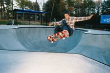
Hmm, interesting how you framed this one. I can't quite put my finger on it, but I wonder if another point of view would have worked better?nomade said:The whole roll was damaged, i just brought this back to its normal color, supposedly...Tmax, fed 3...
If I see this only as an image put together by lines, then I'd say it's a good thing you anchored the post on the bottom left corner, and placed your "arrow" right below the horizon. If you rotated this slightly so that it'd be a "straight arrow", and cropped it so you didn't have an empty right space...?
Gabriel M.A.
My Red Dot Glows For You
Pherdinand said:yashica gsn, fuji nph as far as I recall...
Funny. I think this would have been a great opportunity to take the shot from a lower point, and have the "three portraits" at the same height, perhaps, us looking straight, or up, but not down. Cropping the right edge would help, but then you'd have a cut person in the background. That's the problem with crowds (blast that spectacled man on the top left corner).
Try unconventional crops, see what happens. This has potential. Too funny.
Gabriel M.A.
My Red Dot Glows For You
I think it's seven. The critique forum universe balances itself...raid amin said:Racha, Pherdinand and Gabriel:
Let's move on. Ray mentioned that the exact number of five participants could be changed. In another critique qgroup we have six participants.
lff
Established
Okay everyone.....I'm back. I have no idea where someone had the idea I was deleted, and I've only been away for 22 hours. Also, whither Pherdinand?
First- raid, my name is barry. I actually did state it on my first post announcing my entry for this critique- no matter though. The sunrise is a fine study in color; although a little more color (or at least texture) from the water might have made this shot better. As it is , this shot probably would look good on a wall anyway.
Nomade, I like this image. It reminds me of the cover photo on a small book of short stories that I have. I don't know that I could suggest anything to "help" it.
Pherdinand, this picture does have nice color & good exposure; but it doesn't "speak" to me. Perhaps as suggested before a lowering in perspective might have advanced your idea better. I don't think a shallower DOF was possible here (also suggested earlier) because you may have had too much light & ISO for the max 500 shutter speed your GSN has.
Gabriel, this is another picture I like. I also like the DOF effect you were able to use by placing the mute hand at the front focal plane & the lens achieved a nice fall off of focus as you travel deeper into the picture. I can only imagine how this might have looked in full color though.
Now I suppose we shall all await Pherdinand's appraisal of our work.
raid
Dad Photographer
It would help if Ray could come up with a system that makes the critiques flow better. Obviously, the people doing the critiques should follow these rules then. I was thinking along the lines of listing us with rank order and have us post our critiques in rank order. Then we know quickly where we stand.
Now Pherdinand will join us ....
Raid
Now Pherdinand will join us ....
Raid
Pherdinand
the snow must go on
ok ok i'm here guys
it was weekend! and that accidentally includes a saturday evening
So
Raid: I like it that it is minimalistic, no silhouettes in the foreground (what you'd usually have in sunset shots), no spectacular clouds, nothing. The reflection also works well. What i find strange, is the rough bottom edge of the reflection; and the dirty halo around the sun. Also, i would frame it lower so the sun is higher in the black background.
lff: good framing, especially for this difficult subject. I also like the facial expression you caught here. I would love it if it would be in full funky colour, though.
nomade: I like that it's simple and the tones (messed up as they are) fit with the subkect matter. Why did you leave it open on the right?I mean, while it's tight on the other three sides, on the right it looks a bit awkward to me.
Gabriel: excellent shot, i like the choice for the DOF, as well as the shirt of the guy against the brick wall background. His head is a bit lost in the blur and the writing on the wall, however. Probably it was not your choice, but it would have been luckier with a plain brick background behind him. Also, i'm not sure about the bright strip on the right edge.
Good shots, everyone. I'm glad to see that nobody put up the top shots of him/her, so there IS something to comment, besides appraisal
As to my own shot: Yeah as some of you noticed, the idea would have been to get the guy's portrait next to the (family members?) painted portrays he is selling. Indeed, there was a iso400 limitation, i had to use f/11 not to terribly overexpose. But i could have picked a better angle, true! thanks everyone!
nomade
Hobbyist
Thanks everyone for your comments, about the photo, uhumm i left some empty space because i thought well there should be a space for the arrow, it's like imaginning, that it's goin to move, that someone is goin to pull it off...Into space.
That is what was on my mind.
raid
Dad Photographer
My photo: I took this photo with the intent to get such an image. I used a 500mm lens with a 1.4X converter and I spotmetered from the rising sun. Film used was a slow Fujichrome slide film. The water shows as black since the slide film has a limited range of exposure lattitude. All color shown is natural as the sun is. There was no manipulation done at any time.
Gabriel M.A.
My Red Dot Glows For You
OK, a bit late (as always, right? I fall asleep in front of the RFF forum -- must glue eyes) 
Thanks for the comments, all. I just find it interesting that there are complaints that the face is not showing or that things get lost in the blur.
I'm not complaining about those observations, it actually gives me an insight into what people's visual priorities are.
Now my question to you is: does everything have to be in focus? Must faces be shown at all time? Is blur bad? Things not in the plane of focus bad? Or are they just plain annoying? Are details in the background distracting that they need to be removed? Does street photography need to be clean in order to remove elements that are not aesthetically pleasing? Do we ask people to change their clothing because it doesn't match the background? Or do we ask them to take their glasses off?
Again, don't take this as a complaint, I just want feedback on that: do you think that this is necessary so that you can have an excellent, "what you see in life", real picture? Do all those details make it "distracting", or do they actually add to a picture because they are elements that tell you something about a place, about the person, about the elements?
Thoughts?
Pherdinand
the snow must go on
gabrielma said:Now my question to you is: does everything have to be in focus? Must faces be shown at all time? Is blur bad? Things not in the plane of focus bad? Or are they just plain annoying? Are details in the background distracting that they need to be removed? Does street photography need to be clean in order to remove elements that are not aesthetically pleasing? Do we ask people to change their clothing because it doesn't match the background? Or do we ask them to take their glasses off?
No,no,no,no, and no, to all those questions.
But sometimes one is just not lucky enough to get everything fitting, in a frame.
The blur is good. The blur with the poster/writing behind the guy's blurry head is bad, in my oppinion.
The distracting details don't need to be removed. It just have been a bit better if that only thing was not there.
lff
Established
Thanks everyone for the critique. Raid, I'd barely ever noticed the 2 people in the BG, much less thought of croppipng them. Thanks!
I had just entered an 11x17 print of this photo in a Member Show for a photography museum here in NC (The Light Factory); but got no feedback from anyone in that it won no awards or even honorable mention (not that surprising considering the large number of entrants or that there's only 5 awards given, including HM). Therefore I was curious how people who don't skateboard might react to it.
Pherdinand- No worries on the weekend issue. I had quite a Sat. night myself. Also, funny you should ask....I do sort of have a color version of that shot. Different perspective, but same trick in the same place & the same skater. A little more blur again...too much on this one for my tastes, but oh well.
Attachments
raid
Dad Photographer
This wraps up an enjoyful and informative session.
Raid
Raid
Pherdinand
the snow must go on
Yes, that's it. The colours are so nice, i like it much more, althoguh you are right with the overall blur being too much
Share:
-
This site uses cookies to help personalise content, tailor your experience and to keep you logged in if you register.
By continuing to use this site, you are consenting to our use of cookies.