RayPA
Ignore It (It'll go away)
Welcome to this critique thread. Please read the purpose statement and the guidelines/ground rules regarding participation.
Purpose
The primary purpose of this thread is to provide a forum where photographers can give and receive constructive criticism on one another's photographs. By setting up some basic guidelines we hope that this thread will provide a forum where the give and take of honest constructive criticism can help us become better photographers.
Guidelines/Ground Rules
The thread has very specific rules regarding participation. The one basic rule is that you cannot provide criticism on an image or comment in a critique thread unless you also have an image posted. To post an image to this thread you must be a participant. Participation in this thread is limited. Here are the guidelines and ground rules for participation:
• Participation in this thread is limited to 5 photographers
• Participants join the thread by posting their intention. You can simply reply with your intent to join by posting something like: "I'm joining," "I'm in," or just state your name
• Joining is on a "first come, first served" basis. The first 5 to reply become the participants
• Once the thread has 5 participants, no other photographers can join or participate in the thread
• Once the thread is full of participants all photographers will upload their image(s)
• Please abide by any thematic requirement (e.g., landscape, portrait, etc.)
•The number of photos for each participant is limited to one
• Photographers attach photos as thumbnails (no inline images or links)
• Photographers post their images supplying titles (if any) and other pertinent information (the amount of information should be minimal)
• Photographers can only comment on their own images and reply to comments only when everyone else in the thread has posted their comments on the image
• Every participant must comment on every photo (except their own—initially)
• Every participant must make at least two comments, one positive comment, and one constructive criticism (which is actually two positive comments)
• Once every photographer has commented then a free flowing discussion begins. It is at this point that every photographer can comment on their own work and reply to comments, ask questions, etc.
• The participants decide when the thread closes.
If you'd like to participate in a critique thread and need some ideas about how to proceed with viewing images critically, you may find this thread helpful:
How do you look at photos
You can also provide feedback on critique threads here:
Critique Feedback Thread
Remember: Please do not provide criticism on an image or comment in a critique thread unless you also have an image posted.
This thread is now active, please follow the guidelines if you'd like to participate! Have Fun!
.
nico
Well-known
Let's try even this one!
Bye
Nico
Bye
Nico
Wayne R. Scott
Half fast Leica User
I'll play in this one also.
Wayne
Wayne
Silva Lining
CanoHasseLeica
Me - I'm In!
sf
Veteran
i'm in
i'm in
me too!
I have a few to add
i'm in
me too!
I have a few to add
Wayne R. Scott
Half fast Leica User
George makes 5, right?
Wayne
Wayne
Wayne R. Scott
Half fast Leica User
ampguy
Veteran
I pulled out, this thread needs one more fast.
Wayne R. Scott
Half fast Leica User
Bumpity, bump, we need one more since ampguy went awol.
Wayne
Wayne
Warren T.
Well-known
Hi Guys,
I'll go again. I'm in.
--Warren
I'll go again. I'm in.
--Warren
Warren T.
Well-known
Silva Lining
CanoHasseLeica
nico
Well-known
sf
Veteran
sf
Veteran
NICO :
I like the forms and colors in this shot, I might say that there is too much black space, particularly on the bottom of the frame. You could possibly gain something from a slight exposure increase (could just be my monitor, but it seems a tad dim), and maybe bring out the differences between the hills a little more (in terms of brightness) to amplify the depth effect.
Honestly, I would crop and edit as shown in the attachment.
BUT, I kind of like the gem effect you get with all that black space and the nest of colors and light in the middle. . .
Attachments
sf
Veteran
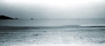
Silva Lining :
I really like the mood of this shot. Very well put together compositionally as well.
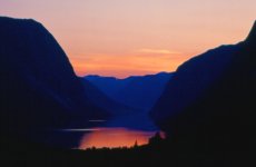
I notice that the horizon is slightly tilted to the left. Perhaps this is intentional and adds to the melancholy of the shot.. . .
I would be likely to crop out the far left piece of land, but leave the little one to its right.
Other than that, this is a great image.
I really like the mood of this shot. Very well put together compositionally as well.
I notice that the horizon is slightly tilted to the left. Perhaps this is intentional and adds to the melancholy of the shot.. . .
I would be likely to crop out the far left piece of land, but leave the little one to its right.
Other than that, this is a great image.
Attachments
Last edited:
sf
Veteran
Warren T. :
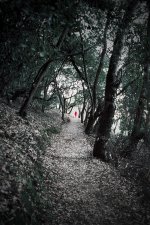
I like this. It seems you have the composition down very well. Maybe the subject is a little too far off, but I actually like it exactly as it is in that respect. Only thing I might do would be (something very artificial) to lower the saturation of all parts of the image except the person in the red coat. Just lower it enough that they really stand out.
Here is my creative edit - just playing with your image a little. It's good to share perspectives on editing for impact.
Attachments
sf
Veteran
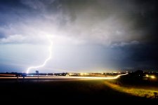
Wayne R. Scott said:Here goes nothing........................
Wayne
Wayne, yours is pretty much perfect. I am a fan of light in images - lightning, fire, whatever. This is a very powerfully sparkling shot - and well framed with vignetting. Great avatar material.
I honestly can't think of any useful criticism. You might want to get rid of those scanning artifacts along the top 1/3 of the image. Sort of looks like something was showing through from the other side of the paper or something like that.
Silva Lining
CanoHasseLeica
Wayne
I love this shot. I have been trying to capture something similiar everytime there has been a thunderstorm, but no luck yet. Obviously this was a long-ish exposure but no areas are burntout and the shot is balanced. My only improvement to make this shot better would be some cropping at the bottom and right hand side to remove what I presume are car headlights in the bottom right hand corner.
Warren
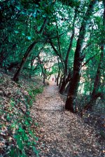
I like the way this shot draws you in to it. The green of the foliage is very 'cold' but the red figure at the end of the patch grabs hold of you eyeball and pulls them down the track! A suggestion would be that it is slightly over exposed, but that would being fussy.
Nico
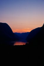
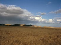
Great colours in this. The exposure is great in that there is still some detail in the contours of the hills rather than them being black. I would suggest cropping the shot at the bottom to remove some of the black and place the horizon off-centre.
ShutterFlower
I love the colours in your shot and the patterns that the clouds make on the mountains in the background. I guess that the land in front of you was inclined although I wonder if you might be able to improve things by straightening the horizon - even artificially. The only other thing I would add is that a foreground object would be perfect, but thats just being picky
I love this shot. I have been trying to capture something similiar everytime there has been a thunderstorm, but no luck yet. Obviously this was a long-ish exposure but no areas are burntout and the shot is balanced. My only improvement to make this shot better would be some cropping at the bottom and right hand side to remove what I presume are car headlights in the bottom right hand corner.
Warren
I like the way this shot draws you in to it. The green of the foliage is very 'cold' but the red figure at the end of the patch grabs hold of you eyeball and pulls them down the track! A suggestion would be that it is slightly over exposed, but that would being fussy.
Nico
Great colours in this. The exposure is great in that there is still some detail in the contours of the hills rather than them being black. I would suggest cropping the shot at the bottom to remove some of the black and place the horizon off-centre.
ShutterFlower
I love the colours in your shot and the patterns that the clouds make on the mountains in the background. I guess that the land in front of you was inclined although I wonder if you might be able to improve things by straightening the horizon - even artificially. The only other thing I would add is that a foreground object would be perfect, but thats just being picky
Wayne R. Scott
Half fast Leica User
Warren,
I like this type of shot very much. The pathway provides a leading line through the photo to your red figure. The trees and pathway lead to a vanishing point in the distance which is strengthened by the apparent small size of the red clothed person, which gives a sense of depth or distance.
My only suggestion would be in post processing the print to darken ("burn") the bright areas in the sky on the right side of the photo and the foreground to make the person "pop" out of the photo.
Shutterflower,
I like this photo as I am a fan of wide open spaces. I love to watch cloud formations travel across the sky and observing the shadows as they roll across open prairie and desert landscapes.
I would suggest that you move your horizon either up to empahsize the foreground or down to emphasize the sky and cloud formations. I get a feeling of balance between the two in your photo as the horizon is almost dead center and I keep bouncing back an forth from foreground to sky trying to decide which you want to be your strong point.
Silva Lining,
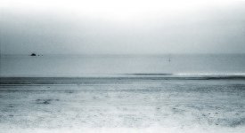
I like this photo also, just wish I had some large bodies of water around here to photograph. I like the transition in grey tones through out the photo as they give a feeling of vastness to the photo. The edge of the sand where it meets the water, the horizon line where the water meets the sky, and the brighter sky in the top above the darker sky are all compositionally well placed. My eye is drawn into the photo. Can't think of anything I would add except maybe a pirate ship on the horizon.
nico,
Nice dramatic sunset, I like the reflection of the sunset in the lake. I would suggest moving your horizon line (the mountain range) either up or down so that it is in the upper or lower 1/3 of the photo. Actually I would move it down to remove a majority of the dark foreground, but then that is my individual taste. I can see where a massive dark foreground could lead you right to the sunset.
Thanks to all for the comments and for posting their photos.
Wayne
I like this type of shot very much. The pathway provides a leading line through the photo to your red figure. The trees and pathway lead to a vanishing point in the distance which is strengthened by the apparent small size of the red clothed person, which gives a sense of depth or distance.
My only suggestion would be in post processing the print to darken ("burn") the bright areas in the sky on the right side of the photo and the foreground to make the person "pop" out of the photo.
Shutterflower,
I like this photo as I am a fan of wide open spaces. I love to watch cloud formations travel across the sky and observing the shadows as they roll across open prairie and desert landscapes.
I would suggest that you move your horizon either up to empahsize the foreground or down to emphasize the sky and cloud formations. I get a feeling of balance between the two in your photo as the horizon is almost dead center and I keep bouncing back an forth from foreground to sky trying to decide which you want to be your strong point.
Silva Lining,
I like this photo also, just wish I had some large bodies of water around here to photograph. I like the transition in grey tones through out the photo as they give a feeling of vastness to the photo. The edge of the sand where it meets the water, the horizon line where the water meets the sky, and the brighter sky in the top above the darker sky are all compositionally well placed. My eye is drawn into the photo. Can't think of anything I would add except maybe a pirate ship on the horizon.
nico,
Nice dramatic sunset, I like the reflection of the sunset in the lake. I would suggest moving your horizon line (the mountain range) either up or down so that it is in the upper or lower 1/3 of the photo. Actually I would move it down to remove a majority of the dark foreground, but then that is my individual taste. I can see where a massive dark foreground could lead you right to the sunset.
Thanks to all for the comments and for posting their photos.
Wayne
Share:
-
This site uses cookies to help personalise content, tailor your experience and to keep you logged in if you register.
By continuing to use this site, you are consenting to our use of cookies.