Comments from sleephead:
PHOTO BY PHERDINAND
The picture gives the immediate impression that this is no ordinary self-portrait. The grain and overall dark shades work very well with the tone of the photo. There is a story here, which is good, but the story is a mystery, which, in my opinion may also be good, if that's what the photographer intended. I like the tight composition, it makes you feel close to the subject, who is perhaps in a state of despair over what he has just read.
My only suggestion for improvement of this photo would be to tweak the composition slightly, so as not to distract from the subject: level out the slight tilt to the left (noticible at edge of coffee table), and consider Photoshopping out the wall plug at the corner of the sofa. If I was in Photoshop already, then i would also burn in all the white parts (text and pattern) of the sweater - removing them really make a big improvement in my opinion.
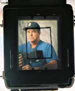
PHOTO BY WAYNE R. SCOTT
The picture tells a clear story: "I'm a photographer". This is an original and multi-dimensional self-portrait in several senses. First, it has the obvious frame-within-a-frame dimension, and second the photographer has used, in a way, three different cameras to make the self-portrait. The photo is certainly out of the ordinary, and holds one's attention as the eye goes around a explores the details. Technically, the photo is sharp and the exposure is good.
In terms of constructive criticism, I think that some of the strengths of this picture are also some of it's weaknesses:
The telling of the "I'm a photographer" story is a little heavy-handed in my opinion, the main culprit being the medium format SLR in your hand. It, combined with your facial expression and the way the camera is held (knuckles), give an aggressive impression.
I also am not crazy about the composition - I find the hand strap touching the frame edge on the left distracting, and the slight tilt of the view camera to the left annoys me. The bubble-level and viewfinder at the top I can live with, but the tripod below is distracting.
Also, have you considered rotating the picture 180 degrees? That would work well with my suggestions below.
If you were to re-shoot this picture, then this is what I would suggest:
Hold something else, maybe the Canon Q-17, or better yet held something "softer" like an example photograph in your hands, with your hands in a relaxed position, and perhaps use the medium format SLR to take the picture. I would also consider moving in closer to get only the back of the view camera as the outer frame, thereby, removing the strap, tripod, bubble-level, etc.
See attached cropped and rotated photo. Tilt not fixed.
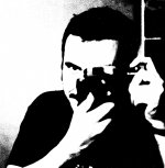
PHOTO BY NICO
Nico, I like the high-contrast self portrait very much - it has a great graphic quality to it. You seem to have a bit of a smirk on your face, and your visible eye is very intense-looking. I can't think of any way to improve on this photo, except maybe if those window frame lines weren't in the top right corner.
PHOTO BY TODD HANZ
A very interesting and "jarring" self-portrait! I especially like the toes at the bottom. The two little black dots on the lighting umbrella (or whatever that is) disturb me a little. It's technically very good with nice tones and contrast.