Critique #29 *Landscape*--5 Participants

I am going to write a lot about each of this critique's submissions, frankly I'm knocked out by the quality. I'm taking my son for some "quantity" time burgers and Will Ferrel in Talladega Nights. I'll write tomorrow, cheers Jan
 
Lots of good landscape views in this thread. Two of them make me miss the ocean and two others make me miss the eastern portion of the states where the seasons are marked with beautiful color changes. What we have in the southwest is vistas and sunsets.

Sigh...

Anyway,

RayPa: Your photo reminds me of a photographer I worked with in Viet Nam. His name was John Parr and he and I were stationed together in Cu Chi in 1969/70. He was a working pro when he was drafted having supported himself while a student at Cornell as a news photographer. He used a Leica M3 and I remember some pictures he shot on a patrol which had some grass in the foreground that had the same crisp glow as your photo. Is that a lone figure way in the back on the high left? Its hard to tell on the screen image. I like how this image is put together. Graphic weight nicely balanced. Easy flowing line from left to right on two divergent lines. Were it mine to play with I would lose the small amount of the building on the high right which breaks the illusion of calming ocean side isolation. I can hear the surf and I wish I were there. Good job. I would like to see the print of this image.


MinorTones: On two prior threads I have urged the participants to re-size their images to a smaller size so I did not have to wander through a huge grainy image or squint at a smaller one. Your photo is one I would have wished to see quite a bit larger. Lots of interesting detail I would have liked to see more closely than this size would allow. In any case a well crafted photograph. Beautiful tonal range and nicely framed. My only complaint (if that is the right word) is the size. Another place I would like to be at some time(Rather than sitting here sweating in the humid heat of the late desert summer).


Jan: This photo is one I would like to have in at least 11x14" so I could lose myself from time to time in the landscape you captured here. It's either late afternoon or early morning by the angle of the sun and in either case a wonderfull image of fall harvest. I wish you had brought along a tripod so you could have brought even greater detail and possibly more color in the sky but as I re-read your description perhaps you did. I am not capable of shooting handheld at a 10th of a sec. Bully for you if you can. A good photo of a beautiful scene.


Raid: Wonderful color capture. That particular autum red and orange is not one I ever see in the southwest. At least in terms of growing things.The sky here will produce some beautiful colors. But there is something about autum colors I really like. As I see it you actually have a couple of different photographs here depending on how it is cropped. Quarter the image and the top right quarter is a great photo by itself. Cut off the bottom third and you have the same scene but in a landscape format which would also get rid of whatever that black line is at the bottom. Another scene I would like to see in person. Good eye.
 
Last edited:
MinorTones said:
This is with an M6 and summicron 50/2 taken on kodak bw400cn.
Carolina Beach, NC.

I have to concur with the opinion of the quality of the images posted here. You guys have keen skills for landscapes.

Mitch, your image makes very nice and subtle use of the classic curve. What's cool is that the curve is barely there. It follows the jagged edge of the rocks from the foreground into the horizon, but is barely defined. As much as this is landscape it is also a wonderful study in tones, and really a study of the large rock in the foreground. I think that by presenting this in portrait, rather than landscape, you tip your hand a little, but it's fine, because it works as a landscape, as well. By giving us the rock and its smooth and slippery realism, as well as the beach, you've captured a the sensation of the place, the smells, the sounds. For me a landscape should interpret a place, or bring the essence of a place, into a two dimensional image, and, for me, you've done that.

Just like Jan's image I have a hard time offering constructive criticism. About all I can suggest is to straighten the horizon. If doing so costs you the composition/balance, I would leave it like it is.

Very nice work! Well done.

:)
 
remrf said:
I'll try again. I started to post once before but did not attach the image. Duh!

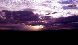
Again, more beauty! God's light! (I waited until I got back on my home computer to view this, because my work cranker was burying the shadows.) The sense of space and the awesomeness of nature really come through here. The image is the clouds, the light and the distant mountain peak, shining like a beacon, a destination—makes me want to get religious! :) It's really "just right," Larry. It's not corny, or cliched in any sense, and that can be difficult to do with sunsets and sunrises—to paraphrase Jimmy Durante "We've seen a million of 'em!" This has got just the right amount of realism with the shadowy foreground detail, and the road (is it?) off on the left. I'd like to see a little more of it all, but it's not important in the least—and that's all I got to offer as constructive criticism!

Great image, Larry. Inspirational. Perfect!

:)
 
RayPA,

This is the second look, and what I held back yesterday for the second post.

I do like the way you handled the tones in the image. The grass really pops and the sand looks just right. It may be a bit darker than the real sand(or maybe its somewhere in Hawaii), but I like things dark.

I have to echo Rem's suggestion about the houses. They were one of the first things I noticed and I felt they were out of place. I realize though if you cut them out in a crop you would also lose some space near the end of the grass line and it could make the composition much more cramped.

I think the darkness of the burn in the top left hand side does not look natural in comparison to the rest of the horizon.

A beautiful photo.

-Mitch
 
Raid,

You have made a very peacefull image. It looks almost like frost on the grass. The grass looks blue kind of I've never seen that before. It makes the photo very interesting to me.

The gradation of colors and tones from the botom of the frame to the top keeps my eye mostly in the center of the frame then I look to the top where the highlight is on just the tip of the mountain.

The colors of the changing leaves are great and my eye is drawn to the right hand side with that orange tree and the horses. I like the photo a lot because it is something I haven't seen before in a landscape. That crazy grass stands out.

A small preliminary critique...whats with the black bar at the bottom of the photo.

-Mitch
 
Remrf,

On the second viewing I am still enamoured with this image.

To critique I usually think of how I would have taken the picture. In this situation I bet I would have screwed the exposure in the worst way. You kept the highlights and the shadows tamed.

The only thing I might have done is crop the image below the top right dark cloud, but in doing that you would lose much of the brightness of the photograph, and the highlights would be concentrated in the top right.

So maybe that cloud belongs there after all.

So much for my critique. It's a beautiful image.

-Mitch
 
Jan,

I can't say I would do much different in your photograph.

I think the out of focus bottom left plant is distracting and maybe a burn or crop of the bottom, up to the blue/green grass just above that plant might help.

I'm not sure how constructive this is, but I feel like the pure white sky in the image is distracting. There isn't much you can do now, and there probably wasn't enough lattitude in the film to get any detail up there.

A very serene image though. I really like the color differences you saw from the foreground to background. Good eye.

-Mitch
 
remrf said:
I'll try again. I started to post once before but did not attach the image. Duh!


remrf: The clouds are beautiful and I can imagine how it must have felt to be there in person to enjoy this view. I find the black foreground too wide. With such light, it is typically not possible to capture both foreground details and the contrast in the clouds. A graduated neutral density filter would have given you some help here, if your goal was to actually get some details in the foreground.

I played with the photo a little ...


Nice photo.

Raid
 

Attachments

  • rff crtitique 29.jpg
    rff crtitique 29.jpg
    48.5 KB · Views: 0
RayPA said:
Here's mine.


\/

Ray: This is a beautiful beach photo. I have plenty of opportunities for beach photos., so i can always learn more about it.The only thing I may suggest would to be to crop from the bottom part of the sand and start the image by the sea grasses. The "little man" in the background standing at the water is nice to have in the photo. Well done.

Raid
 
MinorTones said:
This is with an M6 and summicron 50/2 taken on kodak bw400cn.
Carolina Beach, NC.


Mitch,

The photo is beautiful, and yes, I prefer the vertical shots in such situations. The photo takes my eyes from the bottom and to the top. The one thing that you could not change [most likely] is the lack of light to bring this out in a 3D effect.

Raid
 
jan normandale said:
here it is...
Yashica Electro 35GSN with Fuji Superia 200 ISO shot at about f8 and 1/10th sec ;
lab processed and scanned to a CD


Jan: The quality of light is very nice in this photo of the field. The washed out sky [on my screen] is distracting. I suggest to slightly crop the sky. What "could" you have done with the foreground ...maybe shoot from a lower angle so that the "greens"below are not cut off. Well done.

Raid
 
Raid,

On the second look I still don't see anything I would change in the photo.

The black bar at the bottom is still wierd, and I'm not sure why you left it there. I assume it was part of the scanning process.

-Mitch
 
Ray I wonder what you mean by tipping the scales in my image, because it is in a portrait format.

In the photo I kind of wish I had color film at the time, because the moss on the rocks was a bright green color. The color was enhanced by the moisture of the moss and it really made the rocks pop out in the foreground.

I'm a little dissapointed in the highlights being blown on the waves. I'd like more detail there, but I got the film done at walgreens and having someone else do your film is always a little risky.

I was kind of bugged by the tilted horizon and had to crop the image in PS to straighten it some. Just a tiny bit around each side was lost. When the water horizon was straight the rest of the photo looked tilted, so I settled on this crop.

So guys what would you do to your pics given a second chance at the shot?

-Mitch
 
Remf, sky shots are always interesting to me, sunsets are something I like also. This is a hybrid sky/sunset shot to my eyes. I wonder if this is a typical sky in Arizona? The light is excellent , the clouds are complex. Stratus and cumulus make this skyscape layered. It creates a frame filling punch. The bottom of the frame is dark in the mid ground, lighter in the foreground this creates a depth to the shot and helps pull the viewer back to the centre. The centre is powerful, the sun and it’s rays create a riveting focal point for the eye. Three basic colours create a visually simple palette and enhances the overall Zen of this very strong shot.

Ray, the BW used here forces the eye to deal with the image and doesn’t let it drift into another zone. The grass initially takes your eye as it covers a left to right movement across the frame, the mid ground of the frame echos this motif. The spaces between are filled with either sand, water or sky. The sky is moody and overcast pumping up the definition of the sand and grass elements. Top left frame shows water top right shows some residences, while walking along the beach I’m seeing a lone figure. I get a feeling of coldness in the air but my imagination says the figure is warm. I’d like this on my wall if I lived around this seashore. Strong shot and also deserving of some wall space.

Minor tones, this is an interesting shore shot. The rocks lead the eye from the foreground towards the top right all surrounded by water with a strong horizontal horizon line capped by the gray sky these soft water and sand elements support the complex rock feature and it’s layered moss. Lots happening in this frame. Good one to have seen and shot. The exposure and focus are as good as you can get. Nice one.

Raid, wow this is one place where the colour cooks! Yes it’s cold, yes the frost is showing on the grass but the mid frame colour in the trees gets amplified by the white-green grass and foreground in a subtle but strong way. The horses on the right mid frame are counterbalanced by the buildings on the mid left frame. The sky is purple and it’s a colour I have seen and shot. It is one of those rare occurences that photographers get. You got it. The colour rendition is perfect. I really like this one, it pops.
 
Ray, thanks for the look. You have seen everything in this shot! I’m impressed yes there is an antenna in this shot. I didn’t think it would be noticed.. wrong ;- )
I liked the light on this field and stopped for it. The bowl gave the shot a feeling of depth that isn’t available on flat fields. Nothing was missed by you.

Remf , yes it was shot with a tripod. The shot loses something in the 1 mb scans I get from the processing shop. I shot this as the sun was setting, 5 minutes more and my light was gone! I had time to shoot this in a 6x9 format it is amazing in detail. Doesn’t show in the current situation. Yes the colours are one thing I do like about the east. Thanks for the comments and look.

Raid and Mitch that is one of those skies that we see in August and September in Ontario. As the sun drops the opposite horizon goes pale washed out blue. That’s just how it is. I agree it would be nice to see some strong cloud features in the sky. I can visualize it punching up the rest of the shot’s colours. Thanks for looking and the words

Great set gentlemen/ photographers , glad to have been part of it!
 
Jan, I am happy to learn that your shot is actually much sharper than the screen image would indicate. I can imagine what the shot looks like in the 120 format and I would lose myself wandering through its detail.

And yes my shot is a typical Az. sky with clouds. On any night when there are clouds in the sky here the chances of a spectacular sunset are about 90%.

Thankfully I have a pro lab here in Tucson that knows how to scan and does it well. In 6x4.5 format (which is what I've been shooting lately) they have three levels of scan available. The "full" scan of 6x4.5 is over 100mb. The economy scan is 27mb and the "quickie" is about 5mb and cost about $2.00. Below is an example of the "quikie". If you have images that need a better scan than you can get locally send them to me and I will have Photoworks do a scan at the level you desire. Your photo on this thread (and probably many others) deserve better than you are getting locally in my opinion.

I just remembered they do have a website and you could work with them directly if you so desire.

http://www.photographicworks.com/

And what I called a "quikie" they call a "frontier scan".
 

Attachments

  • sbnc01.jpg
    sbnc01.jpg
    594.2 KB · Views: 0
Last edited:
I drove to the Smoky Mountains one week after the peak of fall colors as I had no options due to my teaching schedule. When I arrived in Townsend (TN), there were hardly any people left there at first, and after a few days I was the only person staying at a major motel. I noticed one night that snow flakes were falling even though it was fall and we were at low elevations, so I got up early and I drove to the entrance of Cades Cove. The drive was closed but I got this shot from outside the drive. I used a tripod for long exposure and most likely this was Fujichrome 50 with a Singh Ray graduated neutral densirty filter 2X on a Canon F1N.

edited: [The grass was covered with some ice/snow]

I am glad you like it. I have it as a 20x30 enlargement.

Raid
 
Last edited:
MinorTones said:
Ray I wonder what you mean by tipping the scales in my image, because it is in a portrait format.

In the photo I kind of wish I had color film at the time, because the moss on the rocks was a bright green color. The color was enhanced by the moisture of the moss and it really made the rocks pop out in the foreground.

I'm a little dissapointed in the highlights being blown on the waves. I'd like more detail there, but I got the film done at walgreens and having someone else do your film is always a little risky.

I was kind of bugged by the tilted horizon and had to crop the image in PS to straighten it some. Just a tiny bit around each side was lost. When the water horizon was straight the rest of the photo looked tilted, so I settled on this crop.

So guys what would you do to your pics given a second chance at the shot?

-Mitch

Hi Mitch,

Actually I think I wrote "tipping your hand," and what I meant was that your image is clever because you give us a landscape (in portrait format) while also giving us a nice study of the rock in the foreground--the format favors the rock but works really well with the landscape behind it. By using the portrait format, you "tipped your hand" that the emphasis should be on the rock. If the format was landscape, I think the landscape would take precedence in the composition. I like the use of the vertical format here. It adds depth. I have a similar image where I shot a landscape vertically and provided some up close detail (a large rock in my case, too [I'll try to find the image when I get home tonight). The effect is very similar to what you acheived here.

I like the bright white highlights on the waves, btw. I was going to mention that it made the image "pop" a little more.
 
Back
Top Bottom