RayPA
Ignore It (It'll go away)
Welcome to this critique thread. Please read the purpose statement and the guidelines/ground rules regarding participation.
Purpose
The primary purpose of this thread is to provide a forum where photographers can give and receive constructive criticism on one another's photographs. By setting up some basic guidelines we hope that this thread will provide a forum where the give and take of honest constructive criticism can help us become better photographers.
Guidelines/Ground Rules
The thread has very specific rules regarding participation. The one basic rule is that you cannot provide criticism on an image or comment in a critique thread unless you also have an image posted. To post an image to this thread you must be a participant. Participation in this thread is limited. Here are the guidelines and ground rules for participation:
• Participation in this thread is limited to 5 photographers
• Participants join the thread by posting their intention. You can simply reply with your intent to join by posting something like: "I'm joining," "I'm in," or just state your name
• Joining is on a "first come, first served" basis. The first 5 to reply become the participants
• Once the thread has 5 participants, no other photographers can join or participate in the thread
• Once the thread is full of participants all photographers will upload their image(s)
• Please abide by any thematic requirement (e.g., landscape, portrait, etc.)
•The number of photos for each participant is limited to one
• Photographers attach photos as thumbnails (no inline images or links)
• Photos should be standard screen resolution (72~90) and the longest side of the image approximately 10 inches in length.
• Photographers post their images supplying titles (if any) and other pertinent information (the amount of information should be minimal)
• Photographers can only comment on their own images and reply to comments only when everyone else in the thread has posted their comments on the image
• Every participant must comment on every photo (except their own—initially)
• Every participant must make at least two comments, one positive comment, and one constructive criticism (which is actually two positive comments)
• Once every photographer has commented then a free flowing discussion begins. It is at this point that every photographer can comment on their own work and reply to comments, ask questions, etc.
• The participants decide when the thread closes.
If you'd like to participate in a critique thread and need some ideas about how to proceed with viewing images critically, you may find this thread helpful:
How do you look at photos
You can also provide feedback on critique threads here:
Critique Feedback Thread
Remember: Please do not provide criticism on an image or comment in a critique thread unless you also have an image posted.
This thread is now active, please follow the guidelines if you'd like to participate! Have Fun!
.
RayPA
Ignore It (It'll go away)
Please note an addition to the guideline (above in BIG RED) regarding image size. Please try to standardize your image sizes so they are not too small, nor too large. Thanks!
Have Fun.
Have Fun.
Rafael
Mandlerian
I'm in. (Thanks Ray)
rxmd
May contain traces of nut
So am I. I'm new to the critique section, so please be gentle ")
Philipp
Philipp
formal
***
I'm in too.
David
David
N
Nuno
Guest
I'm in too!
sbug
Acceptably Sharp
In if I am in time.
sbug
Acceptably Sharp
formal
***
rxmd
May contain traces of nut
1969
1969
OK, here's mine. Taken two weeks ago on Union Square market in New York.
Bessa R, CV 35/2.5 Color Skopar at f/11 (I think), Agfa Optima 100 film. Scanned using a Fuji Frontier - I know this could be done better but it's all I have on my laptop at this point. No postprocessing except rescaling to 720x482.
Philipp
Attachments
Rafael
Mandlerian
N
Nuno
Guest
Rafael
Mandlerian
Sbug
Sbug
All five images are up, so let's begin.
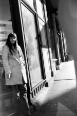
Sbug, I think that you've captured a very interesting expression on the woman's face. It's sort of wistful. I really like it. It's clear that she's off in her own thoughts at the moment and, in that sense, the photograph really implies a story. One wonders what she is thinking about.
I like the way you have positioned her off to the side of the frame. The "rules" suggest that one should usually have the subject looking into the frame. But in this case, I think that your image is far more effective for the fact that she is looking out of the frame.
I realise that this photograph was probably shot from the hip as you walked past the woman. Had you set up to take the shot, you would likely have lost her expression as soon as she saw you. So there are always trade-offs with images like this one. However, I do find the out of focus bit on the right to be quite distracting. I really like the angled composition of your image. But I think that it would have been more effective had that out of focus bit been out of the way of the lens (if it would have been possible to get it out of the way. I have no idea what it is). The repetition of lines on the building would have been much more prominent in the image.
While I am being picky, I am also bothered by the flare in the bottom left corner and the fact that the woman's feet are chopped off. Again, I realise that this image was probably shot from the hip. So you would have had no way of spotting the flare or of composing the image precisely. But hey, this is a critique.
The strength of this image is definitely the mood that is set by the woman's expression. Nice shot.
Sbug
All five images are up, so let's begin.
Sbug, I think that you've captured a very interesting expression on the woman's face. It's sort of wistful. I really like it. It's clear that she's off in her own thoughts at the moment and, in that sense, the photograph really implies a story. One wonders what she is thinking about.
I like the way you have positioned her off to the side of the frame. The "rules" suggest that one should usually have the subject looking into the frame. But in this case, I think that your image is far more effective for the fact that she is looking out of the frame.
I realise that this photograph was probably shot from the hip as you walked past the woman. Had you set up to take the shot, you would likely have lost her expression as soon as she saw you. So there are always trade-offs with images like this one. However, I do find the out of focus bit on the right to be quite distracting. I really like the angled composition of your image. But I think that it would have been more effective had that out of focus bit been out of the way of the lens (if it would have been possible to get it out of the way. I have no idea what it is). The repetition of lines on the building would have been much more prominent in the image.
While I am being picky, I am also bothered by the flare in the bottom left corner and the fact that the woman's feet are chopped off. Again, I realise that this image was probably shot from the hip. So you would have had no way of spotting the flare or of composing the image precisely. But hey, this is a critique.
The strength of this image is definitely the mood that is set by the woman's expression. Nice shot.
Rafael
Mandlerian
Formal
Formal
Formal,
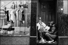
The interaction between the two figures in your photograph (I assume mother and son) is just fantastic. Reasoning with a child can be such an adventure! You have captured the moment very effectively. The timimg of your shot is excellent.
I have two clear critiques of the image and a third that I will suggest more for discussion than anything else. Firstly, I think that the image could obviously have been straighter. I don't think that the angled composition (if it was even intentional) really adds anything to the image. If anything, it is distracting.
Secondly, I am a bit bothered by the door handle that is growing out of the back of the child's head. I'm not sure that you could really have done anything about it. It's possible that a lower camera angle might have hidden the handle behind his head. But then the great strength of your image derives from your timing. And it is possible that the split second delay that you would have needed to get lower might have caused you to miss this moment all together.
Thirdly, and this is the critique that I am raising more for discussion than anything else, I think that your image would have been stronger had you framed it vertically and cropped out the store window all together. Doing so would obviously have removed the shopping context from the image. However, I find that the bright left side of the frame distracts quite significantly from the two people on the right. Try blocking off the left side of the frame and tell me what you think. The interaction between the two figures is still very strong. And they stand out much more prominently in the frame after the crop. Personally, I think the crop makes your image stronger. But I would be interested in what you think.
On the whole, this is a very well timed shot that captures a very telling moment. Well done.
Formal
Formal,
The interaction between the two figures in your photograph (I assume mother and son) is just fantastic. Reasoning with a child can be such an adventure! You have captured the moment very effectively. The timimg of your shot is excellent.
I have two clear critiques of the image and a third that I will suggest more for discussion than anything else. Firstly, I think that the image could obviously have been straighter. I don't think that the angled composition (if it was even intentional) really adds anything to the image. If anything, it is distracting.
Secondly, I am a bit bothered by the door handle that is growing out of the back of the child's head. I'm not sure that you could really have done anything about it. It's possible that a lower camera angle might have hidden the handle behind his head. But then the great strength of your image derives from your timing. And it is possible that the split second delay that you would have needed to get lower might have caused you to miss this moment all together.
Thirdly, and this is the critique that I am raising more for discussion than anything else, I think that your image would have been stronger had you framed it vertically and cropped out the store window all together. Doing so would obviously have removed the shopping context from the image. However, I find that the bright left side of the frame distracts quite significantly from the two people on the right. Try blocking off the left side of the frame and tell me what you think. The interaction between the two figures is still very strong. And they stand out much more prominently in the frame after the crop. Personally, I think the crop makes your image stronger. But I would be interested in what you think.
On the whole, this is a very well timed shot that captures a very telling moment. Well done.
Rafael
Mandlerian
Rxmd
Rxmd
RXMD,
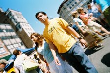
This is a very lively image that very effectively conveys a sense of the hustle and bustle of the market. It also makes very nice use of colours. The yellow t-shirt stands out all the more because of the predominance of blue in the rest of the frame.
You have emphasised the "1969" very effectively. It is prominent in the frame. And, of course, it is the only thing that is in focus in your image. Whether or not you intended to employ these devices to accentuate the date, their effect is very marked (I only wonder because I am guessing that this photograph was shot from the hip. But I may be wrong).
By way of critique, I would suggest that the image would have been a bit stronger had the man's head also been in focus. Because he is so nicely framed by the two buildings and his head is placed against that clear blue sky, my eye goes immediately to his face. It is only upon finding his face to be out of focus that my eye slides down to the "1969."
There is something a bit unsettling about having so much of the image out of focus. I think that it would be a bit more satisfying to look upon if the man's face was in focus. And I don't think that that little bit of extra depth of field would detract very much from the prominence of the date in the image.
Of course, I may just be a dullard who is missing the fact that your objective was to express the degree to which everything was "out of focus" in 1969. If that was, in fact, your objective then your image is actually very clever. But the photograph remains a bit unsettling to look at because so much of it is out of focus.
All that said, I think that yours is a very interesting photograph that makes very good use of colour. It does keep me thinking.
Rxmd
RXMD,
This is a very lively image that very effectively conveys a sense of the hustle and bustle of the market. It also makes very nice use of colours. The yellow t-shirt stands out all the more because of the predominance of blue in the rest of the frame.
You have emphasised the "1969" very effectively. It is prominent in the frame. And, of course, it is the only thing that is in focus in your image. Whether or not you intended to employ these devices to accentuate the date, their effect is very marked (I only wonder because I am guessing that this photograph was shot from the hip. But I may be wrong).
By way of critique, I would suggest that the image would have been a bit stronger had the man's head also been in focus. Because he is so nicely framed by the two buildings and his head is placed against that clear blue sky, my eye goes immediately to his face. It is only upon finding his face to be out of focus that my eye slides down to the "1969."
There is something a bit unsettling about having so much of the image out of focus. I think that it would be a bit more satisfying to look upon if the man's face was in focus. And I don't think that that little bit of extra depth of field would detract very much from the prominence of the date in the image.
Of course, I may just be a dullard who is missing the fact that your objective was to express the degree to which everything was "out of focus" in 1969. If that was, in fact, your objective then your image is actually very clever. But the photograph remains a bit unsettling to look at because so much of it is out of focus.
All that said, I think that yours is a very interesting photograph that makes very good use of colour. It does keep me thinking.
Last edited:
Rafael
Mandlerian
Nuno
Nuno
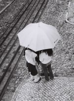
Nuno,
There is an interesting sense of mystery to your photograph. As the observer, I really wonder what is being discussed under the umbrella. In that sense, your image really draws me in.
I also really like the tones and textures in your photograph. The detail of the stones and the tracks are really beautiful. And your exposure seems to be spot on.
My sense is that the image could most have been improved in terms of its graphic design. I think that it would have been stronger had the umbrella not been so centered in the frame and had it not cut into the railway tracks. Just imagine how the image would have changed had you shifted your own position a little bit to the left. You could have placed the umbrella in that space bounded by the tracks and the two curbs. And, because the lines of the tracks would not have been "cut," the pattern with the woman's black jeans would have been more effective.
I think that a cleaner composition would have greatly strengthened this otherwise very interesting photograph. The angle of view is very good. And you spotted a great subject against a fantastic background. As I have already stated, your exposure is very good. I just don't think that the arrangement of the elements in the photograph is quite as strong as it could have been. Nice shot though.
Nuno
Nuno,
There is an interesting sense of mystery to your photograph. As the observer, I really wonder what is being discussed under the umbrella. In that sense, your image really draws me in.
I also really like the tones and textures in your photograph. The detail of the stones and the tracks are really beautiful. And your exposure seems to be spot on.
My sense is that the image could most have been improved in terms of its graphic design. I think that it would have been stronger had the umbrella not been so centered in the frame and had it not cut into the railway tracks. Just imagine how the image would have changed had you shifted your own position a little bit to the left. You could have placed the umbrella in that space bounded by the tracks and the two curbs. And, because the lines of the tracks would not have been "cut," the pattern with the woman's black jeans would have been more effective.
I think that a cleaner composition would have greatly strengthened this otherwise very interesting photograph. The angle of view is very good. And you spotted a great subject against a fantastic background. As I have already stated, your exposure is very good. I just don't think that the arrangement of the elements in the photograph is quite as strong as it could have been. Nice shot though.
sbug
Acceptably Sharp
formal: lots to like here. the obvious disinterest that they boy has is excellent, as is his position. I love that they have stepped off the sidewalk and into the little doorway to talk. The womens clothing in the storefront hammers home the boys indifference to shopping. The tilt is a bit disconcerting to me and maybe that is because it is so slight. Also, and you have no control over this, I would like it more if the stone surrounding the doorway was light like the stone to the left side, leaving the door the only dark portion of the frame. That said, it's a quality shot I'd be proud to have taken myself.
rxmd: First off, great lens. I love the color in this shot and the focus on his shirt is sharp. Excellent sense of movement elsewhere in the frame. I do think I'd prefer more traditional vertical or horizontal framing though. That would include more of his surroundings which I would like. The angle here doesn't improve the photo in my eyes. Was this a hip shot?
Rafael: Geat interaction between the speaker and the woman on the left. They seem oblivious to the world outside them. I'd love to know more of what the discussion was about. There are several interesting faces in the photo that appear as I look at it more. I would prefer a bit less contrast to give more shadow and highlight detail. I look forward to hearing your take on this image.
Nuno: I'm a sucker for the overhead street shot as well as umbrellas and cobblestone streets so this is off to a good start for me. It seemed a bit flat so I saved it and hit auto levels. I initially liked the greater contrast but as I looked at it more, the original image began to look better. What is going on in this photo? I guess that is my big question. Was there anything just outside the frame that could have helped give this more reference? Maybe a slightly different angle?
rxmd: First off, great lens. I love the color in this shot and the focus on his shirt is sharp. Excellent sense of movement elsewhere in the frame. I do think I'd prefer more traditional vertical or horizontal framing though. That would include more of his surroundings which I would like. The angle here doesn't improve the photo in my eyes. Was this a hip shot?
Rafael: Geat interaction between the speaker and the woman on the left. They seem oblivious to the world outside them. I'd love to know more of what the discussion was about. There are several interesting faces in the photo that appear as I look at it more. I would prefer a bit less contrast to give more shadow and highlight detail. I look forward to hearing your take on this image.
Nuno: I'm a sucker for the overhead street shot as well as umbrellas and cobblestone streets so this is off to a good start for me.
It seemed a bit flat so I saved it and hit auto levels. I initially liked the greater contrast but as I looked at it more, the original image began to look better. What is going on in this photo? I guess that is my big question. Was there anything just outside the frame that could have helped give this more reference? Maybe a slightly different angle?
N
Nuno
Guest
Sbug: I love how her expression makes the photo. You inevitably try to take a guess at her thoughts. The gray patch on the upper right (you, i guess...) could be a bit distracting, but it also shows how you shot this one. When I saw the flare on the lower left I couldn't take my eyes off the dirt on the negative, it looks like ash falling from her cigarette.
Formal: This is one of the things I like best about street Photography, showing human interaction. This shot shows the best kind (for me), Parent-Child interaction. I also like the shop window personally as I think I might have had this kind of reaction when my mom took me shopping with her. Looking at the photo I thought that some of the wall on the right could have been cropped out and while you're at it, you could also apply a 1 degree CCW tilt...
Rxmd: Although I like this photo very much I think it is making me dizzy, especially the two ladies to the right of the man. I like the strong colours very much, the yellow t-shirt sure helps the more distracted eye stay with what is the main subject and not with all else that's going on in this photo. Overall a very nice photo.
Rafael: My favorite! Great expressions all over this photo, the man on the right above all. But while my eyes wonder through the picture to catch all of these faces, they quickly go back to the two people speaking. It makes me wat to know more about it.Even the photo nailed to the board is very good...
Last edited by a moderator:
rxmd
May contain traces of nut
sbug
sbug
sbug: I like the overall thoughtful impression the image conveys, as if she was taking a break from some activity that demands her attention. I like this about street photography a lot, taking a single frame out of a continous stream of events around you and condensing all the emotions and dispositions in this single frame. The sense of motion and immediacy conveyed by the slight blur and the finger (if that's what it is) emphasises this sense of still photography very well.
I assume it was shot from the hip, so formal critique has to take this into account. I do like unconventional framing, but I think in this particular case a more conservative vertical framing would have been at least as good; however, in hip shots this is obviously difficult to assess. I've attached a rotated version that I like better, partly because it emphasises the reflection in the window more since it's the only non-orthogonal feature in this region of the picture. Similarly, with respect to focus, the relatively narrow focus does a good job in isolating and emphasizing her against the background, focus lies slightly behind her, but this is impossible to get right in hip shots at open apertures, and it still works out for this picture.
Philipp
Attachments
rxmd
May contain traces of nut
Rafael
Rafael
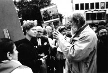
Rafael: This is an excellent picture IMHO. There are two inclined, orthogonal compositional axes, one deliminated by the line of sight from the woman at the lower left to the man in the center right, the other by the stick of the board in the middle that looks like a symbolic barrier separating the two speakers. These axes are at work throughout the picture, in the boards and in the line of sight between the two discussants, where it also conveys both a sense of hierarchy (from the perspective of the man on the right) and a sense of standing up to some (alleged?) authority (from the perspective of the other speaker). DOF could be a bit narrower (I assume you used hyperfocal focusing), but it still works out nicely. It is remarkable how one seems to find something meaningful in this picture wherever you look.
In my opinion this is the strongest of the five pictures here. Where was this taken? It reminds me of lots of demonstrations in and/or concerning the Middle East.
Philipp
Rafael
Rafael: This is an excellent picture IMHO. There are two inclined, orthogonal compositional axes, one deliminated by the line of sight from the woman at the lower left to the man in the center right, the other by the stick of the board in the middle that looks like a symbolic barrier separating the two speakers. These axes are at work throughout the picture, in the boards and in the line of sight between the two discussants, where it also conveys both a sense of hierarchy (from the perspective of the man on the right) and a sense of standing up to some (alleged?) authority (from the perspective of the other speaker). DOF could be a bit narrower (I assume you used hyperfocal focusing), but it still works out nicely. It is remarkable how one seems to find something meaningful in this picture wherever you look.
In my opinion this is the strongest of the five pictures here. Where was this taken? It reminds me of lots of demonstrations in and/or concerning the Middle East.
Philipp
Share:
-
This site uses cookies to help personalise content, tailor your experience and to keep you logged in if you register.
By continuing to use this site, you are consenting to our use of cookies.