rxmd
May contain traces of nut
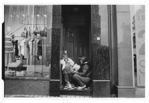
Nuno
Nuno
Nuno: This photo well conveys a certain sense of mystery since we don't know what the three are concerned with, but also of loneliness and isolation because they stand there in an otherwise empty, barren urban terrain that is deliminated only by streetcar tracks and pavements. There is a nice compositional contrast between the gray and black structure of the cobblestones and the uniform white of the umbrella and some of the clothing. However, it is difficult to "understand" this shot because there is little clear reference to either an emotional or personal disposition or to the surrounding situation. The umbrella is really the only link here.
I have great sympathy for people using FSU gear, especially when the results are good. (Half of my gear is Russian.)
Compositionally I have a personal problem with shots where there is only one main object attracting the eye straight in the center of the picture within a uniform surrounding - partly because I've shot many such shots and now can't seem to like them anymore. Maybe my personal taste is somewhat conventional here, but in this case I would like it to be more to the edge to expose it by contrasting it with empty space in the other half, I've attached a very crude crop showing the general idea. A completely minor side-note in the same direction: in a uniformly structured background I find out-of-focus effects a little bit distracting, partly because the uniformity is lost. In this shot I would probably have preferred more DOF in the upper half.
Philipp