RayPA
Ignore It (It'll go away)
Welcome to this critique thread. Please read the purpose statement and the guidelines/ground rules regarding participation.
Purpose
The primary purpose of this thread is to provide a forum where photographers can give and receive constructive criticism on one another's photographs. By setting up some basic guidelines we hope that this thread will provide a forum where the give and take of honest constructive criticism can help us become better photographers.
Guidelines/Ground Rules
The thread has very specific rules regarding participation. The one basic rule is that you cannot provide criticism on an image or comment in a critique thread unless you also have an image posted. To post an image to this thread you must be a participant. Participation in this thread is limited. Here are the guidelines and ground rules for participation:
• Participation in this thread is limited to 5 photographers
• Participants join the thread by posting their intention. You can simply reply with your intent to join by posting something like: "I'm joining," "I'm in," or just state your name
• Joining is on a "first come, first served" basis. The first 5 to reply become the participants.
• Please, only join this thread if you are able post an image within 24 hours of joining.
• Once the thread has 5 participants, no other photographers can join or participate in the thread
• Once the thread is full of participants all photographers will upload their image(s)
• Please abide by any thematic requirement (e.g., landscape, portrait, etc.)
•The number of photos for each participant is limited to one
• Photographers attach photos as thumbnails (no inline images or links)
• Photos should be standard screen resolution (72~90) and the longest side of the image approximately 10 inches in length.
• Photographers post their images supplying titles (if any) and other pertinent information (the amount of information should be minimal)
• Photographers can only comment on their own images and reply to comments only when everyone else in the thread has posted their comments on the image
• Every participant must comment on every photo (except their own—initially)
• Every participant must make at least two comments, one positive comment, and one constructive criticism (which is actually two positive comments)
• Once every photographer has commented then a free flowing discussion begins. It is at this point that every photographer can comment on their own work and reply to comments, ask questions, etc.
• The participants decide when the thread closes.
If you'd like to participate in a critique thread and need some ideas about how to proceed with viewing images critically, you may find this thread helpful:
How do you look at photos
You can also provide feedback on critique threads here:
Critique Feedback Thread
Remember: Please do not provide criticism on an image or comment in a critique thread unless you also have an image posted.
This thread is now active, please follow the guidelines if you'd like to participate! Have Fun!
.
Last edited:
RayPA
Ignore It (It'll go away)
Please note the revision in the guidelines (highlighted in red)
Thanks! Enjoy!
.
Thanks! Enjoy!
.
Rafael
Mandlerian
I'll play again. These are really great.
jmilkins
Digited User
signing in")
Wayne R. Scott
Half fast Leica User
I'll go in this also.
Wayne
Wayne
raid
Dad Photographer
I'm in.
Raid
Raid
Rafael
Mandlerian
We just need one more.
raid
Dad Photographer
Come on ...we need YOU.
Wayne R. Scott
Half fast Leica User
Bumpity-Bump. We need one more victim ........errrr one more participant.
Wayne
Wayne
formal
***
I'm in
... 6 7 8 9 10
... 6 7 8 9 10
Wayne R. Scott
Half fast Leica User
Here is mine:
Wayne
Wayne
Rafael
Mandlerian
raid
Dad Photographer

formal
***
jmilkins
Digited User
Wayne R. Scott
Half fast Leica User
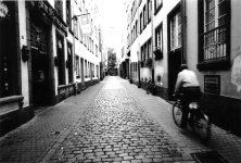
Rafael- Great job with the 21mm. Good exposure, I like the way the brick road leads to a vanishing point in the horizon. I get the feeling that the cyclist is headed straight to that point. 21mm is the hardest lens for me to use, I just have not gotten along with it.
Raid- Arghhh! Let me guess, you were doing lens tests with 3200 iso film in bright sunlight. I don’t really mind grainy pictures, sometimes. I normally associate grain with low light street, opera, bar type scenes. Not sunny bedroom window portraits of a pretty little girl. It doesn’t work for me here.
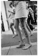
Formal- I am not really well versed in street photos, I guess this is a hip shot. Interesting viewpoint.
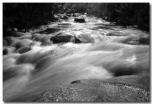
jmilkins- As I said above I am not good with 21mm let alone 15mm!! The stream has a nice flow through it. The long time exposure gives a dream-like quality to the moving water. I like the foreground use of the rock in the lower left hand side of the photo.
Wayne
Raid- Arghhh! Let me guess, you were doing lens tests with 3200 iso film in bright sunlight. I don’t really mind grainy pictures, sometimes. I normally associate grain with low light street, opera, bar type scenes. Not sunny bedroom window portraits of a pretty little girl. It doesn’t work for me here.
Formal- I am not really well versed in street photos, I guess this is a hip shot. Interesting viewpoint.
jmilkins- As I said above I am not good with 21mm let alone 15mm!! The stream has a nice flow through it. The long time exposure gives a dream-like quality to the moving water. I like the foreground use of the rock in the lower left hand side of the photo.
Wayne
Rafael
Mandlerian
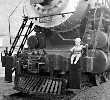
Wayne - This shot just makes me smile. I have been a huge train buff since I was a little kid. I even had an engineer's cap just like that one. And what I wouldn't give to have a shot like this of myself at that age!
The composition is very strong in this image. You give us enough of the train so as to leave no doubt in our minds about what's going on here. But you are tight enough on the child for his expression to come through loud and clear. Was this shot in a square format or did you crop it? Either way, I think that the square format was a very good choice here.
In terms of critique, I don't have very much to offer. The flare in the top right is a bit of a problem. However, the image has a real timeless quality to it that derives, at least in large part, from its overall "soft" feel. So in this case, I don't actually think that the flare is that big of an issue. Overall, I really like this image.
Raid - I have to say that I agree with Wayne on this one. The extreme graininess of the image doesn't really work for me either. I really like the pose. And I love the way you have your daughter looking out of the frame. Her exression is wonderful. It's clear that she is really drawn in by whatever is going on outside that window. But the image is just too grainy for my taste.
Also, on a really picky note, I don't like the way her hand is cut off on the left side of the frame. The idea and the set up for this portrait were really strong. But I think that the final image could have been better.
Formal - I'm trying to figure out what's going on in this photo. Are the woman selling or advertising for Nivea? This is an interesting image. It's very sharp and the exposure seems to be very good. The whole image has a bit of an "off balance" feel to it. I'm not sure whether or not that was what you intended. But the camera angle, combined with the woman caught mid-step creates a type of tension in the image.
There are definitely some interesting aspects to this image. But I am not really sure what I am supposed to get out of it. I would really like to hear more from you about this shot, maybe a bit about where and why you took it.
John - The tones in this image are really wonderful. And I think that you have given the stream just enough blur. Too much blur often gives shots like this a very "fake" look to them. I really like your choice of shutter speed here.
The texture of the rock in the foreground is very beautiful. However, to my eye, the inclusion of that rock detracts a bit from your overall composition. That rock pulls my eye away from the rest of your image. But I do not think that it should be the centre of interest in this photograph. I guess that's my biggest critique of this image: that it does not seem to have a clear point of focus. The image is absolutely gorgeous. But I think that the composition could have been tightened up a bit.
jmilkins
Digited User
Bay and train image
Wayne
I like the instant impact this image has – the contrast of the massive locomotive with the comparatively tiny child. The tightly cropped square format suits the image, and I particularly like the placement of the child in the third right of the picture. The expression on the baby’s face is wonderful- full of the joy of the moment. For me there’s perhaps a little less contrast than I’m used to in images – perhaps its an older, subtler lens or is there too much flare?
Cobblestone lane image
Rafael
This one is interesting for me as it creates a familiar yet strange scene – it instantly says “overseas” (for me of course). The architecture and signs are is different, the bicyclist and the bicycles are on the “wrong” side of the road. – if I was stepping out from a doorway, I’d be looking the wrong way for traffic! I like your selection of shutter speed to blur the rider and the moment you choose to take the image to place the rider moving into the frame – the viewer follows naturally. It’s a strong, composition with the buildings and pavement leading into the shot too. The slight tilt on the camera might at first be distracting, but adds to the dynamic nature of the image for me.
Sepia daughter image
Raid
This one is good. It looks like you were really pushing the boundaries of the film and/or lens here Raid, but that’s good to do as it creates a unique signature for the image. The natural light is very nice and the sepia treatment is right for the image. I can cope with the grain, but I don’t think it would work any bigger on screen for me as the grain just gets too large then. I imagine it’s a print that would look quite different in real life. I do find the pose slightly distracting as your daughter’s right outstretched arm seems to be at odds with the direction of her gaze out the window, but then she’s not sitting / posing for a formal portrait is she?
Sunkissed image
Formal
This one is an interesting street shot, and it took me quite a while to try to sort the reflections from the original – it certainly made me sit there and try to work out the order of the limbs! The image has lots of interest in it – almost like its two photos - the difference between the composition of the original and the reflection plays tricks on the viewer. You’ve really chosen a perfect moment to take the shot. The “sunkissed” element makes it intriguing - there’s an untold story.
Wayne R. Scott
Half fast Leica User
I don't know if I am supposed to answer yet, but here goes. This was the very first sheet of 4x5 film I ever exposed in my life. It is also the very first negative that I have ever scanned in my life. The lens was a single coated 162mm Optar on a Crown Graphic. I did not use a lens hood and the main light source is open sky coming in from the top right hand corner of the photo. I am reasonably certain that this was the cause of the flare. The sun had just set below the horizon to the left in the photo. I cropped some of the left hand image as it showed more of the train station and I did not feel that it added to the photo.
Wayne
Wayne
Last edited:
raid
Dad Photographer
I will follow Wayne's comment on his image by commenting on mine.
First of all, none of Dana's images posted on RFF are "posed". She decides what she wants to do. I take photos, and hopefully some of the photos come out nice.
In this particular shot, I was really pushing the TMAX3200 to the extreme, aiming at getting a unique photo back. I have never before used this film, as I prefer ASA50-100, and I had seen many times its use in dark environments.
Back to the photo: I scanned the nagative a day before posting it,and I noticed that it was scanned as a color negative, so I played with the colors a little.
Thanks for the comments.
Raid
Share:
-
This site uses cookies to help personalise content, tailor your experience and to keep you logged in if you register.
By continuing to use this site, you are consenting to our use of cookies.