Critique #34 *Open Theme* 5-Participants

jvx- I think you have a great photo lying with in your photo. As it is now I want to draw a verticle line down the middle of the photo and divide it into two equal parts. The left side-- not so hot, I can't see the kid's eyes and he is not in focus. The right side has the eyes sharply in focus and staring a hole right through me. The shallow dof really brings out the eyes. This is how I would crop your photo:

Wayne

Edit: I deleted my version from my online folder which deleted it here also.
 
Last edited:
Raid: Nice catch on the spots on Waynes photo. I missed them completely until you pointed them out. I was so caught up in the nice tones I missed the spots altogether.
 
nico- I am not certain what I am supposed to be looking at in your photo. My eye wanders around in the photo and I can not pick out any thing in particular that grabs my attention. My suggestion to you is to "fill the frame" remove all doubt as to whatit is that you want us to see.

Wayne
 
jvx: I like the photo with both boys together; in fact, they "must"be together for the photo to be a really good photo. Technically, the photo is not perfect, but the subject matter makes it interesting. If you had a sharper image with better contrast you would have a winner.

Raid
 
kmack- I like the look of concentration on the Bingo players face. What bothers me is the merger of her face with the younger woman's arm in the background. I am not sure how to fix this, perhaps a longer focal lenth lens with wider aperature or perhaps a slightly different camera position to eliminate the merger.

Wayne
 
raid- I am not sure if your photo is slightly underexposed for the man's face or not. I had a difficult time seeing him until I brought it into photoshop and adjusted levels. In adjusting the levels his shirt loses some of its saturated color but his face is more visible, at least on my monitor. I think this is a great capture with great composition.

Here is what I was looking at after levels adjustment:

harmonicaman.jpg


Wayne
 
Wayne R. Scott said:
raid- I am not sure if your photo is slightly underexposed for the man's face or not. I had a difficult time seeing him until I brought it into photoshop and adjusted levels. In adjusting the levels his shirt loses some of its saturated color but his face is more visible, at least on my monitor. I think this is a great capture with great composition.

Here is what I was looking at after levels adjustment:

harmonicaman.jpg


Wayne


Wayne: The slide is well exposed, but things may vary in different monitors. The scanning process also can change the way a slide appears on a monitor.

Raid
 
Raid: love the tight composition and the contrast between red, brown and blues. Also a big fan of the intense look on the man's face and the limited depth of field to isolate the man from the background. One negative comment would be that it is unclear what the man is doing unless you know the title or see it in a series of shots; maybe it's the hardly visible microphone or the lack of eye contact, I don't know.

For me, your original version is perfect and Wayne's edit is much too light, so it really does depends on monitor differences.
 
nico said:
Here is mine:
"Barber shop"
BessaR+Nok50+IlfordHp5
Bye
Nico


Nico, not a big fan of this shot. I don't like the composition with all the space on the right side, and overall the shot is really cluttered and lacks a point of interest. Nothing seems sharp (except the second chair, somewhat? but no big difference) so I think you should consider either stopping down and getting everything sharp, or use selective focus and make sure there is a very noticeable difference between sharp and unsharp. In a barber shop maybe you could have tried working with mirrors/reflections? Just a thought.
 
kmack said:
Ok, Bingo at the Ruritan Club.


Kevin, a very atmospheric shot. I like the grain. What film(-speed) was this? On my monitor the image is a bit light, no true blacks, but I suppose that is just due to monitor differences and one of the problems of internet photosharing that we just have to try and look past. I'm not sure about the combination of depth-of-field and framing, the lady in the front is as far as I can see the main subject of the photograph, but she doesn't really pop out of the picture. Especially the background around her face is quite cluttered. Perhaps either less depth-of-field or a slightly different framing could have solved this. I like the image though!
 
Wayne R. Scott said:
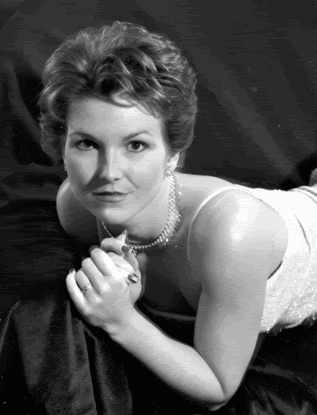
Here is mine.
Wayne

Classy glamour shot, Wayne. I have to admit the spots in the background immediately bothered me - I think they are drying marks on the film? But, that's just a small detail. I like the lighting of the shot. The pose however looks a bit forced, or at least very uncomfortable.
 
On my photo this was a scan at 300 dpi of a badly damaged 4x5 negative.

Here is the raw scan:

Roxanne-damaged.gif


I agree that the pose looks uncomfortable. She is a Yoga instructor, you should see some of her other poses if you think this one is uncomfortable :)

Here is how I would crop it if I were going to print it, I am not going to touch it up here as I am not going to print it.

Roxanne-2b.gif


This was shot with a 135mm Optar on a Super Graphic, Arista 400 film.


Wayne
 
I know Nico has not replied yet, but the pictures have been posted two days ago already so I figure I'll answer some of the comments on my image already.

I uploaded this shot for critique because I knew it was not technically perfect but to me, it had some character... And I wanted to hear some other opinions about that.

Here's a better version (I bracketed two or three shots for correct focus):

2s700aq9.jpg


This is an image from a documentary series on the homeless kids in Romania. The border is not the final border; nor is the editing final; I'm still developing and scanning and afterwards I will make a final edit to all the selected photos, maintaining uniformity for things such as the border.

Wayne, aesthetically your suggestion for cutting the photo in two is a good one; but as far as content is concerned the boys together are key. The brotherhood and taking care of each other is part of what I want to show in this series.

Some background.... The kid on the left is mentally handicapped, the boy on the right has a skin disease. They have no homes. And there were many, many more kids like these. They live under bridges, in the sewers, at the railway station. During the day they are mostly high on glue, and they beg, prostitute themselves or steal. During the night they rape the girls in their group of homeless kids, fight with other groups, and try to rest amidst garbage and faeces in the sewers.


Regards
 
jvx- BAMM!! This last version really works! Much better than the first one you posted.

You must reallize that all of these opinions are just my view and what I like; which doesn't make them right. (or wrong for that matter).

Wayne
 
Sorry for the delays guys. Here my thoughts about the shots:

Jvx:
nice capture, i really like their expressions. I also like composition and light. The soft focus works fine here. It's the kind of photo I think you may like it at all or nothing at all. I like it, so I wouldn't change anything of the shots :).

Kmack:
I like the photo, well seen and composed: I like the woman in the foreground whose expression shows great attention to the game and the man who's looking at you break the pattern of the bingo players' heads. I also like the details on the table. I'd like to see this shot a little bit less grainy (this is the only thing i'd change). :)

Wayne:
a classic glamour shot, I think it's "timeless" I couldn't say if it has been shot yesterday or in the '50. I really like it. I also like the pose, the make up and the dress. The only thing I'd try to correct (if possible) is the shadow of the nose on her face, I think it is a little disturbing but except for this I think it's a good portrait. :)

Raid:
I can hear that harmonica play, you perfectly caught the musician spirit and efforts (eye closed and sweat soaked shirt). I also like colours.
I like this shot "as is" so I wouldn't change anything of it. :)
Bye
Nico

P.S. about my shot I think you're right in your comments; I posted it here because I had some doubts about it (didn't know if i like it or not and, if not, why). Now I made up my mind. Thanks for your friendly and honest comments :)! Nico


Nico
 
Back
Top Bottom