Critique#38 *Open Theme* 5 Participants

Quite the diverse group of images on this thread. I will make comments on the images in the order they appear.

Foolproof: At first I didn't see much of anything in this shot. But I came to like what I see as very droll humor. The camera seems to be turning its "nose" away from the garbage bins as if it can't take either the sight or the smell. If that was the intent then it would seem to me that the camera is a bit cramped in the framing. If it wasn't then you would have to "splain" this photo to me as it appears to be over my head.


Tetrisattack: This image seems to be from a school of photography about which I know little and like even less. I see a very low contrast grainy shot of a place setting with a can of soup on the plate. Possibly a contact print or at least rendered to appear as a contact print. Whatever the point is sails right past me. Again I would need to have this one" splained" to me.


Raid: No need for explanantion here. A stunning photo. I like every element of the shot with the exception of the "frame" with the dust spots or whatever that is around the edge. Whatever. Talk about being in the right place at the right time with the right tools. There are quite a few beach at sunset/sunrise shots floating around the photographic world. No matter. This one is yours and its a beauty. Good eye and great capture.


wyk_penguin: There are a lot of things I like about this image. Great detail and color rendering.Extended dof. Strong graphic elements. Repetition of forms. But is seems cramped to me. As if it needed more ...something in the lower left front portion to tie it to the surrounding area. Perhaps that would not have been possible. I wasn't there. In any case a strong photograph.
 
Last edited:
We see things differently at times but often our comments are similar in context.
As fprConor'squestion tome,I will have to wait until everybody comments on my photo before commenting myself. There are the rules.


Raid
 
tetrisattack: id have to agree with remrf on this one. its from a school of photography which i dont know much about, so id feel odd giving a critique. an explanation would be great, so i can give it a go.

raid amin: red,red,red. what can i say. firewater maybe. a well executed shot, but the colour is the only thing holding it for me. the one in your avatar is far more beautiful! maybe blue's my colour :)

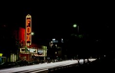
remrf: nice busy night shot - maybe waiting for a girl to cross the road and popin the shutter for a long exposure and the a quick pop of a flash towards her would be cool. i think this would be a good experiment involving the 'fox' sign, putting another level to the word.

wyk_penguin: nice ensemble of patterns and shapes. i think it was a good choice to leave the two green patches in at the top to keep it from becoming too abstract. and that combined with the figures gives it a sense of location aswell. maybe a bit more contrast.

nice diversity of images here which is great! keeps me on my toes before im back to college for another aul year.

my photo wasnt shot in an alleyway at all. it was a wide open street in temple bar. anything outside of the frames wasnt really worth keeping in to be honest, but a bit more above the camera would have been great indeed.

they aren't garage doors, they're shop shutters on a street. the lines on the pavement are perfectly level from left to right considering perspective. that said it is slightly about symmetry, but its more an image about the world turning their back on the velocity of waste we create every day.
 
The red in my photo troubles me as a monotonic photo, but it was a special sunset indeed that evening. What was special about this photo was the event itself and being there to witness it.

In 1991 there was a major volcanoe erruption when Mt. Pinatubo (Phillipines) sent out masses of ashes into the atmosphere. The ashes in the atmosphere reflected the setting sun rays after the actual sunset.

It was rather weird; you witness the sunset, it gets dark, and then the sun "rises"again with such strange monotonic colors. It was as if some giant paint brush was used to color the sky. This shot was taken after it got fully dark for 10 minutes. Then, there was a glow in the sky and everything lit up. I used the old Fujichrome 50 or 100.

I really had a blast for two years until the effect faded away. At the same time, the "Alpenglow" disappeared from the mountain sunsets. I always was the only person at the beach.


Thanks for the comments.

Raid
 
Last edited:
A million sorrys. :bang: (Why do I always end up last....:bang: )

Foolproof:
I liked your choice of the bins in front of the doors. The labels on the bin and the pattern of the doors adds some texture to a scene that i would otherwise see as 'too dull'. However, I wounder why the camera is there. It is in quite an odd place IMHO. I would have done a tighter crop.

Tetrisattack:
What everyone said - 'I am not familiar with this kind of photo.' A nice symmetric composition that gives, unexpectedly, an interesting picture. I agree with your use of low contrast. I don't know why though, just as if it should be that way. If the same 4X5 neg was printed with normal contrast, the whole effect would be ruined. I don't know why the spoon is somewhat transparent in the print. I would have imagined that the spoon is most important of all, while the knive and fork look a bit excessive.

Raid admin:
The colour!!! (Yep, colour, becasue there is only one :D ) More spectacular if it was on a slide projector not my monitor. I would have liked to get closer to the birds. But I can imagine the difficulties.

Remrf:
You capture the activityof the Fox Tucson theater well. I especially like the blurred out human figures. However, it really took me a while to find that there was human existance in the photograph because there is simply too much activity going on on the streets. The traffic light on the left side is particularly distracting. I would have gone for a more "head on" angle of the theater.
 
On my own photograph:
This is something I got from my summer vacation to Twaiwan. What caught my eye when I took the photo were the different shades of orange in the tiles and the contrast between the tiles and the glass panels. I included the trees because I thought the they would give a better sense of location to the photo, but yes i find the window and the lamp-post at the top left distracting. I posted this photo straight out from a scan of the negative. Perhaps a slight increase of satauration and some burning to the top left corner would be better.
 
This has been an interesting thread as much for the comments after the critiques as for the critiques themselves. The comments on my image caused me to recall what my purpose was in taking the photo. My original intention was to shoot some long B exposures of the traffic downtown at night. I was doing that when I looked further up Congress st. and saw the theater was lit up.

A little background might be in order. The Fox Tucson opened in the mid 30's and served Tucson faithfully for the next 40 years. It was closed in the early 70's and sat idle until 98' when the city and a group of private investors decided to renovate the theater for current use. By pure chance I was downtown on the opening "open house" night. The public was invited to come as see what had been done in the theater. The theater was orginally designed in the "art deco" style of the 30's but with a southwestern flavor. Beautiful wood paneling and huge ceiling and wall murals and in the theater area a giant brass dome shaped chandelier that was 20' wide at the base.

I had shot several moving traffic shots a little to the west of the theater and when I saw the sign lit up I moved down to the front of the site. I shot from both directions on the opposite side of the street. The shot on my website (posted below) is more in line with my original intention. I like the effect of long exposure, stopped down night shots which make light trails of the lights on the cars. That I could have the Fox Tucson lit up in the background was a plus. The shot I posted for this thread was the one I did not like at the time. But a few months later I looked at it again and decided I liked the frenetic energy of the shot. But I think some of the comments are right on about the shot I posted. It is very busy and does not have enough light trails to go with my original intention. It has wandered from the intent and while it has for me some visual appeal I can see that it does not portray what I had intended.

I've been meaning to get back down there and shoot the building again. This time with the intention of shooting the building.

The shots by the way were metered . F-22 @ 30 seconds.


Raid, I was surprised to see objections to the monochromatic effect in your shot. It happens with regularity in the southwest at sunset and is one of the more beautiful aspects of the shot imo.
 

Attachments

  • dt02.jpg
    dt02.jpg
    87.9 KB · Views: 0
So, I suppose an explanation. :) The theme is pop art, it's a comment on Warhol. As for the meaning? Ultimately, it is what it is, but what I had intended was to point out how hard it is to actually feed yourself through art. There are a lot of other viewpoints to the shot that I've carefully considered, but that's the main one.

The contact print itself is a van dyke brown, 4x5", on rising stonehenge white.

It's incredibly tough to get comment, let alone critique on this sort of work, so I thank you all for your time. :)
 
monochromatic effect

monochromatic effect

There are sunsets with puffy rosy clouds and some dark blues, and there
monochromatic looking sunsets. All sunsets are nice to look at. As stated above, the event by itself was stunning [to me].


The discussions sometimes get cut short, and maybe we could take another turn at some or even all of the photos. Maybe we see "more"?


Raid

====================================================
"Raid, I was surprised to see objections to the monochromatic effect in your shot. It happens with regularity in the southwest at sunset and is one of the more beautiful aspects of the shot imo."
 
I wish I could enjoy all of your images. For some reason thumbnails just appear as blank rectangles.

Ted
 
Back
Top Bottom