RayPA
Ignore It (It'll go away)
Welcome to this critique thread. Please read the purpose statement and the guidelines/ground rules regarding participation.
Purpose
The primary purpose of this thread is to provide a forum where photographers can give and receive constructive criticism on one another's photographs. By setting up some basic guidelines we hope that this thread will provide a forum where the give and take of honest constructive criticism can help us become better photographers.
Guidelines/Ground Rules
The thread has very specific rules regarding participation. The one basic rule is that you cannot provide criticism on an image or comment in a critique thread unless you also have an image posted. To post an image to this thread you must be a participant. Participation in this thread is limited. Here are the guidelines and ground rules for participation:
• Participation in this thread is limited to 5 photographers
• Participants join the thread by posting their intention. You can simply reply with your intent to join by posting something like: "I'm joining," "I'm in," or just state your name
• Joining is on a "first come, first served" basis. The first 5 to reply become the participants.
• Please, only join this thread if you are able post an image within 24 hours of joining.
• Once the thread has 5 participants, no other photographers can join or participate in the thread
• Once the thread is full of participants all photographers will upload their image(s)
• Please abide by any thematic requirement (e.g., landscape, portrait, etc.)
•The number of photos for each participant is limited to one
• Photographers attach photos as thumbnails (no inline images or links)
• Photos should be standard screen resolution (72~90) and the longest side of the image approximately 10 inches in length.
• Photographers post their images supplying titles (if any) and other pertinent information (the amount of information should be minimal)
• Photographers can only comment on their own images and reply to comments only when everyone else in the thread has posted their comments on the image
• Every participant must comment on every photo (except their own—initially)
• Every participant must make at least two comments, one positive comment, and one constructive criticism (which is actually two positive comments)
• Once every photographer has commented then a free flowing discussion begins. It is at this point that every photographer can comment on their own work and reply to comments, ask questions, etc.
• The participants decide when the thread closes.
If you'd like to participate in a critique thread and need some ideas about how to proceed with viewing images critically, you may find this thread helpful:
How do you look at photos
You can also provide feedback on critique threads here:
Critique Feedback Thread
Remember: Please do not provide criticism on an image or comment in a critique thread unless you also have an image posted.
This thread is now active, please follow the guidelines if you'd like to participate! Have Fun!
.
T
Todd.Hanz
Guest
I'm in!.....................
venchka
Veteran
Put me in coach!
Rafael
Mandlerian
I'm in as well.
Wayne R. Scott
Half fast Leica User
Am I in time to play?
Wayne
Wayne
N
Nuno
Guest
Looks like there's one free seat!
I'll take it!
I'll take it!
Wayne R. Scott
Half fast Leica User
Rafael
Mandlerian
T
Todd.Hanz
Guest
venchka
Veteran

N
Nuno
Guest
Rafael
Mandlerian
There are some really great shots in this thread. Here are my comments:
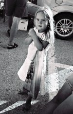
Wayne: Great hip shot! There was quite a heated debate about hip shots some time back. I, for one, consider the hip shot to be an invaluable tool in the arsenal of the street photographer. Composing hip shots takes a good deal of skill. And here, I think you have done really nicely in that regard.
The expression on the little girl's face is simply wonderful, a sort of cross between shyness and mischievousness. The lighting is very good. I really like the highlights in the girl's hair. Normally, I would have found the legs in the bottom right of the frame to be distracting. But in this case, because they are not directly lit and because they work so well with the other set of legs to frame the little girl, I actually think that they work in the image.
My only real critique concerns the crop. I think that you could crop a bit off of the top of the image (right under the gas cap of the car) and a bit off of the left side of the image (right to the edge of the man's left hip). I do find the bright spot in the top left corner of the image to be quite distracting. And I see no reason why you shouldn't crop out the man's backside. Apart from these minor critiques, I really like this image.
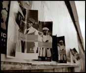
Todd: This is a really interesting image. My eye goes straight to the face of the man on the right side of the poster on the left of your image. It then travels to the face of the man on the left of that poster and then back into the image. The pattern repetition and the diagonal lines make for a very strong composition. But I also really appreciate the "imperfections" in the image (e.g. the peeling bits of old posters at the bottom of the frame and the poster on the far right that is sticking out from the wall). Also, your choice of depth of field is perfect in my opinion.
As far as a critique goes, as I did with Wayne's image, I am going to propose a slightly different crop for your image. The poster on the very far left bothers me a bit because of the way in which it breaks up the pattern created by all of the other posters. I think that your image might work very well in a square format. If you simply crop to the left edge of the first full poster, you wind up with a bright spot in the top left corner of the frame. So I would be tempted to crop in to somewhere near the right eye of the man in that poster. You could then take a bit off of the top of the frame to get a square image. It's just a suggestion. As it stands, I find this to be a very interesting image that really draws in my eye. Nice shot.
Venchka: You've captured a great expression on this little girl's face. I love the way she's gripping the edge of the table. She is clearly deep in thought. The yellow flotation device adds a touch of humour to the shot.
I know that these moments with kids come and go very quickly. Most of the time, you have very little time to think about composition. You just snap your shot quickly or else the moment gets lost. So do take this critique with a grain of salt. Had I been in your position, I would probably have gone for a different camera angle. This angle really has the viewer looking down on the little girl. I would have gotten lower. The girl's expression really draws the viewer into wondering just what it is that she is contemplating so intently. I think that effect would have been even more pronounced had the viewer been at her level and seen more of her eyes. Also, the lower camera angle would have allowed you to show more of the context of the shot. This composition is a little too tight on the girl for my taste. I would have liked to have had a little more context.
On the whole though, I think that you have done very well at capturing a really touching moment.
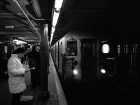
Nuno: I really like this shot. For me, it succeeds because we can see the face of the subway driver. I like the contrast between the feeling of movement that is conveyed by the right side of the frame and the static feeling of the left side which is accentuated by the woman reading. The image has a whole lot going on in it. Very nicely done.
I have a few quibbles with your composition. Firstly, I don't like the inclusion of the "E" from the exit sign. It breaks up the pattern of the ceiling. I think that you could have changed your camera angle slightly to fully hide the sign behind the pole. Also, I find the white papers in the woman's shopping bag to be distracting. A slightly different camera angle or a different crop could easily have taken care of that. On the whole though, I really like this shot. It's very dynamic.
Wayne: Great hip shot! There was quite a heated debate about hip shots some time back. I, for one, consider the hip shot to be an invaluable tool in the arsenal of the street photographer. Composing hip shots takes a good deal of skill. And here, I think you have done really nicely in that regard.
The expression on the little girl's face is simply wonderful, a sort of cross between shyness and mischievousness. The lighting is very good. I really like the highlights in the girl's hair. Normally, I would have found the legs in the bottom right of the frame to be distracting. But in this case, because they are not directly lit and because they work so well with the other set of legs to frame the little girl, I actually think that they work in the image.
My only real critique concerns the crop. I think that you could crop a bit off of the top of the image (right under the gas cap of the car) and a bit off of the left side of the image (right to the edge of the man's left hip). I do find the bright spot in the top left corner of the image to be quite distracting. And I see no reason why you shouldn't crop out the man's backside. Apart from these minor critiques, I really like this image.
Todd: This is a really interesting image. My eye goes straight to the face of the man on the right side of the poster on the left of your image. It then travels to the face of the man on the left of that poster and then back into the image. The pattern repetition and the diagonal lines make for a very strong composition. But I also really appreciate the "imperfections" in the image (e.g. the peeling bits of old posters at the bottom of the frame and the poster on the far right that is sticking out from the wall). Also, your choice of depth of field is perfect in my opinion.
As far as a critique goes, as I did with Wayne's image, I am going to propose a slightly different crop for your image. The poster on the very far left bothers me a bit because of the way in which it breaks up the pattern created by all of the other posters. I think that your image might work very well in a square format. If you simply crop to the left edge of the first full poster, you wind up with a bright spot in the top left corner of the frame. So I would be tempted to crop in to somewhere near the right eye of the man in that poster. You could then take a bit off of the top of the frame to get a square image. It's just a suggestion. As it stands, I find this to be a very interesting image that really draws in my eye. Nice shot.
Venchka: You've captured a great expression on this little girl's face. I love the way she's gripping the edge of the table. She is clearly deep in thought. The yellow flotation device adds a touch of humour to the shot.
I know that these moments with kids come and go very quickly. Most of the time, you have very little time to think about composition. You just snap your shot quickly or else the moment gets lost. So do take this critique with a grain of salt. Had I been in your position, I would probably have gone for a different camera angle. This angle really has the viewer looking down on the little girl. I would have gotten lower. The girl's expression really draws the viewer into wondering just what it is that she is contemplating so intently. I think that effect would have been even more pronounced had the viewer been at her level and seen more of her eyes. Also, the lower camera angle would have allowed you to show more of the context of the shot. This composition is a little too tight on the girl for my taste. I would have liked to have had a little more context.
On the whole though, I think that you have done very well at capturing a really touching moment.
Nuno: I really like this shot. For me, it succeeds because we can see the face of the subway driver. I like the contrast between the feeling of movement that is conveyed by the right side of the frame and the static feeling of the left side which is accentuated by the woman reading. The image has a whole lot going on in it. Very nicely done.
I have a few quibbles with your composition. Firstly, I don't like the inclusion of the "E" from the exit sign. It breaks up the pattern of the ceiling. I think that you could have changed your camera angle slightly to fully hide the sign behind the pole. Also, I find the white papers in the woman's shopping bag to be distracting. A slightly different camera angle or a different crop could easily have taken care of that. On the whole though, I really like this shot. It's very dynamic.
Rafael
Mandlerian
Bueller? Bueller? 
Wayne R. Scott
Half fast Leica User
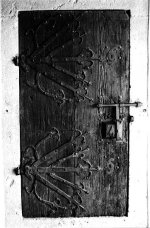
Rafael- That is one pretty impressive door!! I have found out from other critic sessions that my monitor tends to render images darker than most peoples. So I brought your image into photoshop to lighten it so that I could see the detail in the black door. On my monitor it was basically a black mass which I am sure is not what you are seeing. Any way, I think this would make a very interesting series of detail photos, like close-ups of the latch, the hinges the wood etc.
Todd- I find this an interesting capture. The first poster is almost an anomaly as all of the other posters are the same, which keeps drawing my eye back to the first poster. My only suggestion would be to crop slightly the right side of the photo to eliminate the white sky which keeps drawing my eye out of the photo.
venchka- I like this photo of “pensive Emma”. There is very little that I would change other than to crop the left side and the top of the photo to place Emma a little higher and to the left in the photo.
Nuno- This photo is one that I had to bring into photoshop to see detail on my monitor (see my comments above to Rafael), which is my equipment problem and not yours.. I am not a good judge of street photos as it is something that I do not study. I am not exactly sure what it is that you are trying to show in this photo. This may be a very typical evening scene in a large city, I wouldn’t know as I live in the country and our means of transportation is mainly pick-up trucks. I don’t feel that it is fair for me to make suggestions for changes as I don’t know what I am doing in this type of photography.
Wayne
T
Todd.Hanz
Guest
Wayne:
nice hipshot, you captured a great expression on her face. Hipshots are tough and you really need to know your field of view to pull it off on a regular basis, nice one. I don't know how I'd change this, maybe crop the arm out of the lower right but that may crowd the frame too much.
Rafael:
great detail in this one along with some nice light too. I really like the textures you've captured in this one. IMHO, I might have zeroed in on a feature of the door also, the fan looking hinge or the latch, etc. Pretty cool!
Venchka:
great expression on her face, it looks like she's waiting for something, maybe icecream. I might have composed it differently, lower camera angle, maybe put her off to the upper left corner to have her looking more into the frame, etc but thats just me, nice work.
nuno:
I really like this type of shot because we don't have this kind of transportation in my city, so we don't have this kind of photo op. I like the raw edgey feel and the composition and darkness add to the moodiness. The only thing I would add is a bit more shadow detail on the right of the train, not sure if that's possible given the low light in the area, nice shot.
Great job guys, keep it up!
Todd
nice hipshot, you captured a great expression on her face. Hipshots are tough and you really need to know your field of view to pull it off on a regular basis, nice one. I don't know how I'd change this, maybe crop the arm out of the lower right but that may crowd the frame too much.
Rafael:
great detail in this one along with some nice light too. I really like the textures you've captured in this one. IMHO, I might have zeroed in on a feature of the door also, the fan looking hinge or the latch, etc. Pretty cool!
Venchka:
great expression on her face, it looks like she's waiting for something, maybe icecream
. I might have composed it differently, lower camera angle, maybe put her off to the upper left corner to have her looking more into the frame, etc but thats just me, nice work.nuno:
I really like this type of shot because we don't have this kind of transportation in my city, so we don't have this kind of photo op
. I like the raw edgey feel and the composition and darkness add to the moodiness. The only thing I would add is a bit more shadow detail on the right of the train, not sure if that's possible given the low light in the area, nice shot.Great job guys, keep it up!
Todd
venchka
Veteran
venchka
Veteran
Wayne's Hip Shot
Wayne's Hip Shot
Well done. Yes, there is some clutter, but what ya gonna do? You captured her eyes. That is critical. Something I missed in Emma's picture. We should all learn to get down to a 3-4-5 year old's level. Perhaps "shooting from the hip" is the correct way to approach children. I'm rambling. Good job. Work on isolating the subject. I know, easy for me to say.
N
Nuno
Guest
Grest shots everyone!
Here goes:
Wayne: My eye keep coming back to the look on her face. Your hip shot really captured it well. Although the shot looks a little "busy"(the only thing I would say could be corrected...) none of the other elements catch my attention for more than one second.
Rafael: Beautiful subject.Great textures and exposure concentrating on the door it self. Your position could be a bit more perpendicular to the door, but I don't know what your intention was. As it is, this perspective makes me think the door was rather small.
Todd: My favorite! I love the composition and DOF you've chosen here, my eyes "travel" through the posters and in doing so I can see how their not all alike. The sharpness of MF is difficult to beat and here you prove it well.
Venchka: Emma look intriguing here. I'm trying to guess what she was waiting for, if she was waiting for anything at all. Exposure is really good. A lower point-of-view might get a better shot of her eyes but could also get a bit more distracting background into the shot.
venchka
Veteran
Rafael-Interesting detail. Is it a door? Or shuttered window? Technically, this photo shows off the details in the subject, the quality of the lens and the quality of the film. Well done. Perhaps it is my monitor or the small image size for web viewing, but the right side below the latch is blown out. The top left corner is too black. Again, it may just be the limitations of posting here. I would like to know more about the location. Where is this wonderful wood and iron scupture? For my tastes, I think the subject may be cropped too tightly.
Todd-Not fair! MF photos are just too nice. Even small on the web. Big negative quality aside, it is a very good photograph. Finding interesting subject matter in what most folks would think is little more than trash takes a very good eye. I wonder how many people passed that location and never noticed what you saw? It's all good to my eye.
Nuno-I admire this type of photography. Carry a camera everywhere and learn how to use it everywhere. We all need to acquire these habits. Like the other Wayne here, I don't have any experience in these places. I have no idea how, or even if, you could improve on this image. What I see is interesting. Perhaps that is as it should be.
There. Sorry I was tardy.
Todd-Not fair!
MF photos are just too nice. Even small on the web. Big negative quality aside, it is a very good photograph. Finding interesting subject matter in what most folks would think is little more than trash takes a very good eye. I wonder how many people passed that location and never noticed what you saw? It's all good to my eye.Nuno-I admire this type of photography. Carry a camera everywhere and learn how to use it everywhere. We all need to acquire these habits. Like the other Wayne here, I don't have any experience in these places. I have no idea how, or even if, you could improve on this image. What I see is interesting. Perhaps that is as it should be.
There. Sorry I was tardy.
venchka
Veteran
Emma and her sister were waiting for rainbow yogurt after swimming. The last picture is Emma declaring that posing for pictures had ended for the day!
Yes! I need to get away from standing stright up and taking all my pictures with the lens 5'-4" from the ground.
Thanks for the kind words and helpful suggestions!
Yes! I need to get away from standing stright up and taking all my pictures with the lens 5'-4" from the ground.
Thanks for the kind words and helpful suggestions!
Attachments


Share:
-
This site uses cookies to help personalise content, tailor your experience and to keep you logged in if you register.
By continuing to use this site, you are consenting to our use of cookies.