lubitel
Well-known
jvx,
this is such a devilishly good shot. the look on this face and the way his eyes just shine is great. The focus is right on, contrast and sharpness are nice. The way you chose your composition is interesting too, it really puts emphasis on the head, it seems to cut it off from the rest. a very fascinating portrait.
ampguy,
This is a very dynamic photo. The tilt of the camera and the lines of the guitars add to this effect. I also like how the white pickup and the older guy dressed in white are unified while the rest of the photo is rather dark. I think this shot would have been better with a somewhat different perspective. may be if it was just shot from a lower standpoint, or may be if the tilt was in the other direction? I feel its a bit too heavy on the right.
garethc,
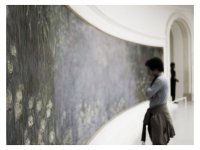
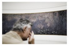
a very thought provoking capture. I wonder what he thinks and what he sees. I really like the composition the white on top and bottom make it seem elongated. And the way the person brings the viewer into this picture from the left corner. I also like the way the painting is out of focus and the we have no way of knowing if its a traditional painting or something abstract.
jmilkins,
also very dynamic photograph, i like the composition and the way the driver looks like he is on top of the world in his right upper corner cruising in (some kind of ) classic car. I also like how the line of the windschild going up seems to kind of stabilize the composition.
this is such a devilishly good shot. the look on this face and the way his eyes just shine is great. The focus is right on, contrast and sharpness are nice. The way you chose your composition is interesting too, it really puts emphasis on the head, it seems to cut it off from the rest. a very fascinating portrait.
ampguy,
This is a very dynamic photo. The tilt of the camera and the lines of the guitars add to this effect. I also like how the white pickup and the older guy dressed in white are unified while the rest of the photo is rather dark. I think this shot would have been better with a somewhat different perspective. may be if it was just shot from a lower standpoint, or may be if the tilt was in the other direction? I feel its a bit too heavy on the right.
garethc,
a very thought provoking capture. I wonder what he thinks and what he sees. I really like the composition the white on top and bottom make it seem elongated. And the way the person brings the viewer into this picture from the left corner. I also like the way the painting is out of focus and the we have no way of knowing if its a traditional painting or something abstract.
jmilkins,
also very dynamic photograph, i like the composition and the way the driver looks like he is on top of the world in his right upper corner cruising in (some kind of ) classic car. I also like how the line of the windschild going up seems to kind of stabilize the composition.