RayPA
Ignore It (It'll go away)
Welcome to this critique thread. Please read the purpose statement and the guidelines/ground rules regarding participation.
Purpose
The primary purpose of this thread is to provide a forum where photographers can give and receive constructive criticism on one another's photographs. By setting up some basic guidelines we hope that this thread will provide a forum where the give and take of honest constructive criticism can help us become better photographers.
Guidelines/Ground Rules
The thread has very specific rules regarding participation. The one basic rule is that you cannot provide criticism on an image or comment in a critique thread unless you also have an image posted. To post an image to this thread you must be a participant. Participation in this thread is limited. Here are the guidelines and ground rules for participation:
• Participation in this thread is limited to 5 photographers
• Participants join the thread by posting their intention. You can simply reply with your intent to join by posting something like: "I'm joining," "I'm in," or just state your name
• Joining is on a "first come, first served" basis. The first 5 to reply become the participants.
• Please, only join this thread if you are able post an image within 24 hours of joining.
• Once the thread has 5 participants, no other photographers can join or participate in the thread
• Once the thread is full of participants all photographers will upload their image(s)
• Please abide by any thematic requirement (e.g., landscape, portrait, etc.)
•The number of photos for each participant is limited to one
• Photographers attach photos as thumbnails (no inline images or links)
• Photos should be standard screen resolution (72~90) and the longest side of the image approximately 10 inches in length.
• Photographers post their images supplying titles (if any) and other pertinent information (the amount of information should be minimal)
• Photographers can only comment on their own images and reply to comments only when everyone else in the thread has posted their comments on the image
• Every participant must comment on every photo (except their own—initially)
• Every participant must make at least two comments, one positive comment, and one constructive criticism (which is actually two positive comments)
• Once every photographer has commented then a free flowing discussion begins. It is at this point that every photographer can comment on their own work and reply to comments, ask questions, etc.
• The participants decide when the thread closes.
If you'd like to participate in a critique thread and need some ideas about how to proceed with viewing images critically, you may find this thread helpful:
How do you look at photos
You can also provide feedback on critique threads here:
Critique Feedback Thread
Remember: Please do not provide criticism on an image or comment in a critique thread unless you also have an image posted.
This thread is now active, please follow the guidelines if you'd like to participate! Have Fun!
.
ampguy
Veteran
i'm in.
............
............
Dracotype
Hold still, you're moving
Count me in.
Drew
Drew
AusDLK
Famous Photographer
I'd like to throw my one of my favorites into the ring.
formal
***
I'm in.
David
David
raid
Dad Photographer
formal
***
ampguy
Veteran
Yes, looks like 4, please join.
Yes, looks like 4, please join.
.................
Yes, looks like 4, please join.
.................
raid amin said:Do you need Nr. 5? This thread is slow indeed.
Raid
AusDLK
Famous Photographer
Gabriel M.A.
My Red Dot Glows For You
Sorry to butt in, but ausdlk: I think I used that ATM a looong time ago! I forgot exactly where, but it's within the Ringstrasse, isn't it? Not far from the "Mozart" store? (I'll wait till the end of your discussion)
OK, ciao.
OK, ciao.
ampguy
Veteran

Dracotype
Hold still, you're moving
AusDLK
Famous Photographer
my critiques
my critiques
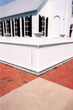
Raid: I looked at your image for good while waiting to see what might happen. I see the foreground mirror symmetry that probably attracted you to take this picture. I still waiting for something else to grab me... But it isn't happening. The symmetry, if mirrored perfectly, would help but the "bowtie" is lopsided. And the house in the background is equally lopsided (in the same plane) and lacks any matching symmetry that would tie it to the foreground. Of all areas in the image, my eye is first drawn to the bright white spot in the upper right -- and this is certainly the least interesting part of the image so that should be darkened or better yet cropped out. Frankly, I'm not sure just where in this image the photographer wants me to take my eyes -- i.e., what is the main subject? I see what you might have been going for but for me it just isn't working.
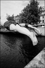
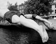
formal: I like this image very much. It is dynamic, almost explosive. The first diver jumping out of the frame and the invisible head of the second is very, very effective. Some of the energy of the divers is lost because of a too-in-focus background that distracts. Too late to fix that in camera but use of PS lens blur filter on the background would do the trick nicely. I also think that a horizontal orientation would significantly heighten the power of this image. I took the liberty to PS your image to show -- rather then tell -- what I am suggesting. I know that some people -- and perhaps you -- choose to only show images full frame but as you may have gathered I'm not one of those -- cropping is my friend! I give your original image an A- and the cropped/blurred version an A++. Congrats.
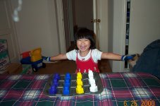
ampguy: This little tyke has an expensive taste in automobiles! This is an endearing image particularly as something for the family album. Since cropping is my friend, I strongly suggest cropping out most of the sofa and blanket (and a little counterclockwise rotation) which is not nearly as interesting as the subject peeking out from behind the magazine. As with many photographs of children it borders on being precious -- which is not a good thing -- which is why I suggest that it works better as photograph for the family album as opposed to one that might be part of a serious portfolio.
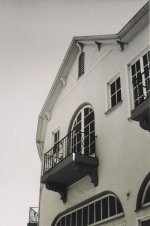
Drew: This image is another long-looker... I keep wanting it to speak to me so I can see it as something other than a mis-aimed snapshot of some building -- a house? a hotel? Is that the top of a garage door? But I'm sorry but I see extremely little that is interesting, not to mention visually compelling, here. What does the photographer want us to see, where should the viewer's eye be drawn? The only interesting element is the balcony that juts out along the lower left edge of the frame. I believe that all good photographs must convey a story of some kind -- to intrique us, to tell us why we should bother to look at it -- and I see no story here. What that said, I'll dispense with any comments now about my compositional concerns.
my critiques
Raid: I looked at your image for good while waiting to see what might happen. I see the foreground mirror symmetry that probably attracted you to take this picture. I still waiting for something else to grab me... But it isn't happening. The symmetry, if mirrored perfectly, would help but the "bowtie" is lopsided. And the house in the background is equally lopsided (in the same plane) and lacks any matching symmetry that would tie it to the foreground. Of all areas in the image, my eye is first drawn to the bright white spot in the upper right -- and this is certainly the least interesting part of the image so that should be darkened or better yet cropped out. Frankly, I'm not sure just where in this image the photographer wants me to take my eyes -- i.e., what is the main subject? I see what you might have been going for but for me it just isn't working.
formal: I like this image very much. It is dynamic, almost explosive. The first diver jumping out of the frame and the invisible head of the second is very, very effective. Some of the energy of the divers is lost because of a too-in-focus background that distracts. Too late to fix that in camera but use of PS lens blur filter on the background would do the trick nicely. I also think that a horizontal orientation would significantly heighten the power of this image. I took the liberty to PS your image to show -- rather then tell -- what I am suggesting. I know that some people -- and perhaps you -- choose to only show images full frame but as you may have gathered I'm not one of those -- cropping is my friend! I give your original image an A- and the cropped/blurred version an A++. Congrats.
ampguy: This little tyke has an expensive taste in automobiles! This is an endearing image particularly as something for the family album. Since cropping is my friend, I strongly suggest cropping out most of the sofa and blanket (and a little counterclockwise rotation) which is not nearly as interesting as the subject peeking out from behind the magazine. As with many photographs of children it borders on being precious -- which is not a good thing -- which is why I suggest that it works better as photograph for the family album as opposed to one that might be part of a serious portfolio.
Drew: This image is another long-looker... I keep wanting it to speak to me so I can see it as something other than a mis-aimed snapshot of some building -- a house? a hotel? Is that the top of a garage door? But I'm sorry but I see extremely little that is interesting, not to mention visually compelling, here. What does the photographer want us to see, where should the viewer's eye be drawn? The only interesting element is the balcony that juts out along the lower left edge of the frame. I believe that all good photographs must convey a story of some kind -- to intrique us, to tell us why we should bother to look at it -- and I see no story here. What that said, I'll dispense with any comments now about my compositional concerns.
Attachments
Last edited:
raid
Dad Photographer
jumping in
jumping in
formal: I like this photo for its dynamics, but I wonder whether I would have liked it more [or less] if the entire body was shown with face. Now,I sense youth and adventure as being the message of this image.
Raid
jumping in
formal said:M6; 24mm; T-Max 400
formal: I like this photo for its dynamics, but I wonder whether I would have liked it more [or less] if the entire body was shown with face. Now,I sense youth and adventure as being the message of this image.
Raid
raid
Dad Photographer
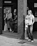
Dave: This photo has lots of potential, but it is cluttered. There are too many objects to look at. If the people on the left were slightly more out of focus, it would be a stronger image for me.AusDLK said:Something new, not online anywhere...
Raid
raid
Dad Photographer
boy reading
boy reading
Raid
boy reading
ampguy: This is a successful image. One of the girl's eyes shows. I would do some cropping to make this a tighter framed image around the boy.ampguy said:..........................
Raid
Last edited:
raid
Dad Photographer
Building
Building
Drew: If you took this photo from your window, then maybe there was not much more that you could have done [other than change the focal length maybe]. There is no point drawing my eyes to it. Maybe if you had focusedonly on one aspect of this building ,it would be stronger.
Raid
Building
Dracotype said:Titled: Go From My Window
Zorki 4 & Industrar 26m I think. Kodak C41 B&W.
Drew
Edit: Darn, I forgot to resize. Forgot about that.
Drew: If you took this photo from your window, then maybe there was not much more that you could have done [other than change the focal length maybe]. There is no point drawing my eyes to it. Maybe if you had focusedonly on one aspect of this building ,it would be stronger.
Raid
ampguy
Veteran
She's a girl
She's a girl
see, here she is learning to cook ...
She's a girl
see, here she is learning to cook ...
raid amin said:ampguy: This is a successful image. One of the boy's eyes shows. I would do some cropping to make this a tighter framed image around the boy.
Raid
Attachments
raid
Dad Photographer
ampguy said:see, here she is learning to cook ...
I am sorry! I went back and changed boy to girl.
Raid
ampguy
Veteran
no big deal
no big deal
We used to kid her that she looked like Mowgli") Once I gave her a haircut, a really bad one, My wife will never forgive me for that, but I tried...
Once I gave her a haircut, a really bad one, My wife will never forgive me for that, but I tried...
no big deal
We used to kid her that she looked like Mowgli
Once I gave her a haircut, a really bad one, My wife will never forgive me for that, but I tried...raid amin said:I am sorry! I went back and changed boy to girl.
Raid
Share:
-
This site uses cookies to help personalise content, tailor your experience and to keep you logged in if you register.
By continuing to use this site, you are consenting to our use of cookies.