mascarenhas
Established
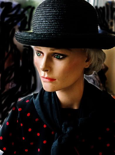
Wayne R. Scott said:Here is mine:
Wayne
Wayne, I like the way the model is lit (except for the plastic sheen on the right of its neck), and the colors, but I think the photo would benefit from shorter dof, and a darker background (maybe burning it in), which would remove the distracting column to the left and separate the left of the model's face from the background. Deeper shadows in the right may remove the plastic look and make the model look more real, which is what I think you were trying to achieve, right?