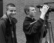
nico:
I can barely see the street and the three blokes in my lcd monitor, and the buildings look very blown out. I think the image could work if the contrast between top and bottom was lower. As it is I would cut the top half and make the street scene the image (lightening it up a bit).
raid:
Great candid you caught here, I enjoy this kind of photograpy. I agree with Kevin that cutting the empty space at the top would make a stronger image. Kevin suggested a square crop. I think a 4x5 crop would work, too. I also think the scan is not doing it justice, it looks soft and there are blown highlights in the hat.
formal:
This is my favorite of this bunch, and I am counting mine. 🙂 Great street photography, I wish I had taken it. Composition, lighting, exposure, all spot on to me. But as this is the critique forum 🙂, maybe it would be better if you had composed a little higher, not cutting the top of the girl's head; there seems to be enough space at the bottom to do this. But I know how this kind of accurate framing is hard on RF's. 🙂
kmack:
It's a nice street shot, I like the composition, and just the slightest bit of background blur separating the two guys from the background, but still making the background clear. I think the contrast is too low, though. I did a slight curves manipulation that I think makes the image "pop" more, it's attached.