RayPA
Ignore It (It'll go away)
Welcome to this critique thread. Please read the purpose statement and the guidelines/ground rules regarding participation.
Purpose
The primary purpose of this thread is to provide a forum where photographers can give and receive constructive criticism on one another's photographs. By setting up some basic guidelines we hope that this thread will provide a forum where the give and take of honest constructive criticism can help us become better photographers.
Guidelines/Ground Rules
The thread has very specific rules regarding participation. The one basic rule is that you cannot provide criticism on an image or comment in a critique thread unless you also have an image posted. To post an image to this thread you must be a participant. Participation in this thread is limited. Here are the guidelines and ground rules for participation:
• Participation in this thread is limited to 5 photographers
• Participants join the thread by posting their intention. You can simply reply with your intent to join by posting something like: "I'm joining," "I'm in," or just state your name
• Joining is on a "first come, first served" basis. The first 5 to reply become the participants.
• Please, only join this thread if you are able post an image within 24 hours of joining.
• Once the thread has 5 participants, no other photographers can join or participate in the thread
• Once the thread is full of participants all photographers will upload their image(s)
• Please abide by any thematic requirement (e.g., landscape, portrait, etc.)
•The number of photos for each participant is limited to one
• Photographers attach photos as thumbnails (no inline images or links)
• Photos should be standard screen resolution (72~90) and the longest side of the image approximately 10 inches in length.
• Photographers post their images supplying titles (if any) and other pertinent information (the amount of information should be minimal)
• Photographers can only comment on their own images and reply to comments only when everyone else in the thread has posted their comments on the image
• Every participant must comment on every photo (except their own—initially)
• Every participant must make at least two comments, one positive comment, and one constructive criticism (which is actually two positive comments)
• Once every photographer has commented then a free flowing discussion begins. It is at this point that every photographer can comment on their own work and reply to comments, ask questions, etc.
• The participants decide when the thread closes.
If you'd like to participate in a critique thread and need some ideas about how to proceed with viewing images critically, you may find this thread helpful:
How do you look at photos
You can also provide feedback on critique threads here:
Critique Feedback Thread
Remember: Please do not provide criticism on an image or comment in a critique thread unless you also have an image posted.
This thread is now active, please follow the guidelines if you'd like to participate! Have Fun!
.
ClaremontPhoto
Jon Claremont
Yes, I'm in.
sbug
Acceptably Sharp
Sure, count me in too.
lubitel
Well-known
I am in. at least 10 characters
Silva Lining
CanoHasseLeica
I'll have a go at this one!
formal
***
So will I.
David
David
ClaremontPhoto
Jon Claremont

formal
***
Silva Lining
CanoHasseLeica
lubitel
Well-known
sbug
Acceptably Sharp
ClaremontPhoto
Jon Claremont
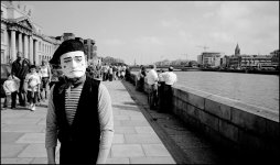
formal: 'Man On Dublin Quay
A very nice take on a well-documented part of your city. The buildings and river will be recognisable to many people and the mime adds interest and suggests the vibrant life of a modern city. It works and shows architecture, river, tourism and performance art without any one part overwhelming another even though the mime is the focus of attention for us the viewers. The mime's posture and placement within the frame gives some tension in a very positive way.
However, the mime has a family coming up fast behind them and while you could not move the family you may perhaps have moved the mime and/or yourself to achieve a slightly less busy background. Or indeed have waited for the people to move on. Although in these settings as soon as one group moves out of the photo another group moves in. Perhaps less depth of field would have lost the people but that would have also lost the construction work on the far bank. You can't win. The other people are fine and add to the scene not detract.
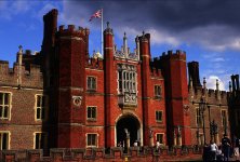
Silva Lining: 'Late Sun at Hampton Court'
Henry VIII photographed this scene. Well almost. It's a great photo of a very popular subject and you have done it justice. Everything works: the viewpoint is great and suggests the scale of the building, the flag is flying, the people suggest accessibility and something of interest inside. Great. The best aspect is the lighting which can have only happened for a very short time and would have been difficult to deal with technically.
The fire hydrant sign on the front wall is a distraction. I would have cropped a little from the bottom to lose it. In order to maintain a 3:2 proportion you could then take a little off the right side and lose some of that dark shade.
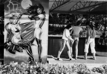
lubitel: 'Shot With J-3'
I like it for being well-observed and contrasting the fantasy figures in the poster with the real people to the right. Especially because the people cannot be aware of the poster while they are looking at what's on the counter. Technically there's a good range of greys while at the same time being contrasty and punchy, and the background is not at all distracting. Nice one.
It would be more graphic if you were to crop from the left to the edge of the poster, from the bottom to the tiled sidewalk and from the right to the person with white trousers. Also, and you could not do anything about it at all, it would look better with two people rather than three!
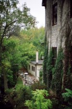
sbug: 'Sorry for the delay. Here goes'
Yes, this says 'fantastic holiday' much better than some over-photographed tourist trap. It's end of the day at a nice old hotel before dinner. It seems to be the sort of photo that brings back happy memories many years later. The composition works very well, the choice of color film is just right for the saturated greens. The icing on the cake is the guy sitting and looking relaxed. It looks good because it puts the guy in scale with this big old building without making him the subject and tilting the camera down, and thereby getting all sorts of diverging verticals perspective headaches.
Maybe, just maybe, if the camera was looking a little more left to show us a little more tree on the left and a tiny bit less building on the right it could be improved. But you were there and I wasn't and you could see the building site to the left and I can't...
A very nice take on a well-documented part of your city. The buildings and river will be recognisable to many people and the mime adds interest and suggests the vibrant life of a modern city. It works and shows architecture, river, tourism and performance art without any one part overwhelming another even though the mime is the focus of attention for us the viewers. The mime's posture and placement within the frame gives some tension in a very positive way.
However, the mime has a family coming up fast behind them and while you could not move the family you may perhaps have moved the mime and/or yourself to achieve a slightly less busy background. Or indeed have waited for the people to move on. Although in these settings as soon as one group moves out of the photo another group moves in. Perhaps less depth of field would have lost the people but that would have also lost the construction work on the far bank. You can't win. The other people are fine and add to the scene not detract.
Silva Lining: 'Late Sun at Hampton Court'
Henry VIII photographed this scene. Well almost. It's a great photo of a very popular subject and you have done it justice. Everything works: the viewpoint is great and suggests the scale of the building, the flag is flying, the people suggest accessibility and something of interest inside. Great. The best aspect is the lighting which can have only happened for a very short time and would have been difficult to deal with technically.
The fire hydrant sign on the front wall is a distraction. I would have cropped a little from the bottom to lose it. In order to maintain a 3:2 proportion you could then take a little off the right side and lose some of that dark shade.
lubitel: 'Shot With J-3'
I like it for being well-observed and contrasting the fantasy figures in the poster with the real people to the right. Especially because the people cannot be aware of the poster while they are looking at what's on the counter. Technically there's a good range of greys while at the same time being contrasty and punchy, and the background is not at all distracting. Nice one.
It would be more graphic if you were to crop from the left to the edge of the poster, from the bottom to the tiled sidewalk and from the right to the person with white trousers. Also, and you could not do anything about it at all, it would look better with two people rather than three!
sbug: 'Sorry for the delay. Here goes'
Yes, this says 'fantastic holiday' much better than some over-photographed tourist trap. It's end of the day at a nice old hotel before dinner. It seems to be the sort of photo that brings back happy memories many years later. The composition works very well, the choice of color film is just right for the saturated greens. The icing on the cake is the guy sitting and looking relaxed. It looks good because it puts the guy in scale with this big old building without making him the subject and tilting the camera down, and thereby getting all sorts of diverging verticals perspective headaches.
Maybe, just maybe, if the camera was looking a little more left to show us a little more tree on the left and a tiny bit less building on the right it could be improved. But you were there and I wasn't and you could see the building site to the left and I can't...
sbug
Acceptably Sharp
Jon: I do like portraits of people in their place of work. It tells you a lot more about them than just a plain background. He (Elias I asume) is the best part of this photo, great expression. The colors otherwise have a bit of a tint to them that I'm not altogether fond of and the bright light behind him is a bit distracting. It appears that you used a flash and that is good. I'm not one for flash use but this would have been disasterous without it. Nice job. I hope you give him a print.
formal: Very nice comp and exposure. Excellent range of tones and I love how his white face pops in this photo. The picture is a bit empty on the right side. Might have been nice if there was something there to balance the abundance of people on the left but there obviously wasn't. Maybe shifting the camera to put the mime in a similar position but on the right side of the frame? Hard to know.
SilvaLining: Great colors although the Velvia leaves them a bit too saturated for my tastes. It's a very interesting subject with lots of detail. I think just a bit more forground would add some stability to the photo and I can see some green grass there. That would be nice running along the entire bottom of the frame. If this is location is near you, it is worth stopping there agin to take a few more shots and see what you like.
lubitel: Good range of tones in this and I like the contrast of real vs drawn subjects. I'd prefer to not have the slight tilt that the frame has and maybe take one step closer to the subject. If one of the three on the right was a blond that would be nice too but nothing you have control over. Well seen subject.
Silva Lining
CanoHasseLeica
Jon - Elias (Who works in the cafe)
A very good character study showing Elias in his place of work. Great portraits often show the individual in a situation that defines their identitiy and this photo does that. You feel you know Elias and his job, yet it also makes you want to find out more.
Critical comments would be to cop the yellow boxes out on the left as they are little distracting, howver that would be hyper-critical!
Formal - Man on Dublin Quay
A location I know well, A brilliant capture of the expression on the Street-artist's face. His positioning in the shot is pleasing - I guess his face is obeying the 'rule-of-thirds', the shot is well exposed too.
The only thing that detracts from the shot is the busy background with the family behind the artist's head. It's difficult to be too critical through as I doubt there is much you could have done about it!
Lubitel - J3 Shot
An interesting capture - I like the contrast between the 'fantasy' girls and the 'real' girls in the background. Looking more closely at the 'real' girls, their poses are quite interesting.
An interesting shot that leaves more questions than answers.
My only constructive criticism would be that the 'real' girls are not sharp.
sbug
A nicely exposed shot where the lighting was quite difficult. I am intrigued by the contrast between the creamy out of focus areas and the sharp central area of the frame. (Its quite a similar effect to that which i get with my Canonet - which camera did you use?). I find myself drawn to the man who is sat in one of the chairs you wonder who or what he is looking at. More interesting though is the cat walking across the path further up the frame. It has the cadence of a cat but looks too large given the perspective (?) These two things lend an air of mystery and a certain unease to the shot which I find compelling.
Not sure what to suggest in terms of a constructive criticism - maybe include a little more of the river to the left, but then you would lose the interesting aspect I mentioned above.
formal
***
Jon
-----
This is a good portrait; I like his expression and the environmental context. The till looks like a computer and it takes a bit of time to see that we are in a cafe.
His left shoulder is a bit indistinct and I'm not sure I like the colour cast (?) in the image. What film/lights did you use?
Silva Lining
--------------
The contrast between the red building, blue sky and dark clouds make this image. I also like the flag (... not sure an Irishman should say that about the union flag") ).
).
I find the small wall at the bottom distracting. I wonder if cropping out the two "less red" parts of the building on the left and right might help.
lubitel
---------
Good image. I like the contrast between the different sorts of women on either side of the image.
I find the out of focus hedge at the front distracting. It is a pity you didn't get all of the feet into the picture.
sbug
------
I like the shades of green, but to be honest I don't get this picture. It took me some time to see the man and I think that cropping out the sky might produce a more powerful image.
David
-----
This is a good portrait; I like his expression and the environmental context. The till looks like a computer and it takes a bit of time to see that we are in a cafe.
His left shoulder is a bit indistinct and I'm not sure I like the colour cast (?) in the image. What film/lights did you use?
Silva Lining
--------------
The contrast between the red building, blue sky and dark clouds make this image. I also like the flag (... not sure an Irishman should say that about the union flag
).I find the small wall at the bottom distracting. I wonder if cropping out the two "less red" parts of the building on the left and right might help.
lubitel
---------
Good image. I like the contrast between the different sorts of women on either side of the image.
I find the out of focus hedge at the front distracting. It is a pity you didn't get all of the feet into the picture.
sbug
------
I like the shades of green, but to be honest I don't get this picture. It took me some time to see the man and I think that cropping out the sky might produce a more powerful image.
David
lubitel
Well-known
Formal,
really nice image! and good composition. I like the persective and the contrast of all these "normal" people / tourists walking around having a nice day, and then this funny character ironically making a sad face.
Jon,
its a well captured portrait. I like the relaxed expression on his face, this man was obviously comfortable with you photographing and that shows. I wonder if you know him personally. I wonder what he does too, there is a seemingly old computer, and a package of... bread? or donuts? is this some kind of restaurant?
sbug,
I think its a well composed image. I like how the green color goes from yellows to dark greens, and browns around the photo. The three light areas are also well positioned. the man on a chair gives it some life, but I wish he was just a little closer.
Silva,
very dramatic photo. both the colors and the subject matter: union jack waving on this court, dark clouds. I like the contrasts of this photo, light blue sky against the dark clouds, the stark red of the walls with the interesting contour against the blue of the sky. these contrasts, the lighting make a powerful image.
Silva Lining
CanoHasseLeica
Jon - thanks for your comments, I hadn't noticed the sign at the time, but yellow does seem to be a colour that draws the eye!
sbug - I live a short walk away from Hampton Court, so I'll go back and try your suggestion. Incidentally, did you se the cat when you took the photo or did you notice it afterwards?
sbug - I live a short walk away from Hampton Court, so I'll go back and try your suggestion. Incidentally, did you se the cat when you took the photo or did you notice it afterwards?
sbug
Acceptably Sharp
Thanks for all of the critiques. The man is in an outdoor seating area of a microbrewery in the basement of this old mill. I did not notice the cat (or small dog?) when I took the photo. I too am curious as to the overall look of the photo. It has a very soft focus look in parts of it. I shot it with either my Nikkor 35/2.5 of 50/1.4. I could maybe see the softness with the 50 wide open but I don't think I shot it wide open. My gut says I used the 35 anyway. The glow above the top of the outdoor heater really perplexes me. The rest of the center area is fairly sharp.
I would have liked to have gotten some more of the river on the left side but the mill and the vines really caught my attention that day. I think the suggestions to move the composition to the left are well founded. I may try this shot again.
I would have liked to have gotten some more of the river on the left side but the mill and the vines really caught my attention that day. I think the suggestions to move the composition to the left are well founded. I may try this shot again.
ClaremontPhoto
Jon Claremont
Thank you all for your helpful comments.
The colors were the result of XPro ten year old (at least) E6 film in a C41 minilab. Results are very unpredictable and strong color casts are common, but so is total failure, or no change whatsoever.
For a few words about Elias and his work you may care to look at my site where you'll see the same photo with a little bit about the cafe.
Lubitel: If you have time to go to my site you'll see my photo of a circus poster very similar to yours but without the people.
ClaremontPhoto
Jon Claremont
sbug said:The glow above the top of the outdoor heater really perplexes me.
The heater needs an adjustment by a qualified gas technician, just tell the brewery that it's giving off too much flare and it's bokeh is not good!
Share:
-
This site uses cookies to help personalise content, tailor your experience and to keep you logged in if you register.
By continuing to use this site, you are consenting to our use of cookies.