Critique #54 *Landscape Theme* 5 Participants

@ haagen_dazs: no problem for me, if also other members agree you can still join :)
@ other members: sorry for being late posting my critiques but it has been a quite busy day (sometimes it happens) i'll post tomorrow morning (it's midnight here).
bye
nico
 
Kevin: Your image is very nice,but the flowers in the foreground take away from the depth of the photo. The highlights in the center of the image become more mysterious looking if you crop away the flowers and maybe look at the image as a vertical image starting close to the water.


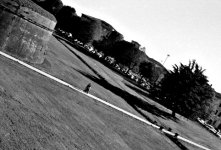
Nico: I have taken many photos nearly identical to the one you have posted here, but not tilted. Is this Virginia Tech ? There is "too much"white space in the top right corner of the photo.

Gabriel: The blue is amazing in your image. What was the purpose of including the wooden stand in the forground? Is this an old life guard post?

Jon: I took the liberty to enhance (?) the contrast and color balance in your image. I think that now the image looks great.

Raid
 

Attachments

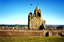
  • Montemor o Novo Castle.JPG
    Montemor o Novo Castle.JPG
    125.2 KB · Views: 0
Raid: Thank you. But don't you think it looks too contrasty now? My wife always thought the (untouched) original had been digitally enhanced anyway.
 
Last edited:
Hey I want to join too... : ) ..... nah just joking but some of us live in different times zones and always miss ....I got a few chances but it took awhile ....
 
Sorry for being late guys, here my critiques:

Kevin: I like it, there’s a lot to see here, flowers, water, trees. This landscape also has a nice range of tones and an interesting composition. As an alternative version I’d like to try a vertical crop with a slight darkening of the leaves in the upper middle background.

Gabriel: I like these gorgeus colours (I agree about the amazing blue). I also like composition (well balanced among vertical, horizontal and diagonal lines).
The upside down boat and the long shadow of lifeguard stand give the shot a melancholic mood (it makes me think about the end of the day). I think I wouldn’t change anything here.

Jon: Nice place to take photo there, I like composition and colours. The landscape in the background completes the photo. If I should try to improve the shot I’d try a slight crop on the right. It’s also interesting what Raid did on colours.

Raid: Good job on the exposure, I like the blur in the water and soft colours too. I like composition, with the photo divided by the waters. I like this one as is, so I do not have any improvement to suggest:

:)
Bye.
Nico
 
Jon Claremont said:
Raid: Thank you. But don't you think it looks too contrasty now? My wife always thought the (untouched) original had been digitally enhanced anyway.


Jon: I am used to Velvia slide film with landscape photos, so tome the contrast is now fine, but I know that many others prefer "natural looking" contrast. In nature, there rae few things that look "natural". We make things look they we we like to have them look like in an image. It isj ust my opinion and means nothing more.

Raid
 
Hi raid,
it's not Virginia Tech but just Lucca'a ancient surroundings :), I was up on them and took the shot of the gardens all around . I tried the crop you suggested and it works, I'll post it when all the others will have posted their comments.
Ciao
nico
 
Gabriel M.A. said:
Here's mine:


Gabriel M.A.

My god you must thank god on your bare knees on an hourly basis for providing the world with color saturation tools which go all the way up to 35001

Or might this be the original location where Mickey Mouse lives?
 
Raid: Thank you for showing me the higher contrast. I usually use Reala and had no idea that films could be as contrasty as your enhanced version of my photo. I guess I'm used to Reala's take on color, and Sensia processed C41, and am grateful for your information.
 
Sorry for being awol on this thread. I should post later this evening. :eek: I like to take my time looking at the pics, and don't want to do a drive-by here.
 
Jon Claremont said:
Here is 'Montemor o Novo Castle':
I'm not quite sure what to make of it, although there is an adherence to the rule of thirds. There's nothing wrong with it that I could concretely point out as being "wrong", yet it needs something. Some photos are best seen in a larger print, this may be one of those cases.

Perhaps a B&W version or this scene in a more "dramatic" environment (as much as I'm allergic to the use of that word).

I do like that this is leveled, and appears to be carefully composed.
 
kmack said:
Catoctin Creek, sunrise.
My very first impression was that this was a very very busy piece. It needs to be observed for a long time in order to appreciate the placement of elements; this is one instance where perhaps color would have been a better choice than B&W, in order to aid the viewer discern the various elements.

I did notice the triangular shape placed in the middle of the frame, with what appears to be placement of diagonals that help frame the rest as if it were a cup. It's interesting.
 
raid said:
This is my image: Great Smoky Mountains National Park, Tennessee, USA.
A nice image; very pleasing subject, with the technique pinned down in order to get that nice waterflow blur. The yellow leaves may be a bit off-place, but give it an (obvious) sense of time placement. The flow, diagonally from top right to bottom left is well done.
 
nico said:
Here mine:
Untitled
BessaR+Nok50+ilfordHp5
Lucca
Very unconventional composition. The photo has given a sense of movement from left to right by this view, and gives it a sense of being a long path. Much longer than if this had been taken "straight" or even tilted a little as most other people would have. I'm still not sure whether I like the parking lot in the frame or not, yet I would suggest trying a crop where you can get rid of the area right of the right edge of the tree.
 
Hi,
here's mine cropped on the right and slightly darkned in order to see more patterns (very difficult to see the surroundings bricks because are very small).
What do you think about it?
thanks.
nico
 

Attachments

  • Le-Mura-ctq54.jpg
    Le-Mura-ctq54.jpg
    172.3 KB · Views: 0
nico said:
Hi raid,
it's not Virginia Tech but just Lucca'a ancient surroundings :), I was up on them and took the shot of the gardens all around . I tried the crop you suggested and it works, I'll post it when all the others will have posted their comments.
Ciao
nico

Hi Nico,

Virginia Tech has a similar looking campus, and I used to take photos of the old stone buildings. So it is in Lucca after all.

The cop looks better. The emphasis in your photo is on the "long path" taken by the two people, and my eyes were immediately drwan to that path. I would try to make the image either square or horizontal with cropping from the top [ as Jon also has recommended]. Again, this is just a personal observation.

Raid
 
Last edited:
In my photo, I placed the camera on a tripod to get stability and sharpness. I included the area on the left to get the yellow leaves into the image. The blur in the water is obtained at speeds slower than 1/15.

Raid
 
Back
Top Bottom