raid
Dad Photographer
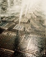
oscroft said:OK, here's mine. I didn't go for anything from yesterday's soup session (cos it's all similar in theme to my other one).
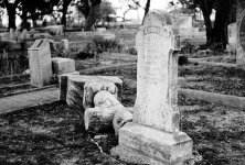
This one is taken with a Bessa-L and CV 21/4 on Velvia 50. It's a close crop from a wider view (the wider view just didn't work).
Alan: I am seeing beautiful geometrical shapes in your photo. Squares and circles are plenty. Too bad there are no triangles! I wrestled with keeping the top left corner of the photo. Is it needed or not. The shapes are not bad at all.
WouldI have tried to take the photo from a different angle to take it vertically and in the direction of the geometrical circular patterns in the foreground?
Nice photo.
Raid