ampguy
Veteran
very interesting
very interesting
If having seen this modified shallow DOF picture either first or along side Raid's original, I probably would have preferred it.
However, seeing it after seeing Raid's original, I feel that although it brings more focus on the children, it is artificially taking detail out, almost like where on the news, they mosaic out faces and stuff.
However, it's possible that when or if Raid took this photo with a narrower DOF it would have looked the same as what you did with PS (or whatever digital program), I would probably have preferred it.
So I would have to admit my critiques will vary, depending not only if I see mods done, but depending if I saw the mods done prior to the original or not.
jl-lb.ms said:Raid, I was sort of thinking like the others at first, that a shallower depth of field would have helped. I even tried some creative blur, with this result. But actually I think I like the busy version; it does show the busy-ness of a beach.
john
ampguy
Veteran
hmm
hmm
Thanks John,
This crop, and what Raid and others suggested probably makes it a better photo.
However, to me, it is now a little less innocent in that previously the table foreground indicated it wasn't a shot aimed for, but a random unframed photo at an interesting angle.
hmm
Thanks John,
This crop, and what Raid and others suggested probably makes it a better photo.
However, to me, it is now a little less innocent in that previously the table foreground indicated it wasn't a shot aimed for, but a random unframed photo at an interesting angle.
jl-lb.ms said:Ted,
First, I find nothing wrong with your shot. But just to mess around, what about cropping the table? Like this.
ampguy
Veteran
better, but
better, but
how about taking another inch off the right and taking out the upper R tree, and pipe? Looks good on my monitor, and would look good with a white matte.
better, but
how about taking another inch off the right and taking out the upper R tree, and pipe? Looks good on my monitor, and would look good with a white matte.
jl-lb.ms said:How about this, fellows? Sort of based on your comments. Too altered?
ampguy
Veteran
I would...
I would...
take another 1/2" off the left, and remove the distracting bent line. I like the work on the right that aligns the post to the edge.
I would...
take another 1/2" off the left, and remove the distracting bent line. I like the work on the right that aligns the post to the edge.
jl-lb.ms said:George, here's my "interpretation" of your photo. Not necessarily an improvement, but different.
sf
Veteran
jl-lb.ms said:Ted,
First, I find nothing wrong with your shot. But just to mess around, what about cropping the table? Like this.
I think if you cropped the table, the perspective would be lost .We need the table to tell us what this is.
sf
Veteran
jl-lb.ms said:How about this, fellows? Sort of based on your comments. Too altered?
Looks fine to me.
ampguy
Veteran
good point
good point
If you only saw the cropped version without the table, and you knew what it was, you would likely think it was wider than it is.
good point
If you only saw the cropped version without the table, and you knew what it was, you would likely think it was wider than it is.
shutterflower said:I think if you cropped the table, the perspective would be lost .We need the table to tell us what this is.
oscroft
Veteran
ampguy: untitled
ampguy: untitled
It's taken me quite a while to try to decide how to think about this shot, and I confess it hasn't been easy. It's the kind of shot where I'd normally probably think something like "Hmm, interesting - not sure what to make of it" and move on. But it has intrigued me (and this critique format has made me spend more time thinking about something new to me, which is one of its great strengths). So, this photo is possibly telling me something about life in a kitchen/restaurant/diner, but I'm not sure what - it doesn't really say anything about what the person is doing. But having said that, I do quite like it - is it a pause between hard work, a quiet time before opening, or is it perhaps nothing to do with the cooking world at all? So, as I say, it has intrigued me, and it has made me want to know more - I wonder if it might work better as one of a series of similarly tightly framed shots rather than as a standalone shot?
oscroft
Veteran
shutterflower: Westin in Bellevue, WA
I love the composition and love the tone and colour. The position of the model against the concrete pillar is just right, with her right arm breaking up a vertical which would otherwise cut the frame in two. The lines on the wall behind direct the eye nicely to the model - and the expanse of wall, with the model forward and to the right of the frame, is a lovely piece of composition. I do like nearly-monochrome colour photos, and what really makes me smile about this one is that you've made a model's pale skin colour the most striking colour in the photo! Had her clothes been any other colour, or even any other shade of grey, it just wouldn't have worked as well - and she definitely needed to be wearing a skirt of just the right length rather than trousers, in order to get just the right amount of her legs contributing to the colour of the scene.
But what can I suggest to improve it? That's a hard one. Perhaps just a tiny bit shaved of the right border to remove the darkness at the top right? (But that might unbalance the composition - I don't think you would want to lose that sloping vertical line on the wall at the left in a rebalancing crop).
oscroft
Veteran
jl-lb.ms: cemetery
jl-lb.ms: cemetery
Nice gravestone shot. I like the contrast - I think high contrast almost always works well for statuary subjects. And I like the way the diagonal line of the fallen stones leads the eye into and out of the scene, to/from the main standing stone. I'm wondering whether that diagonal might possibly have been made to fit the frame by shooting from further to the left, with the standing stone harder against the right of the shot? (Though it looks like that might have introduced a diagonal element running the other way that might have made it confusing). But as it stands, I think I'd experiment with a square crop, removing the extraneous background from the left and right and concentrating on the diagonal line of the stones.
oscroft
Veteran
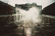
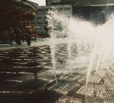
It's actually a fountain, in Liverpool city centre - see attached full frame (and oh, it looks like a 15mm shot, not 21mm). Any suggestions for better crops would be welcome. I've tried a crop with most of the water jets and the three figures to the left, but I think the very high contrast prevents it working well - I've attached it too (Note to self: don't use unforgiving high contrast film like Velvia with very wide-angle high-contrast lenses in high contrast conditions).It took me a while to figure out what this is, and I'm not sure I still know. Is it gutters on the street, or are they application specific gutters on some kind of equipment?
The circular patterned squares seem to not be aligned to potentially make a circle with four squares, which seems may have been the manufacturer's goal?
The reflective wet textures and spray emanating from the oval circles of the squares within squares is appealing.
The fact that the circular patters are not aligned makes me want to jump into the picture and try to align them!! I wonder what answers, if any, the uncropped version has?
Attachments
lff
Established
Now why would you want to go & crop out "Marks & Sparks"?
Haha.....I did like the original crop, for what my opinion is worth here. I wouldn't have commented on this thread had I not seen the lauded old English chain store.
oscroft
Veteran
Hehe, I hadn't realised what the shop was until I looked againNow why would you want to go & crop out "Marks & Sparks"?
Share:
-
This site uses cookies to help personalise content, tailor your experience and to keep you logged in if you register.
By continuing to use this site, you are consenting to our use of cookies.