Critique #64 *Portrait* 5 Participants

RayPA

Ignore It (It'll go away)
Local time
10:23 PM
Joined
Jan 28, 2005
Messages
4,417
Welcome to this critique thread. Please read the purpose statement and the guidelines/ground rules regarding participation.

Purpose
The primary purpose of this thread is to provide a forum where photographers can give and receive constructive criticism on one another's photographs. By setting up some basic guidelines we hope that this thread will provide a forum where the give and take of honest constructive criticism can help us become better photographers.

Guidelines/Ground Rules
The thread has very specific rules regarding participation. The one basic rule is that you cannot provide criticism on an image or comment in a critique thread unless you also have an image posted. To post an image to this thread you must be a participant. Participation in this thread is limited. Here are the guidelines and ground rules for participation:

• Participation in this thread is limited to 5 photographers
• Participants join the thread by posting their intention. You can simply reply with your intent to join by posting something like: "I'm joining," "I'm in," or just state your name
• Joining is on a "first come, first served" basis. The first 5 to reply become the participants.
• Please, only join this thread if you are able post an image within 24 hours of joining.
• Once the thread has 5 participants, no other photographers can join or participate in the thread
• Once the thread is full of participants all photographers will upload their image(s)
• Please abide by any thematic requirement (e.g., landscape, portrait, etc.)
•The number of photos for each participant is limited to one
• Photographers attach photos as thumbnails (no inline images or links)
• Photos should be standard screen resolution (72~90) and the longest side of the image approximately 10 inches in length.
• Photographers post their images supplying titles (if any) and other pertinent information (the amount of information should be minimal)
• Photographers can only comment on their own images and reply to comments only when everyone else in the thread has posted their comments on the image
• Every participant must comment on every photo (except their own—initially)
• Every participant must make at least two comments, one positive comment, and one constructive criticism (which is actually two positive comments)
• Once every photographer has commented then a free flowing discussion begins. It is at this point that every photographer can comment on their own work and reply to comments, ask questions, etc.
• The participants decide when the thread closes.


If you'd like to participate in a critique thread and need some ideas about how to proceed with viewing images critically, you may find this thread helpful:

How do you look at photos

You can also provide feedback on critique threads here:

Critique Feedback Thread

Remember: Please do not provide criticism on an image or comment in a critique thread unless you also have an image posted.

This thread is now active, please follow the guidelines if you'd like to participate! Have Fun!


.
 
Austin, Texas, February 2005

Austin, Texas, February 2005

Let the comments begin.
 

Attachments

  • Cigar-Maker.jpg
    Cigar-Maker.jpg
    173 KB · Views: 0
hey Dave :),
there's mine still missing. I'm going to post it within a couple of hours.Sorry for the delay,
ciao
nico
 
Ok, here's mine - finally :angel:
"Luisa S."
BessaR+Nok50+Xp2

Ciao
nico
 

Attachments

  • Luisa-S.-prova.jpg
    Luisa-S.-prova.jpg
    163.2 KB · Views: 0
DMG:
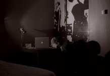
It's dark and tells a story for me. I like the person exhausted in this weird room and we know how they feel even though we cannot see their face. To succeed this photo must depend on body language and context. And it does succeed. If it were a little lighter so we could see more that would be good perhaps, also if it wasn't flipped left right so the Apple logo was the right way round.

Dale Cook:
She looks wary with her hands clasped like that and looking way off camera. It's a nice photo, and very clear. In fact the woman and the bench are so clear that it has the air of being made in a studio with a painted woodland backdrop. Did you try any others at the same sitting with altered body language? Or was it your aim to make this photo in this way? I like it but find it hard to say why.

AusDLK:
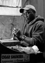
A great environmental portrait of a man and his work. There's good eye contact, and relaxed body language, and a clear demonstration of his work and how to hold the part-finished cigar. The brightness to the top left is a distractor and could have been avoided if the camera was a little to the left and in front of the man - although you were there and know whether or not that was a viable option.

nico:
What a gorgeous photo with tons of eye contact and a great smile. She must be very pleased with this. The tones work just right and the placement of the woman within the frame gives a small dynamic but not overpowering. Technically it must have been tricky as her left shoulder (right for us) is out of focus indicating very little depth of field. The square shape above her right shoulder is a little distracting as is the horizontal line almost level with the top of her head - but if that's the location you've got then that's the location you're working in.
 
Critique

Critique

DMG:
This one definitely conveys a strong message of "exhaustion" to me. I like the stark and minimalist feeling of the room. My only suggestion would be that I think the shot would be more powerful if it wasn't as flat in the tone range. Maybe adding some contrast would help.

Dave:
This is a really well composed and executed portrait! It has a strong sense of interest that invites you to spend time with the photograph to better understand what is going on. It's really difficult for me to find anything that I would change in the shot.

Jon:
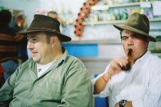
The expression and moment in time capture of the guy on the right is great. I really like how you were able to hold the sharpness in the expression while allowing motion into the shot with the lifting of the drink. Definitely adds another dimension to the shot that makes it far better than it would have been otherwise. The only thing that bothers me about the shot is the individual on the left. For me, he doesn't add anything to the picture. I would be interested in seeing a cropped version of the photo with the sole focus being the individual on the right.

Nico:
A really well executed capture! Your subjects expression is very relaxed and almost comforting. (It makes me wonder how many shots you took to get this particular shot). I also like the composition and tone of the photo. It's so easy to overdue contrast and blow the smoothe transition of tone you have here. Just a couple of minor items I might change would be remove a couple of items in the background (the lower half of the clock and the dark spot half way down to the right). Nice work!
 
Jon Claremont said:
Dale Cook:
She looks wary with her hands clasped like that and looking way off camera. It's a nice photo, and very clear. In fact the woman and the bench are so clear that it has the air of being made in a studio with a painted woodland backdrop. Did you try any others at the same sitting with altered body language? Or was it your aim to make this photo in this way? I like it but find it hard to say why.

Jon,

In response to your questions. I actually took this shot between some others I was taking of some friends. It is actually outside (no backdrops). Unfortunately, this was the only shot that I took. Her hands and body position are that way primarily because it was quite chilly and she was recoiling for warmth. So...her position was natural and not posed.

Thanks again for your feedback!
 
first of thanks for the comments so far guys

Jon :- I like the sense of fun and familiarity this picture creates. This pair look a right couple of characters. The only drawback for me is it feels a tad overexposed for my liking

Dale :- Love the tonality in this shot and the pose conveys the weather/time of year. I would have liked to have seen this in colour

Dave :- I like the eye contact in this shot plus the humour of the sticker, the composition is a little tight for me though

Nico :- Again the eye contact is superb and the warmth of the smile make this special, the background is a bit distracting (the highlights from the pans in the bottom right)

thanks again guys (the other Dave)
 
DMG -- I have looked and thought about your entry for awhile now. As a portrait, I'm not sure that I am going to have much good to say about it... At least as I define a portrait, the subject should be identifiable. In the general sense, I suppose that it is a picture of a person so technically I suppose it could be qualified as such. So that aside, what about the image in general if one ignores the category? From a technical point of view, I think that it could be improved by adjusting brightness/contrast as it appears rather flat -- but the first thing that glares out at me are the spots -- I see at least six rather large spots that I can only conclude are ignored dust spots from a scan. Not to be overly harsh but why would anyone offer up anything less than as perfectly rendered image as possible for critical review? These easily correctable flaws distract any critical viewer and makes a critic wonder how seriously the image is to be considered in the first place. Again, sorry to be so blunt but sugar coated comments here (or anywhere) simply do not serve the artist -- the artist that truly wishes to learn from critical review. All in all, I think the image has great promise -- maybe not as a portrait -- as it is definitely mysterious and moody (ie., is the guy sleeping or dead? what are those shapes on the wall?) but as is it pretty much just sits on my screen as a blob.

Jon -- These blokes look like they're having a good time. The background is a tad confusing, the guy on the left looks like he has the top of a head popping out of his hat, and unfortunately the brown sweater on the left competes with the left subject's face a bit too much. I do find myself drawn into the image and wondering what I am missing besides a cool one. If I was photographing these guys I would have hoped for the guy on the left to be looking at the camera too as I think that would have made for a more compelling people picture. Technically and compositionally, I don't have much to comment on (other than the background) as I think all of this is pretty good. Other than that I don't see how the image could be improved much -- except to say again catching the guy on the left looking at the camera (or vicinity) would have made for a stronger image.

Dale -- This is a powerful image. It is bold and the out of focus elements both in the foreground and the background very nicely done. Technically wonderful. The side edges of the bench disappear into the background a bit too much for my taste so I might have played with that some. I would also have straightened the bench back "horizon" but this is a nit-pick. The sharpness of the woman is a bit questionable but I chalk this up to an issue with the jpg. Other than these minor nit-picks, I think you have created a beautiful portrait of your partner here. One worthy of framing and going above the mantelpiece.

Nico -- This is nice one. The eyes have it. There is a kindness there for all to see. Maybe it's my display (since so many of the images I've commented on today appear this way) but I think yours could also be improved with some added contrast. And what's up with her right shoulder? I see a very strong moray pattern there... That aside, I'd also suggest that you consider a tighter crop to remove the distracting 1/3 of a clock from the top center and a little off of the right side. But that said, this works very nicely as a portrait and I think that it flatters the subject -- and I think that is the mark of a truly good portrait.
 
Last edited:
Hi,
here's my thoughts about the photos.

DMG:
altough I can agree with Dave about what can be considered a portrait I like your shot, it's a storyteller with a strong mood. I like compostion and the minimalistic environement avoids distractions. i like the exposure but maybe a little bit more contrast would help. I'd also like to see, as "alternate version", a tighter crop on the right and on the upper side, just to see how it works :)

Jon:
i like that couple, i think they're funny and the feeling i get form the shot is that i'd like to spend some time with them watching football matches, drinking etc; i get "good vibrations" from this portrait. I also like the eye contact. for me this photo works as it is so i would not change anything here even though the background is a little bit distracting but, i agree with you, it is the only one you had when you shot.

Dale
being this one a critique forum I have only a few words to write about your photo! :). that's because I think it is a good one where everything works just properly: the composition with the subject slightly on the left, the light/exposure job, the nice oof you choose and the sharpness. I also like the expression you caught. Hard to tell what to change here to improve this portrait.

Dave:
i like this environmental portrait, it's clear and "easy to read" as a good novel. The composition shows all the elements in their right place, the advertisement, the table, the cigar and the hands. the eye contact, relaxed, completes the shot showing the man not only the craftsman. i also like the exposure job and the light / shadow play on the man's face. the only thing i can suggest, as constructive criticism, is a less tighter crop on the right (i'd like to see some more of the man's back).

That's all folks,
ciao
nico
 
Last edited:
Back
Top Bottom