You are using an out of date browser. It may not display this or other websites correctly.
You should upgrade or use an alternative browser.
You should upgrade or use an alternative browser.
Critique #66 *Open Theme* 5 Participants + 1 Guest
- Thread starter RayPA
- Start date
- Latest activity Latest activity:
- Replies 50
- Views 5K
raid
Dad Photographer
Guest is Welcome
Guest is Welcome
Thanks! Let's try this approach and see what will develop here.
Raid
Guest is Welcome
ampguy said:I'm responding to an invite from Ray. I'd be pleased to be a guest on this one if it's still available. Thanks.
Thanks! Let's try this approach and see what will develop here.
Raid
davidbivins
Established
raid
Dad Photographer
mrtoml
Mancunian
AusDLK
Famous Photographer
davidbivins
Established
Reply to Sirius
Reply to Sirius
sirius
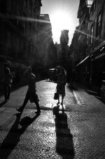
The way you've captured the light on this street seems very natural to me. I work in Manhattan and at this time of year the stretch of 5th Avenue near my office blows out with light like this at lunchtime. You create the perception that there's little to be seen outside the stark silhouettes, yet that's not really the case--you leave enough range in the shadows that a deeper look reveals more
detail. I think the flaring is also very appropriate and wonderfully starry.
The street is grabbed by your frame with a little excitement. The angle and harsh lighting brace me for something more than I ultimately find. While so much of the photo is worth a deeper look, I feel that a piece is missing. Perhaps being closer or further away from the people would have created a different
relationship or geometric idea that would have made this image more complete. Is there a story? A statement? Simply a pleasure-inducing formality? Not quite. It's very close.
I must say that this image gave me a lot to feel and think about. I just wanted a little more.
Thanks for showing it!
David.
Reply to Sirius
sirius
The way you've captured the light on this street seems very natural to me. I work in Manhattan and at this time of year the stretch of 5th Avenue near my office blows out with light like this at lunchtime. You create the perception that there's little to be seen outside the stark silhouettes, yet that's not really the case--you leave enough range in the shadows that a deeper look reveals more
detail. I think the flaring is also very appropriate and wonderfully starry.
The street is grabbed by your frame with a little excitement. The angle and harsh lighting brace me for something more than I ultimately find. While so much of the photo is worth a deeper look, I feel that a piece is missing. Perhaps being closer or further away from the people would have created a different
relationship or geometric idea that would have made this image more complete. Is there a story? A statement? Simply a pleasure-inducing formality? Not quite. It's very close.
I must say that this image gave me a lot to feel and think about. I just wanted a little more.
Thanks for showing it!
David.
davidbivins
Established
Reply to raid
Reply to raid
raid:
Every time I look at this photo I see it somewhat differently. I think that's a good thing.
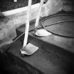
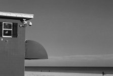
My first reaction was slight annoyance. Here's a sparsely populated scene, an empty bar with surveillance cameras... "why cut off the bottom of the building and kill our frame of reference?" I thought.
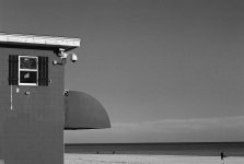
But wait. I closed it and looked again later, seeing a very graphic presentation. Now the things in the photograph were free to be shapes and work abstractly. Everything from the unlit neon sign to the "peeling" awning, the man on the beach to the cameras became objects on the tabletop of the photographer's eye. The wide areas of flat tone started to make a lot of sense at this point. I wouldn't want any more detail in the sky for example.
I would want to spend more time looking at your work to see how this fits or doesn't fit.
I think this photo offers a puzzle that's fun to play with. I think it would be much
stronger presented with images in a similar vein. That's not really the point of this thread, but if you had this between two other photos of equal abstraction, it could be quite exhilirating.
Thanks for showing it!
David.
Reply to raid
raid:
Every time I look at this photo I see it somewhat differently. I think that's a good thing.
My first reaction was slight annoyance. Here's a sparsely populated scene, an empty bar with surveillance cameras... "why cut off the bottom of the building and kill our frame of reference?" I thought.
But wait. I closed it and looked again later, seeing a very graphic presentation. Now the things in the photograph were free to be shapes and work abstractly. Everything from the unlit neon sign to the "peeling" awning, the man on the beach to the cameras became objects on the tabletop of the photographer's eye. The wide areas of flat tone started to make a lot of sense at this point. I wouldn't want any more detail in the sky for example.
I would want to spend more time looking at your work to see how this fits or doesn't fit.
I think this photo offers a puzzle that's fun to play with. I think it would be much
stronger presented with images in a similar vein. That's not really the point of this thread, but if you had this between two other photos of equal abstraction, it could be quite exhilirating.
Thanks for showing it!
David.
davidbivins
Established
Reply to Mark
Reply to Mark
Mark:
Your Holga seems to behave very well. The focus aberrations are pleasant and this isn't a subject that would gain anything from the effects of light leaks.
This photograph is pleasing. Your choice of film and exposure (such control as you have with a Holga) makes for a meaty image, crispy sharp in the middle and velvety smooth around it. The tools are a quick pun on legs and feet. Sticking with the pun, one of them might trip over the hose or cable.
I have a love/hate relationship with punny photographs like this. Full disclosure: I take them myself all the time. They're fun to take, even better when they turn out well, amuse my friends, and generally don't have much meaning or interest beyond the pun itself. So my constructive criticism is probably as much me talking to myself as it is to you.
I take away two distinct feelings after viewing this that aren't necessarily what you want to viewer to feel: first, the photograph is well-executed from a technical perspective, and second, the tools look like they're walking up the stairs. If that's all you were after, I think you got it. If you wanted minds to linger on the photo longer and let the technical expertise be transparent in favor of a deeper narrative or relationship with the subject, this composition, or perhaps subject, may not have been the best choice.
Either way, you've gotten me interested in viewing your other work, and spreading awareness of your work is never a bad thing.
davidbivins
Established
Reply to AusDLK / Dave
Reply to AusDLK / Dave
Dave:
Beautiful exposure and choice of film and speed: the grain has a soft texture that suits the boy's face and helps the surrounding details dissolve pleasantly.
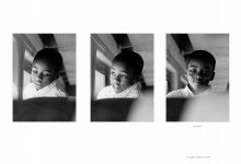
Your choice of a triptych works well because the repetition of the background helps it disappear so that it's all about the child's face. By the time we get to the third face, the ever-growing blob in the lower-right corner of the frame is irrelevant. The triptych format also allows us to say the boy's face is "animated," something more implied if we only look at one frame.
The caption interests me because it suggests that this boy has been caught in some sort of act, probably harmless. But what is it? What mischevious fun did he get into? Or is it just his self-consciousness at being "caught" by the photographer? The triptych format suggests a linear narrative, a sequence in time, but I'm not sure what's happened. You've demonstrated a gift for capturing the boy's nature; both the second and third photos could work well on their own in this way. I would bet this his adult face will still carry these expressions in its repertoire.
Coincidentally, he looks remarkably like a child version of one of my art directors.
In short: Really nicely done, though I wish I could see better what the story is.
Thanks!
David.
Reply to AusDLK / Dave
Dave:
Beautiful exposure and choice of film and speed: the grain has a soft texture that suits the boy's face and helps the surrounding details dissolve pleasantly.
Your choice of a triptych works well because the repetition of the background helps it disappear so that it's all about the child's face. By the time we get to the third face, the ever-growing blob in the lower-right corner of the frame is irrelevant. The triptych format also allows us to say the boy's face is "animated," something more implied if we only look at one frame.
The caption interests me because it suggests that this boy has been caught in some sort of act, probably harmless. But what is it? What mischevious fun did he get into? Or is it just his self-consciousness at being "caught" by the photographer? The triptych format suggests a linear narrative, a sequence in time, but I'm not sure what's happened. You've demonstrated a gift for capturing the boy's nature; both the second and third photos could work well on their own in this way. I would bet this his adult face will still carry these expressions in its repertoire.
Coincidentally, he looks remarkably like a child version of one of my art directors.
In short: Really nicely done, though I wish I could see better what the story is.
Thanks!
David.
mrtoml
Mancunian
My comments. I'm new to this forum so I hope I don't upset anyone 😱
Sirius:
I like the dynamics of the image. Strong leading lines and dramatic contrast. On the other hand the strength of the contrast can also be interpreted as a weakness. The viewer would like to see what is going on in the shadows, but there is no way you can see. For example, it looks like the man is looking back at something, but it is pitch black so we can't see it. Also with the sun's rays it is difficult to make out what the tower is in the background. It seems to be of a strange architectural design. On the other hand this all lends to the mystery of the image.
David:
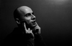
I really like this a lot. Beautiful lighting and atmosphere. A very nice portrait. Minor criticism might be the pose of the hands. It almost looks like he is pulling a face. The hands somehow do not look very natural to me. Slightly uncomfortable maybe.
Raid:
A nice abstract shot. At least initially I see this as an abstract composition of shapes. It is nicely balanced then by noticing the figure on the far left in the distance. It also helps that the sky was fairly clear and it has been darkened perhaps by a filter. Perhaps an alternative version might include a little more of the beach itself in the foreground.
AusDLK:
A nice triptych. You really get a sense of a happy go lucky kid just daydreaming or watching the world going by. And then the last shot where he has noticed the photographer gives it a nice sense of 'closure' moving from candid shot to awareness. Only criticism might be the slightly distracting grey in the bottom right corner of the 2nd and 3rd shots.
Sirius:
I like the dynamics of the image. Strong leading lines and dramatic contrast. On the other hand the strength of the contrast can also be interpreted as a weakness. The viewer would like to see what is going on in the shadows, but there is no way you can see. For example, it looks like the man is looking back at something, but it is pitch black so we can't see it. Also with the sun's rays it is difficult to make out what the tower is in the background. It seems to be of a strange architectural design. On the other hand this all lends to the mystery of the image.
David:
I really like this a lot. Beautiful lighting and atmosphere. A very nice portrait. Minor criticism might be the pose of the hands. It almost looks like he is pulling a face. The hands somehow do not look very natural to me. Slightly uncomfortable maybe.
Raid:
A nice abstract shot. At least initially I see this as an abstract composition of shapes. It is nicely balanced then by noticing the figure on the far left in the distance. It also helps that the sky was fairly clear and it has been darkened perhaps by a filter. Perhaps an alternative version might include a little more of the beach itself in the foreground.
AusDLK:
A nice triptych. You really get a sense of a happy go lucky kid just daydreaming or watching the world going by. And then the last shot where he has noticed the photographer gives it a nice sense of 'closure' moving from candid shot to awareness. Only criticism might be the slightly distracting grey in the bottom right corner of the 2nd and 3rd shots.
ampguy
Veteran
Guest critique comments
Guest critique comments
sirius - an excellent street alley shot in bright sunlight, with the sun just above the gap of the two buildings. I like the exposure, and how the sun rays show well, while still preserving some shadow detail in the buildings and the texture of the cobblestones. I would try straightening it slightly. Even if it is straight, something appears tilted right just a small bit. very nice.
davidbivins - the offset symmetry makes this interesting, along with the lighting, and expression and gestures made by the subject. I like the clean background and grainy texture. The photo is sharp and highlights his face and forehead, making an excellent portrait. The one imperfection I see in this print or scan is the texture of the grain to the upper right seems a little swirly/painty, where throughout the rest of the background it is relatively consistent. excellent.
mrtoml - sharp b&w photo of tools, possibly being cleaned after use. The tools are interesting, but the framing leaves my eyes searching for more context, as to the location, or the workers. Perhaps less cropping, or wider field of view encompassing the whole set of steps would tell a bigger story. The wet cement being very sharp, along with the tools, does however give a sense of the hardness and messiness of the work these tools make. very nice.
Dave - This is a nice series of 3 photos likely taken in rapid succession. I like the 3rd one the best with the boy smiling and looking at the camera. There is not enough detail in the frame for me to immediately recognize if this is a train or bus, and the bottom portion (seat?) with the reflection to the right is slightly distracting to my eye. They might work well as square photos with the bottom of the seat cropped. All 3 are great photos, my favorites in order are the 3rd, 2nd, then first. Excellent.
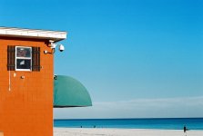
Raid - this is a very sharp photo of a building on the beach. The window on the building with lights and security camera seem less interesting than the background with people walking on the beach, but the sun shade on the building is interesting. The photo is tilted to the left very slightly and there may be a small negative scratch on the far right, but the texture of the grain and the subject of the sky with clouds works well. I wonder how this would work with an extra inch of sand at the bottom? Very nice photo.
Guest critique comments
sirius - an excellent street alley shot in bright sunlight, with the sun just above the gap of the two buildings. I like the exposure, and how the sun rays show well, while still preserving some shadow detail in the buildings and the texture of the cobblestones. I would try straightening it slightly. Even if it is straight, something appears tilted right just a small bit. very nice.
davidbivins - the offset symmetry makes this interesting, along with the lighting, and expression and gestures made by the subject. I like the clean background and grainy texture. The photo is sharp and highlights his face and forehead, making an excellent portrait. The one imperfection I see in this print or scan is the texture of the grain to the upper right seems a little swirly/painty, where throughout the rest of the background it is relatively consistent. excellent.
mrtoml - sharp b&w photo of tools, possibly being cleaned after use. The tools are interesting, but the framing leaves my eyes searching for more context, as to the location, or the workers. Perhaps less cropping, or wider field of view encompassing the whole set of steps would tell a bigger story. The wet cement being very sharp, along with the tools, does however give a sense of the hardness and messiness of the work these tools make. very nice.
Dave - This is a nice series of 3 photos likely taken in rapid succession. I like the 3rd one the best with the boy smiling and looking at the camera. There is not enough detail in the frame for me to immediately recognize if this is a train or bus, and the bottom portion (seat?) with the reflection to the right is slightly distracting to my eye. They might work well as square photos with the bottom of the seat cropped. All 3 are great photos, my favorites in order are the 3rd, 2nd, then first. Excellent.
Raid - this is a very sharp photo of a building on the beach. The window on the building with lights and security camera seem less interesting than the background with people walking on the beach, but the sun shade on the building is interesting. The photo is tilted to the left very slightly and there may be a small negative scratch on the far right, but the texture of the grain and the subject of the sky with clouds works well. I wonder how this would work with an extra inch of sand at the bottom? Very nice photo.
raid
Dad Photographer
Sirius: I have some initial comments on your posted image:
1. Composition: I find it very interesting and dynamic to see the man going sideways across the street while two women are going up and down the street. The vertical composition allowed you to capture the sun rays as they illuminate the scene.
2. Exposure: Your chosen exposure gives the street paving a perfect exposure while it covers the individuals in semi-darkness. I wonder howthe photo wouldlike if you had increased exposure by 1-2 f-stops. The people would be more illuminated while the sun burst would be more exteremein its intensity. There isno guarantee that it would be any "better". Right now, the shadows of the people show very well, whereas with added exposure the shadows may diminish in strength.
3. Tilt: The image is slightly tilted. Was this a part of the composition or a side effect?
I may return to this image later on.
Raid
raid
Dad Photographer
David: I have some comments on your image:
1. Composition: You chose a horizontal composition that seems to work very well with the open space on the right. The man does not look at the camera but at someone else on the right. Sometimes I think he is looking at me. There is a graphics component here; his two hands seem to hold his head like a support for a statue. How would the imahe have looked like if taken from the frontin a vertical composition?
2. Exosure: The exposure is very well chosen here,with excellent choice of light for the face of the man. The man is mostly in the dark except for his face and two hands which emphasizes these two parts.
3. Message: Is the man laughing with the photographer?
Raid
raid
Dad Photographer
mrtoml: I see the following in your image:
1. Composition: A stork/man is walking up the stairs and its two legs are shown! The background is a little distracting though. Still, you have chosen a very interesting composition here. A different composition would be to have taken the photo from a different angle, shooting more up the stairs.
2. The waiter hose: Will the stork/man stumble and fall? I like the way the water hose is laying on the ground. It adds to the graphical nature of this image.
3. Exposure seems to be well chosen.
Raid
raid
Dad Photographer
Dave: I like the choice of the three images. There is life in the set ofphotos, as if I know the little boy somehow. The chosen exposure is really nice,with light hitting the boy's face as if there is a beam of light illuminating the boy. Yes, there is a white ghost showing up in the last two images, but the effect is minimal. I would have preferred not to have these white areas. Was this a bus theme? Nice idea in action.
Raid
Raid
sirius
Well-known
Thanks for your comments everyone. Sorry, I was a little slow in responding here.
- - -
David:
The picture looks well exposed to me. The forms are defined and well-rounded in space. The tones are silky.
I don't really know what is intended by the photo. He appears to be massaging his jaw, but I'm not sure what is interesting about this. Maybe there is a story there that I am missing.
- - -
Raid:
It appears to be a photo exploring abstraction. Large shapes are defined with small quirky details. I like the shapes. The tones are velvety in the photo and I can sense the strong colour and bright light, even though the photo is monotone.
Is that a negative scratch on the right? What are your feelings about retouching that?
The picture feels a little unbalanced in the composition. In painting class my abstract teacher would talk about creating a "push-pull" in how you portion out your shapes to make the surface more dynamic. The building is very heavy in the left-hand side and is not counter-balanced enough by the composition. Though I'm not suggesting that you crop this photo, I have attached crop below that seems more balanced from the perspective I'm discussing here. I hope you don't mind and that this is a useful exercise.
- - -
mrtoml:
I like this photo. It is fun and anamorphic. The roughness of the lens just adds character here.
I'm not sure what to suggest. Perhaps if you waited for someone's foot to come into the frame as the walk down or up the stairs there might have been an interesting contrast set-up.
- - -
AusDLK:
In a way this is the most appealing of the photos to me because of the gesture and expression---kids are great. I love sequencing and story-telling. I can feel the emotion of that gaze and remember being "busted" myself.
Somehow I wish there was a little more information about the environment. Were the pictures cropped?
If these photos were meant to be viewed on the screen like this, I think the font you chose is hard to read at that size. Small points, nice series.
- - -
- - -
David:
The picture looks well exposed to me. The forms are defined and well-rounded in space. The tones are silky.
I don't really know what is intended by the photo. He appears to be massaging his jaw, but I'm not sure what is interesting about this. Maybe there is a story there that I am missing.
- - -
Raid:
It appears to be a photo exploring abstraction. Large shapes are defined with small quirky details. I like the shapes. The tones are velvety in the photo and I can sense the strong colour and bright light, even though the photo is monotone.
Is that a negative scratch on the right? What are your feelings about retouching that?
The picture feels a little unbalanced in the composition. In painting class my abstract teacher would talk about creating a "push-pull" in how you portion out your shapes to make the surface more dynamic. The building is very heavy in the left-hand side and is not counter-balanced enough by the composition. Though I'm not suggesting that you crop this photo, I have attached crop below that seems more balanced from the perspective I'm discussing here. I hope you don't mind and that this is a useful exercise.
- - -
mrtoml:
I like this photo. It is fun and anamorphic. The roughness of the lens just adds character here.
I'm not sure what to suggest. Perhaps if you waited for someone's foot to come into the frame as the walk down or up the stairs there might have been an interesting contrast set-up.
- - -
AusDLK:
In a way this is the most appealing of the photos to me because of the gesture and expression---kids are great. I love sequencing and story-telling. I can feel the emotion of that gaze and remember being "busted" myself.
Somehow I wish there was a little more information about the environment. Were the pictures cropped?
If these photos were meant to be viewed on the screen like this, I think the font you chose is hard to read at that size. Small points, nice series.
- - -
Attachments
Last edited:
sirius
Well-known
David:
I made my comments and then went back and read everyone else's.
David, if your subject is massaging his jaw from laughing---as Raid observed---it would explain the photo to me more. Still the lighting seems very moody for a jocular moment.
I hope this is helpful.
I made my comments and then went back and read everyone else's.
David, if your subject is massaging his jaw from laughing---as Raid observed---it would explain the photo to me more. Still the lighting seems very moody for a jocular moment.
I hope this is helpful.
raid
Dad Photographer
raid:
Every time I look at this photo I see it somewhat differently. I think that's a good thing.
My first reaction was slight annoyance. Here's a sparsely populated scene, an empty bar with surveillance cameras... "why cut off the bottom of the building and kill our frame of reference?" I thought.
But wait. I closed it and looked again later, seeing a very graphic presentation. Now the things in the photograph were free to be shapes and work abstractly. Everything from the unlit neon sign to the "peeling" awning, the man on the beach to the cameras became objects on the tabletop of the photographer's eye. The wide areas of flat tone started to make a lot of sense at this point. I wouldn't want any more detail in the sky for example.
I would want to spend more time looking at your work to see how this fits or doesn't fit.
I think this photo offers a puzzle that's fun to play with. I think it would be much
stronger presented with images in a similar vein. That's not really the point of this thread, but if you had this between two other photos of equal abstraction, it could be quite exhilirating.
Thanks for showing it!
David.
__________________
Raid:
A nice abstract shot. At least initially I see this as an abstract composition of shapes. It is nicely balanced then by noticing the figure on the far left in the distance. It also helps that the sky was fairly clear and it has been darkened perhaps by a filter. Perhaps an alternative version might include a little more of the beach itself in the foreground.
__________________
Mark Tomlinson
It appears to be a photo exploring abstraction. Large shapes are defined with small quirky details. I like the shapes. The tones are velvety in the photo and I can sense the strong colour and bright light, even though the photo is monotone.
Is that a negative scratch on the right? What are your feelings about retouching that?
The picture feels a little unbalanced in the composition. In painting class my abstract teacher would talk about creating a "push-pull" in how you portion out your shapes to make the surface more dynamic. The building is very heavy in the left-hand side and is not counter-balanced enough by the composition. Though I'm not suggesting that you crop this photo, I have attached crop below that seems more balanced from the perspective I'm discussing here. I hope you don't mind and that this is a useful exercise.cise.
Serius
Raid - this is a very sharp photo of a building on the beach. The window on the building with lights and security camera seem less interesting than the background with people walking on the beach, but the sun shade on the building is interesting. The photo is tilted to the left very slightly and there may be a small negative scratch on the far right, but the texture of the grain and the subject of the sky with clouds works well. I wonder how this would work with an extra inch of sand at the bottom? Very nice photo.
Ted (AMPGUY)
=============================================
Thanks for all the comments on my image of the building at the beach. I started out taking beach photos, but then I wanted an abstract image. I had the Summicron lens on a camera, and I was looking for something more interesting than waves and sand. The geometry of the building caught my eyes, and I found the beach as a complementing factor to the building. I deliberately downplayed the role of the beach since I wanted to keep the building be the main factor. I will post the original color slide here. The posted image is a B&W converted image from a color slide.
I don’t mind the suggested cropping. I know that some people take offense that their masterpieces have been altered The image is very sharp, and it was a test of the old 90mm Summicron lens hand-held.
I need to check whether this is a negative scratch or something else, Ted and Serius.
I took this image in color,and when I compose with color film I compose often differently than when using a B&W film. With B&W film it is more important to balance composition since everything is a shade of grey, but with color, sometimes a small part of an image area wise is actually "large" impact wise. For example, I added a small slice of the water, but it is blue and I envision the vastness of the ocean, so the small part of the image is [to my eyes] large. In that sense, I composed the image as balanced to my eyes. Changing the image to B&W, it may have become "corrupted" in the eyes of some people. I am trying out the B&W conversion to see if it is now graphically stronger than before or not. What is your opinion on this point?
I find Ted’s input fair and balanced and definitely a contributing positive factor as a “Guest”,don’t you think so?
Raid
Attachments
Last edited:
AusDLK
Famous Photographer
Sorry for the delay in offering my comments.
You'll see them tomorrow.
You'll see them tomorrow.
Similar threads
- Replies
- 0
- Views
- 992
- Replies
- 3
- Views
- 567
- Replies
- 33
- Views
- 3K
- Article
- Replies
- 23
- Views
- 5K
- Replies
- 56
- Views
- 3K